Company milestone · 1975-04-04
Bill Gates and Paul Allen established Microsoft. Allen suggested the name “Micro-Soft”, short for microcomputer software. [2]
Logo files, variants & history · AI, PNG · updated 13 days ago
Brand profile
Technology company
Microsoft Corporation is an American technology company headquartered in Redmond, Washington. Bill Gates and Paul Allen founded it in 1975 to market BASIC interpreters for the Altair 8800; its products include the Windows operating systems, Microsoft 365, Surface computers, Xbox consoles and the Azure cloud platform.
Microsoft uses a corporate identity that combines a wordmark with a four-square symbol. Its company mark is separate from the individual Windows, Xbox and other product identities.
Company: Microsoft.
Available in this archive
Microsoft has 14 downloadable files in AI, PNG in this archive. 7 logo records are catalogued; that is not the number of verified redesigns.
PNG renditions reach 3,000 pixels on the longest side.
Choose a format and size ↓File library
Browse recorded formats and variants for Microsoft. Source formats appear first, followed by raster sizes.
2012 · Current
1972 · Retired
1975 · Retired
1980 · Retired
1982 · Retired
1987 · Retired
2011 · Retired
1972 · Retired
2012 · Current
1975 · Retired
1980 · Retired
1982 · Retired
1987 · Retired
2011 · Retired
A file link or download does not grant a trademark licence or permission to reuse a logo.
Brand heritage
Selected documented milestones; not a complete logo chronology. Company and product dates are labelled separately from design changes.
Company milestone · 1975-04-04
Bill Gates and Paul Allen established Microsoft. Allen suggested the name “Micro-Soft”, short for microcomputer software. [2]
Logo milestone · 1987-02-26
Microsoft adopted the so-called “Pac-Man” logo designed by Scott Baker: the name in Helvetica italic, with a slash between the o and the s to stress the “soft” part of the name. It replaced a green, all-capitals logo whose stylised letter O was nicknamed the “blibbet”. [2]
Logo milestone · 2012-08-23
Microsoft introduced a new corporate logo consisting of a Segoe logotype and a symbol made from coloured squares. The announcement described it as the first major corporate-logo change in 25 years. [1]
Compiled 2026-09-25 by AI-assisted source review. Each statement links its sources; an editor has not yet independently confirmed them.
Earlier records come from the existing archive; their labels and dates are kept as recorded and are not cited.
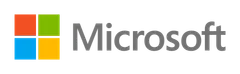
Microsoft introduced this corporate logo on 23 August 2012, its first logo change in 25 years. The Segoe logotype and four coloured squares represent the company and its diverse product portfolio. The current corporate guidance shows this same combination mark. The source comparison does not establish that the archived PNG or Illustrator file was distributed by Microsoft.
Colour sample
Approximate values sampled from the archived artwork file. Sampling can round colours, so these are not the owner’s published colour specification.
Design context
Microsoft relates the squares to the diversity of its product portfolio. The announcement does not assign a particular product to each square.
From the researched record (AI-assisted source review); see research sources.
Logo lettering can differ from a brand’s corporate typefaces.
Reference
1987 “Pac-Man” logo (1987) is credited to Scott Baker. The designer of the specific file version shown on this page is not recorded. [2]
Download for identification, news and comparison. Commercial use needs the owner's permission. This page never grants a licence. Always check the owner's brand guidelines.
1987-02-26: Microsoft adopted the so-called “Pac-Man” logo designed by Scott Baker: the name in Helvetica italic, with a slash between the o and the s to stress the “soft” part of the name. It replaced a green, all-capitals logo whose stylised letter O was nicknamed the “blibbet”. 2012-08-23: Microsoft introduced a new corporate logo consisting of a Segoe logotype and a symbol made from coloured squares. The announcement described it as the first major corporate-logo change in 25 years. [1] [2]
Available file formats: AI, PNG. Dimensions, source and usage conditions are listed for each file below.
Visual neighbours
Ranked from image embeddings, perceptual hashes and geometric evidence. Ranks are not percentages or trademark clearance.
Same company
Listed because the archive records the same company.
Same industry
Listed because the archive records the same industry, United States first.
Provenance
SimilarLogo archive files (blogs.microsoft.com/blog/2012/08/23/microsoft-unveils-a-new-look), checked by an AI-assisted process; an editor has not reviewed it.
SHA-256 of the recorded file. Checksums identify exact bytes, not who created the artwork.
SimilarLogo. “Microsoft logo record.” Updated 2026-11-01. https://similarlogo.com/brand/microsoft/
These files come from SimilarLogo's archive of Microsoft artwork (archive snapshot 2026-08-02). Formats and file details are shown in the library.
All logos and trademarks on SimilarLogo are the property of their respective owners and are provided for informational, editorial and identification purposes only. Availability here does not imply any licence, affiliation or endorsement. Rights holder? Claim this brand · Request removal · Report an error. Staff review each request; there is no automatic takedown.
Help us understand which catalogues and file formats are useful. We do not record search text, uploaded images, names, email addresses or IP addresses in usage events. Events expire after 30 days. Local, staff and recognised bot traffic is separate.
Measurement is off until you opt in. Downloads have separate operational delivery counts.