LinkedIn is a social networking platform connecting professionals from various fields and industries. It was founded in 2003 by Reid Hoffman and other co-founders and was acquired by Microsoft in 2016.
LinkedIn logo history is a story of how the company evolved its visual identity over the years. LinkedIn’s mission is to connect the world’s professionals to help them become more productive and successful. And its logo carries the company mission in its visual appearance. The logo has three main elements: the wordmark, the icon, and the color.
Note: You can download all the PNG and Vector files for free. But you need to credit us or mention Similarlogo website in your work and blog posts. Enjoy!
LinkedIn Logo Evolution, History, Font, Color, PNG, and Vector
The LinkedIn logo has evolved over time, reflecting the company’s growth and changing priorities. Here’s a brief overview of the three major redesigns:
Original Logo (2003-2011)
LinkedIn’s first logo was introduced in 2003 during its founding. This logo aligned with LinkedIn’s focus on connecting professionals.
First Redesign (2011-2019)
In 2011, LinkedIn underwent its first significant logo redesign. This reflects LinkedIn’s expanding user base and its desire to appeal to a broader audience.
Second Redesign (2019-Present)
The second logo redesign came in 2019, bringing a simplified and unified look. The change aimed to create a more cohesive and recognizable brand identity.
In its logo, LinkedIn has maintained the brand’s core elements while also showing its adaptability and resilience. Now let’s discuss the evolution of the LinkedIn logo, and we’ll provide you with PNG and vector download options.
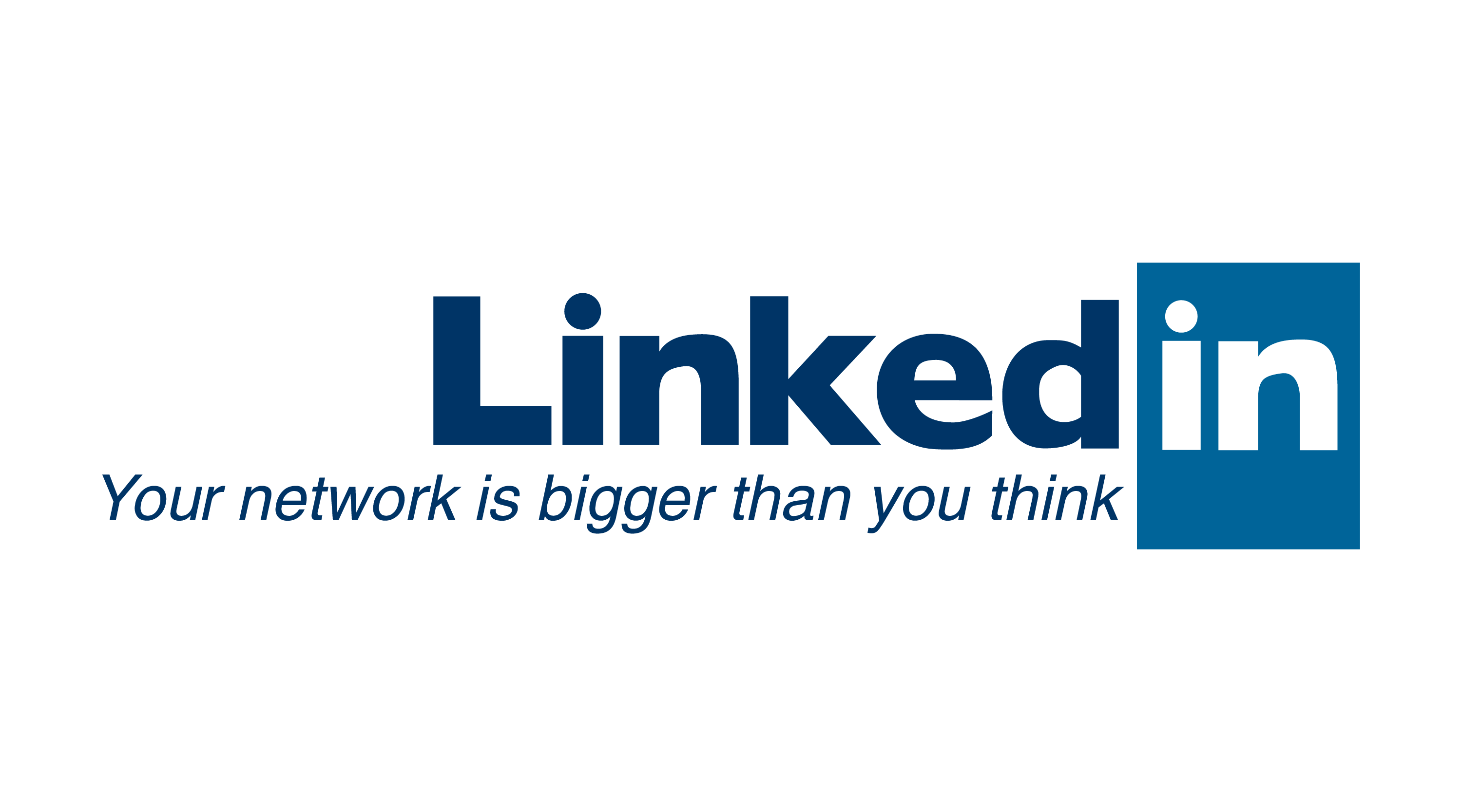
2003
LinkedIn’s first logo was unique and eye-catching. The wordmark consisted of black “Linked” lettering with a solid Blue Rectangle on the right, where the white “in” in lowercase was placed. Linkedin “in” words are placed inside the rectangle square. To make themselves stand out, they also used the motto “Your Network is Bigger than You Think.” However, they removed the logo in later updates.
Color Used in the Logo:
For the wordmark “Linked” color use is #003466. The icon “in” characters are in white and The background of it is in #006499 color. The moto used the #003466 color.
The “Your network is bigger than you think” moto letters are match with “Swansea” Font.
2005
LinkedIn has had some success creating its own growth story. In 2005, LinkedIn’s second logo was a minor update from the original logo. They removed the motto in the last part and made the lettering slick and look like squeezing it. The logo still used the same custom font and the same blue color, but it added a slight gradient effect to the wordmark and the icon. You can see LinkedIn 2005 Homepage below to check.
They use a Darker blue color (197DB2) for the gradient rectangle “In” icon. The rectangle square now looked more round square with a black-blue square around it.
2007
In 2007, the LinkedIn logo had a minor update. They squeezed the letters in wordmark especially “k” and “e” while they removed the gradient effect. Now the square background was brighter and bluer. The color on the background in the icon “In” was the same blue (#197DB2) but without any gradient. They also didn’t change the font. You can check out their 2007 homepage view below.
2011
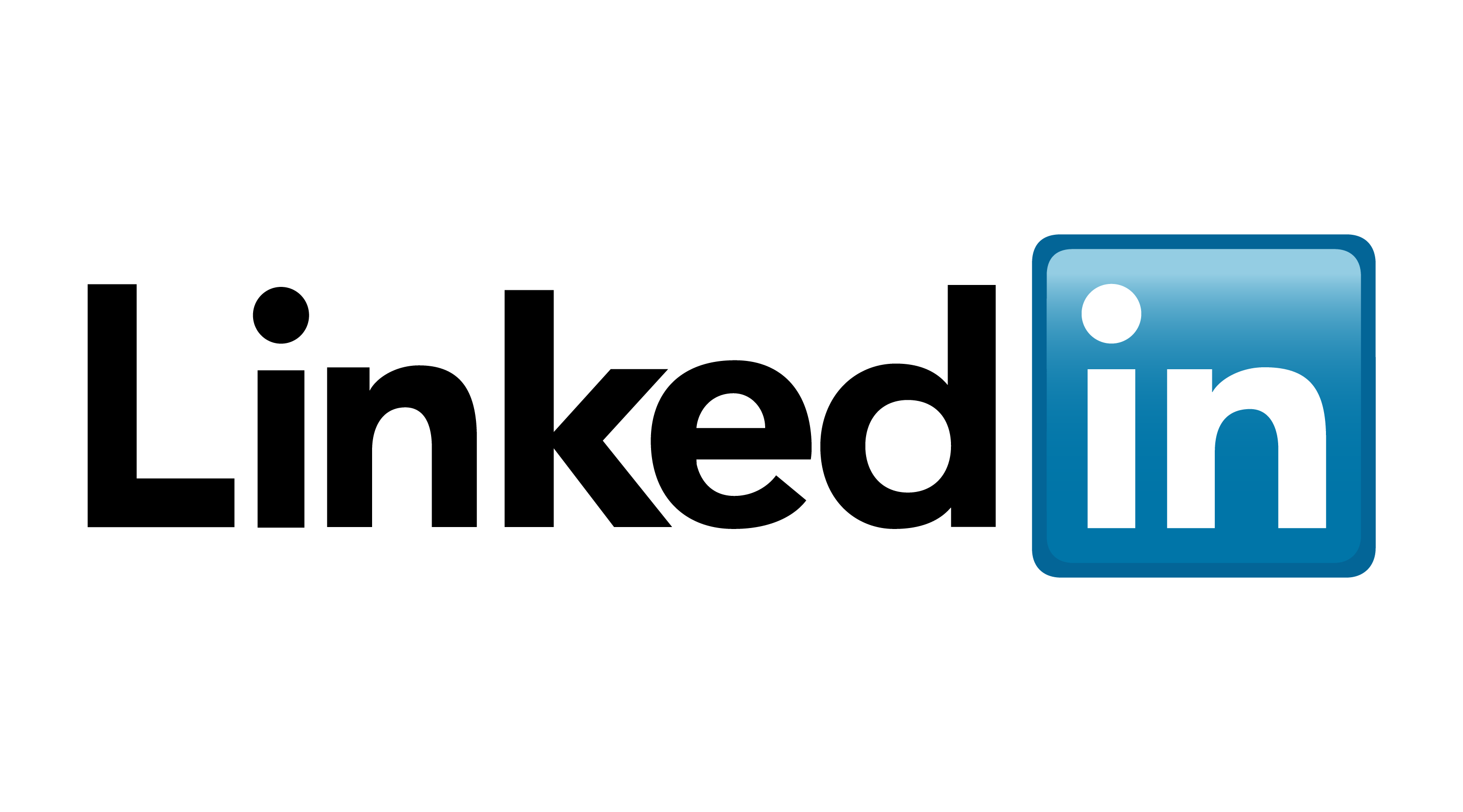
In 2011, LinkedIn underwent its first significant logo redesign. They switched and customized the font so the lettering looked shorter. It was especially noticeable in the wordmark, the words “d” and “c” differed from the previous logo. The logo has also changed its trademark symbol over time. You can see 2011 homepage image below.
The logo used the ® symbol after the icon, indicating that the name was officially registered as a trademark. They also added a bright gradient on top of the blue square background border around the icon.
Color Used in the Logo:
For the wordmark “Linked” color use is #030303. The “in” characters are in white and the background of it is in #007AA7 color.
2015
The logo for 2015 did not change much. They kept the logo, font, and color unchanged. However, the logo has a smaller R-® symbol than the 2011 logo.
2016
In 2018, the logo did not change much. They kept the logo, font, and color unchanged. However, the logo has R-® symbol meaning it is a copyright now. Check out the 2016 LinkedIn homepage below.
The background the of the logo was transparent. This is why LinkedIn appeared different because the site had a black line drawn staright.
2018
In 2018, the logo did not change much. They kept the logo, font, and color unchanged. However, they removed the R-® symbol signaling a shift.
The logo background was transparent. This is why LinkedIn appeared different because the site had a black line drawn straight across it. And its color was #283E4A.
2023
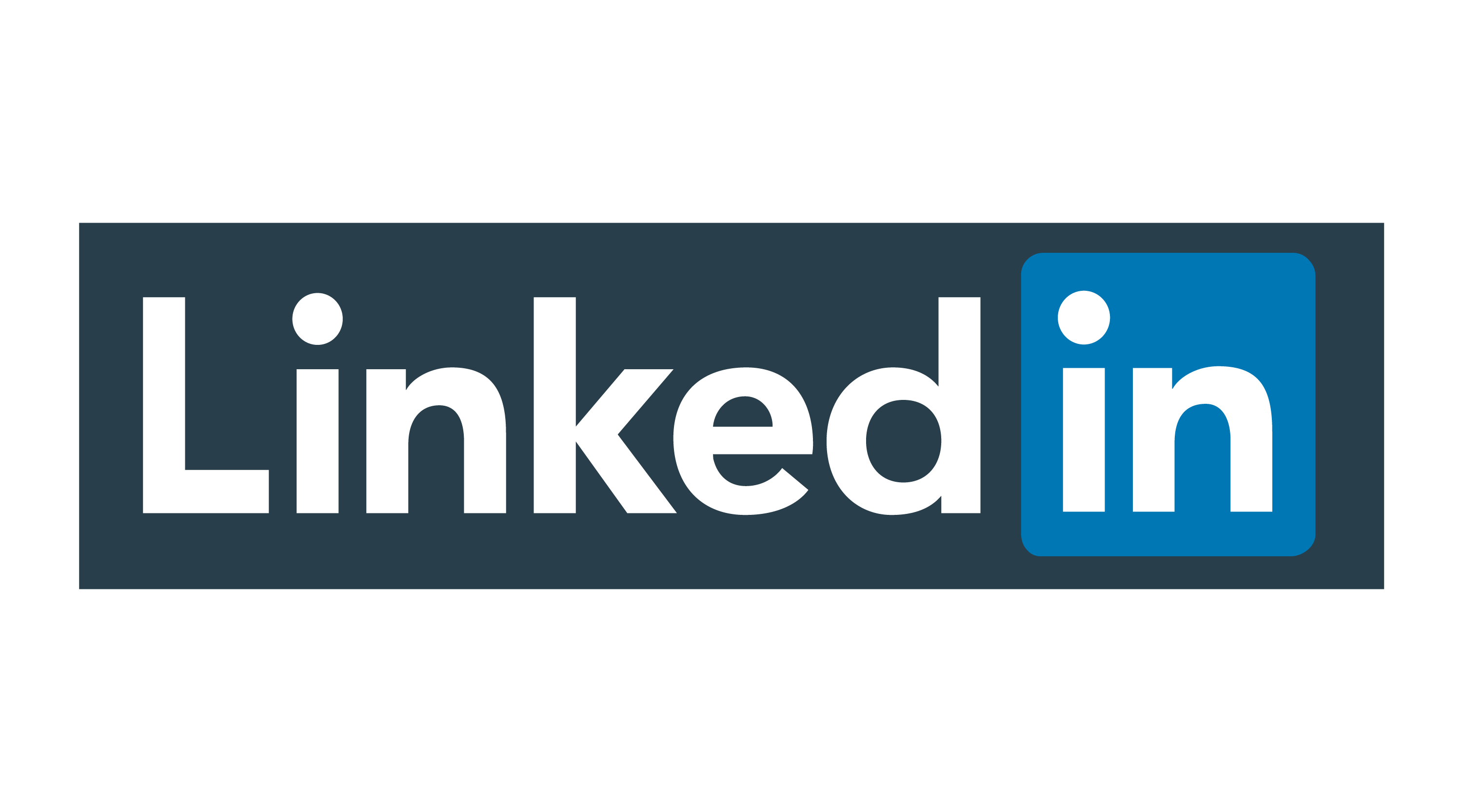
Most recently they changed the LinkedIn logo again slightly. The wordmark was moved to the right to align with the “In” icon. They simplified the logo and gave it a unique look. The most notable change was the color palette, which was changed from black, blue, and white to a single shade of blue.
This change aimed to create a more cohesive and recognizable brand identity. Additionally, the word “LinkedIn” was made slightly larger and the font bolder, enhancing the logo’s visibility and impact.
LinkedIn Font
The Linkedin Logo Letters are matched with the font called “FF Neuwelt Pro Black”. It belongs to the FF Neuwelt family. It was designed by Jens Gehlhaar. You can check out our comparison image below. Then download it from our link immediately.
Conclusion
LinkedIn logo is a symbol of the company’s vision to connect the world’s professionals and create economic opportunity for everyone. The logo has evolved over the years, but it always maintained its core elements: the wordmark, the icon, and the blue color.
LinkedIn’s logo is a successful example of how a company can evolve its logo while maintaining brand continuity. The logo conveys the company’s mission and values, and users have well-received it.