The Spiderman logo, one of the most recognizable symbols in the world of comics, has undergone numerous transformations since its inception. The evolution of the logo is closely intertwined with the evolution of Spider-Man, one of the world’s most popular superheroes, created by Marvel Comics in the early 1960s.
Marvel Comics, the company behind Spider-Man, has a rich history dating back to the 1960s. The franchise now consists of thousands of comic books, nine animated series, and dozens of video games. The Spider-Man brand has become one of Marvel’s best-selling comic book characters, recognized due to the bright symbol on his chest.
In this article, we will delve into the history of the Spiderman logo, exploring its different iterations and the impact it has had on popular culture. All logos mentioned in this article can be downloaded for free in both PNG and vector file formats, allowing fans to explore the visual evolution of this iconic symbol.
Spiderman Logo Evoluton And History
The Spider-Man logo has seen dozens of iterations over the years. The first logo was a simple wordmark that simply said “Spider-Man” in all capital letters. When the spider symbol first appeared, it was a simple, round, and stubby spider shape. The modern Spider-Man logo is significantly more stylized, with long, spiky legs and a more realistic spider body with fangs. Here is a brief overview of the evolution of the Spiderman logo:
1962
The first depiction of Spider-Man was drawn by Jack Kirby, but the version was lost. Therefore, the first famous version was drawn by Steve Ditko and it appeared in “Amazing Fantasy” #15 in 1962. The original Spiderman emblem featured a round eight-legged spider. Compared to the newer versions of the logo, the first one looked a bit cluttered and bulky.
1966
The spider emblem was made narrower.
1967
The spider emblem was further refined with a narrower spider that sat on Spiderman’s chest area.
1973
The spider emblem was modified after Gwen Stacy’s death in the main storyline. The bottom of the spider itself was made rounder and the spider legs were made thinner.
1978
The spider emblem was made even thinner and the higher legs were made to face upward while the lower legs faced downward.
1984
The Spiderman logo was significantly redesigned to coincide with the introduction of Spiderman’s black costume. The spider logo became more streamlined and modern, with long, thin legs that extended from a small, central body. This design was sleeker and more stylized than previous versions, reflecting the darker and more serious tone of the Spiderman stories of this era.
1988
The Spider-Man logo associated with Todd McFarlane from 1988 is a significant piece of comic book history, as McFarlane is renowned for his work on the “Spider-Man” comic series during that time. McFarlane’s Spider-Man is often characterized by a more detailed, webbed costume and a spider symbol that is both intricate and stylized, which became iconic for the character during his tenure as an artist on the series.
1990
The Spider-Man logo symbol from the 1990s, as designed by Erik Larsen, is characterized by a stylized spider with a large body and long, thin legs. The spider’s body is round and the legs extend outward in a radial pattern. The legs are segmented, with each segment tapering towards the end.
1992
The Spider-Man 2099 logo from the 1992 comic series features a futuristic and stylized spider design that is distinct from the traditional Spider-Man logo. The logo often appears on the chest of the Spider-Man 2099 costume, which is primarily blue with red accents and a web pattern that is less dense than the classic Spider-Man suit.
1994
The Spider-Man 1994 TV series, also known as “Spider-Man: The Animated Series,” featured a distinctive logo that was part of the show’s branding and visual identity.
1994
The logo for the Scarlet Spider, as seen in the 1994 animated series and the “Web of Scarlet Spider” comic series (1995-1996), features a stylized spider symbol. The spider is typically red, matching the Scarlet Spider’s costume, and is often depicted with elongated legs that extend across the chest of the costume.
1996
The logo associated with Ben Reilly’s Spider-Man is a stylized spider, similar to the classic Spider-Man logo, but with a few key differences. The spider’s body is more elongated and the legs are more angular, giving it a more aggressive and modern look. The spider is typically depicted in red on a blue background, matching the colors of Ben Reilly’s Spider-Man costume.
1999
The “Spider-Man Unlimited” logo from the 1999 animated TV series features a stylized version of the title with “Spider-Man” on top and “Unlimited” below. The symbol for Spider-Man in this series is a variation of the classic Spider-Man emblem, with a more streamlined and angular design to match the show’s aesthetic.
2000
The symbol for Spider-Man in this series is a variation of the classic Spider-Man emblem, which is a spider in the center of a web, but with a design that matches the unique aesthetic of the “Spider-Man Unlimited” suit.
2002
The Spider-Man symbol from the 2002 Spider-Man movie, starring Tobey Maguire, is a stylized spider. The spider’s body is elongated, and it has two large, pointed pincers at the front. The legs are long and angular, with sharp points at the ends. The symbol is typically depicted in black.
2004
The Spider-Man 2 movie logo from 2004 features the title “Spider-Man 2” in bold red letters with a web-like texture. The number “2” is stylized with a spider symbol incorporated into the design. The spider symbol is a simplified silhouette of a spider, with a round body and four pairs of legs extending outward.
2006
The Iron Spider suit was first introduced in the comic series “The Amazing Spider-Man” #529, and it was a gift to Peter Parker from Tony Stark. The Iron Spider symbol is a stylized spider, often depicted in red and gold to match the Iron Spider suit. The design of the spider can vary, but it generally maintains the shape of a spider with long, slender legs.
2007
The Spider-Man logo and symbol from the 2007 movie “Spider-Man 3” are distinctive and memorable. In this film, the logo is associated with two different Spider-Man suits: the classic red and blue suit and the black symbiote suit, which later becomes associated with the villain Venom.
In “Spider-Man 3,” the symbiote suit also features a spider symbol, but it is significantly different from the classic logo. The symbiote spider symbol is larger and more aggressive-looking, with elongated limbs that stretch across the chest.
2008
The logo for “The Spectacular Spider-Man” TV series (2008-2009) is a simplified version of the iconic Spider-Man symbol. It features two rhombuses representing the spider’s body and head, with bold, square-ended legs. This distinctive design captures the boldness and excitement of the series.
2010
The Spider-Man logo and symbol for the 2010 Future Foundation suit is a departure from the traditional red and blue design. The Future Foundation suit is predominantly white and black. The spider logo on the chest is a stylized, minimalist design, with the body of the spider represented by a thick black oval shape. The legs of the spider are thick black lines that extend from the body, with four on each side. The design is sleek and modern, reflecting the futuristic theme of the Future Foundation.
2011
The Spider-Man logo and symbol for Miles Morales in 2011, as seen in the “Ultimate Comics Spider-Man” series, is a stylized representation of a spider. The design is sleek and modern, with a body and head that are often depicted as a single, rounded shape. The legs of the spider are thick and extend from the body, with four on each side. The logo is typically black, contrasting against the red and black color scheme of Miles Morales’ Spider-Man suit.
2011
The Spider-Man logo and symbol for the Stealth Suit, also known as the Big Time Costume, which first appeared in “Amazing Spider-Man #650” in 2011. The logo typically follows the theme of the suit, which means it would likely be a more subdued and possibly tech-inspired version of the classic Spider-Man logo to match the suit’s stealth capabilities.
2012
The Spider-Man logo and symbol for the 2012 film “The Amazing Spider-Man” features a more stylized and aggressive-looking spider compared to previous iterations. The spider symbol is elongated with sharper angles and longer legs that stretch out across the chest of the suit.
2012
The 2012 Scarlet Spider Kaine version is a stylized representation of a spider. Kaine Parker, also known as the Scarlet Spider, is a clone of Spider-Man and has his own unique logo.
2013
The Superior Spider-Man logo and symbol from 2013 are characterized by a more aggressive and stylized spider emblem that reflects the darker and more assertive nature of the character during this period.
2014
The logo and symbol for Spider-Man in the 2014 movie “The Amazing Spider-Man 2” are characterized by a sleek and prominent spider design. The spider logo on the suit is thin, fitting the overall sleeker style of the suit, and it becomes much more prominent in the sequel.
2015
The Spider-Man logo and symbol from the “All New, All Different” Marvel initiative in 2015 are described as having “way too much going on” according to a Reddit user’s comment1. This suggests that the design was more complex and possibly busier than previous iterations of the Spider-Man emblem.
2015
The “All New All Different Spider-Man 2099” symbol and logo feature a unique design that is distinct from the traditional Spider-Man logo. The symbol is a stylized spider, with a more angular and sharp design compared to the classic rounded spider symbol. The body of the spider is elongated, and the legs are jagged, giving it a futuristic and edgy look. The logo is typically depicted in a bright blue color, matching the primary color of Spider-Man 2099’s costume.
2016
The Spider-Man logo and symbol in the 2016 movie “Captain America: Civil War” are characterized by a sleek and modern design. The logo, as seen in the movie and related promotional materials, features a stylized spider with a body that is more rounded and compact compared to some previous iterations. The legs of the spider are thin and elongated, extending outwards from the body in a way that suggests movement and agility.
2018
The logo is characterized by a sleek spider emblem that is more compact and integrated with the suit’s advanced technology. This logo is from the 2018 movie “Avengers: Infinity War”.
2018 Game
The Spider-Man logo and symbol in the Marvel’s Spider-Man game for PS4, released by Insomniac Games, features a distinctive white spider emblem. This logo is a significant departure from the traditional red and blue Spider-Man suit with a black spider symbol.
2018 Movie
The logo, as seen in the Spider-Man: Into the Spider-Verse movie and related promotional materials, features a stylized spider that is more compact and integrated with the suit’s design. The legs of the spider are streamlined and extend from a central, rounded body, which gives the logo a more contemporary appearance compared to traditional Spider-Man logos.
2019
The Spiderman symbol in the movie “Spider-Man: Far From Home” retains its classic design with a few subtle modifications. The symbol features a bold black spider emblem with elongated legs, similar to previous iterations. However, in this movie, the symbol appears slightly sleeker and more refined, reflecting the evolution of the character.
2022
The Iron Spider logo and symbol, as seen in the Marvel Cinematic Universe (MCU), feature a machine-like gold emblem on a suit with a red and gold color scheme. This design is a departure from the traditional Spider-Man logo, which is typically black and set against a red and blue suit. The Iron Spider suit and its logo were designed by Tony Stark, and the color scheme reflects Stark’s signature colors.
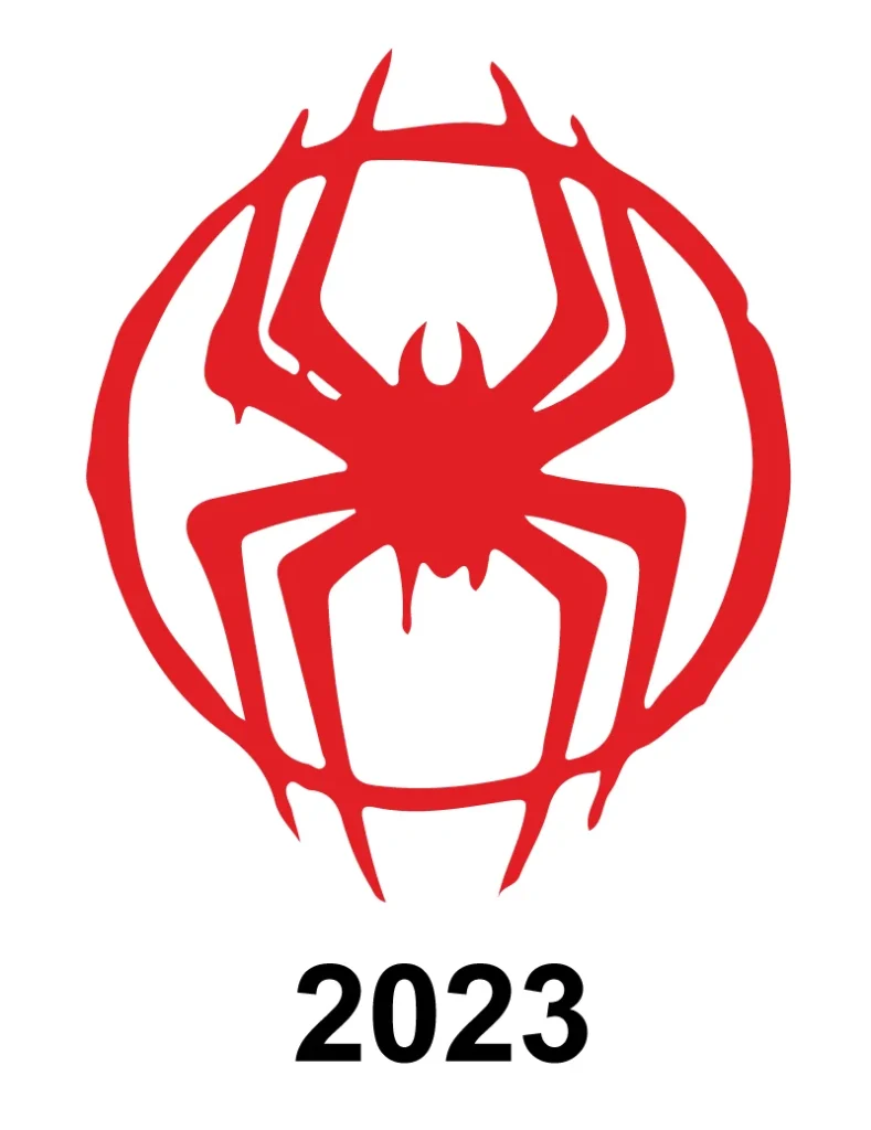
2023
The main Spider-Man logo and symbol in the 2023 movie “Spider-Man: Across the Spider-Verse” belong to the character of Miles Morales, who returns as the film’s main character after embracing his Spider-Man persona in the previous installment. This time the logo has a bit different with circle around it.
Spiderman Word mark Logo History
The Spiderman word mark logo has also seen numerous transformations over the years:
1963
1979
1985
1994
1996-2005
2016
2005-2024
In conclusion, the Spiderman logo has evolved significantly over the years, reflecting the changing character of Spider-Man and the evolving design sensibilities of the times. Each iteration of the logo tells a story about the era in which it was created and the character of Spider-Man at that time. Whether it’s in comics, movies, or video games, the Spiderman logo remains an iconic symbol that represents the hero’s unwavering spirit and dedication to protecting the innocent.