Dive into the fascinating journey of the Roblox logo, an emblem that has evolved alongside the gaming platform itself. From its inception in 1989 to the present day, the Roblox logo has undergone significant transformations, each marking a new era in the company’s history.
Whether you’re a fan of the game or simply interested in design, this article will provide you with a comprehensive overview of the Roblox logo’s evolution. Additionally, we have made available PNG and vector files for each logo, which you can download for free.
Roblox Company
Founded in 2004 by David Baszucki and Erik Cassel, Roblox Corporation has grown from a small startup into a global phenomenon in the world of online gaming and creation. The company, headquartered in San Mateo, California, has developed Roblox, a platform that allows users to create, share, and enjoy a vast array of 3D experiences. As of the end of 2022, Roblox Corporation employs over 2,100 people and has made a significant impact on the video game industry with its innovative approach to user-generated content.
Roblox Logo Evolution And History
1989
The origins of Roblox can be traced back to a program called Interactive Physics, developed by Knowledge Revolution, which was founded by David Baszucki in 1989.
2003
GoBlocks was one of the three names considered for Roblox during its early development. The name GoBlocks was used in 2003 before the platform was renamed to DynaBlocks and eventually to Roblox.
2003-2004
“DynaBlocks” was one of the names considered for Roblox during its early development. The logo for DynaBlocks was shown during ROBLOX BLOXcon. The logo featured a thickened, sans-serif text in a rainbow of colors. This multi-colored wordmark inspired the very first Roblox logo.
2004
The Roblox logo in 2004 was introduced along with the name “ROBLOX”. This logo was composed of a strict shadowed sans-serif inscription in the title case. The logo was shown on the Roblox site when it was made public on July 27, 2004. It featured a futuristic design and custom font, along with the now-iconic red border. This logo was a representation of the idea of building and creating things in the Roblox world.
2004-2005
The logo from this time featured a strict shadowed sans-serif inscription in title case, which was a carryover from the 2004 design.
2005-2006
During this period, the logo maintained elements that emphasized Roblox’s core concept of building and creativity. This time the changes are small like round shape typography with a bit gradient color effect on the logo.
2006-2009
This time the logo was executed in white and red, presenting a fresh and edgy look that resonated with the platform’s growing community. This logo was used until 2009 and featured funky letters that overlapped each other with varying thicknesses of strokes.
2007-2010
Same as before but with slight changes.
2010-2015
Now the red outline are bit bold and more edgy.
2015-2017
During this time the logo used by the company is same but edgy are slightly round.
2017-2018
The Roblox logo in 2018 most recognized one is featured the word “Roblox” written in bold, uppercase letters with a custom font. The “o” “Roblox” were slightly tilted to the right. They use the color red for it.
2018-2022
Later the logo word-mark updated from the red to all-black, allowing it to be more easily placed on any medium or background.
2022 To Present
Current they use the same logo from 2022. But they made white color variation also for black background.
Roblox Icon History
2004
The very first icon used during the alpha stages of Roblox from July 2004 until April 2005 was simple, likely reflecting the platform’s initial development phase.
2005
This icon was used for the pre-beta stage of Roblox until it was released a year later.
2006
A new icon based on the logo executed in white and red.
2009
Same as previous but edge are softer now.
2011
During this time it become a bit 3D type icon with circle behind the “R”. This was also adapted for the mobile app.
2015
The icon is same as previous but the “R” outline color change from white to dark red.
2015-2017
Now the icon use just the red outlined “R” character.
2017
The 2017 Roblox icon was made to look like the first ‘O’ in the 2017 logo, which featured a modified Gill Sans Ultra Bold with two “O”s that looked like squares, one tilting to the right.
2018
In 2018, a gray version of the icon was introduced, used for the Roblox mobile app and representing a shift to a monochrome color palette.
2019
The 2019 Roblox icon continued the monochrome theme and was used for the mobile app and social media accounts until 2022.
2022 To Present
The current icon is a slanted square, representing the first letter “O” in the logo, executed in gradient light gray color with a smaller white square in the middle.
Roblox Studio Logo
The original Roblox Studio logo has seen several iterations since the platform’s inception. Initially, the logo echoed the main Roblox app logo.
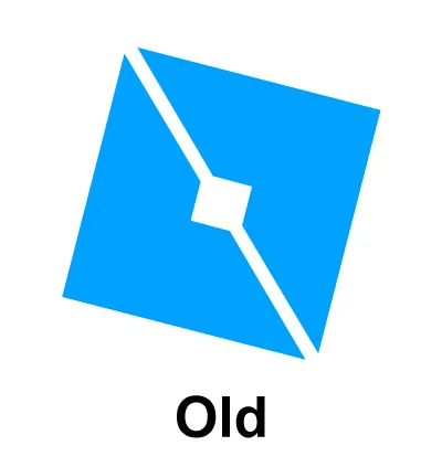
Roblox Old Studio
The old studio logo has two blue mirrored arrow shape, with square and gap.
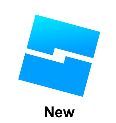
Roblox New Studio
The new Roblox Studio logo has two reverse “L” shape with a square and gap between them.
Similar Logo Look Like Roblox

Bethesda
The similarity between the Roblox and Bethesda logos has been noted by users who sometimes find them confusingly alike. This observation is particularly discussed in online communities where the resemblance has led to mix-ups among some individuals.
Thanks for reading.