The PayPal logo has undergone several transformations over the years, reflecting the growth and evolution of the company. With each iteration, the logo has evolved to represent PayPal’s commitment to secure and convenient online transactions. In this article, we will explore the fascinating journey of the PayPal logo, from its early beginnings to the present day. All the logos mentioned below have PNG and Vector file download options available for free.
PayPal Company Overview
Founded in December 1998 as Confinity, PayPal quickly emerged as a revolutionary digital payment system. It became an independent company and was later acquired by eBay in 2002, only to spin off into an independent entity again in 2015. Today, PayPal operates globally, offering a wide range of payment solutions under various brands, including Venmo and Xoom. The company’s commitment to innovation and security has made it a trusted name in digital payments.
PayPal Logo Evolution and History
1999-2000
The initial PayPal logo, introduced in 1999, featured two “P” letters placed back-to-back, creating a dynamic and unique emblem. This design aimed to symbolize movement and speed, essential qualities for the emerging digital payment platform.
1999-2007
In this period, the logo was refined to include a more straightforward word-mark with bold, white letters outlined in blue. The design retained the dynamic essence of the original logo while introducing a cleaner, more professional appearance.
2007-2014
The 2007 logo redesign introduced the first graphic symbol, a monogram consisting of a double “P”. This change aimed to enhance brand recognition and reflect PayPal’s growing prominence in the digital payment space. The logo maintained the blue color scheme, symbolizing reliability and trust.
2014-Present
The most recent logo update, initiated in 2014, further refined the monogram and wordmark. The design focused on simplicity and flexibility, ensuring the logo’s effectiveness across various platforms, especially mobile devices. This evolution reflects PayPal’s commitment to innovation and its role in the era of mobile payments.
Paypal Apps Icon And Other Logo
PayPal’s expansion into various services has led to the creation of specific logos for its different apps and services, including:
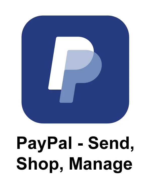
PayPal Send Shop Manage
A simplified logo for a more user-friendly experience.
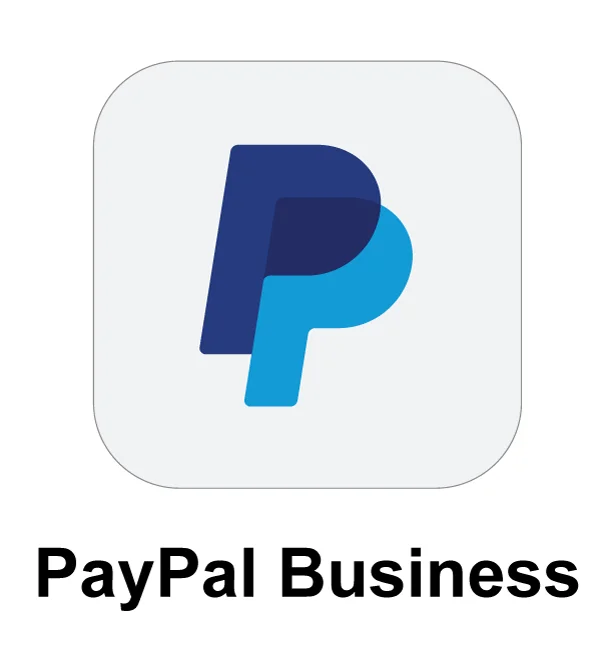
PayPal Business
Tailored for business accounts, emphasizing professional services.
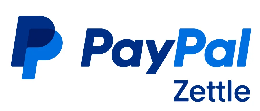
PayPal Zettle
Focused on point-of-sale solutions.
PayPal Venmo

The PayPal Venmo logo is characterized by a playful and vibrant design, reflecting the app’s focus on social payments and seamless money transfers between friends.
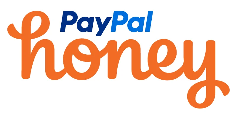
PayPal Honey
The PayPal Honey logo symbolizes the integration of Honey, a popular browser extension that helps users find the best deals when shopping online, into the PayPal ecosystem.
List of Similar Logos
While the PayPal logo stands out as a unique representation of the brand, there are some logos that bear similarities, including:
Paytm
Paytm, an Indian online payment service established in 2010, has a logo that reflects its focus on mobile payments. This logo look similar to the Paypal Logo.
Pnadora

Pnadora is another logo that has some resemblance to the Paypay logo. Specially in the “P” character.
Conclusion
The evolution of the PayPal logo mirrors the company’s journey from a pioneering startup to a global leader in digital payments. Each iteration of the logo has built upon the previous, maintaining core elements while adapting to technological advancements and changing consumer expectations. The current logo, with its simplicity and flexibility, is well-suited for the digital age, symbolizing PayPal’s commitment to innovation and customer service.