The Nasa logo is an iconic symbol that represents the National Aeronautics and Space Administration, the United States’ leading space agency. n this article, we will delve into the fascinating journey of the Nasa logo, exploring its evolution over the years and highlighting the notable changes that have taken place.
All logos discussed are available for free download in both PNG and vector file formats, catering to enthusiasts and designers alike.
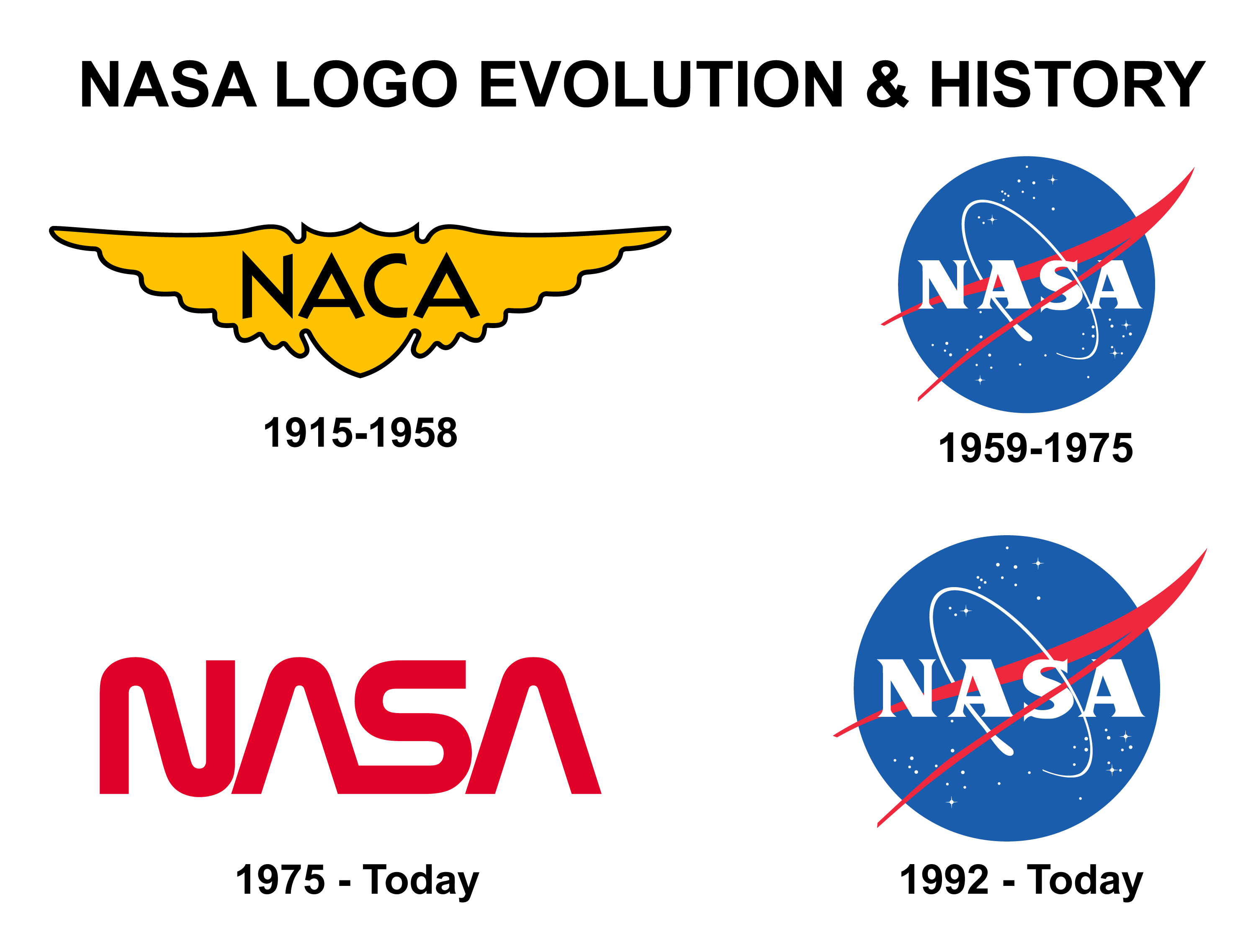
1915-1958: The NACA Era
Before NASA, there was the National Advisory Committee for Aeronautics (NACA), established in 1915. The NACA logo served as the precursor to NASA’s iconic symbols, laying the groundwork for the agency’s visual identity. Although not as widely recognized as subsequent NASA logos, the NACA emblem played a crucial role in the transition to the space age.
1959-1975: The Birth of the “Meatball”
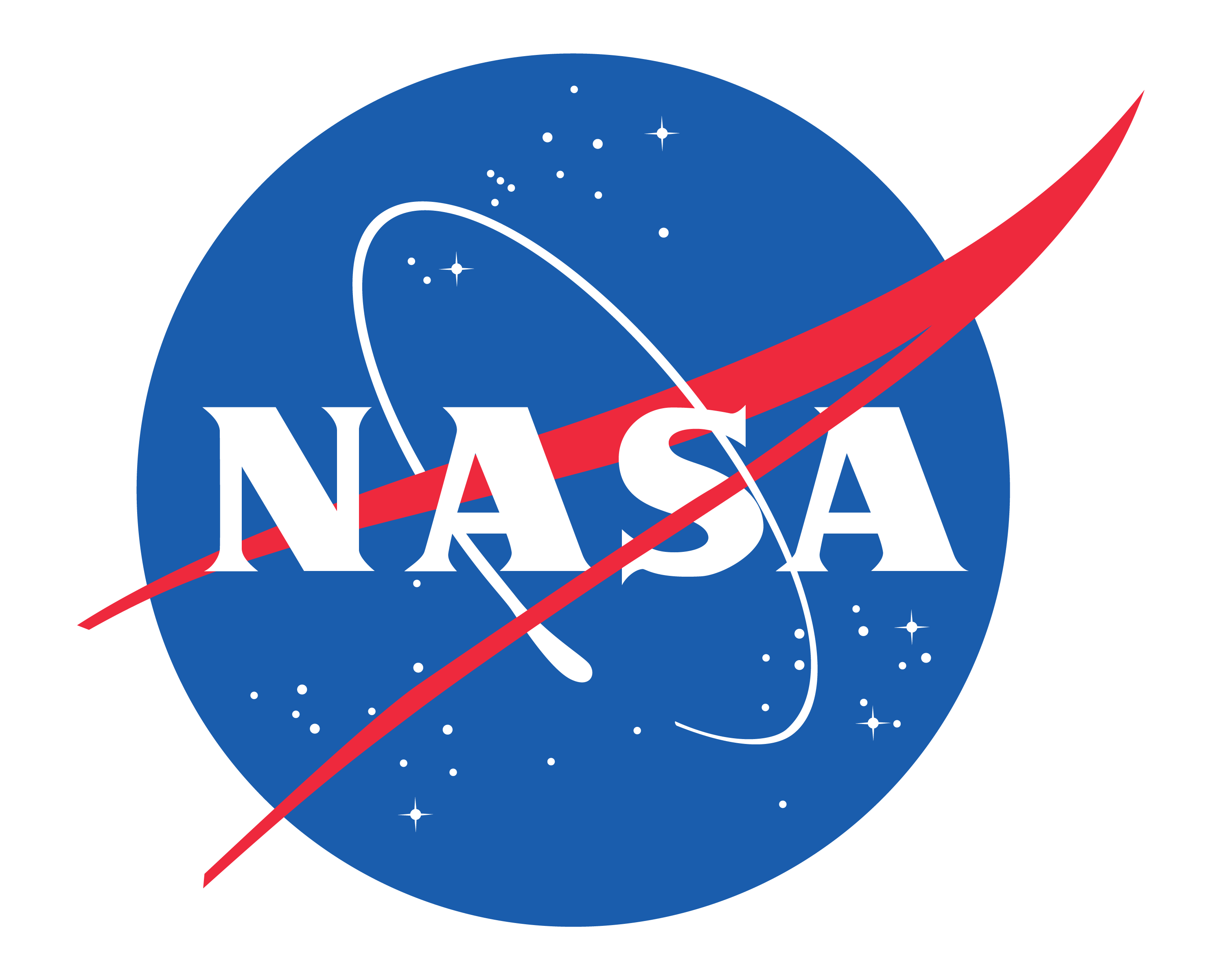
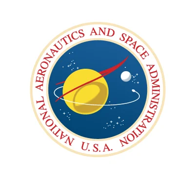
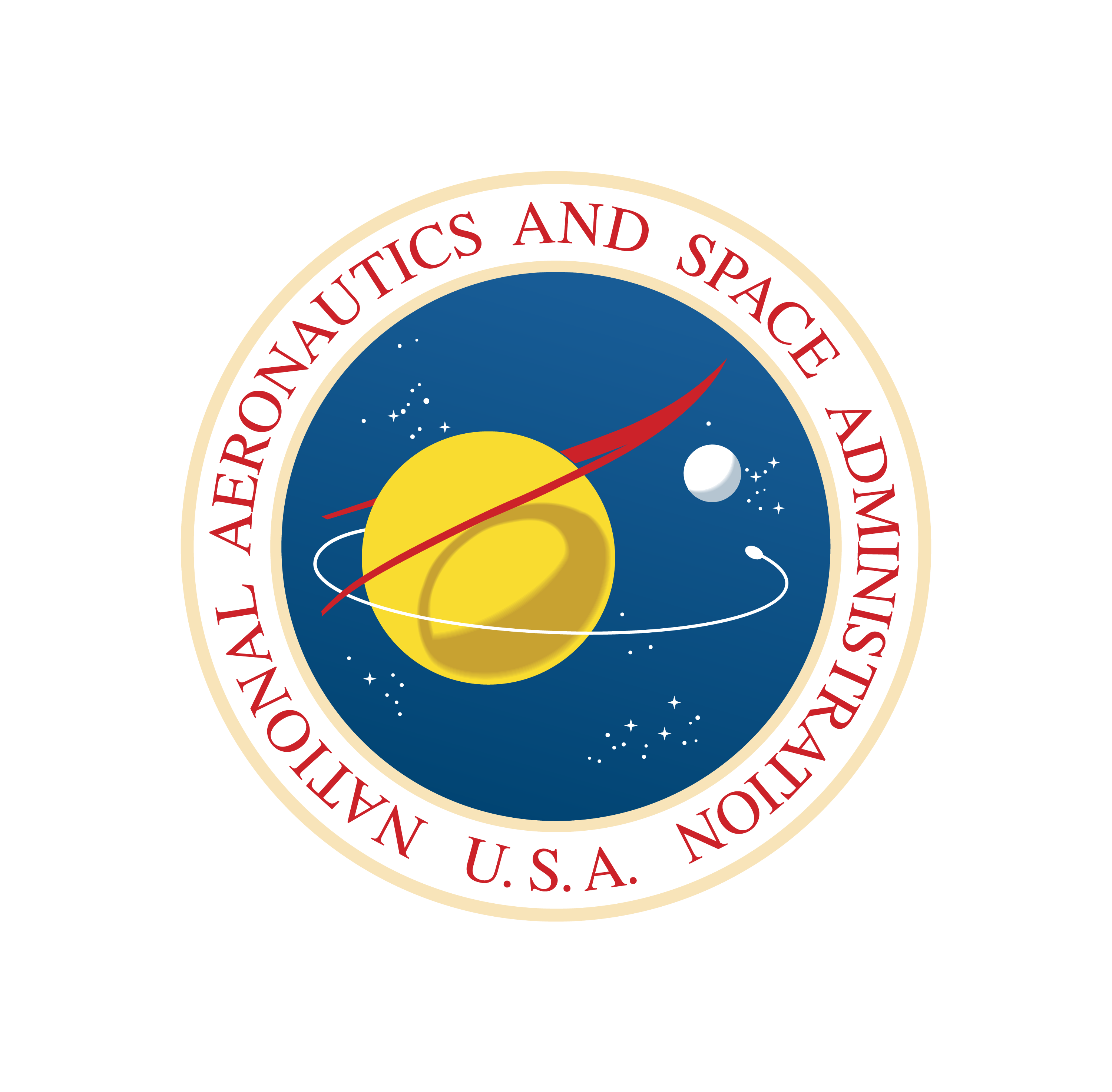
In 1959, NASA’s second year, the “meatball” logo was introduced, designed by James Modarelli. This logo features a blue sphere representing a planet, stars symbolizing space, a red v-shaped wing indicating aeronautics, and an orbiting spacecraft. The circular orbit around the agency’s name signifies space travel. This design was the primary symbol of NASA for 16 years.
1975-Today
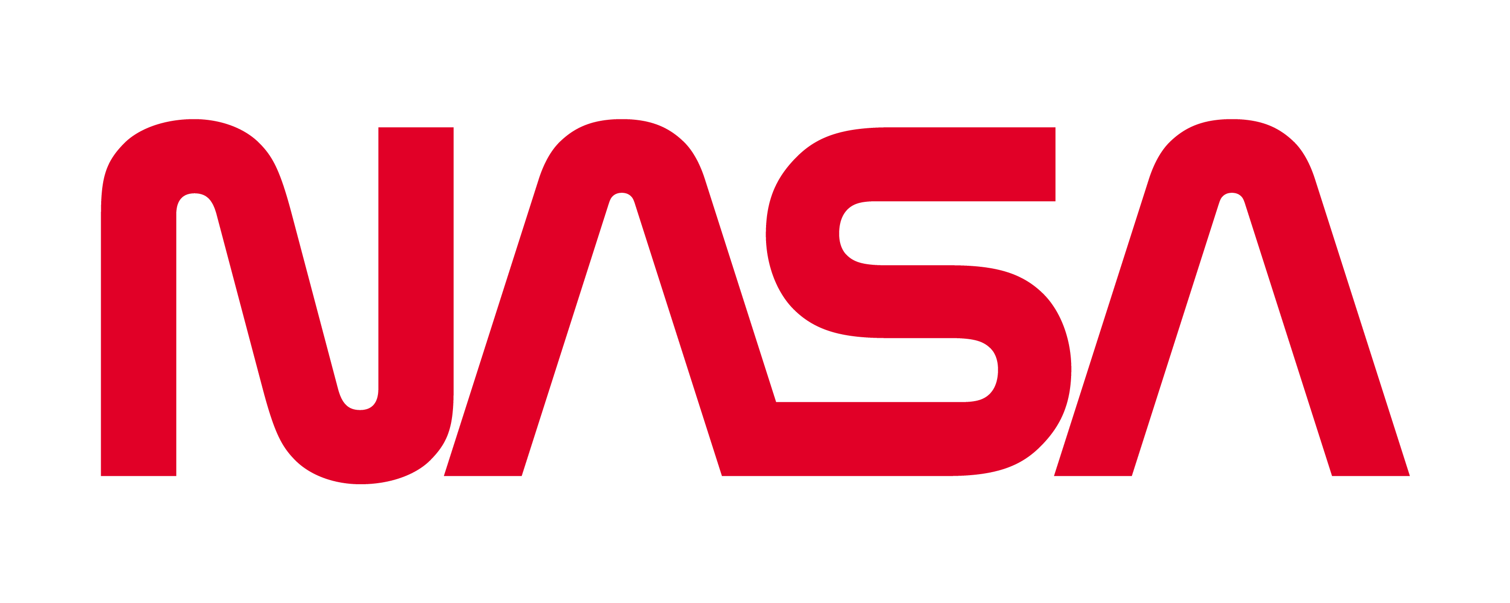
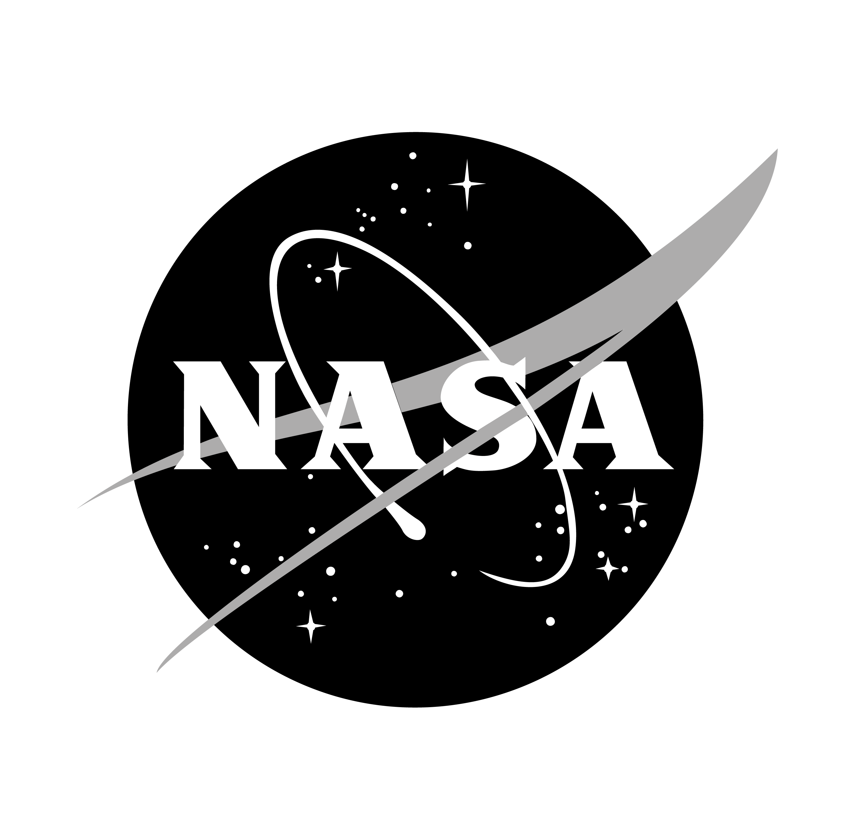
In 1975, seeking a more “modern” identity, NASA introduced the “worm” logo, designed by the firm Danne & Blackburn. Characterized by its red, stylized rendering of the letters “N-A-S-A,” the “worm” was a departure from the complexity of the “meatball.” The unique lettering, with the “A”s lacking a central bar, suggested rocket nose fairings, while the “N” and “S” resembled rocket tubes. This logo was retired in 1992, marking the end of its official use.
1992-Today: The Return of the “Meatball”
In 1992, NASA decided to bring back the classic “meatball” insignia, which has remained the most common agency symbol since. The return to the “meatball” was driven by a desire to invoke memories of NASA’s early successes and to maintain a connection with the agency’s historic past.
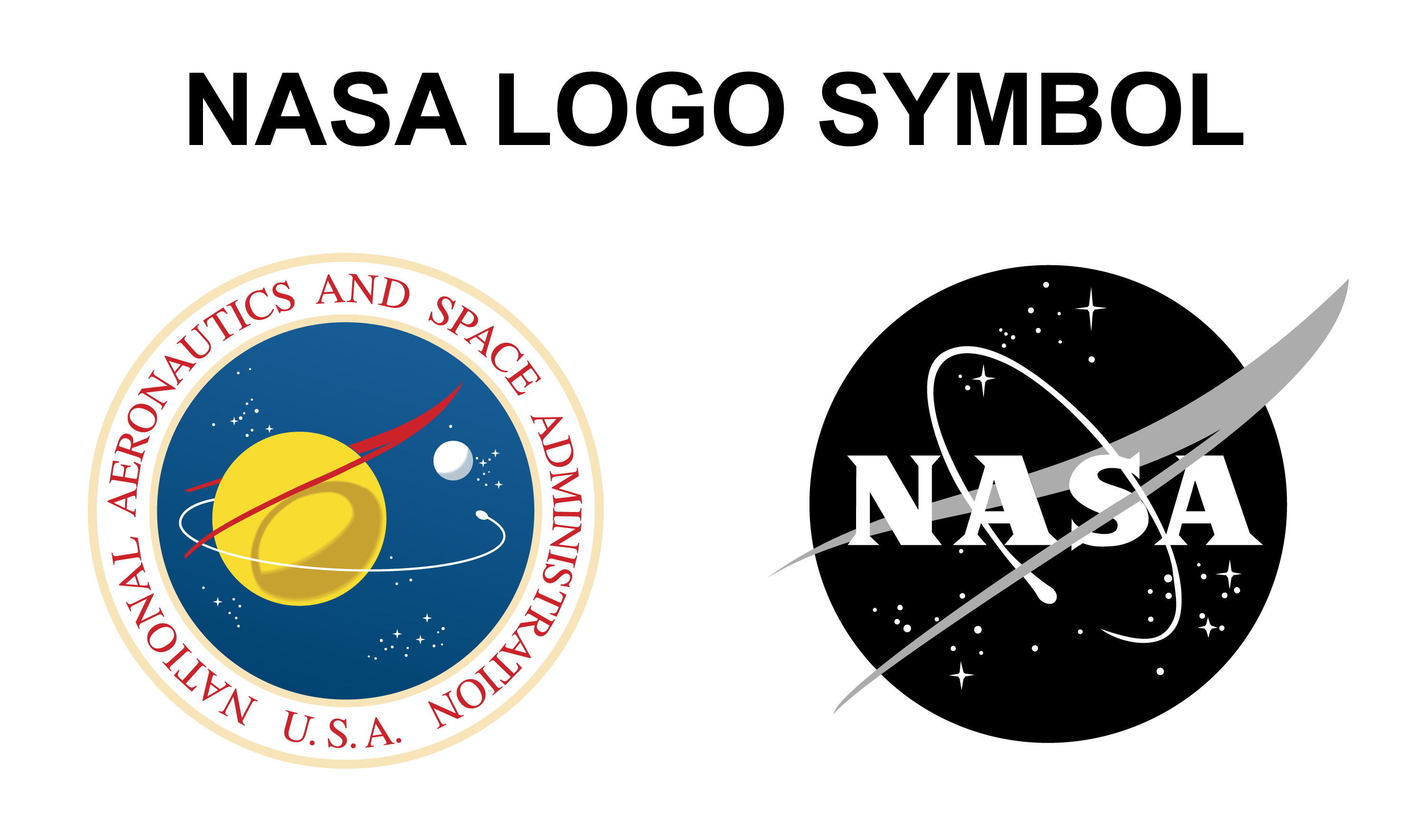
Nasa Logo Symbol
Similar Logos
Several space agencies and organizations have logos that draw inspiration from NASA’s design, reflecting trends in aerospace graphic design.
NADA

North Korea’s space agency, the National Aerospace Development Administration (NADA), has a logo that bears a striking resemblance to the logo of NASA, the United States’ space agency.
CSA ASC
The Canadian Space Agency logo is also look similar with the Nasa Logo. Like it has the same Nasa like meatball design with same color and design aesthetic.
In conclusion, the Nasa logo is a visual representation of the agency’s remarkable journey through history. From its humble beginnings as NACA to its current exploration of space, the Nasa logo has evolved to reflect the agency’s commitment to pushing the boundaries of human knowledge and understanding.