McDonald’s, a global fast-food giant, is recognized by millions around the world. One of the key elements that has contributed to its success is its iconic logo. In this article, we will delve into the company’s logo, its history, and provide download options for logo infographics and individual year-wise logos.
Company Overview
Founded in 1940, McDonald’s has grown into a multinational corporation with a presence in over 100 countries with over 39,000 restaurants. The brand’s most iconic symbol, those instantly recognizable golden arches (“M”), stand for consistent quality and quick service.
Company Logo
The McDonald’s logo, often referred to as the “Golden Arches,” is one of the most recognizable symbols in the world. It represents the arches that were part of the design of the first franchised restaurant in 1952. The logo has become synonymous with fast-food culture.
McDonald’s Logo Evolution and History
Over the years, McDonald’s has made subtle changes to its logo, reflecting the evolving nature of the brand. Let’s take a closer look at the logo’s transformation throughout the years:
1940
The original McDonald’s logo featured a simple white rectangle with three lines of text. Up top, “McDonald’s” flowed in elegant italics. Below, “FAMOUS” stood bold in all caps, underlined with twin dashes. Finally, the bottom proudly declared “Barbecue” in a hefty serif font. This design reflected the restaurant’s barbecue focus back then.
1948
The 1948 billboard-inspired logo aimed to lure customers with hamburgers, replacing “barbecue” in the brand name. It showcased “McDonald’s” in ornate italics atop “FAMOUS” (sans-serif, bold, underlined). A cheeky chef mascot smiled above, while prominent “15¢” prices flanked the name, highlighting their budget-friendly burgers.
1953
The new design was colorful and the word “McDonald’s” prominently displayed in the center. The letters were chunky and bold, exuding a fun, friendly vibe.
1961
Building on the success of the previous logo, McDonald’s revamped its design in 1961, introducing a more streamlined and contemporary look. The iconic golden arches were now displayed prominently, capturing the attention of passersby and becoming synonymous with the brand.
1968
The Golden Arches were merged with the “McDonald’s” name, creating a single, unified logo.
1975
In 1975, the logo retained its shape but underwent a color palette change. It featured a red background with the white name of the restaurant.
1993
In 1993, the logo “M” has a dark shadow which give it a bold look.
1999
This time the logo was placed on top of a red rectangle that bore the company’s name. From our finding this logo is used and most recognized Logo.
2000
Another logo with slight changes where a simile slightly curved line added after the Golden Arches.
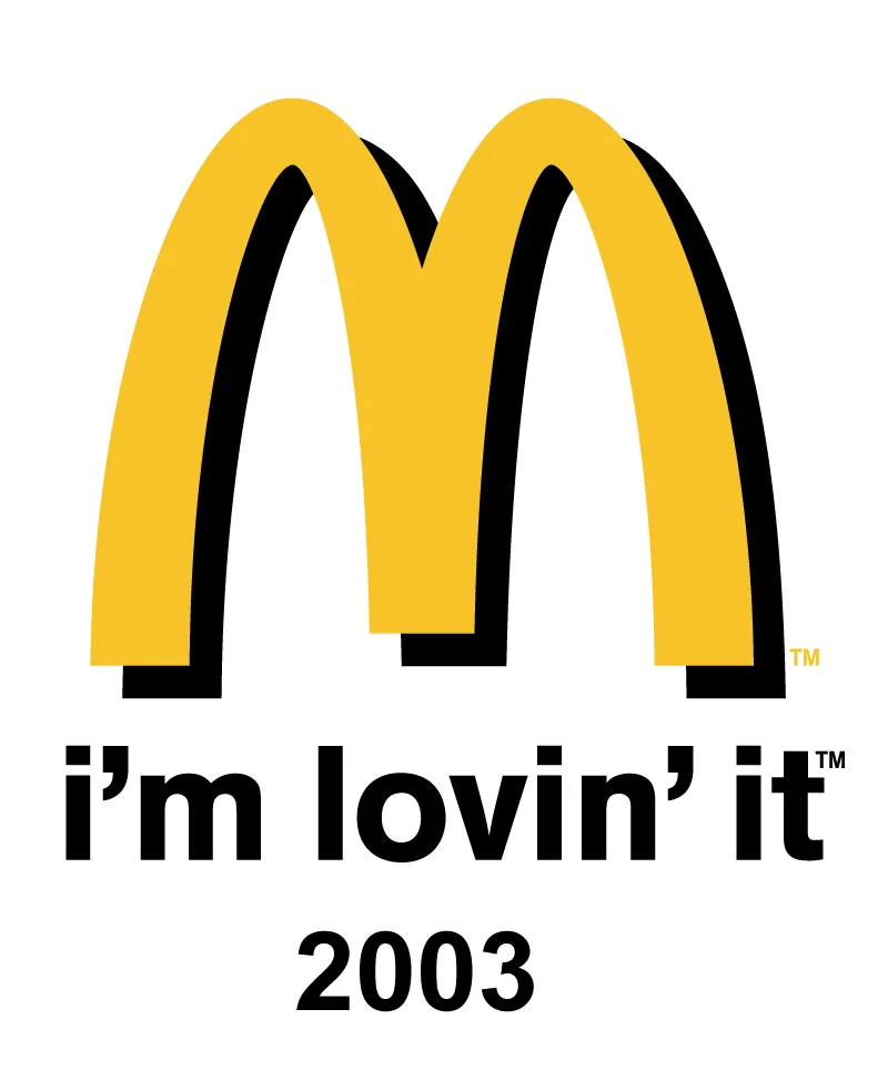
2003
This design made the Golden Arches thicker. This change coincided with the launch of the “I’m lovin’ it” advertising campaign. In some countries, including Australia, it still serves as the primary logo.
2006
The logo was slightly tweaked for a more contemporary appearance.
2018 To Present
The current logo simplifies the design remained the same yellow emblem they had used for a long time, but it was placed inside a red square with rounded corners.
McDonald’s Apps Icon
Check out list of McDonald’s Apps Icons for Android and Ios.
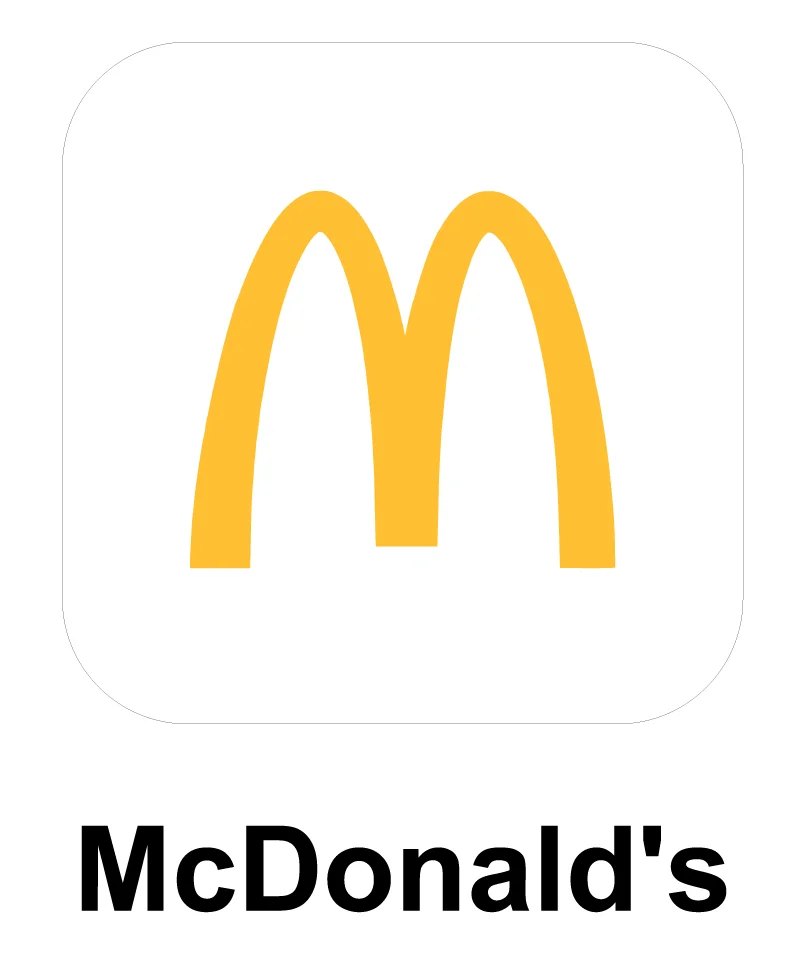
McDonald’s
The app icon features the most current iteration of the Golden Arches, optimized for mobile platforms. This app is available in google play store.
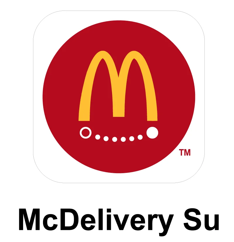
McDelivery Su
This app icon incorporates the Golden Arches with a graphic representing speed and delivery.
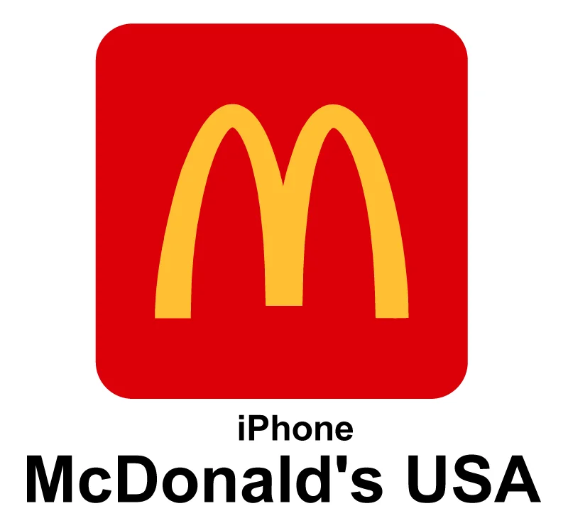
McDonald’s USA
The U.S. app icon uses the standard Golden Arches logo, ensuring brand consistency across various platforms. This app is available in app store.
Note: Each year’s McDonald’s Logo and App Icons are available for free download in PNG and vector format.
McDonald’s Logo | Similar Symbols | Similar Logo
While the McDonald’s logo is unique, but there are some other logos that have shown some similarities. Like-
Russia own version of McDonald’s Logo Called Uncle Vanya’s

The logo looks similar to McDonald’s golden arches, but in this version, the arches are horizontal and “Uncle Vanya” is written below in bold letters in Russian language.
Conclusion
McDonald’s logo history showcases the company’s commitment to innovation and adaptability. Each logo change represents a significant milestone in the brand’s growth and evolution. By providing downloadable options for logo enthusiasts, McDonald’s continues to engage its audience and celebrate its rich history. As McDonald’s remains an enduring symbol of fast-food excellence, its logo will undoubtedly continue to evolve, capturing the hearts and appetites of people worldwide.
Thanks.