Instagram is a social media platform that allows users to capture, create, and share photos and videos with their friends and followers. The Instagram logo is one of the most recognizable symbols in social media. We will tell you today about Instagram’s logo and its history. We will also provide download options.
The Instagram logo is more than just a visual representation of the app. It is also a symbol of creativity, connection, and expression. The logo inspires people to share their stories and passions with the world and to discover new perspectives and experiences.
Note: You can download all the PNG and Vector files for free. But you need to credit us or mention Similarlogo website in your work and blog posts. Enjoy!
Released Instagram Logo – Evolution, History, PNG and Vector
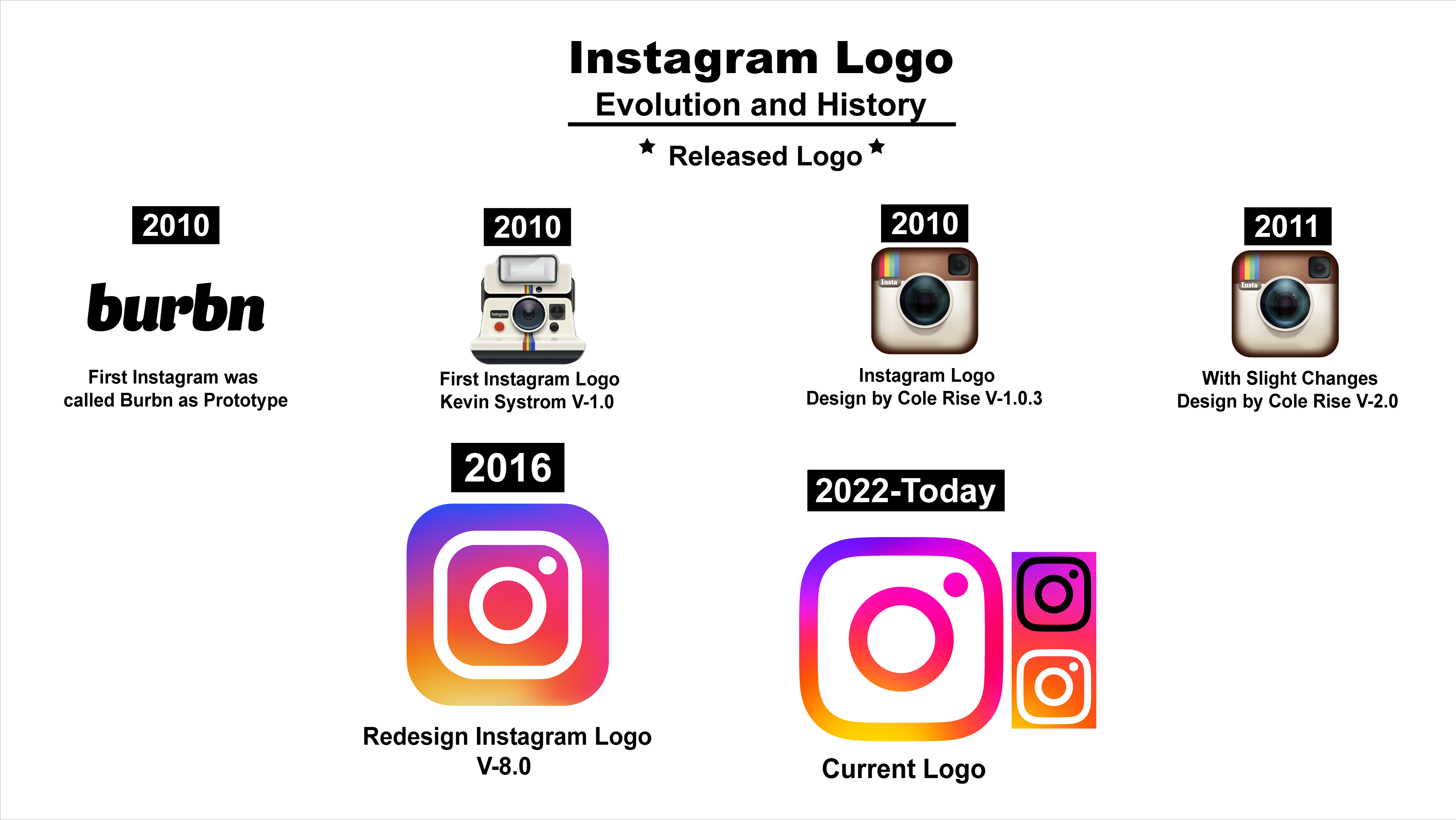
Instagram was launched in 2010 by Kevin Systrom and Mike Krieger. And there is an interesting story behind it. Burbn was the name of the app that Kevin Systrom created before Instagram.
Burbn was a location-based social app that allowed users to check in, post plans, and share photos. Systrom was inspired by his love of Kentucky whiskeys and bourbons. He wanted to create an app that would let him know all the places that served them. He built the prototype of Burbn himself, using his coding skills learned on nights and weekends.
However, Burbn was not very successful, as it was too complicated and had too many features that made it confusing. Systrom realized he needed to simplify his app and focus on the most popular feature, photo-sharing.
He also hired another programmer, Mike Krieger, to help him with development. Together, they studied existing photo apps and decided to create a simple and easy-to-use app that made photo-sharing social and fun. They also added filters to make the photos more appealing and unique.
They named their newly introduced app Instagram, a combination of “instant” and “telegram”.
2010
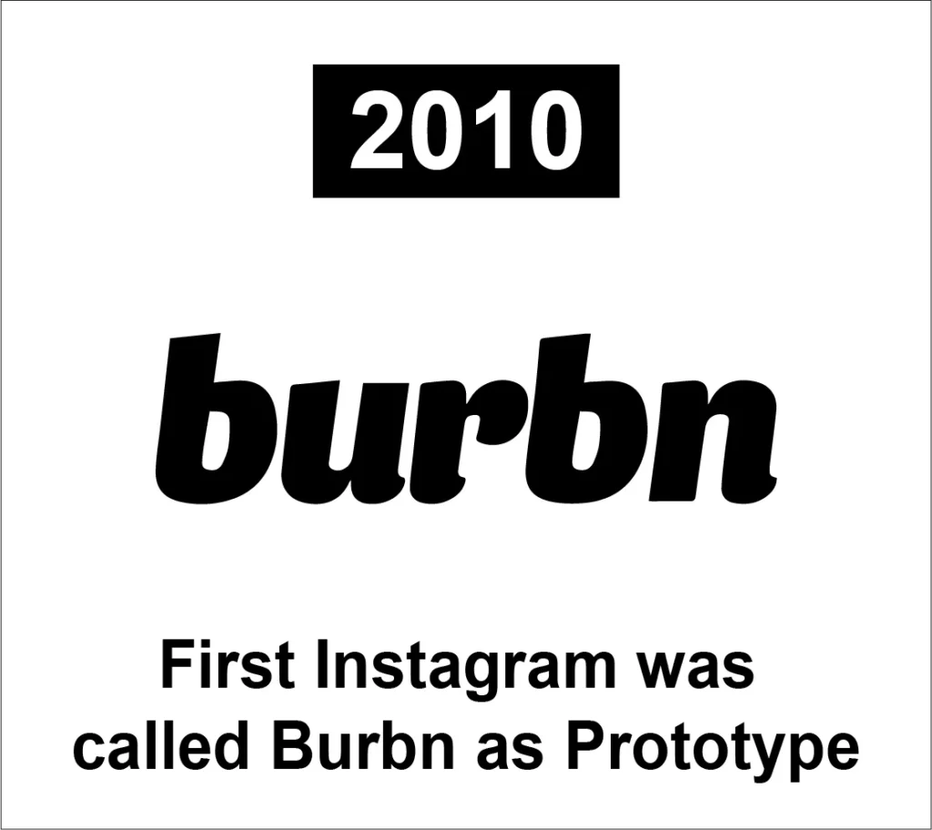
Instagram is a photo-sharing app that started as Burbn, a complex app for whiskey lovers. The creators simplified it and added filters to make it fun and social. Kevin Systrom created this app himself before creating Instagram.
It was a prototype of Instagram. And its logo was very simple and easy to understand. Kevin created the logo by himself.
2010
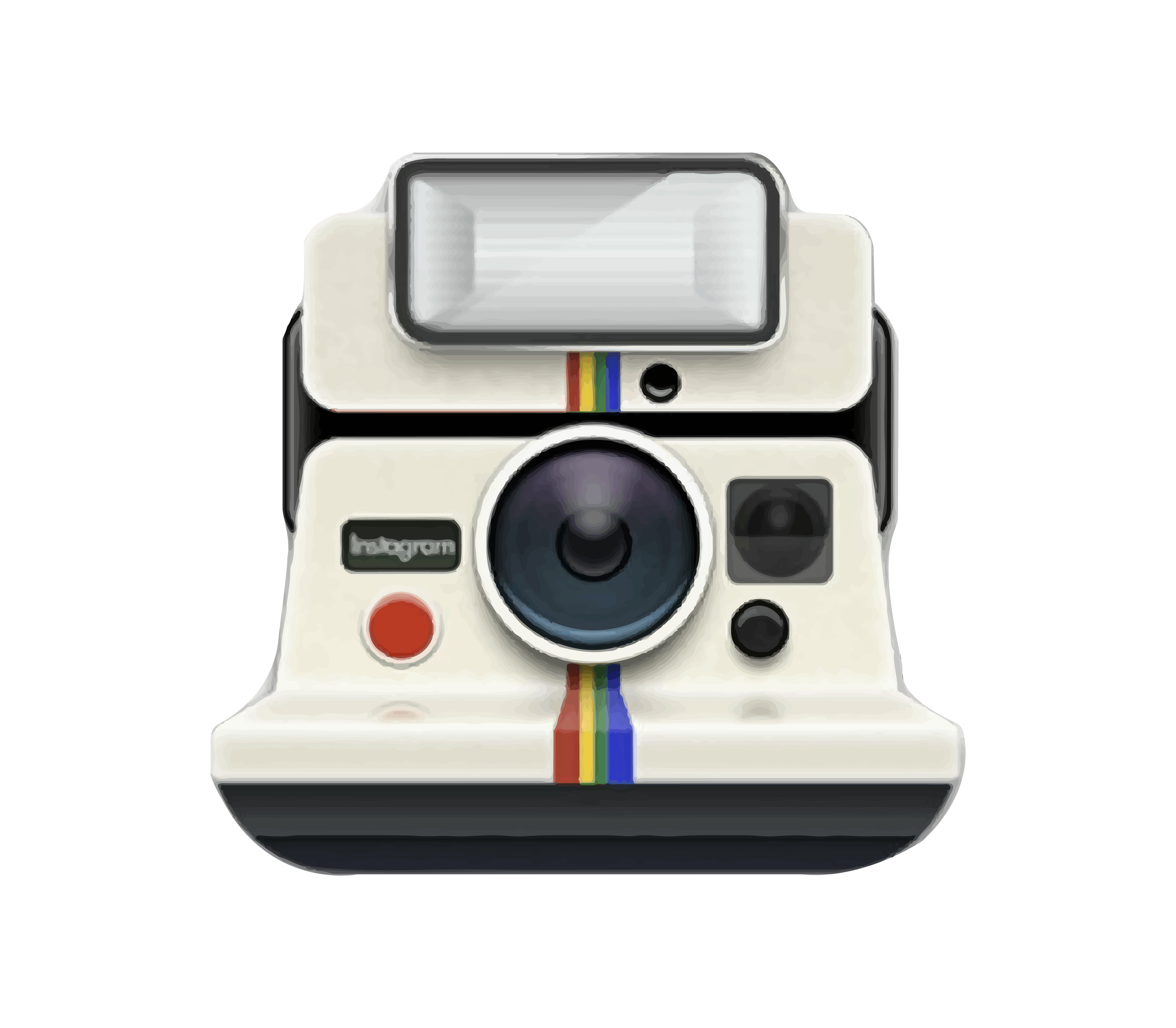
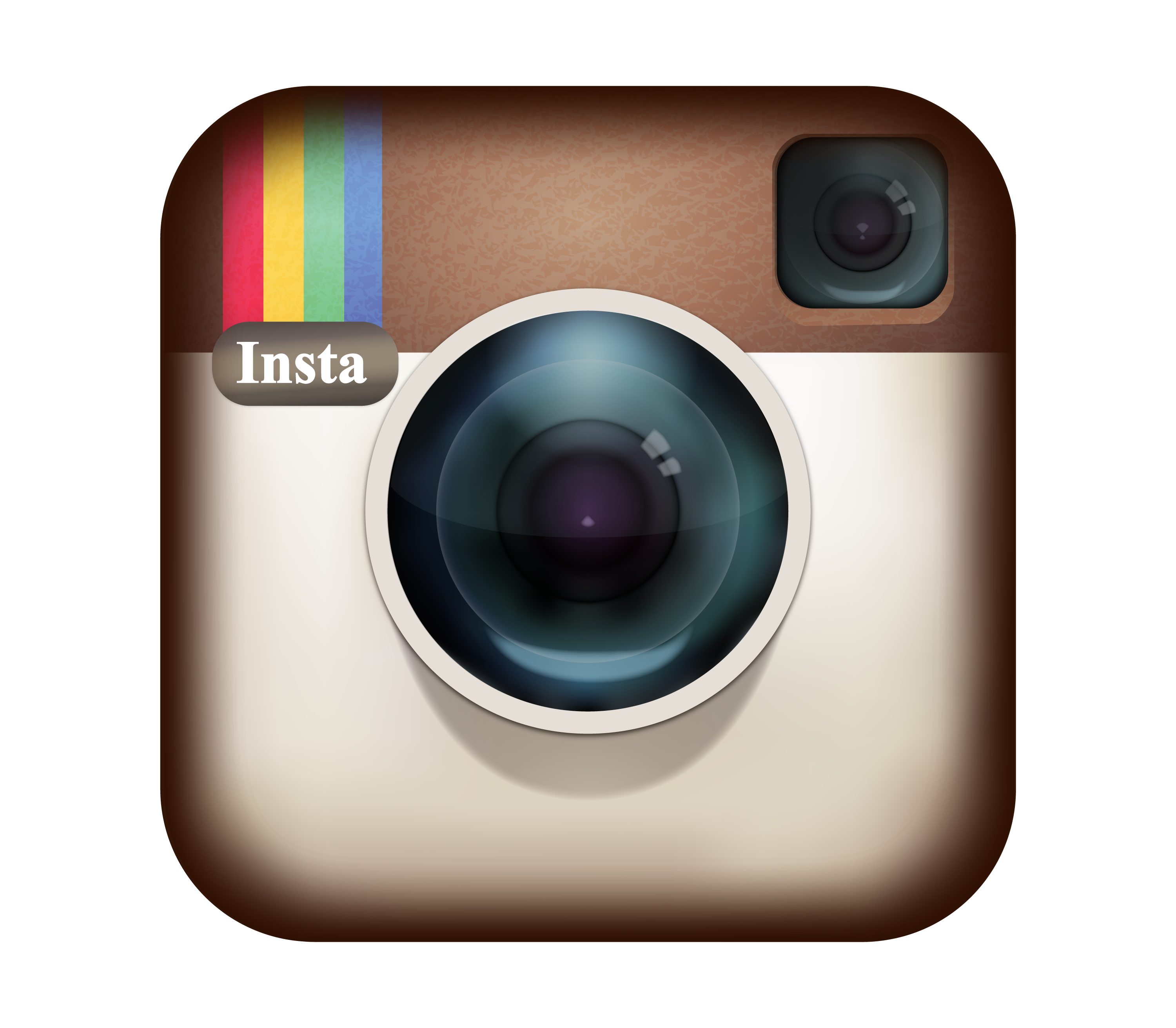
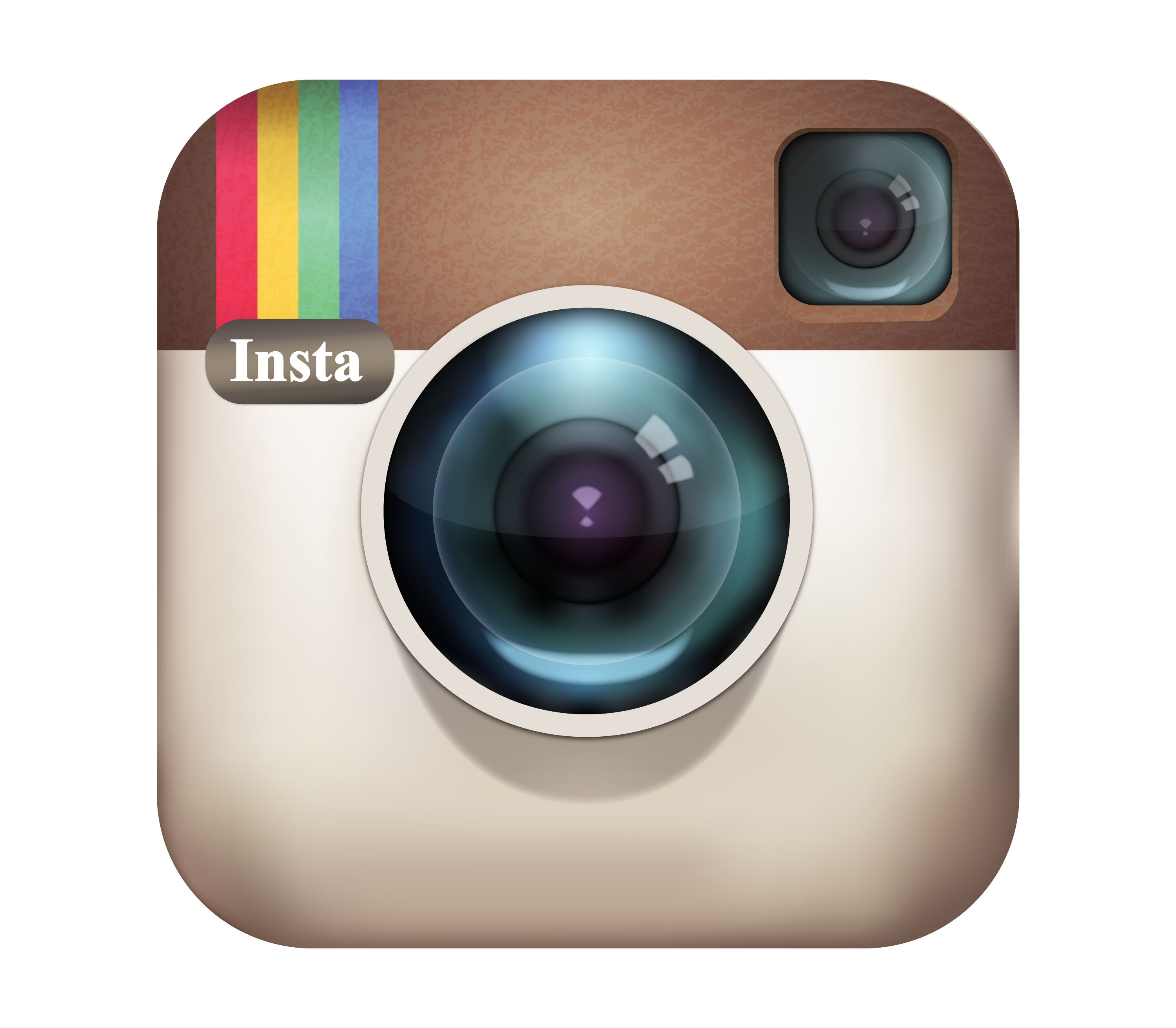
The original Instagram logo was a realistic depiction of a Polaroid camera, with the word “Instagram” written in a cursive font on the bottom. The logo was designed by Kevin Systrom the founder of Instagram. The logo was inspired by Polaroid cameras, which captured and printed images instantly. It also inspired other Instragram logos later. You can download this from our link below! Just click on PNG to download the PNG version or click on Vector to download the vector file.
2010
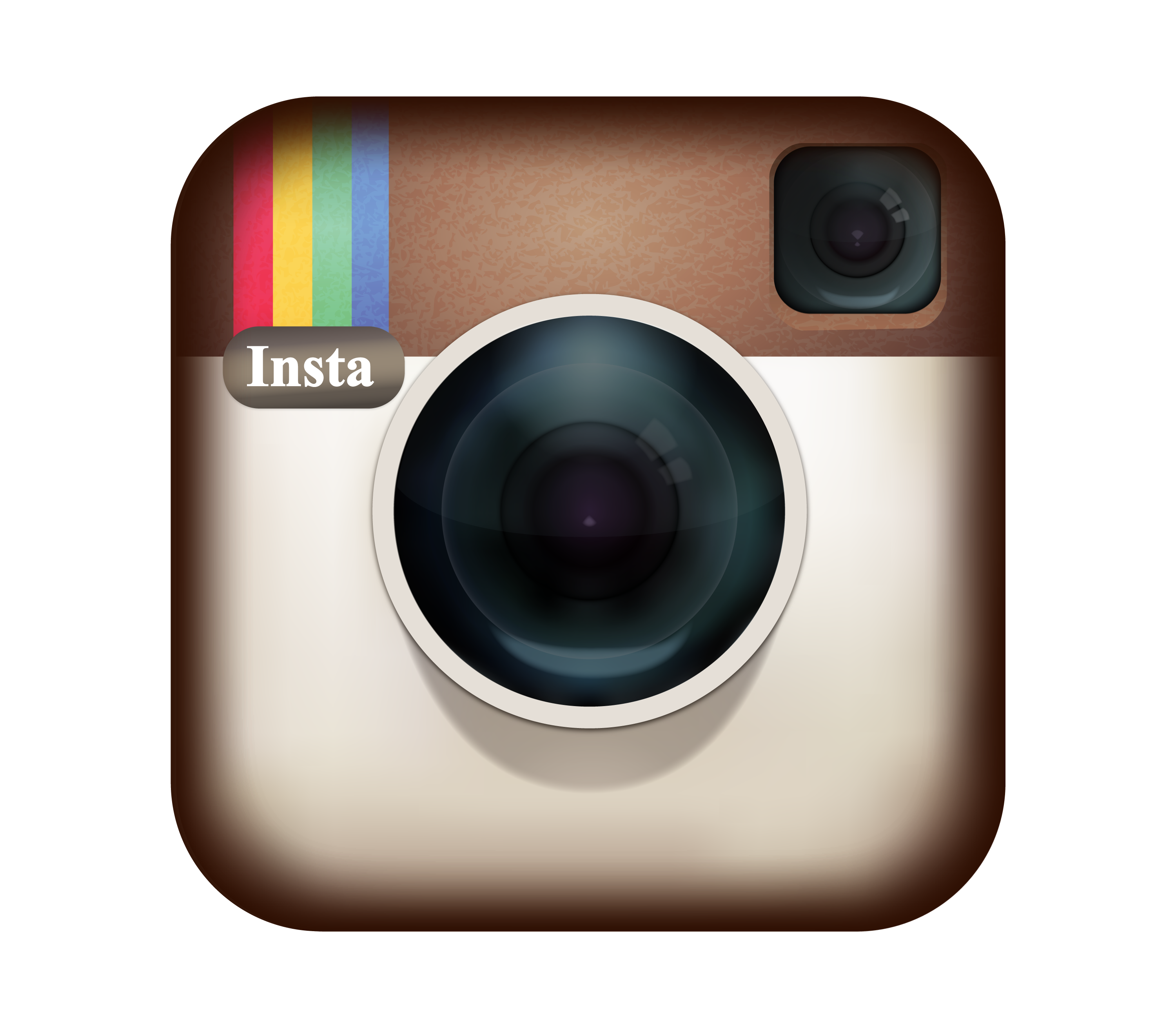
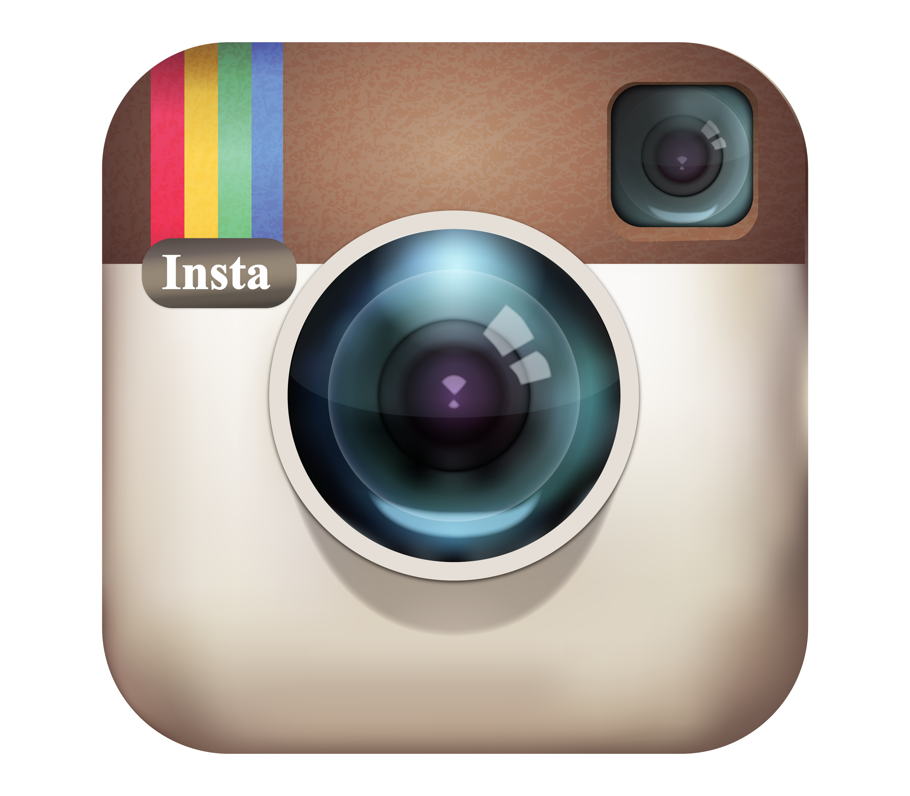
In the same year, after its release, Instagram slightly changed its logo. It changed its Polaroid camera to a modern and simple camera. It was also chosen and approved by Kevin Systrom and unveiled shortly thereafter.
2011
In 2011 very next year, Instagram slightly modified its logo. This version is designed by Cole Rise V2.0. It boosted the colors on the camera with a gradient brighter on its camera. They also brightened the color around the camera making them slightly more light. You can download this from our link below! Just click on PNG to download the PNG version or click on Vector to download the vector file.
2016
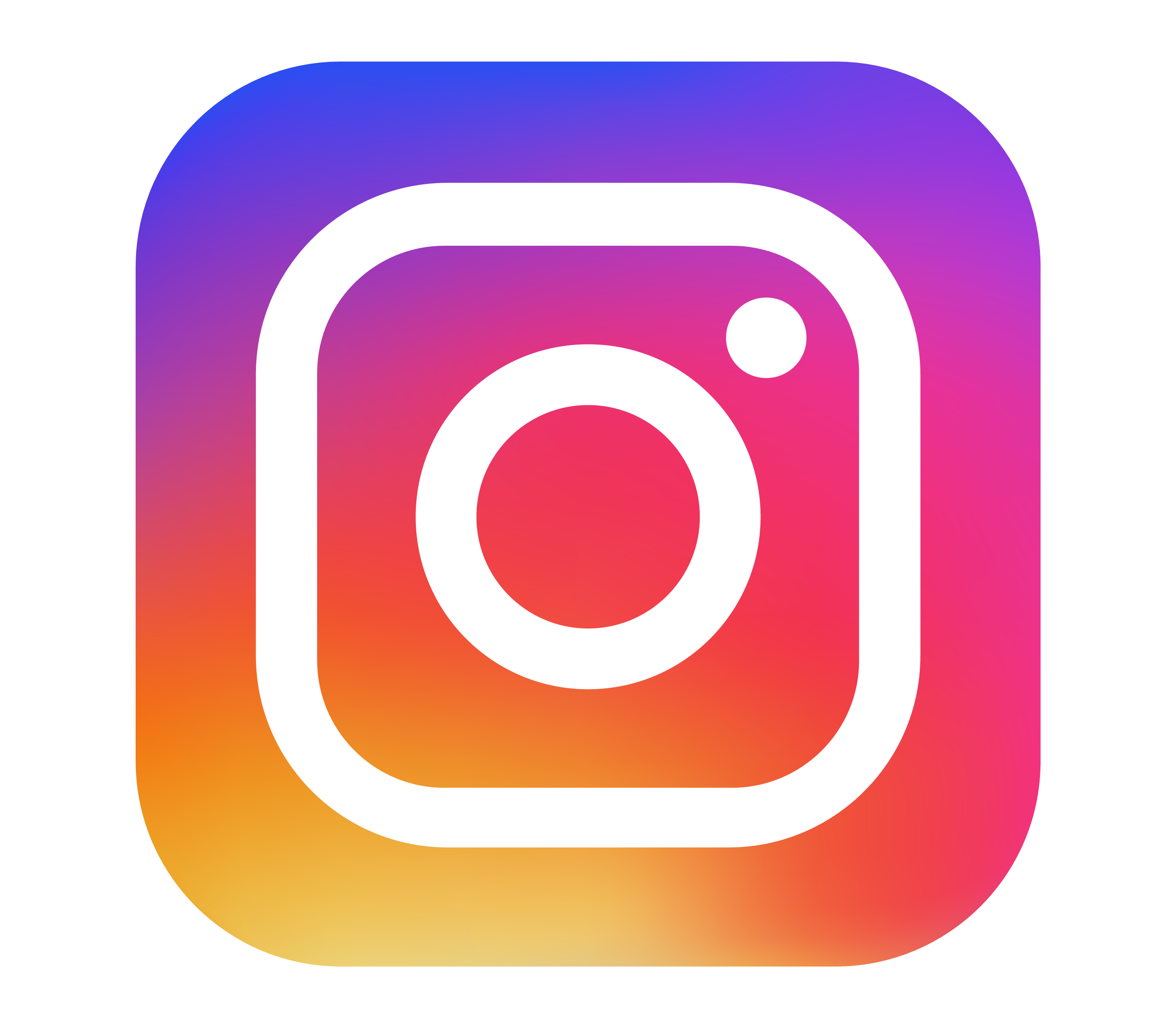
In 2016, Instagram decided to update its logo to reflect its evolution and diversity. The new logo was a simplified and stylized version of the camera, with a gradient of colors that ranged from purple to yellow.
The logo was designed by a team of designers from Instagram and Meta (formerly Facebook), who wanted to create a more modern and versatile logo that could adapt to different contexts and platforms. The logo was met with mixed reactions from the public, but it soon became accepted and embraced by the
2022
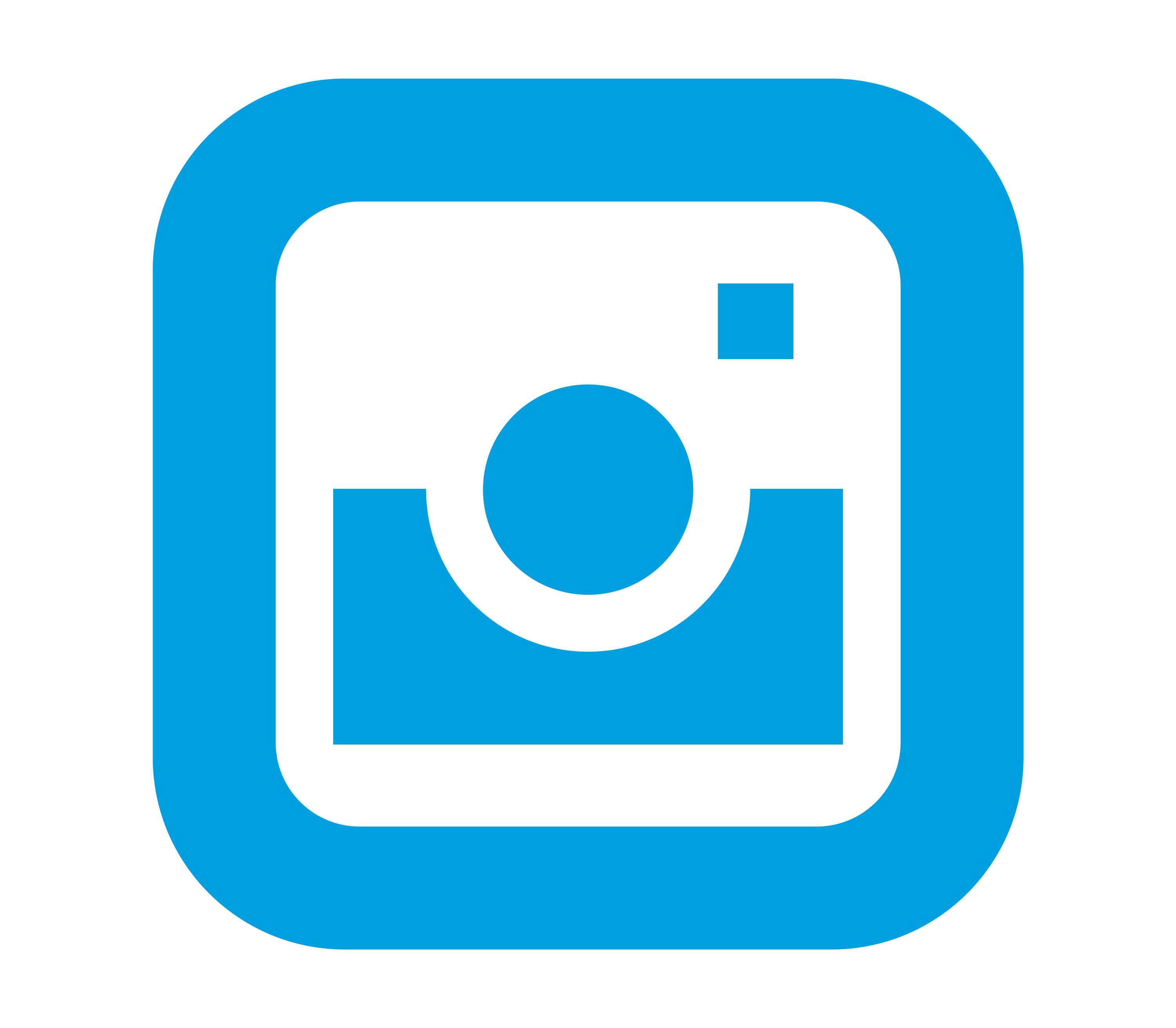
The current Instagram logo is a simple and modern design representing the app’s identity and vision. The logo consists of a rounded square with a gradient of colors, from purple to yellow, and a white outline of a camera in the center. You can download this from our link below! Just click on PNG to download the PNG version or click on Vector to download the vector file.
Instagram Name Text Logo – Evolution, History, Font, PNG and Vector
Instagram text is very unique and uses a distinctive font for its logo and various elements of the app. The text and font has changed over the years, reflecting the app’s growth and development. We will look at the different Instagram logo text over the years and the fonts matching with it.
2010
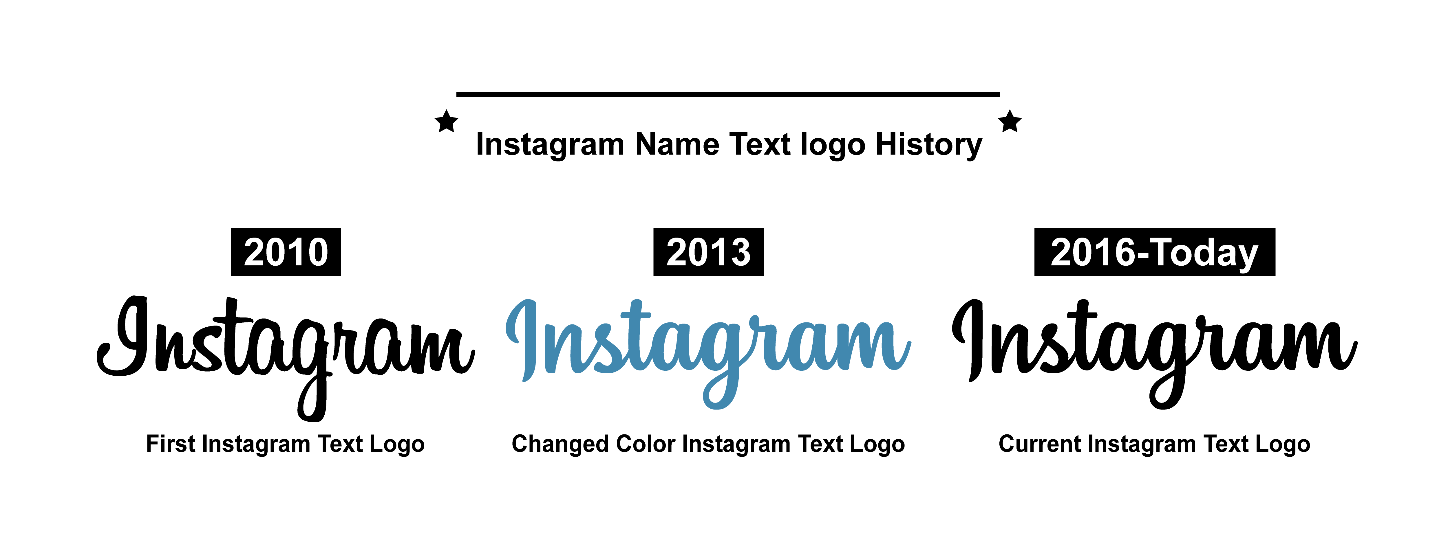
The original Instagram logo was designed by Kevin Systrom, one of Instagram’s co-founders, in 2010. The logo was a realistic depiction of a camera, with a rainbow stripe and the word “Instagram” in a cursive font. The script typeface was very similar to the Billabong font.
2013
In 2013, Instagram released a slightly modified text. They change the color of the text from black to blue (4187AF). Everything else remained unchanged.
2016
Instagram rebranded in 2016, introducing a new, more user-friendly logo and text. The logo changed to a more modern, flat design with a gradient color scheme, leaving behind the retro script.
From my research there is a font that is very close to the 2016 Instagram Logo font called The Grandista font, designed by Mytha Studio.
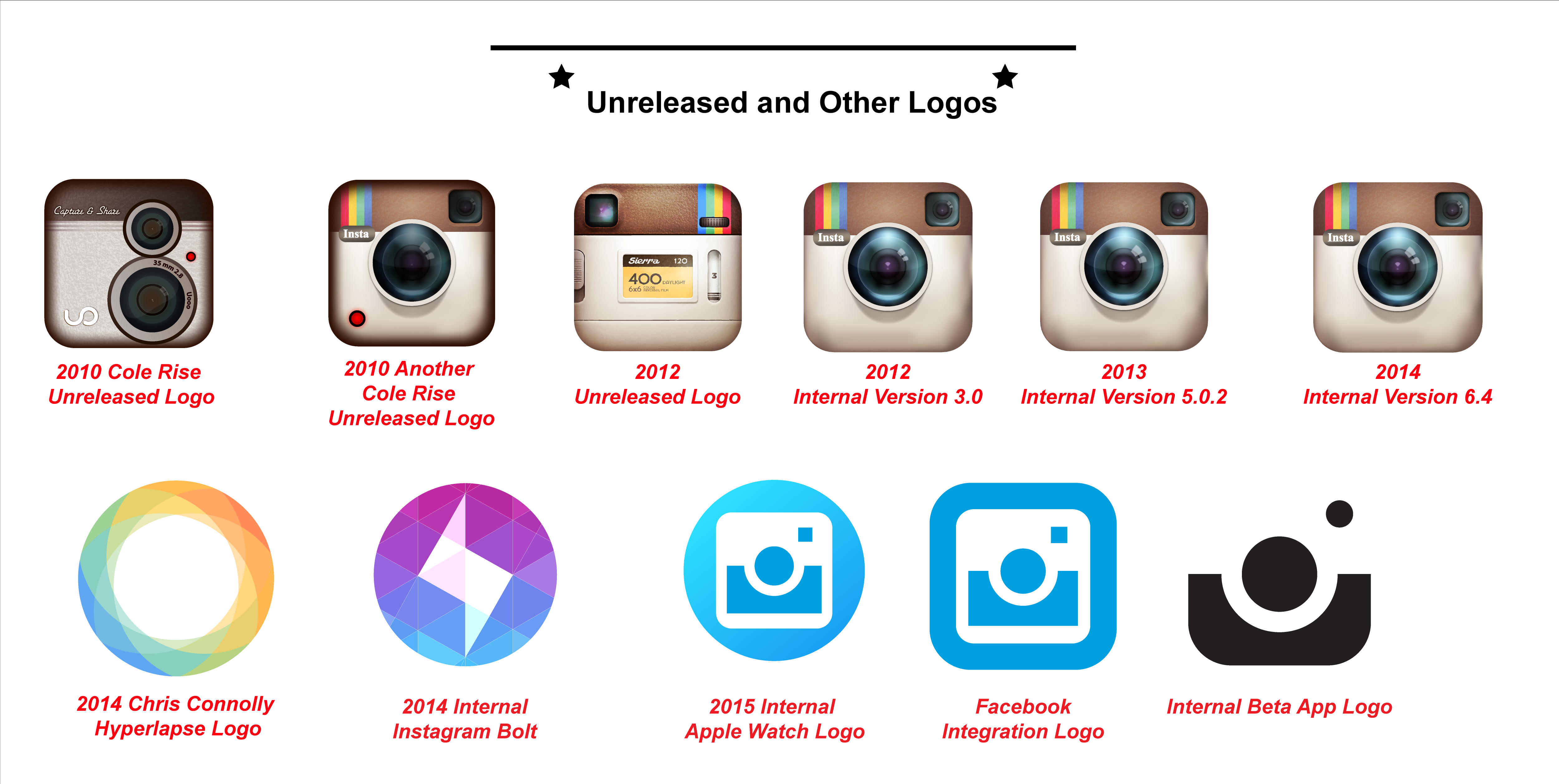
Instagram Unreleased and Other Logo – PNG and Vector
Over the years, Instagram designed many logos and emblem but didn’t published them. in this segment we will talk about those unreleased logos and will provide you with a download link.

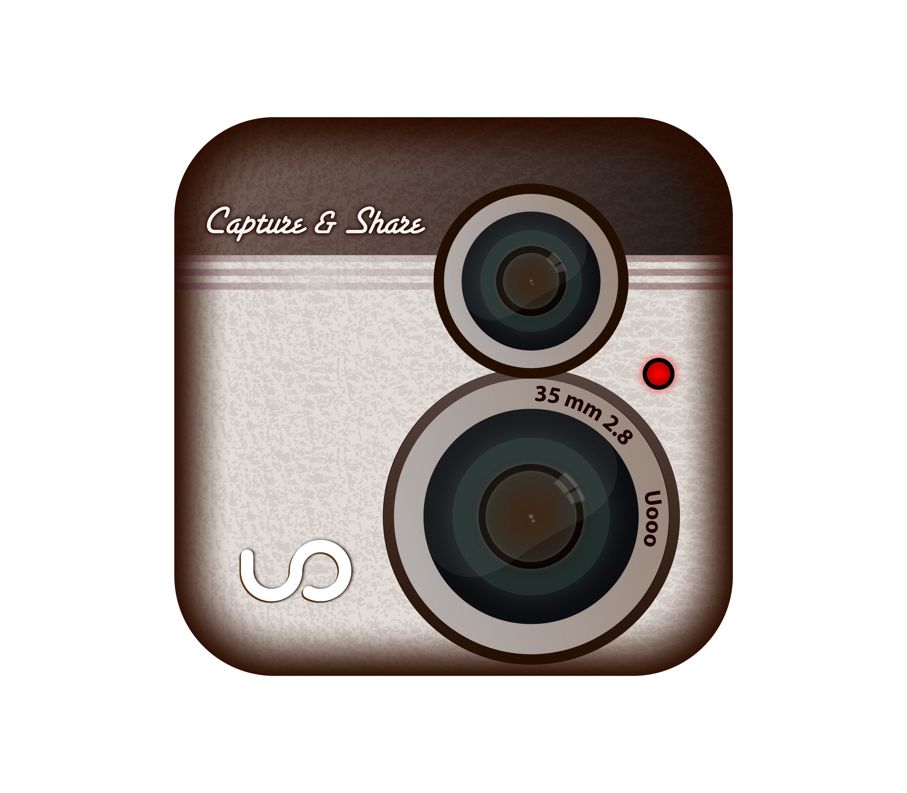
2010
This unique logo with two camera and more grayish logo was designed and used internally for Instagram before the official release. Kevin Systrom first designed it for the compsny. Later they changed the logo and didn’t released it.
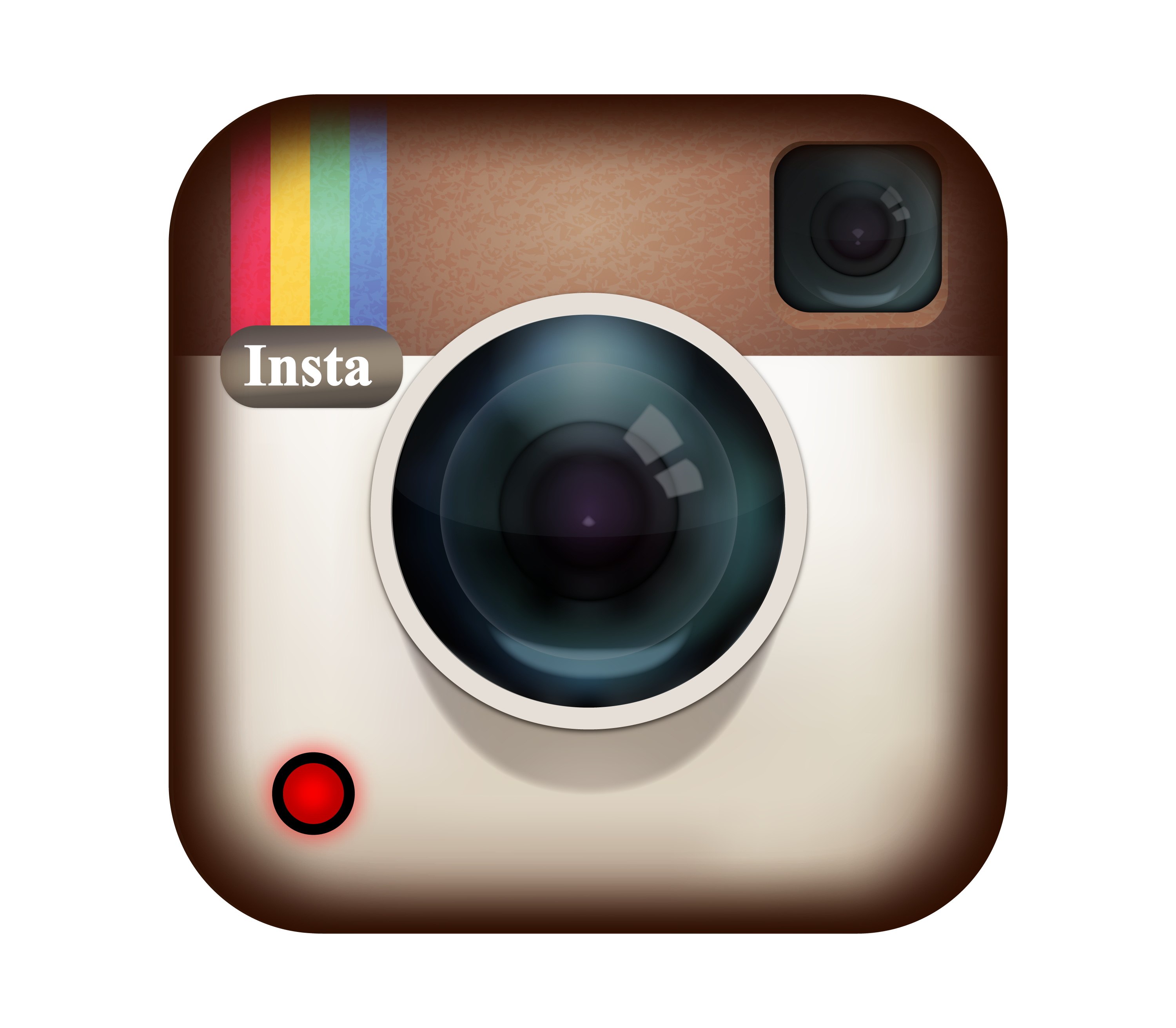
2010
This is another cole rise logo unreleased in 2010. It looked almost same as the official logo. Only difference was the red button on left with black outline surrounding. Later they removed it and published the rest as their official logo.
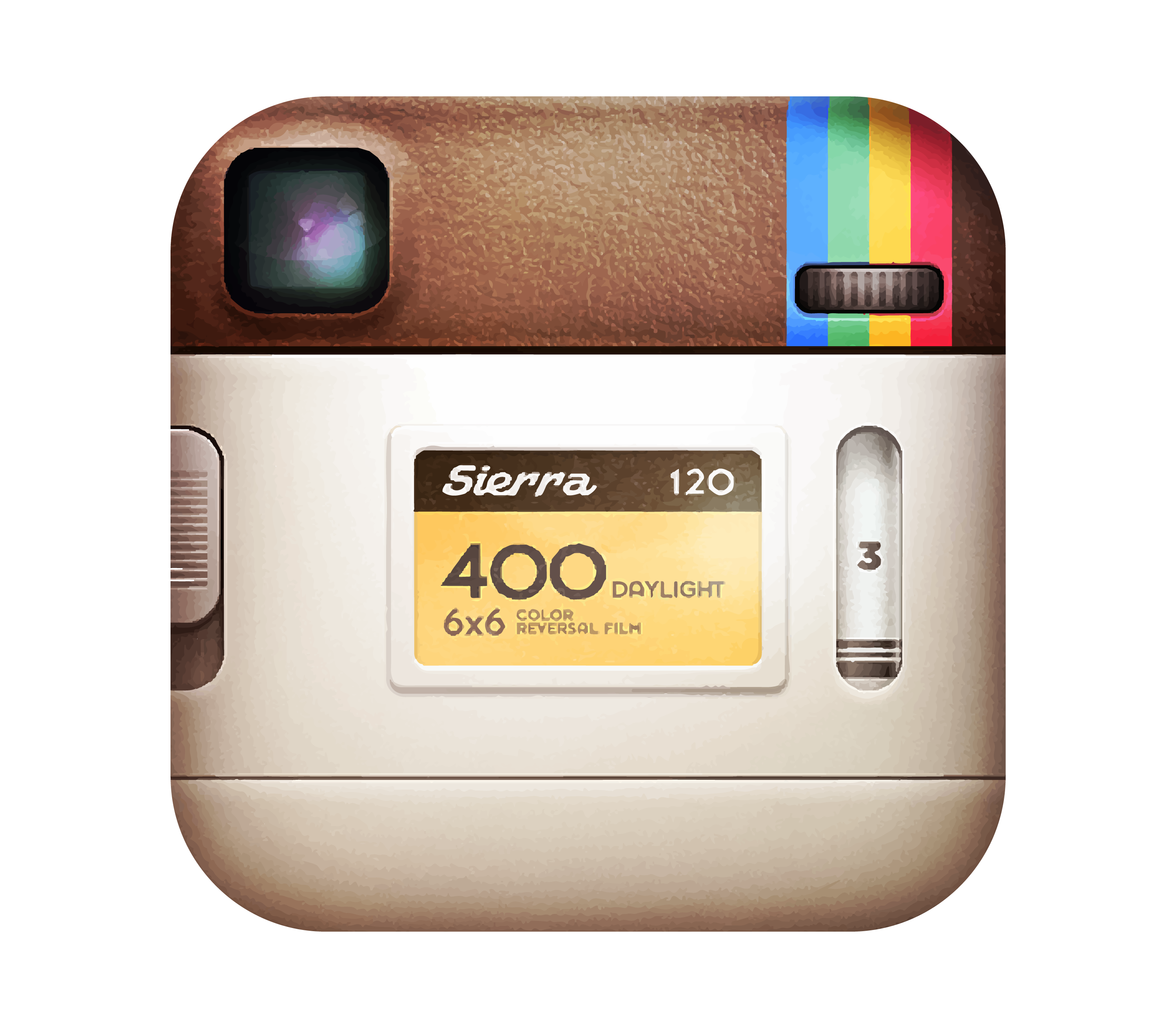
2012
In 2012,Instagram internal team made another logo. The logo looked like the back of the camera with a camera sight on top left and Sierra written with more words. However, they discontinued the logo letter.
2012
There was an internal version of the logo called version 3.0. This logo was used in the company to give it a unique feeling. They later discontinued and chaged the logo to current version.
2013
Instagram used many logos and emblem in their internal company memo and in various stuff. It is one of the, This internal version 5.0.2 was different from previous with more bright colors and shadow on top of camera.
Hyperlapse Logo from Instagram
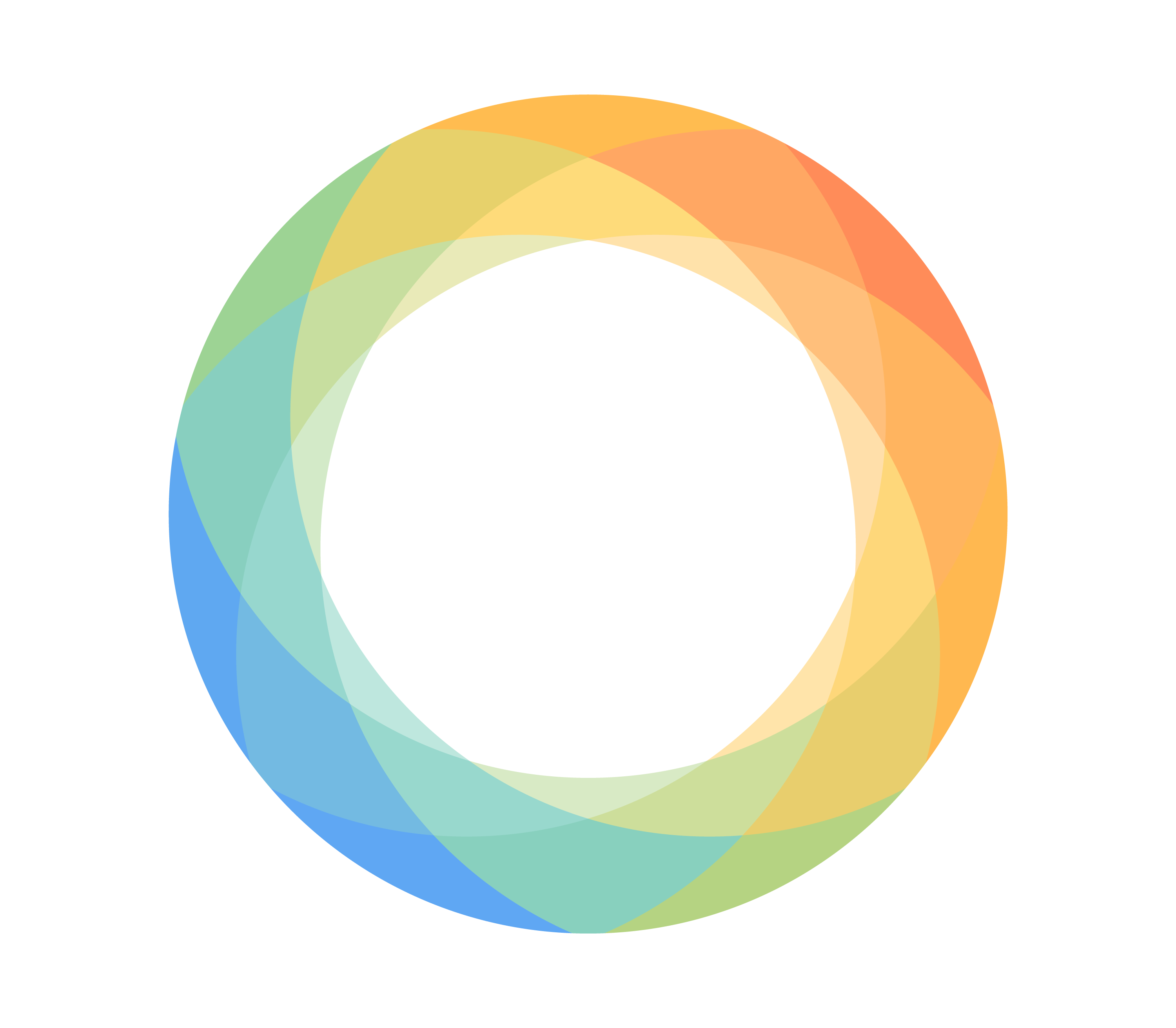
Hyperlapse from Instagram was designed by Chris Connolly. The logo is a smooth circle that is formed by overlapping shapes, which symbolizes how Hyperlapse can merge multiple frames into one seamless video. You can connect with him and others on Dribbble, the global community for designers and creative professionals.
Instagram Bolt Logo
Instagram Bolt was an app Instagram launched in 2014 to compete with Snapchat. The app allowed users to send photos and videos that disappeared after viewing. The app was similar to Snapchat, but it had a simpler interface and faster messaging.
The Instagram Bolt logo is a geometric design used internally by Instagram in 2014. It is a circle with a lightning bolt shape in the center, made up of different shades of pink, purple, and blue triangles. The logo was meant to represent the speed and simplicity of the app. This allowed users to send photos and videos that disappeared after they were viewed. The logo was never officially released to the public.
Instagram Internal Apple Watch App
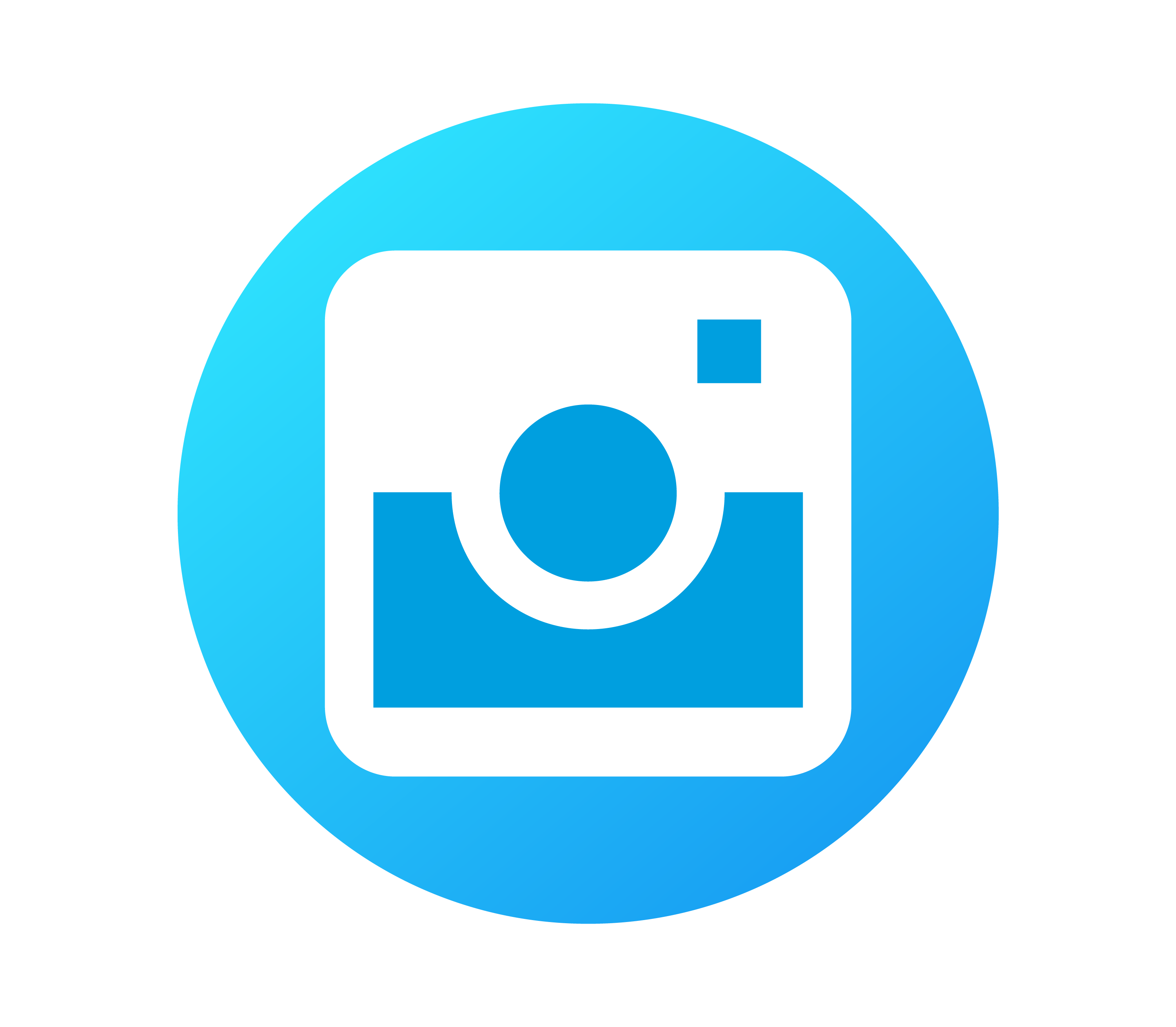
This is Instagram’s 2015 internal Apple Watch app logo. The logo is a blue circle with a white camera icon in the center. The camera icon is a square with a circle in the center and a small square dot in the top right corner.
The Facebook integration app logo is a blue square with a white camera icon in the center. The camera icon is a simple line drawing of a camera with a circle in the center. It looks very similar to internal Apple Watch app logo but the outer circle is a square here. Instagram used this logo internally after Facebook also known as Meta acquired the company.
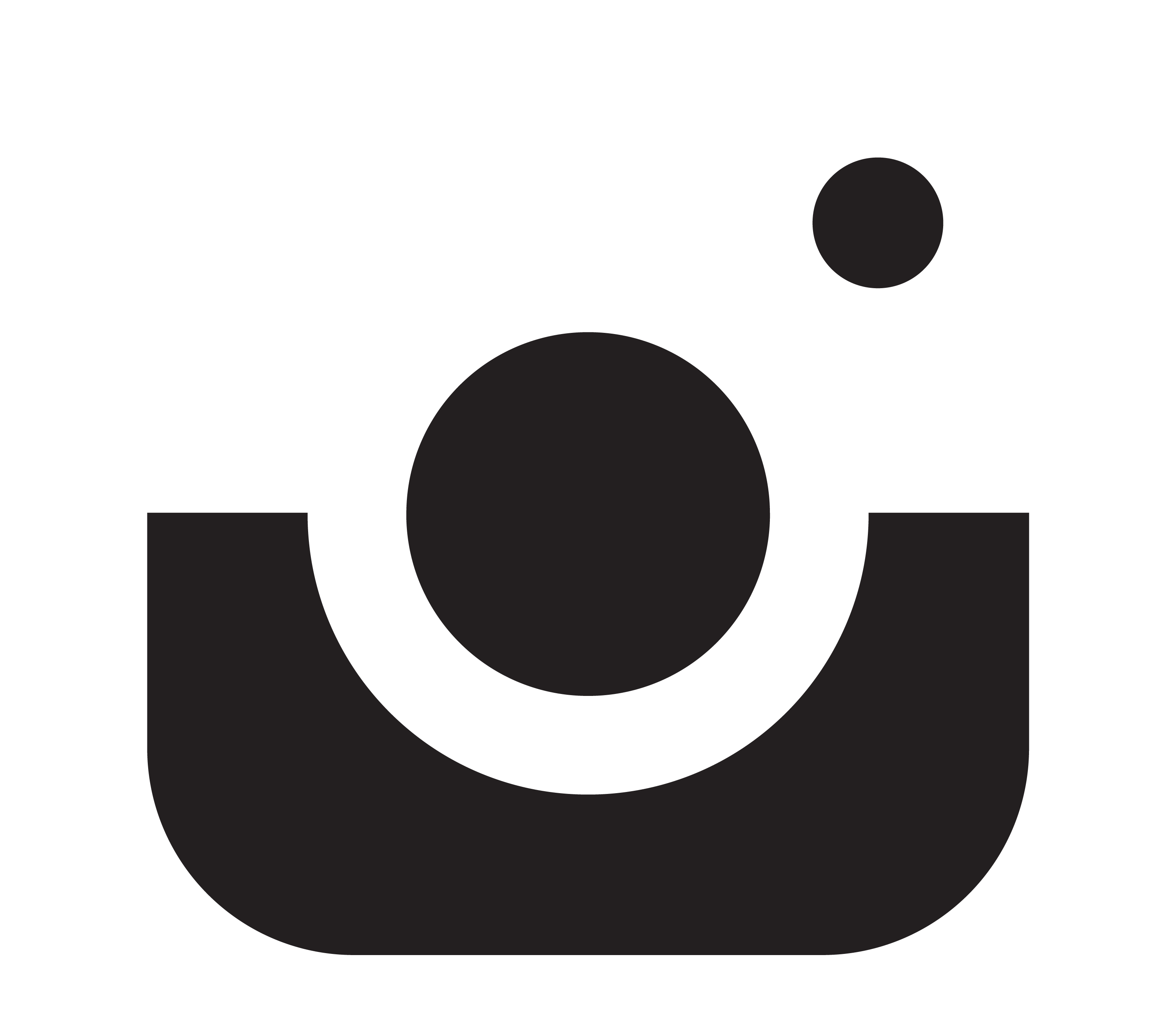
The internal beta app logo is a simple black-and-white design with a large “U” shape and two circles above it. An internal beta app is an app that is not yet released to the public but is being tested by a selected group of users or employees.
The purpose of an internal beta app is to find and fix bugs, improve performance, and gather feedback before launching the app to a wider audience.
Why the Instagram logo works
The Instagram logo works because it is simple, recognizable, and brings back a sense of nostalgia and creativity. The logo is based on the iconic Polaroid camera, which was a popular device for capturing and sharing instant photos. The logo also uses a gradient color system, which reflects the variety and vibrancy of the Instagram community and its content.
The logo has an unusual shape called a “squircle,” which avoids the harshness of straight lines and corners. The logo has evolved from a realistic to a sketchy design to adapt to the changing needs and preferences of users and the app.
Conclusion
Instagram is one of the most popular and influential apps in the digital era, with over one billion monthly active users. Instagram and its related logos are examples of effective and attractive visual design. They convey the essence and values of the app, while also appealing to the users and the market.
They are simple, recognizable, and evocative, and they create a strong and memorable brand identity for Instagram. Here, you can find all sorts of Instagram related logos, whether they have been published or not.