Are you looking for Facebook logo? Facebook, initially launched as “TheFacebook” in February 2004, is a social media platform that allows users to create profiles, share posts, send messages, join groups, watch videos, play games, and more. It was founded in 2004 by Mark Zuckerberg while he was a student at Harvard University. The company’s headquarters are in Menlo Park, California.
Facebook is the most popular social networking site in the world, with over 3 billion active users. It is used by people of all ages and backgrounds to connect with others, share information, and stay up-to-date on the latest news and events
Note: You can download all the PNG and Vector files for free. But you need to credit us or mention Similarlogo website in your work and blog posts. Enjoy!
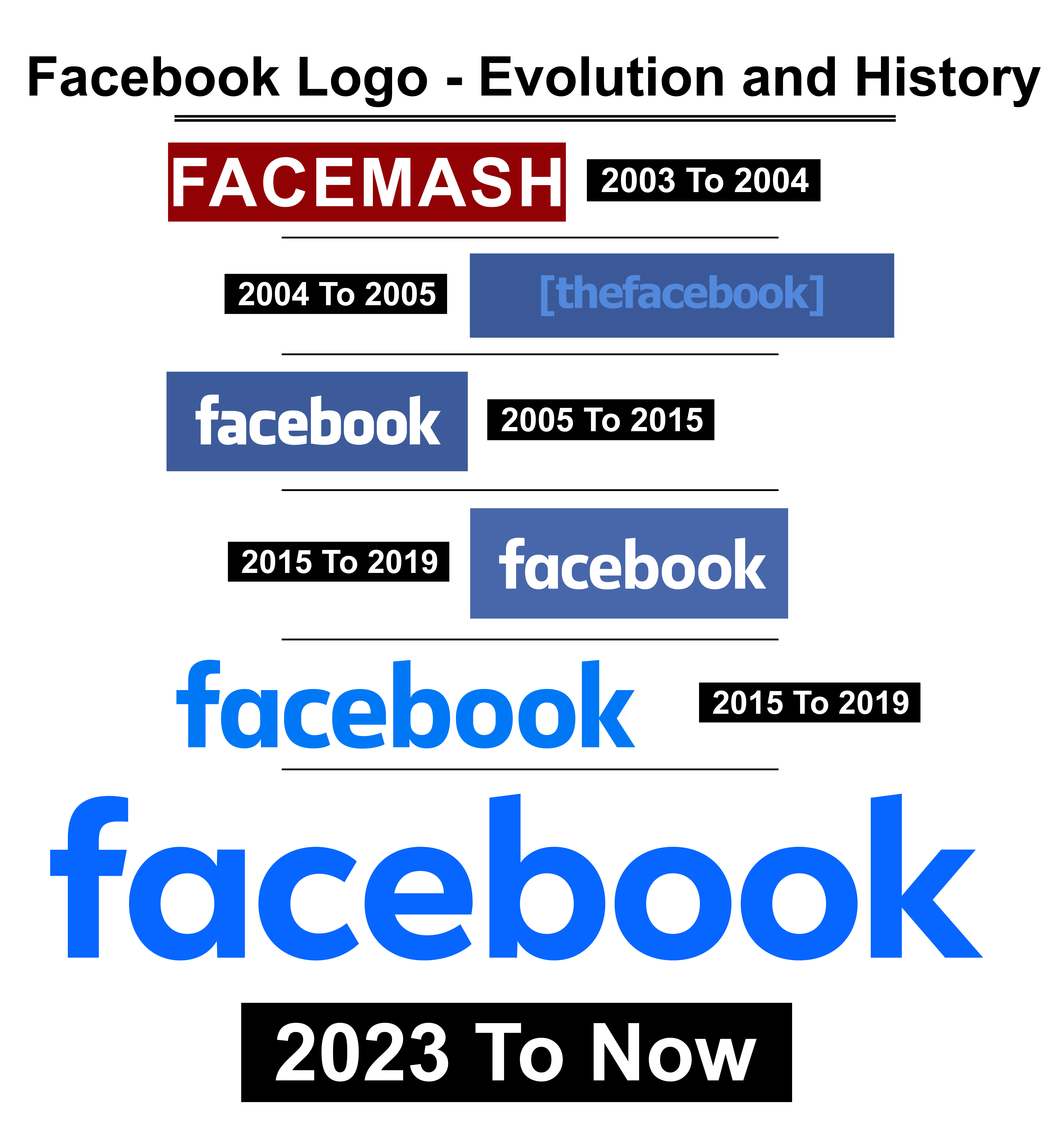
Facebook Logo- Evolution and History
Facebook’s logo represents the social media platform and its brand identity in a simple and recognizable manner. The Facebook logo has been consistent over time despite the changes, making it a timeless logo. Mark Zuckerberg and Sean Parker hired Joe Karl and Mike Buzzard of the Cuban Council to design a logo for the company.
Facebook has made only small changes to its original logo over the years. Buzzard’s logo is almost identical to the one the company uses today. Today I will talk about the Facebook logo and its history, and at the end, we will provide you with a download option for each of them. So, stay with us till the end!
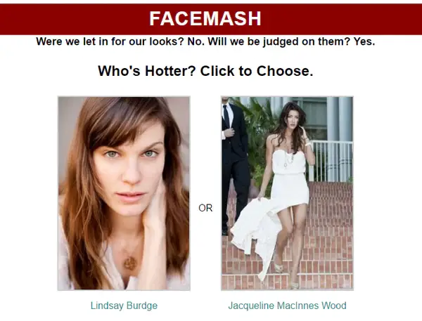
2003 To 2004
Facemash was a website Mark Zuckerberg created in 2003 when he was a sophomore at Harvard University. Users could vote for their favorite photo of two female students and compare their attractiveness.
Facemash was controversial and short-lived. It became famous but controversial in the first few hours, sparking outrage and criticism from the Harvard administration. Later, it was shut down due to opposition and the threat of expulsion of Zuckerberg.
The Facemash logo consists of a maroon rectangle background with the word “FACEMASH” written in white capital letters. The word is written in a sans-serif font, which gives it a modern and sleek look. He used Arial Bold as the font. Facemash was the precursor of Facebook, the social media giant that Zuckerberg launched in 2004.
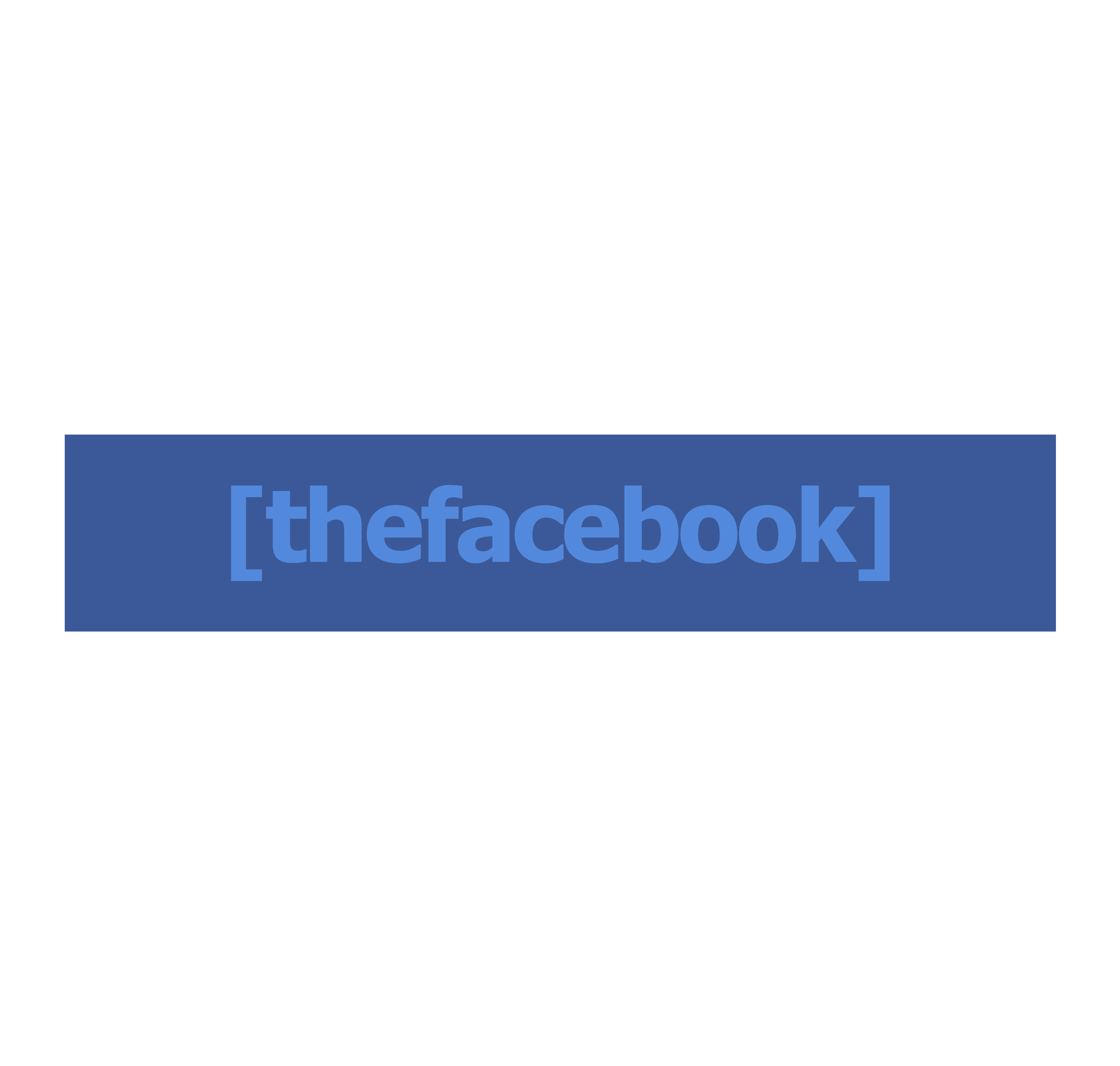
2004 To 2005
The original Facebook logo, known as the “thefacebook” logo, was designed in 2004 by Joe Kral and Mike Buzzard, two Harvard students friends from the Cuban Council with Facebook founder Mark Zuckerberg. The logo featured the word “thefacebook” written in light blue capital letters on a dark blue background. He used Tahoma Font to create the logo. The logo was enclosed in brackets, which suggested a sense of community and inclusivity.
The logo was inspired by the website’s original name, “thefacebook.” The name was a reference to the Harvard student directory, which was often called the facebook because it contained the names and photos of all Harvard students.
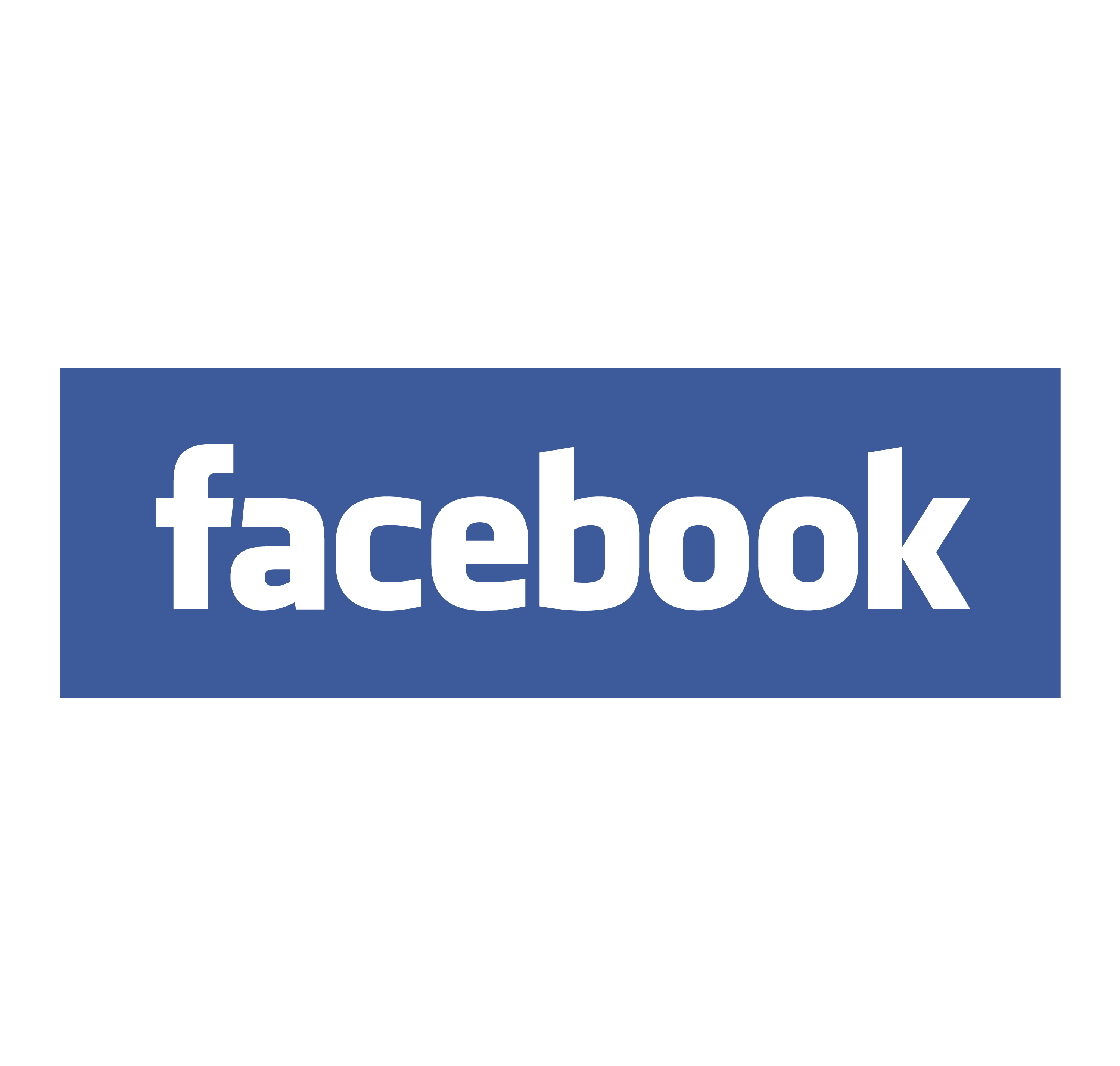
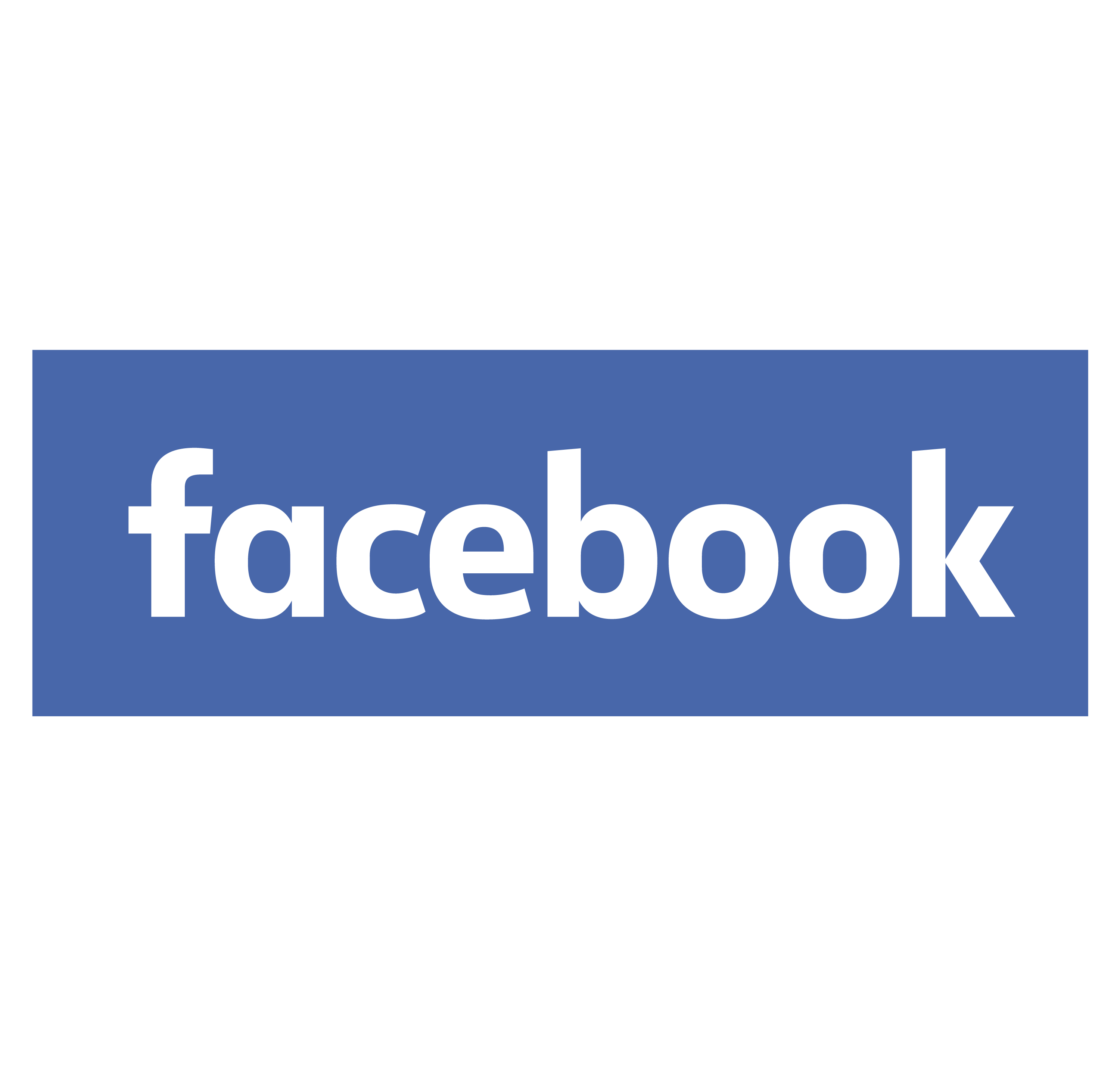
2005 To 2015
2005 Facebook logo was a redesign of the previous logo used when the website was called “TheFacebook”. The updated logo dropped the prefix “The” changed the font from Tahoma Bold to Klavika and made the letters white from blue. Hackman Heavy is a similar font. The new logo also adjusted the size and position of the white lowercase letter ‘F’ inside the blue square. The updated logo was designed by Andrew McCollum, one of Facebook’s co-founders, who was also a graphic designer
2005 Facebook logo was meant to reflect the change in the website’s name and purpose. This was to expand beyond Harvard University and connect people from other colleges and eventually anyone over 13 years old. The updated logo also used blue color because Mark Zuckerberg is color-blind and blue is the color he can see best.
2015 To 2019
In comparison to its predecessor, the 2015 Facebook logo underwent a minor but significant redesign. The difference between the previous logo and this one is that the previous logo had a lighter blue background. In addition, the word “facebook” was written in a different font. They used URW Din Extra Bold font. The new logo has a darker blue background, and the word “facebook” is written in a more modern and clean font.
The new logo was designed by Eric Olson, the creator of the Klavika font used in the previous logo. Olson said that he wanted to make the new logo more friendly, approachable, and legible while also retaining the essence and identity of the old logo.
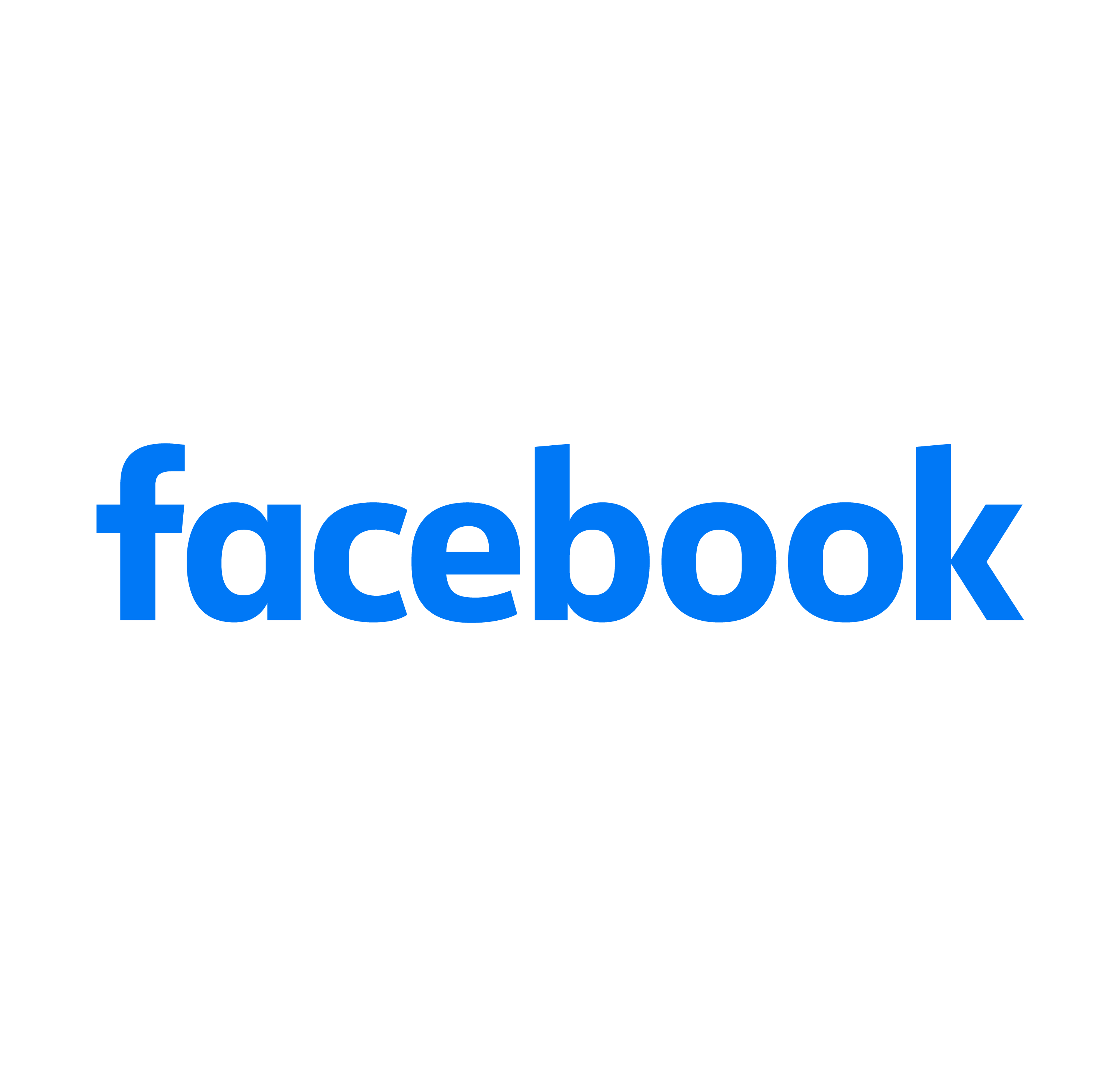
2019 To 2022
In 2019, Facebook slightly revamped its logo. It is a blue rectangle with the word “facebook” written in white lowercase letters. The word “facebook” is written in a sans-serif font, they used URW Din Extra Bold Font. The logo is simple and minimalist, and it conveys modernity and professionalism.
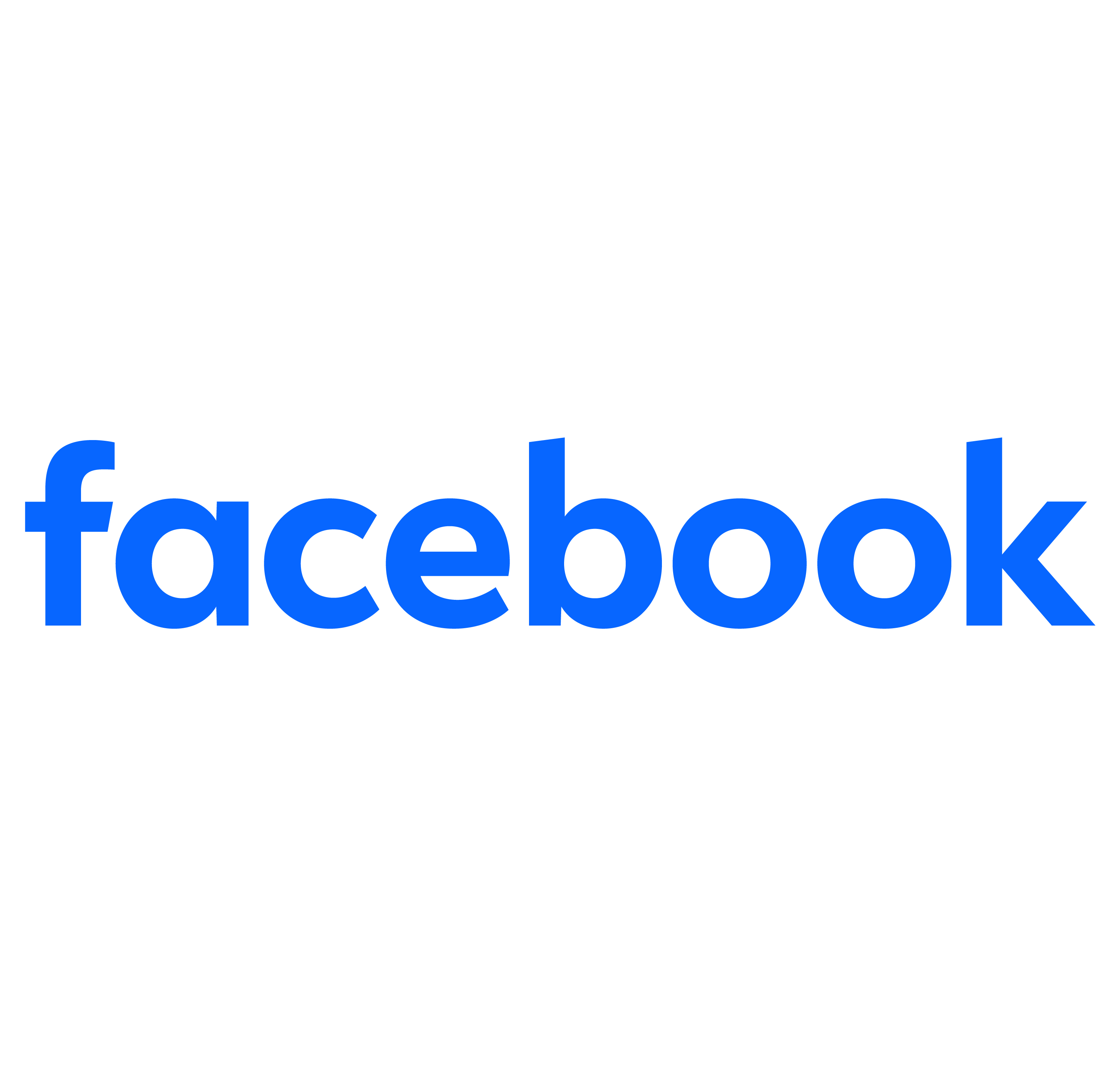
2023
In 2023, Facebook refined its logo. The company decided to enhance the logo by intensifying the blue shade and slimming down the logotype lines. It used Artegra Sans Alt Bold font to create the refined logo. These modifications resulted in a more elegant and lightweight logo appearance.
Introducing the new shade of blue added a delightful and eye-catching element to the overall design. Facebook’s ability to maintain its minimalist recognizability while incorporating subtle yet progressive details is a testament to its mastery of branding and visual identity.
Facebook Logo Symbol Changes History
The Facebook logo is one of the most recognizable symbols in the world. It represents the social media platform that connects billions of people across the globe. The logo has a simple and elegant design, with a white lowercase letter “f” on a blue background. Founder Mark Zuckerberg chose blue because he is red-green blind and blue is the only color he can see. Now let’s talk about the Facebook icon or logo symbol and its history.
2005
In 2005, the company dropped the word “the” from its name and became simply “Facebook”. The logo was also changed to a more minimalist design, with only the letter “f” in white on a blue square background. It had a white shadow square borderline and another white shadow on top of it. They introduced the new symbol and it became famous very quickly.
2009
2009 Facebook icon symbol is a circular shape with a white letter F in the center. The background is a light blue color. The F is in a sans-serif font and is slightly condensed. This “f” is different from the previous symbol with the white shadow background now on the bottom. The symbol is simple and clean, and it is easily recognizable.
2012
The symbol has been slightly changed in 2012. It is a circular shape with a white letter “f” in the center, on a light blue gradient background. The “f” is in a sans-serif font and condensed.
There is one difference between the current Facebook icon and the previous one: the blue shade. The 2012 icon used a lighter gradient blue, which is more vibrant and eye-catching. The previous icon used a slightly darker blue shade, which was more subdued and professional.
2013
What changed? 2013, the logo was slightly modified, with the letter “f” becoming thinner and more elongated. It was part of the Facebook logo redesign and change. Eric Olson also changed the symbol along with the logo. He and the designers shifted the “f” to the bottom right. He also removed the white shadow and made the corner straight and sharper by removing the gradient 3D effect.
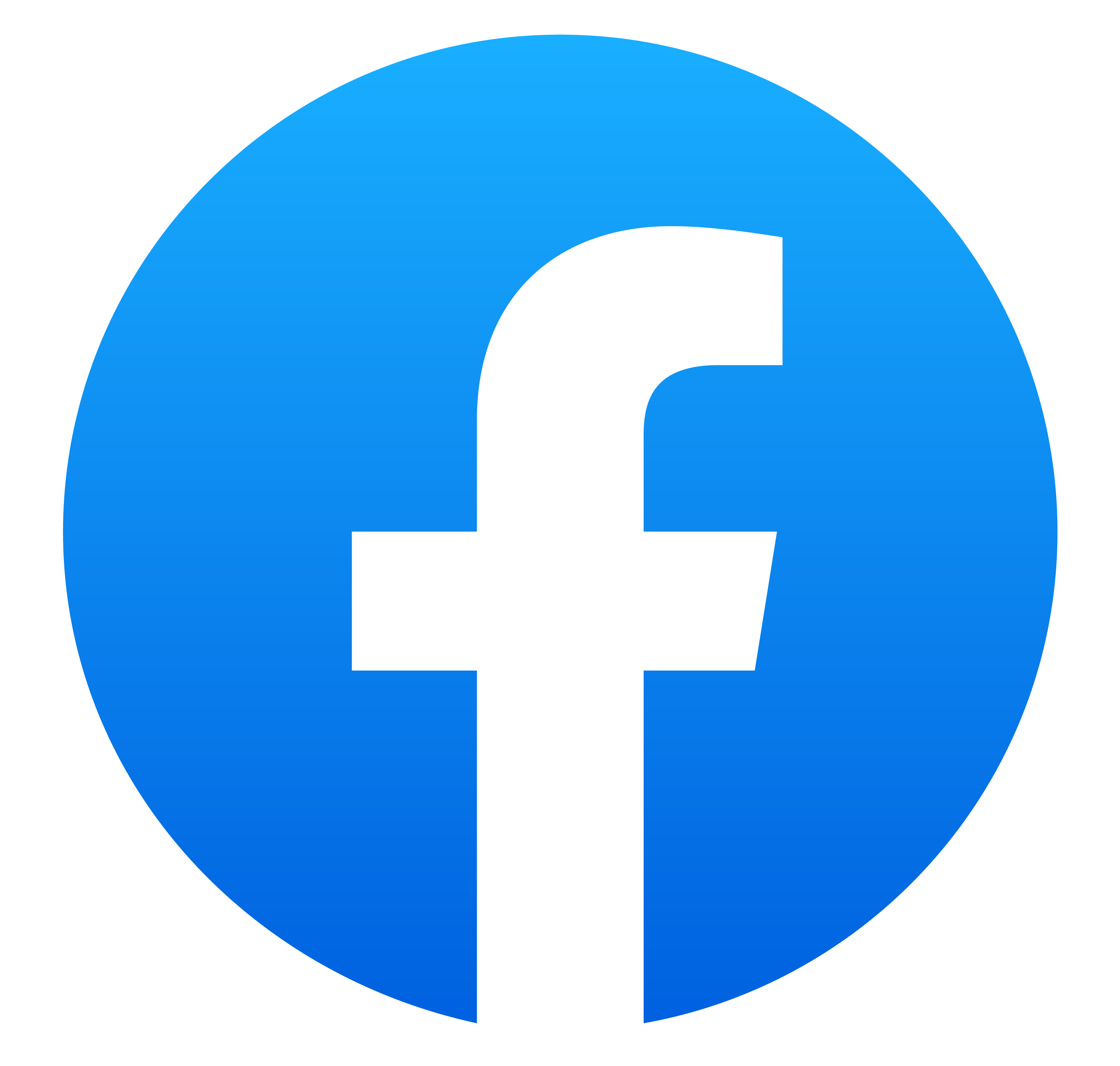
2019
In 2019, as part of a significant redesign of the Facebook brand, the Facebook logo was changed again to a circle instead of a square. The “f” was moved slightly to the left. It had a brighter blue shade and a gradient effect. A British branding agency in London called Saffron redesigned this new logo. It was the most significant design change in the history of the Facebook symbol.
2023
Did you notice anything different? After Facebook changed its name to Meta, it unveiled the first stage of its brand identity revamp. In 2023, it introduced a revised Facebook logo. The gradient 3D effect was gone. The circle was now dark blue, and the word “f” was bold and striking. The company eliminated the gradient, aiming to “establish a refreshed Facebook logo design that is bold, electric, and enduring.”
Conclusion
There is more to Facebook’s logo than just a graphic design. It is a visual representation of the history and vision of the Facebook company, which has grown from a college project to a global phenomenon. The logo has evolved, adapting to the changing needs and preferences of users and the market. The logo has also maintained its simplicity and elegance. The Facebook logo is a classic example of simple yet effective branding today.