Coca-Cola, a global beverage powerhouse, is recognized by billions around the world. A key element that has contributed to its global recognition is its iconic logo. The Coca-Cola logo, with its distinctive red and white colors and script font, is one of the most recognized brand identities worldwide. In this article, we will explore the history and evolution of the Coca-Cola logo. We will provide a concise overview of each logo change year, starting from 1886 to the current design. Additionally, we will offer PNG and Vector format downloads for each logos.
The Company
Coca-Cola is a well-known and iconic beverage company that was founded in 1886 by pharmacist John Stith Pemberton. The company is headquartered in Atlanta, Georgia, and is known for its flagship product, Coca-Cola, a carbonated soft drink that is sold worldwide. Over the years, Coca-Cola has expanded its product line to include a variety of other beverages, including Diet Coke, Coca-Cola Zero Sugar, Sprite, Fanta, and many more.
Coca Cola Logo Evolution and History
The Coca-Cola logo has evolved over time, reflecting the changing trends and design aesthetics of each era. Let’s take a closer look at some key milestones:
1886
The Coca-Cola logo was first created by Frank M. Robinson, who suggested the name Coca-Cola and wrote it in Spencerian script, a popular writing style at the time. The logo had a “typewritten” feel about it, portraying seriousness, sophistication, and class.
Did you know that? The word “Drink” was replaced with “Enjoy” in 1969. But later Coca Cola use both in there products.
1887
The logo was slightly modified, with the Spencerian script becoming more recognizable. The red color had not yet been introduced.
1889
Coca-Cola experimented with separated letters, diamonds, and elongated tails to draw more attention to the two “C”s.
1890
It adopted an Art Nouveau style, which was the most radically different Coca-Cola logo seen2.
1891
The Coca-Cola logo returned to a design similar to its original 1887 version, but with a few modifications. The company embraced the color red and introduced a rectangular box around the logo.
1893
The design with the lines of all elements being emboldened and cleaned. The trademark is added to the tail of the first ‘C’. The “Drink” word was first seen in Coca Cola logo and poster.
1899
The logo was refined again, with all the letters getting more balanced, and the lines of the two parts of the drink’s name almost equalized.
1903
Slight changes this time like character are close the “-” is small.
1906
In 1906, the Coca-Cola logo was used on containers and bottles until 1919 when Coca-Cola stopped using paper labels. The logo has some changes and become more pronounced.
1934
The logo was further refined, and by 1934, it had gained an intense shade of red.
1950 – Round Logo
1958 – Fishtail Logo
1969
The red square, or ‘Arden Square’, featured this classic logo and the ribbon. The word “Drink” above Coca-Cola was also replaced with the word “Enjoy”.
1985 – Coke Logo
The new logo was a departure from the classic Coca-Cola logo. It was simpler and bolder, with the word “Coke” written in a sans-serif typeface. The word “Coke” was capitalized and underlined, and the color scheme was red and white, consistent with the brand’s identity. However, the new product and logo were not well-received, and the company quickly reverted to the classic Coca-Cola formula and logo.
1987
The logo continued to feature the iconic red and white color scheme and the script font without major alterations. But it adds the COKE word under the logo.
1993
In 1993, Coca-Cola decided to bring back elements of the circle logo design from 1950s, but with a different stylization. The red used in this logo was a bit brighter, and it featured two reflective marks on the edges of the circle.
2003
As part of the ‘Coca-Cola Keep it Real’ campaign, the logo was slightly modified.
2007
The logo was slightly modified again, maintaining its classic design.
2011
For Coca-Cola’s 125th birthday, the logo saw bubbles bursting from the contour bottle.
Current
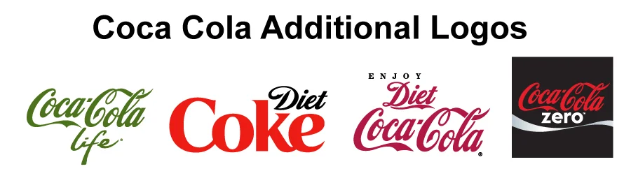
Coca Cola Additional Logos
Coca-Cola Life Logo
Diet COKE Logo
Diet Coca-Cola Logo
Coca-Cola Zero Logo
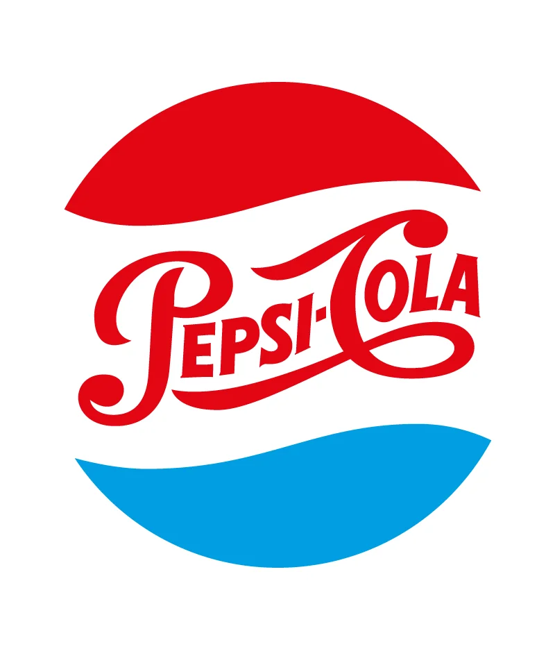
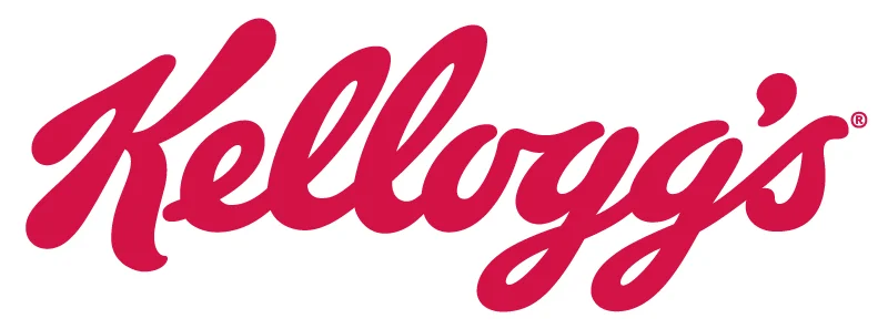
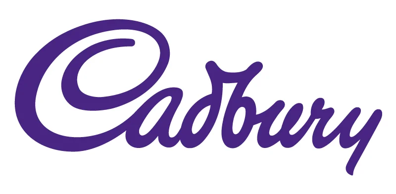
Coca Cola Logo | Similar Symbols | Similar Logo
While the Coca-Cola logo is unique and instantly recognizable, there are some logos that have similarities in terms of design elements or color schemes. Here are a few examples of logos that share similarities with the current Coca-Cola logo:
Pepsi Cola
Kelloggs Logo
Cadbury Logo
Conclusion
The Coca Cola logo is one of the most iconic and successful logos of all time. It has been able to capture the essence and identity of the brand, and to communicate its values and benefits to the consumers. It has also been able to adapt and evolve with the times, while staying true to its roots and heritage. The Coca Cola logo is a masterpiece of design and marketing, and a source of inspiration and happiness for many people.