The Batman logo is one of the most iconic and recognizable symbols in the world. It is a simple image of a bat, with its wings spread wide, but this simple design has powerful meaning.
The logo represents justice, strength, and vigilance. It is a reminder that even in the darkest of times, there is always hope.
Batman’s logo has a long and rich history. It was first introduced in 1939, when Batman debuted in Detective Comics.
Note: You can download all the PNG and Vector files for free. But you need to credit us or mention Similarlogo website in your work and blog posts. Enjoy!
The logo has evolved over the years, but it retains its basic design. Batman logos have been used in a variety of media, including comic books, television shows, movies, and video games. It is also a popular symbol for merchandise, such as clothing, toys, and accessories.
1939
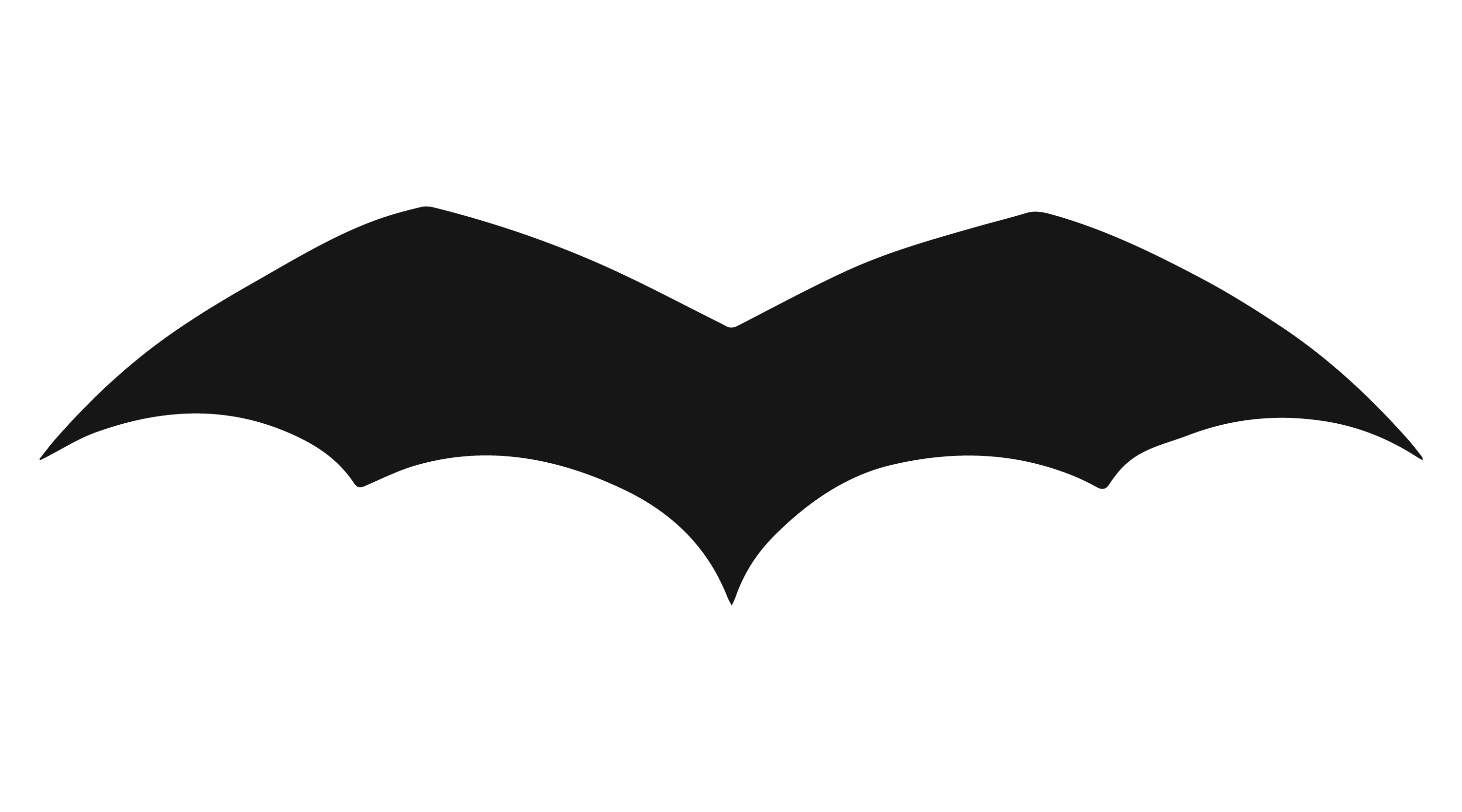
The first design of Batman’s wings appeared in Detective Comics #27 in 1939, created by Bob Kane and written by Bill Finger. The original design featured a plain-looking bat symbol with five-pointed wings and rounded wingtips.
1939 Updated Batman Logo
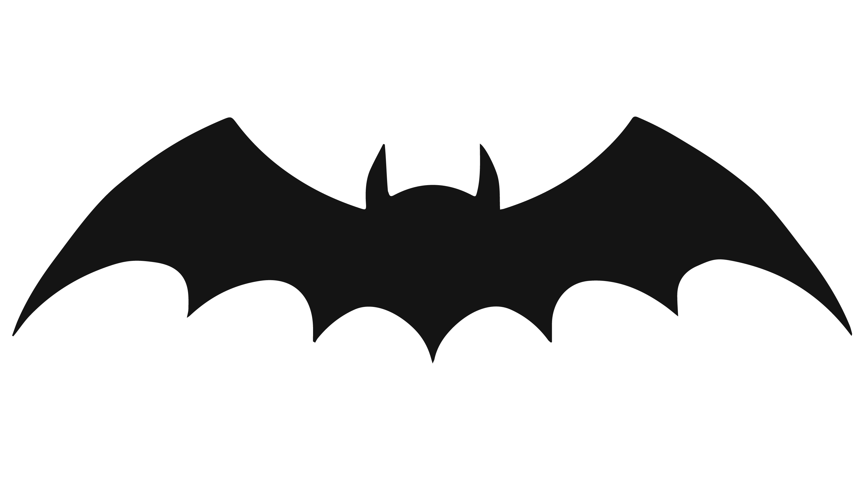
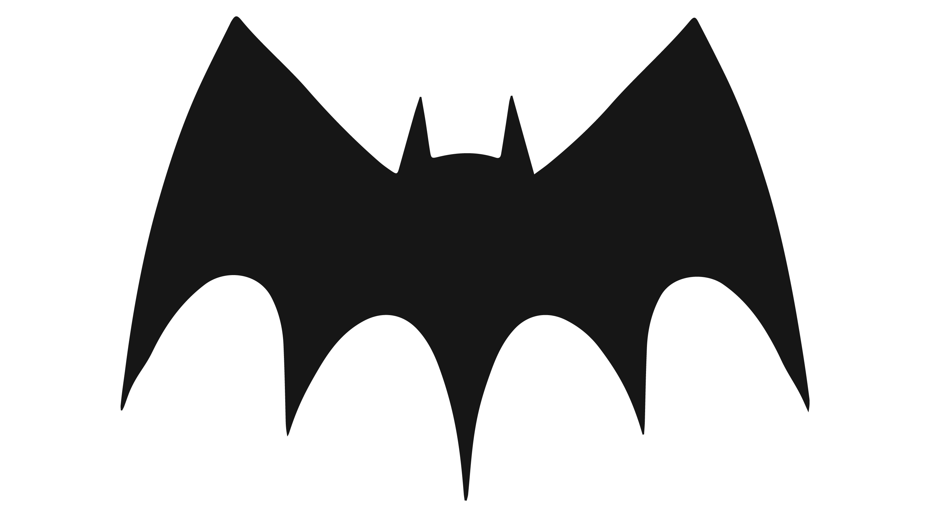
The Batman logo was also updated in 1939 to feature seven-pointed wings and a hint of a head with sharp ears. The wingtips were also sharpened, giving the logo a more dynamic and aggressive look than the original, which resembled a more traditional bat.
1940
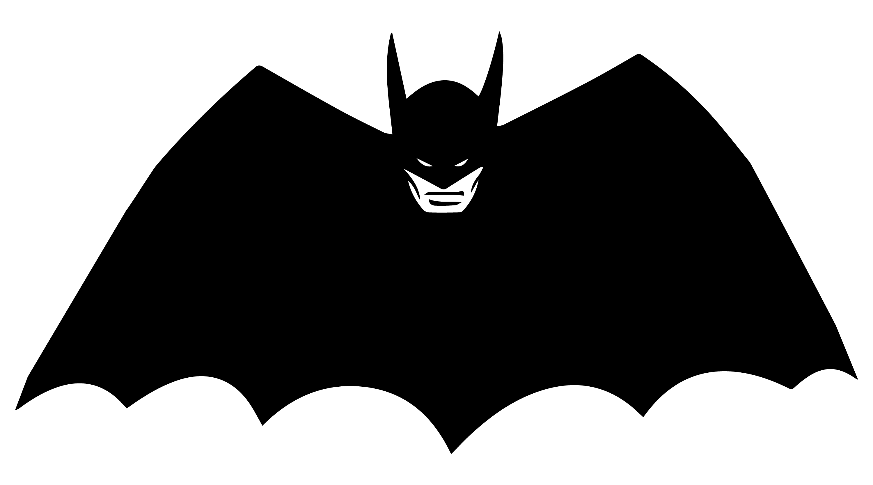
Now Batman has his own comic book series, leaving the Detective Comics series. The 1940 Batman logo was the first comic book logo that resembles a Batman costume. The wings were sharpened and given seven points, and the head was highlighted too.
Logo Title or Letters: The 1940 Batman logo uses the words “Bat” and “Man” inside the logo wings in the comics design.
Similar Font: Canarsie JNL by Jeff Levine. You can buy the font from here.
1941
This logo has Five-Point Batman Wings. But the logo became narrower and sharper, with a more angular design.
1941 Outline Symbol With Extended Wings
Batman’s logo was modified in 1941. This logo featured seven-pointed wings, but also had an outline around the symbol and the wings were extended.
1946
The 1946 modification with a wider stance and five-pointed bat wings added a new visual dimension to the Batman symbol. The logo retained the basic design elements of the bat silhouette but with these subtle changes.
1950
The 1950 Batman logo featured curved top wings, which added a dynamic element to the design and differentiated it from previous iterations. This modification contributed to the evolution of the Batman symbol and helped establish its iconic look during that era.
1958
This logo version has a raised head, curved top wings with five very pointy bottom points. It differs from the previous iteration.
1960
It is the 1960 version of the Batman logo, used in the comic books and the TV series. Carmine Infantino, a famous comic book artist, designed it.
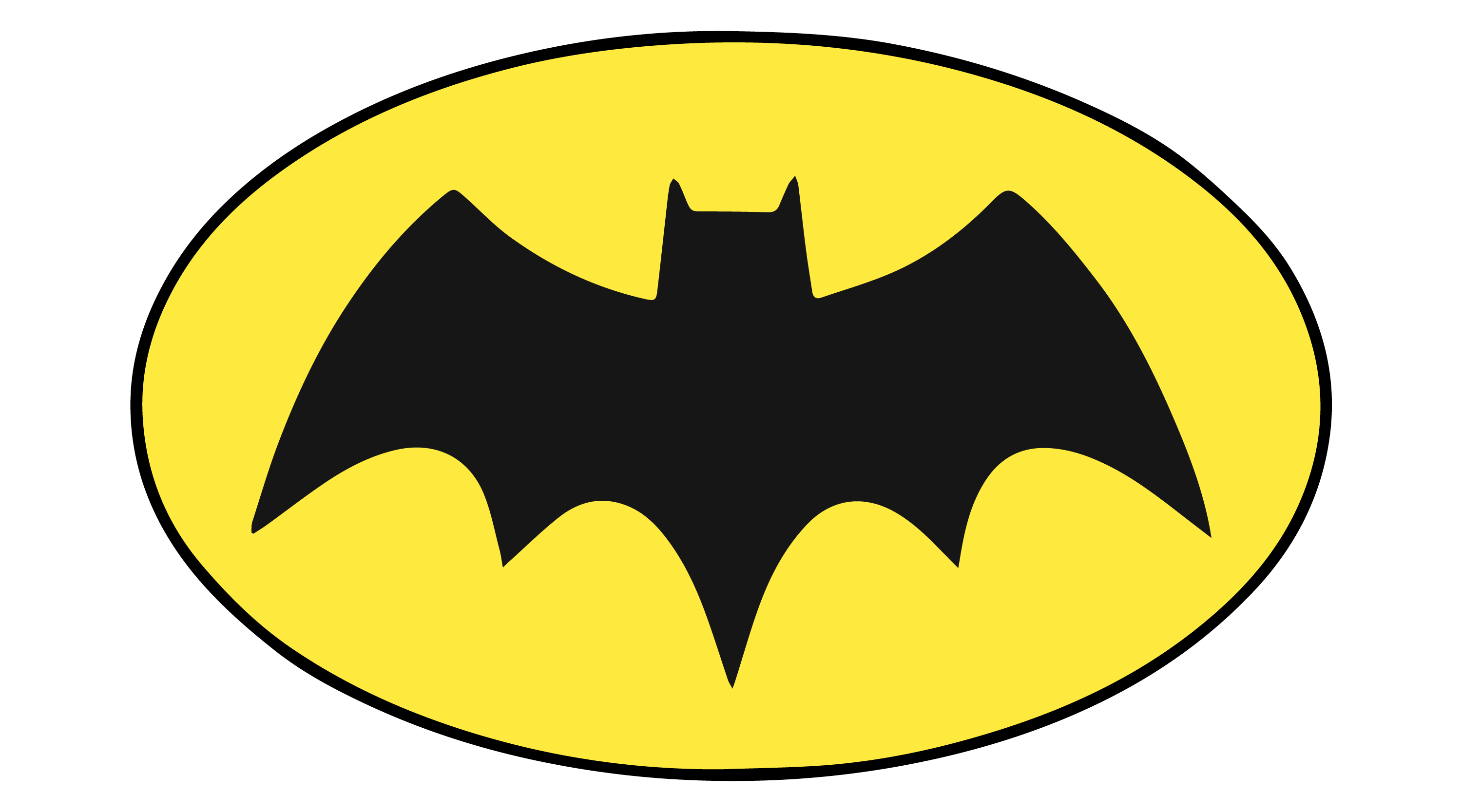
1964
It is the 1964 version of the Batman logo. It is a yellow oval with a black outline of the bat symbol. The bat symbol is a stylized bat with its wings spread out. this logo was part of the batman tv series airing from 1960s.
1965
This logo is a black-and-white image of a bat with its wings spread out. The bat’s body is shaped like a shield, and its head is pointed upwards while the wings are pointed downwards. You can download it for free from our links now!
1966
This logo is from the 1966 live-action Batman TV show starring Adam West as Batman and Burt Ward as Robin. The show was a campy and humorous adaptation of the DC Comics superhero with his sidekick Robin. The logo itself is an oval with a black bat silhouette inside, which is the symbol of Batman.
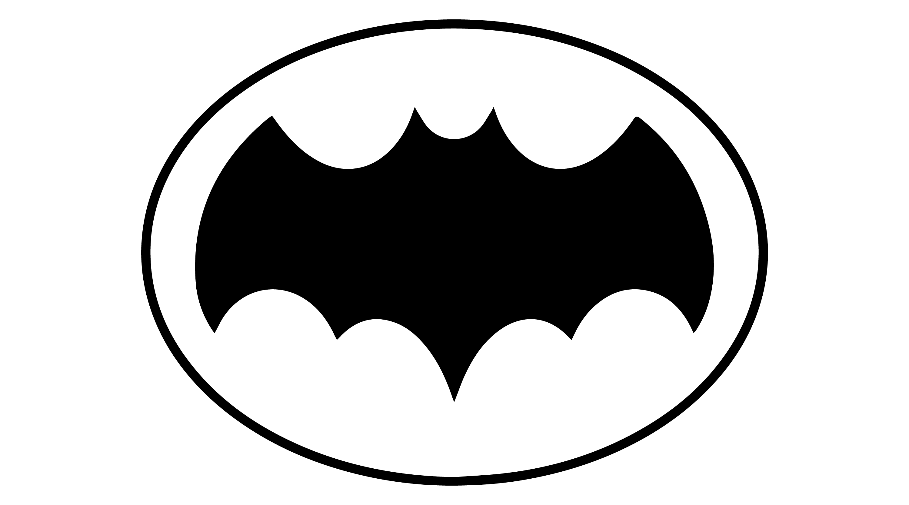
1966
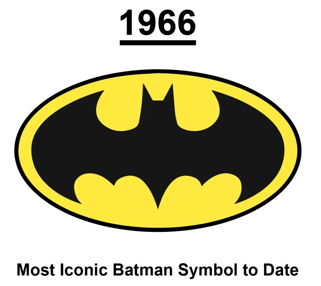
This logo is from the 1966 Batman logo design, which is considered the most iconic Batman symbol to date. The logo is a black bat silhouette inside a yellow oval with a black border. The logo emblem was created for the 1966 live-action Batman TV show starring Adam West as Batman and Burt Ward as Robin.
1972
This logo is from the 1972 Batman comic book series, which DC Comics published. The series featured stories by various writers and artists, such as Denny O’Neil, Neal Adams, Frank Robbins, Irv Novick, and Dick Giordano. The logo itself is a stylized image of Batman’s head and cape. The logo is in black and white, contrasting with the colorful covers and interiors of comic books.
1977
This logo is from the 1977 animated series “The New Adventures of Batman”, which was produced by Filmation and aired on CBS. The logo itself is a black bat with a white outline, which is the symbol of Batman. The bat has a pointed head and two pointed ears, and its wings are spread out and have three points on each side.
1983
This logo is from the 1983 comic book series “Batman and the Outsiders” published by DC Comics. The series featured stories by various writers and artists, such as Mike W. Barr, Jim Aparo, and Alan Davis. The series introduced a new superhero team led by Batman, who quit the Justice League after they refused to help him rescue Lucius Fox from Markovia.
The logo is a black bat silhouette with a small Batman head in the center. The bat’s wings are spread wide, and it’s a line with no pointed wings coming out like other logos. The logo is simple and elegant and reflects the team’s identity as outsiders who follow Batman’s lead.
1986

This logo is from the 1986 comic book series “Legends of the Dark Knight,” published by DC Comics. The series featured stories by writers and artists, such as Dennis O’Neil, Grant Morrison, and Frank Miller. The series was an anthology that focused on different aspects of Batman’s character, primarily set in his early career years.
The logo is a stylized version of the Batman logo, with the bat’s wings spread out in a pointed, sharp shape and the head in the center. The logo is simple and elegant and reflects the diversity and creativity of the series. The logo was designed by Todd Klein, a letterer and designer who worked for DC Comics for over 30 years.
1989

It is a chest emblem from the 1989 Batman film directed by Tim Burton. The logo itself is a black bat with outstretched wings inside a white oval with a black border. You will find this emblem on his bat-suit chest.
1989
This logo is from the 1989 Batman film directed by Tim Burton, starring Michael Keaton as Batman and Jack Nicholson as the Joker. The film was the first installment of Warner Bros.’s initial Batman series and was a critical and commercial success. The logo is a black bat with outstretched wings inside a white oval with a black border.
The logo is simple and sleek and reflects the dark and serious tone of the film. The logo was designed by Anton Furst, a production designer who worked on the film and created the Gothic look of Gotham City. The logo is considered one of the most iconic and recognizable Batman logos, representing a new and popular interpretation of the character and his world.
1989
This logo is from the Legends of the Dark Knight comic 1989. It is a more angular and sharp bat symbol without an oval border.
1992
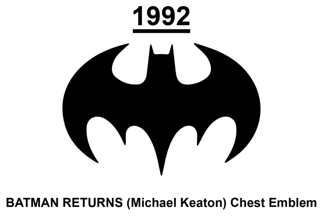
This chest emblem is from the 1992 film “Batman Returns” directed by Tim Burton. The bat emblem is stylized with sharp edges and points and is the same as the one on Batman’s chest in the film. The simple and sleek logo reflects the film’s dark and serious tone.
1993
This logo is from the Knightfall comic series that ran from 1993 to 1994. The series featured Batman’s defeat by Bane, who broke his back and paralyzed him. Batman was replaced by Azrael, a violent and unstable vigilante who modified the Batman suit and became more brutal. The logo has a more pointed and angular design. Inside a black circle, the logo is a black bat with pointed wings and a tapered tail.
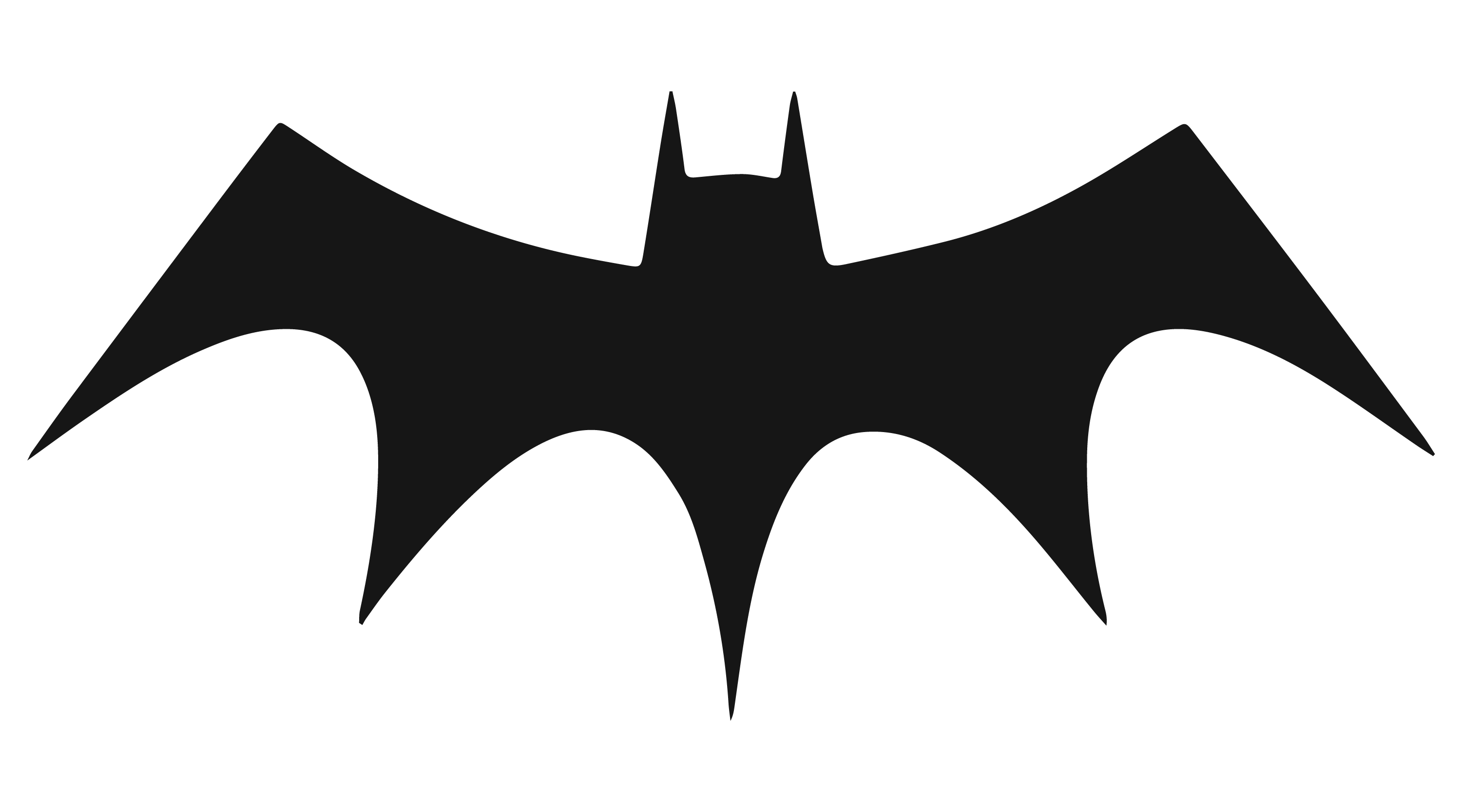
1995
This logo is from the 1995 film Batman Forever, directed by Joel Schumacher. The film was the third installment of the Batman series, beginning with Tim Burton’s Batman in 1989. The wings are sharp and bend in half a circle. The bat symbol is black and is in the center of the image. The logo is simple and sleek and reflects the action and adventure of the film.
1995
This logo is from the Batman Chronicles comic series from 1995 to 2001. The series was published by DC Comics and featured stories by various writers and artists. The logo is a variation of the iconic Batman logo, with a more pointed and angular design. The logo is a black bat with pointed wings and a pointed tail. This logo is considered one of the most distinctive and memorable Batman logos.
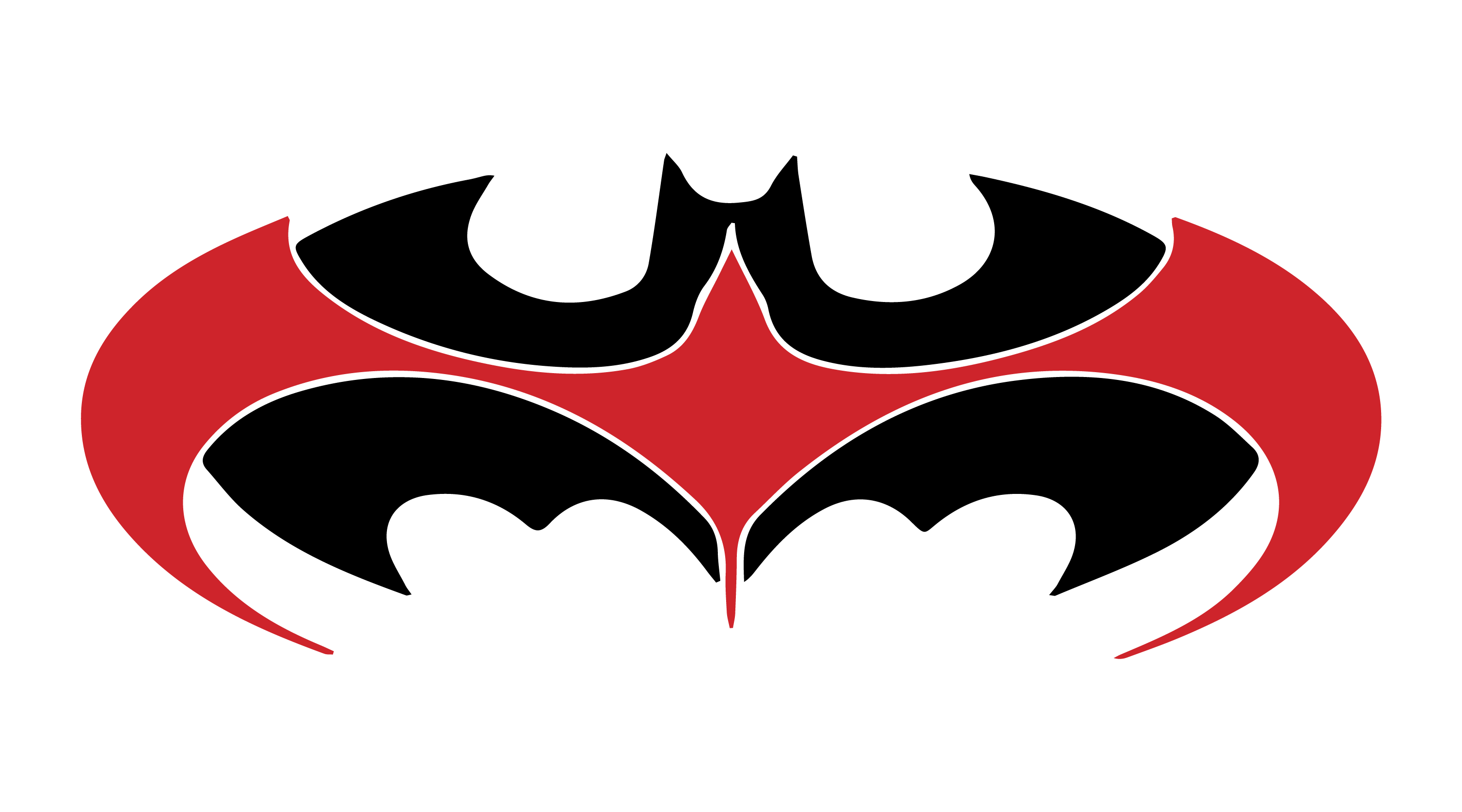
1997
This logo is from the 1997 film Batman & Robin, directed by Joel Schumacher and starring George Clooney as Batman. The film was a box office failure and received negative reviews from critics and fans, who criticized the campy tone, the excessive use of puns, and the poor acting. The logo is different, with two bat symbols: one is black, and the other is red. It has a more curved and smooth design than the previous logos.
1998
This logo is from the Batman Chronicles comic series from 1995 to 2001. The series was published by DC Comics and featured stories by various writers and artists, primarily set in the early years of Batman’s career. The series was not part of the main continuity and allowed the creators to experiment with different styles and genres. The bat silhouette is stylized with sharp points and curves. The logo is simple and elegant and reflects the diversity and creativity of the series.
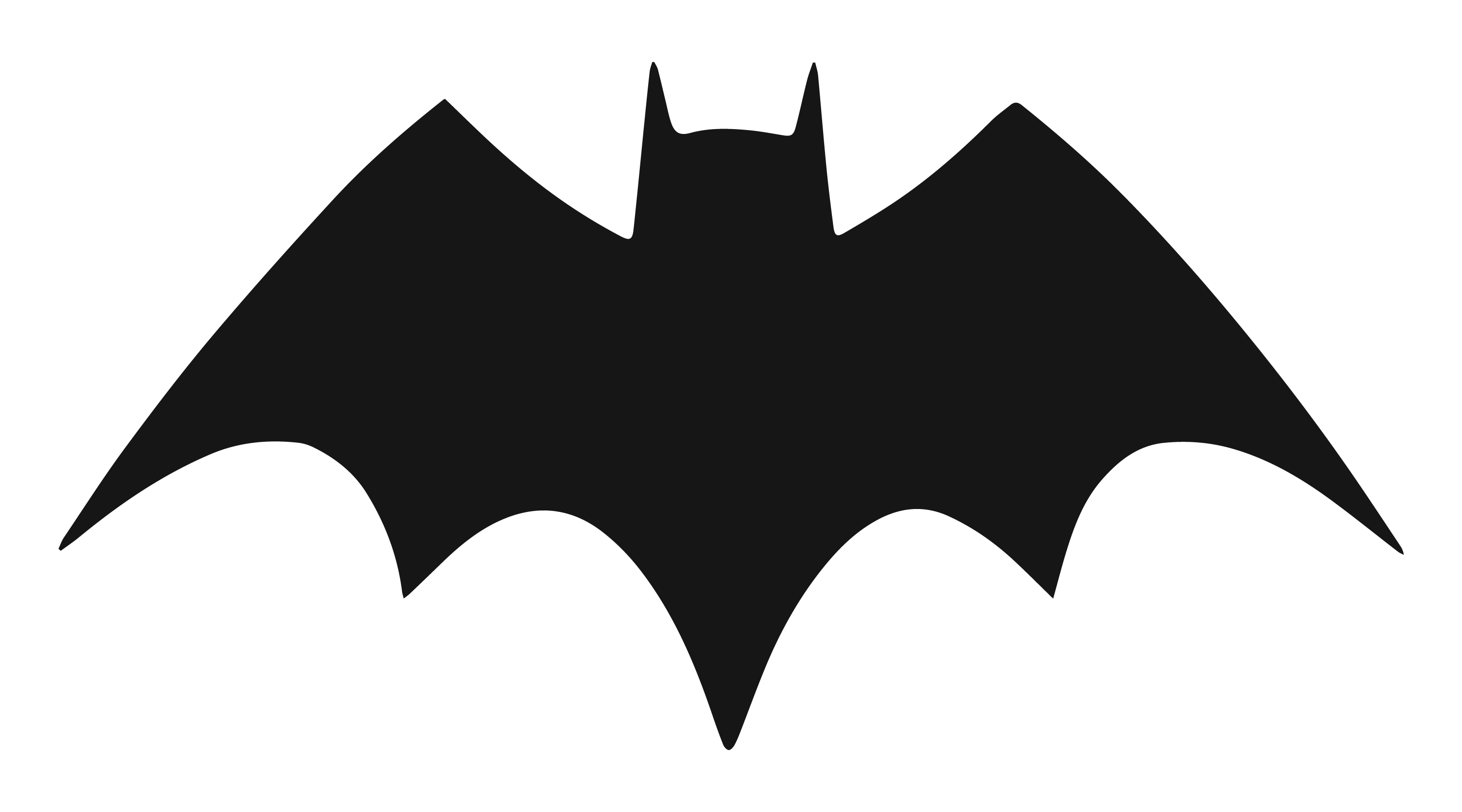
1999
The logo is a variation of the iconic Batman logo, with a bulkier and blockier design. The logo is a black bat with thick wings and a thick tail. The simple and bold logo reflects the character’s strength and resilience in Gotham City.
1999
This logo is from the animated series Batman Beyond, which aired in 1999. The series was a spin-off of Batman: The Animated Series and a part of the DC Animated Universe. The logo has a futuristic and angular design. The emblem is a stylized bat with pointed wings and a curved body. The bat is black, and the background is white.
2001
This logo is from the 2001 video game Batman Vengeance, based on the animated series Batman: The New Batman Adventures. Ubi Soft developed and published the game in conjunction with Warner Bros. and DC Comics. The logo is a bat with outstretched wings that are sharp at the end and a pointed head. The bat is black, and the background is white.
2003
This logo is from the Batman: Gotham Knight comic series from 2003 to 2004 and was published by DC Comics. The logo is a black bat with pointed ears and wings spread wide with sharp edges on the wings. The bat is on a transparent background.
2004
This logo is from the 2004 animated series The Batman, based on the DC Comics superhero Batman. The series was produced by Warner Bros. Animation and aired on Kids’ WB and Cartoon Network. The logo has a stylized bat with a pointed head and wings, and the wings get longer at both ends. The bat is black, and the background is transparent.
2005
This logo is for the Dark Knight trilogy, a series of three superhero films based on the DC Comics character Batman, directed by Christopher Nolan. The trilogy consists of Batman Begins (2005), The Dark Knight (2008), and The Dark Knight Rises (2012). This logo has a white background and a black bat in the center. The bat has four pointed sharp edges on the wings on the sides, sharp edges, and a pointed tail.
2007
This logo is for the 2007 comic book crossover event “Superman and Batman vs. Alien and Predator”. It is a combination of the iconic logos for Batman and Superman, two of the most popular superheroes from DC Comics. The logo has a black silhouette of a bat with a pointed tail and two pointed ears. It is a symmetrical shape with a curved top and a pointed bottom.
2009
This logo is for the 2009 Batman and Robin comic book series, which was an ongoing series written by Grant Morrison and featuring Dick Grayson as Batman and Damian Wayne as Robin. The logo has a black bat with a pointed head and wings that curve down and up. The wings have three points on the bottom and two on the top. The bat shape shows the bat flying with its wings spread out.
2011
This logo is for the 2011 animated film “Batman: Year One”. The film adaptation of the acclaimed graphic novel of the same name by Frank Miller and David Mazzucchelli tells the origin story of Batman and his first year as a vigilante in Gotham City. The logo has a black bat with a pointed head, two pointed ears, and two pointed wings. The wings curve downwards, and the bat’s body is round.
2016
This logo is for the 2016 movie “Batman v Superman: Dawn of Justice” part of the DCEU movie franchise. This logo is a black bat silhouette with pointed wings and a curved body. In the mid, it was expanded to include the iconic Superman logo. This logo was meant to show the iconic heroes together.
2017
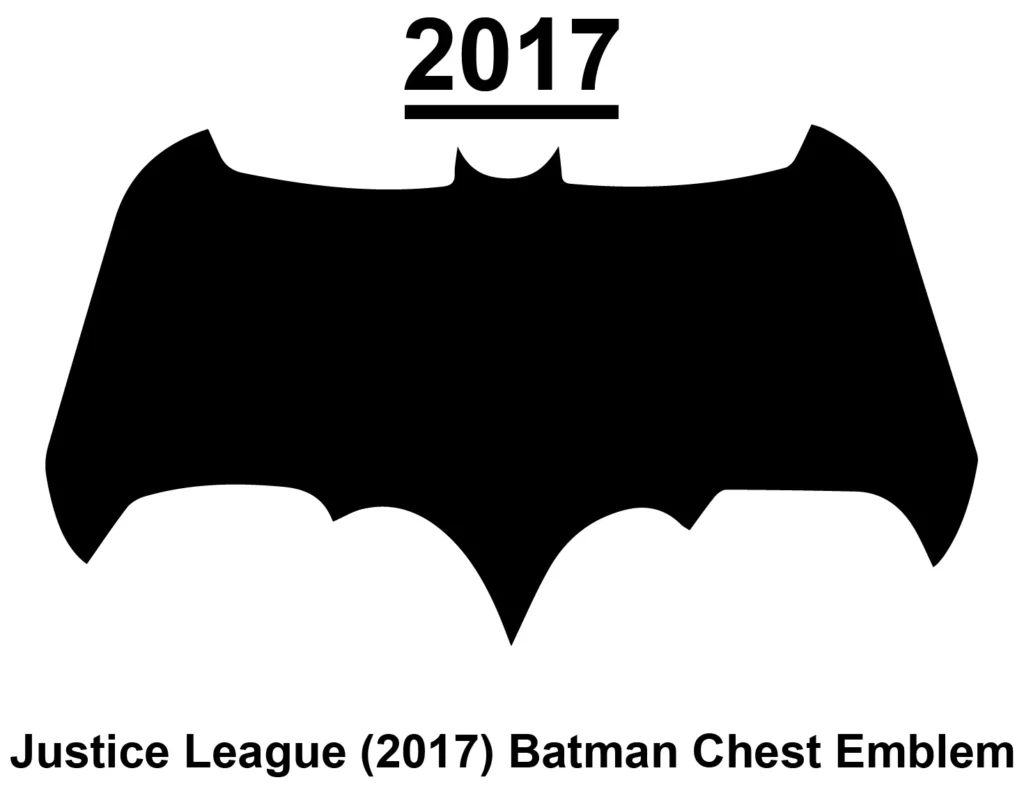
This logo is for the 2017 Justice League Batman Chest Emblem. Justice League movie is a 2017 American superhero film based on the DC Comics superhero team of the same name. It was produced by Warner Bros. Pictures and DC Entertainment and distributed by Warner Bros. Pictures. The film is the fifth installment in the DC Extended Universe (DCEU) and is directed by Zack Snyder. The bat shape is a black silhouette of a bat with a wide wingspan and pointed ears. The wings are curved and the body is small. The bat is symmetrical on the wings.
2022
This logo is from the newly released Batman movie. The 2022 Batman movie is called “The Batman.” It is a reboot of the Batman film franchise, starring Robert Pattinson as Bruce Wayne / Batman, a vigilante who fights crime in Gotham City. The film is directed by Matt Reeves, who also co-wrote the screenplay with Peter Craig. The logo has a stylized bat shape with pointed wings and a tapered head. The wings are spread out, and the body is small. The bat in the logo looks like it is flying with its wings spread.
Conclusion
The Batman logo is a graphic design representing the superhero Batman, a fictional character from DC Comics. The logo has changed over the years, depending on Batman’s different versions in comics, movies, TV shows, and video games. Various artists, such as Ariel Olivetti, created the logo. The logo symbolizes Batman’s identity and mission who fights crime and injustice in Gotham City. It also appears on Batman’s costumes, posters, and promotional materials. The logo is a simple and elegant design that captures Batman’s essence and legacy. It is one of the most recognizable and iconic symbols in comics and pop culture.