Today we will introduce you to the world of the Apple logo. Apple is one of the most influential and successful companies in the world. It is known for its innovative and high-quality products, such as the iPhone, the iPad, the Mac, the Apple Watch, and the AirPods. Apple is also a leader in e-commerce, cloud computing, digital streaming, and artificial intelligence. Apple’s brand identity is spearheaded by its iconic logo, which is recognized by millions of people around the globe.
Note: You can download all the PNG and Vector files for free. But you need to credit us or mention Similarlogo website in your work and blog posts. Enjoy!
In this article, we will explore the origin, evolution, and significance of the Apple logo and how it has become one of the most potent symbols in the world.
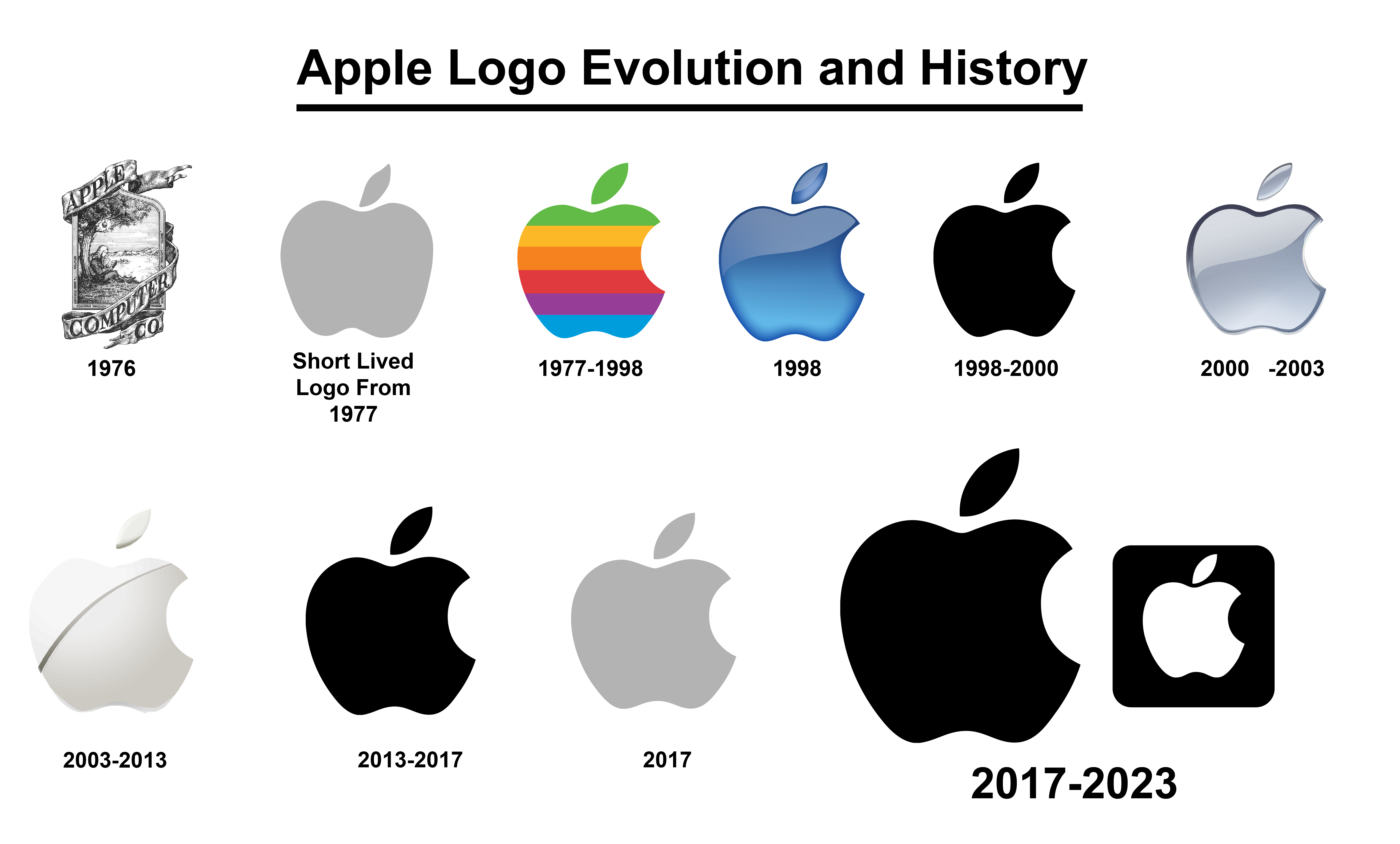
Apple Logo Evolution and History
The Apple logo is a simple and elegant design consisting of an apple with a bite taken from it. The logo has a long and exciting history, evolving to reflect the company’s vision, values, and offerings. The logo has also been subject to various interpretations and myths, from the biblical story of Adam and Eve to the tragic death of Alan Turing. Different graphic designers designed the logo; each contributed to the logo’s development and meaning.
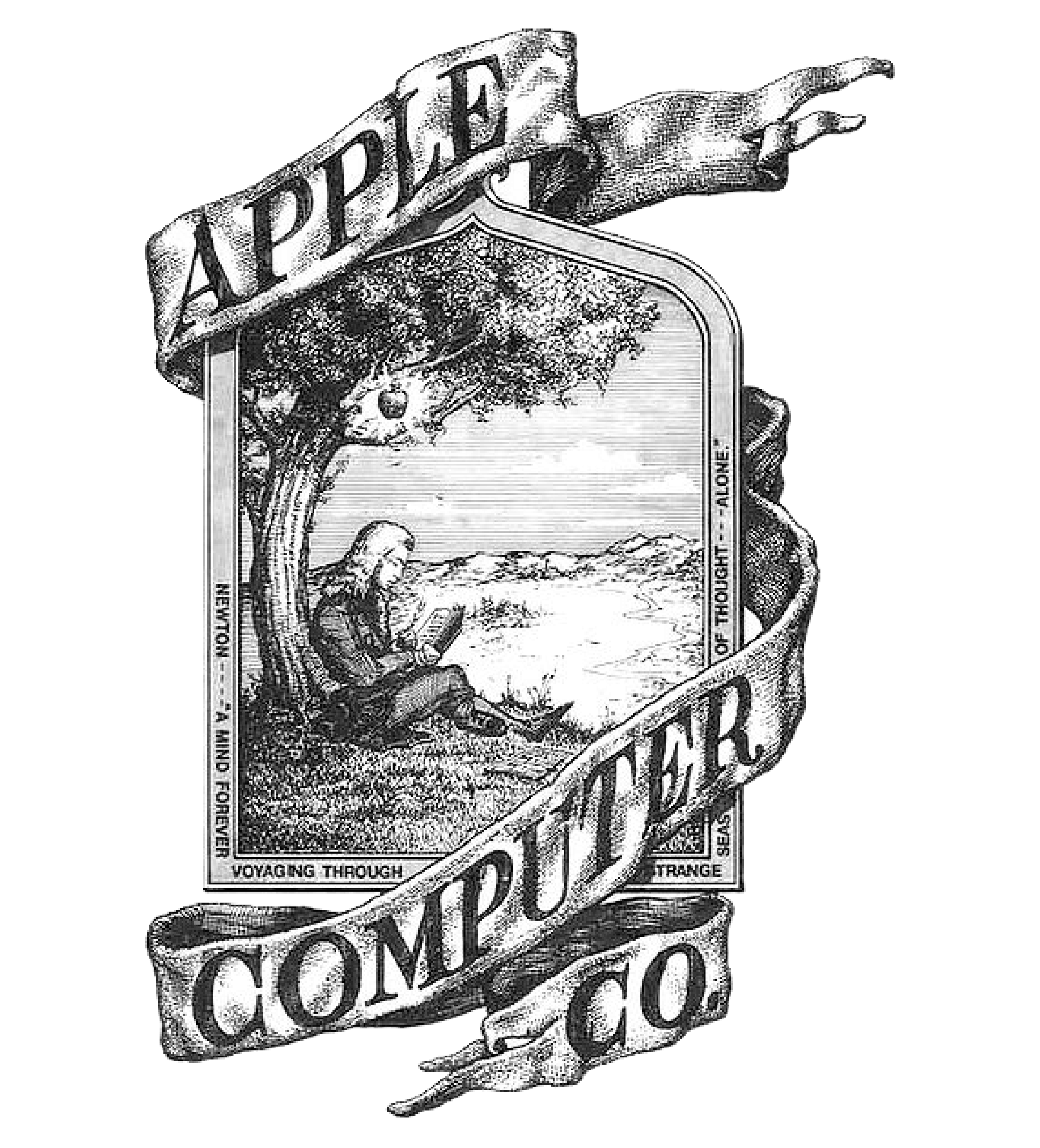
1976
The logo on the left side of the image is the original Apple Computer Co. logo from 1976. It is a black and white illustration of Sir Isaac Newton sitting under an apple tree with a banner that reads “Apple Computer Co.” and the year “1976” below it.
The logo was designed by Ronald Wayne, one of the co-founders of Apple along with Steve Jobs and Steve Wozniak. Wayne was also the first employee of Apple and owned 10% of the company’s shares. The logo was inspired by a famous story about Newton, who discovered the law of gravity after an apple fell on his head. The logo was meant to represent the company’s vision of innovation, discovery, and enlightenment.
However, the logo was soon replaced. The logo was only used for a year, from April 1976 to April 1977. The logo was never printed on any Apple products, but only on the company’s stationery and literature. The logo was very expensive to print, as it required a lot of ink and detail.
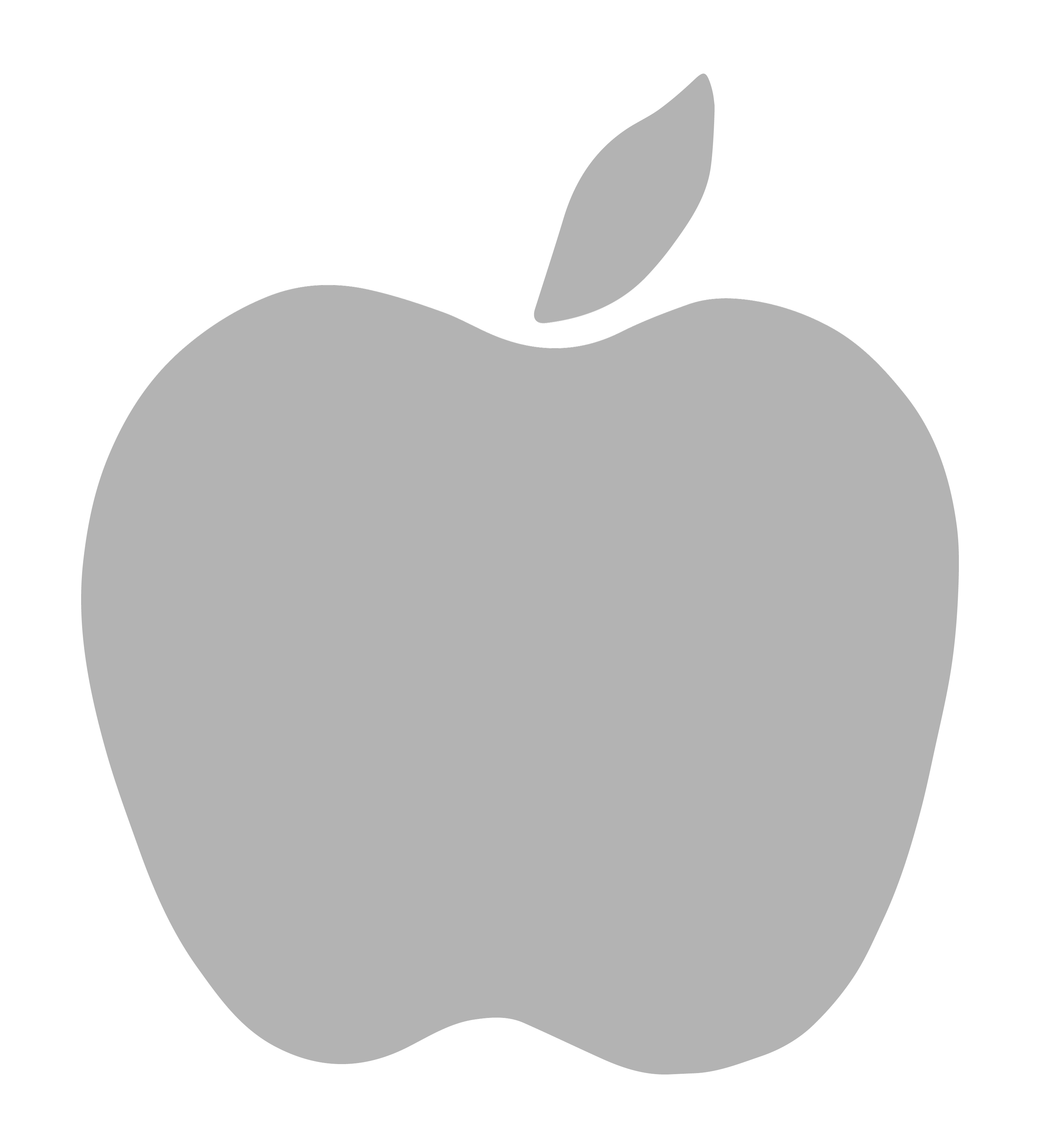
1977
Apple logo from 1977. It is a gray apple with a leaf on top. The logo was designed by Rob Janoff, He made this brief logo before changing it to the iconic version.
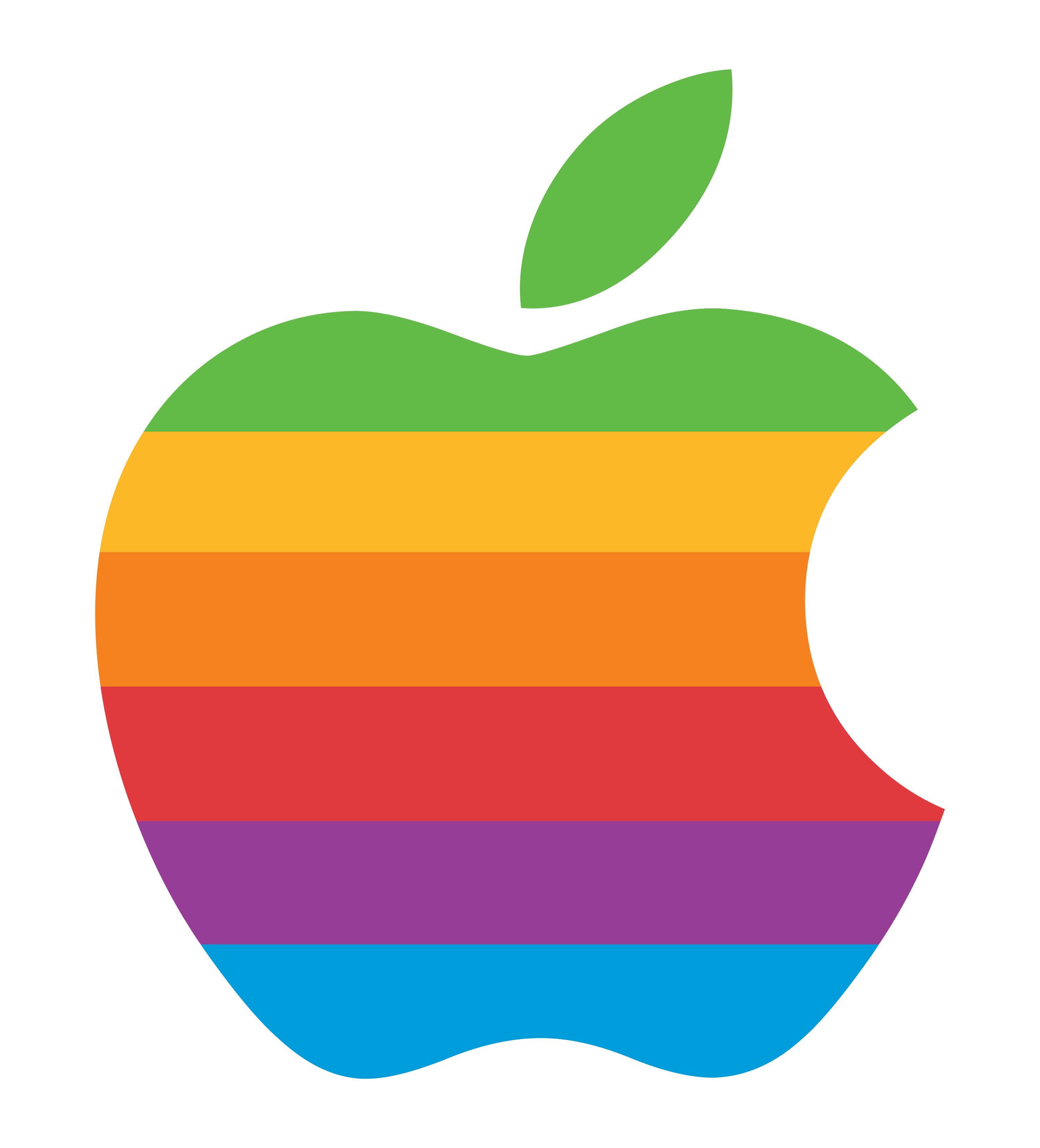
1977 To 1998
This is the old and famous Apple logo, used from 1977 to 1998. It is a rainbow-colored apple with a bite taken out of it and a green leaf on top. The logo was designed by Rob Janoff, a graphic designer who worked with Steve Jobs. Jobs hired them to design the company logo and make it simple.
The bite mark was added to prevent confusion with other fruits and to create a pun on the word “byte.” The rainbow colors were chosen to represent the diversity and creativity of the company. The logo also has a hidden meaning, as it symbolizes the forbidden fruit from the biblical story of Adam and Eve.
1998
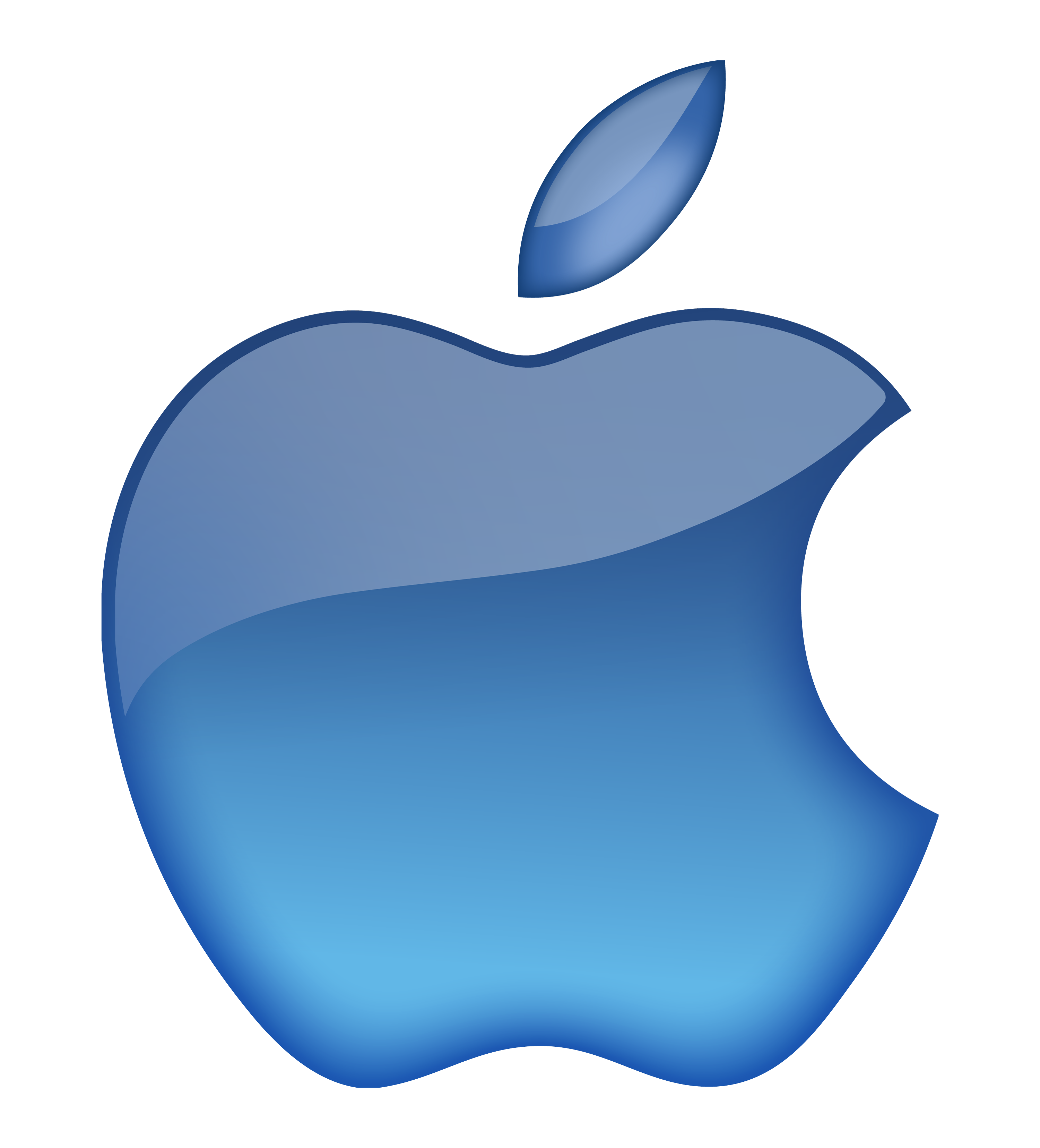
This is the Apple logo of 1998. It is a blue gradient version of the iconic apple with a bite taken out of it and a leaf on top. The logo was introduced in 1998, coinciding with the release of the iMac G3, as part of Apple’s rebranding strategy. It replaced the rainbow-colored logo that had been used since 1977.
1998 To 2000
The logo in the image is the Apple logo used from 1998 to 2000. It is a black silhouette of an apple with a bite taken out of it and a leaf on top. Apple used this monochrome color logo briefly before changing it soon.
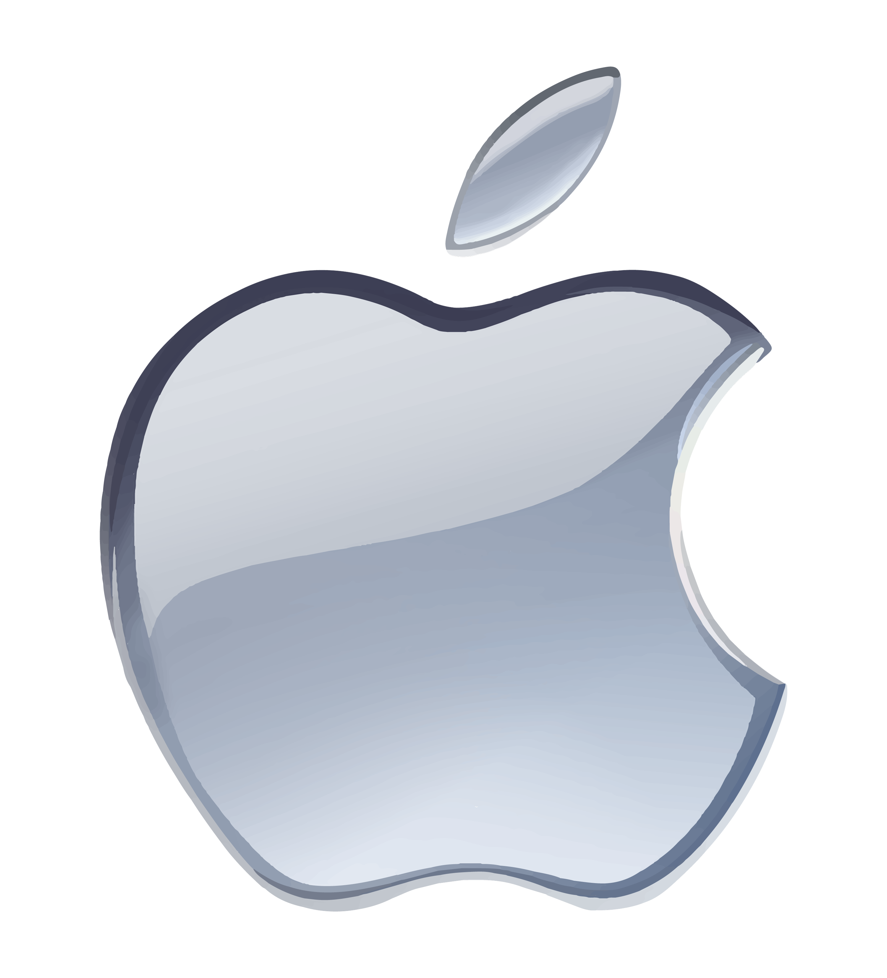
2000-2003
This particular version of the logo was used from 2000 to 2003. It is a silver-colored logo with a grey gradient and a darker outline. The logo was introduced in 2000 as part of Apple’s rebranding strategy. It replaced the black silhouette logo that had been used since 1998.
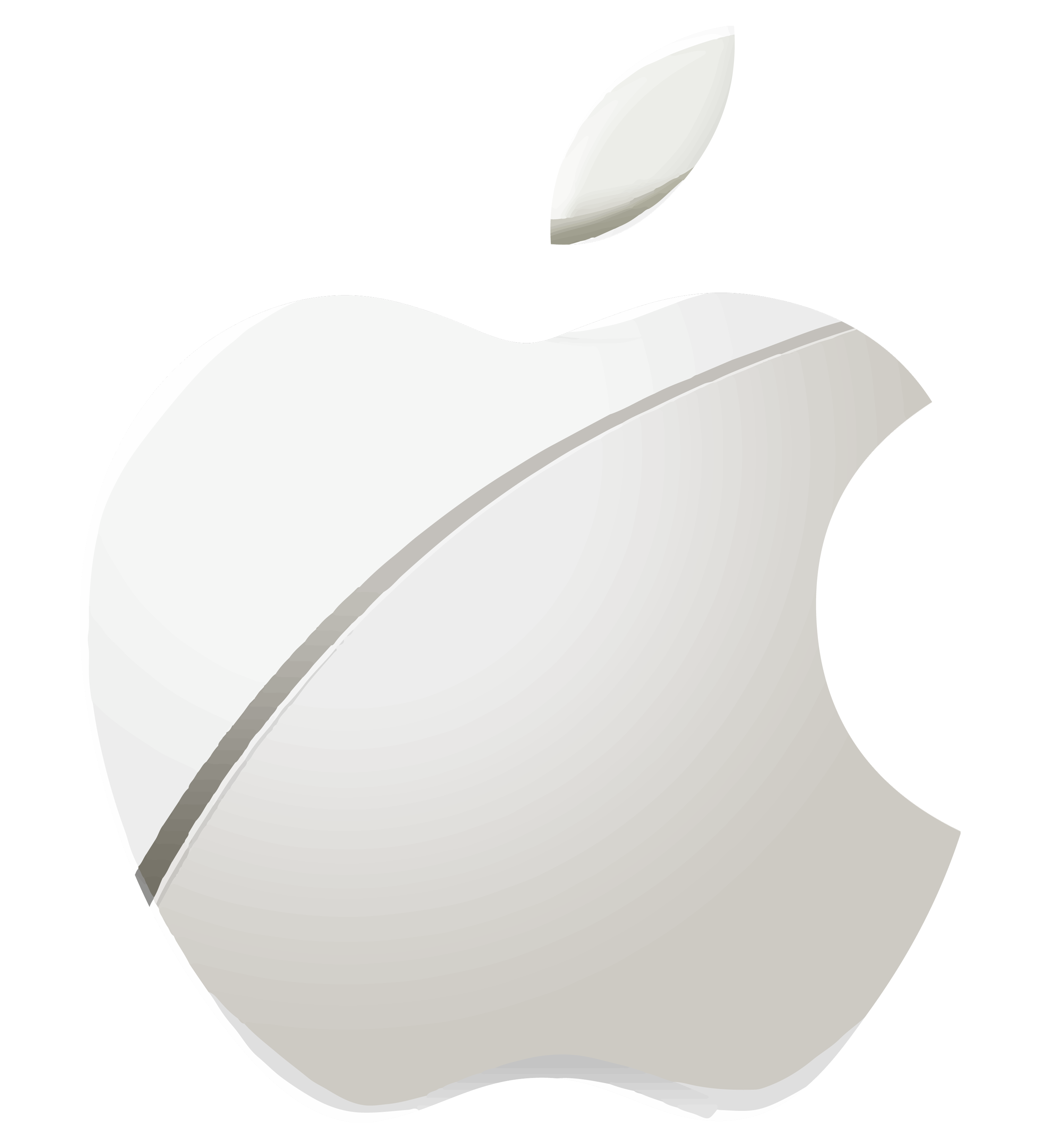
2003-2013
This Apple logo is white with a gray outline and has a bite taken out of it from the right side and vertical slice. It was also known as the sliced Apple logo. The logo had a simpler, sleeker look and design, with a sliced apple shape. It was used for 10 years in the company’s service.
2017
Apple went back to a single-color monochromatic logo in 2017. This time, they chose a dark grey color to visualize their logo. The current logo has been used in many of Apple’s products and services, such as the iPhone, iPad, Mac, iTunes, and iCloud.
2017-2023
The current one shows two Apple logos, one larger and one smaller white apple, inside the black box. It’s a logo used from 2017 to 2023.
Some Apple Event Logos
Apple events are when Apple announces its new products and services to the media and the public. Apple usually holds several events throughout the year, such as WWDC, iPhone launch, and special events.
Apple events are known for their unique and artistic logos, which often hint at the theme or the products that will be revealed at the event. Apple events also showcase Apple’s creativity and innovation, as well as its brand identity and vision. Now, we will talk about the logos used in some of those Apple events. You can also download this logo from the button below!
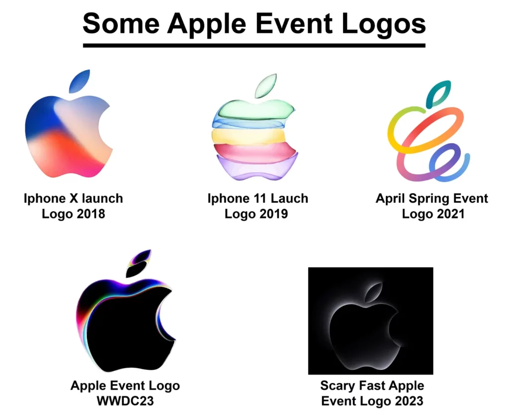
2018
This logo is the one Apple used for the 2018 launch of the flagship smartphone iPhone X. It is 3D a variation of the classic Apple logo. This version of the logo has a gradient of colors, including blue, pink, and orange, which gives it a modern and fresh look. The logo was designed by Apple’s in-house design team and was used in marketing materials for the iPhone X launch.
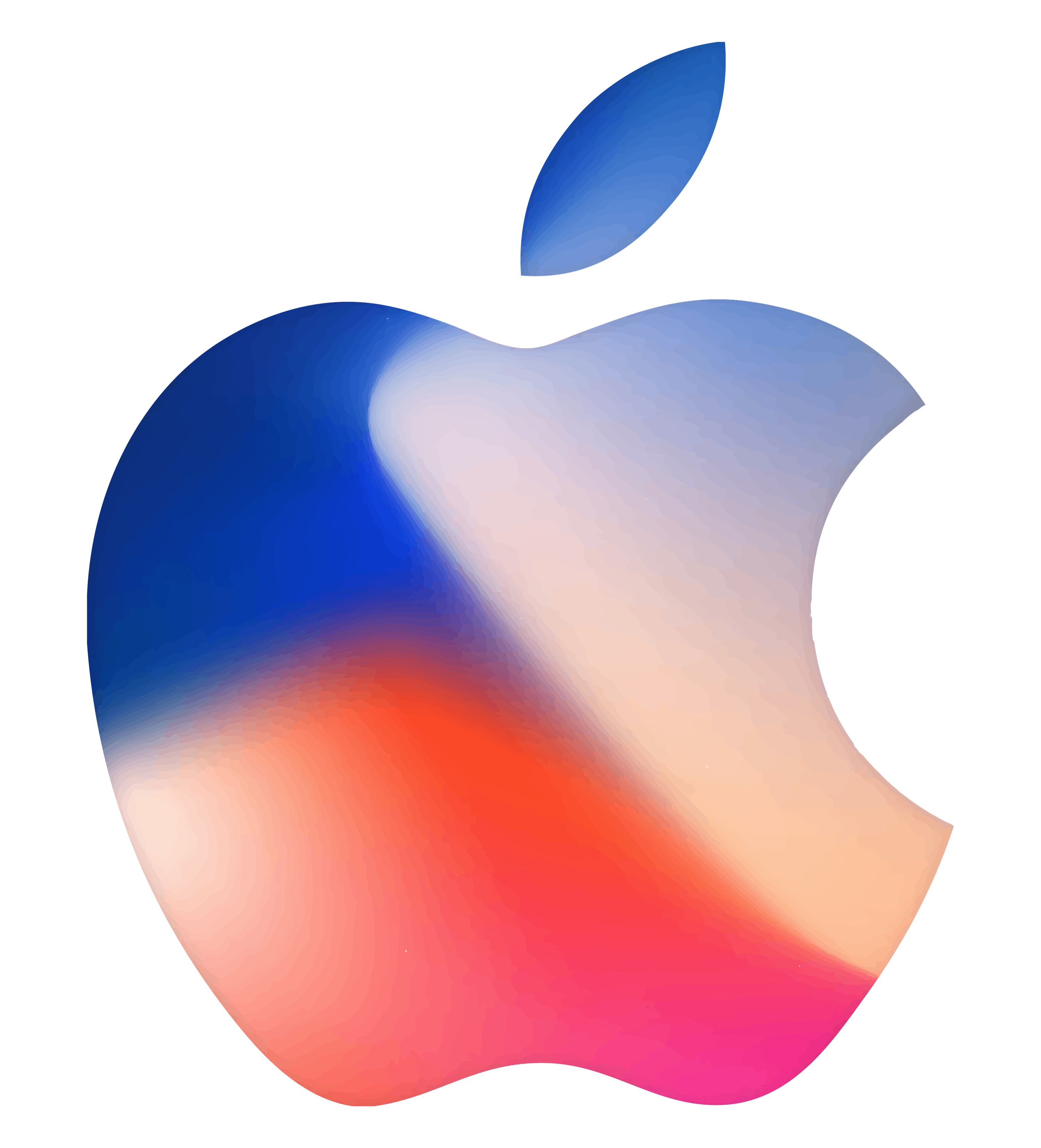
2019
This logo is the one that Apple used for the launch of the iPhone 11 in 2019. It is a variation of the classic Apple logo. This version of the logo is a stylized apple with a leaf on top. The apple is made up of six layers, each a different color. From top to bottom, the colors are green, blue, yellow, orange, pink, and red. The logo is on a white background. The colors represent the different colors that the iPhone 11 is available in.
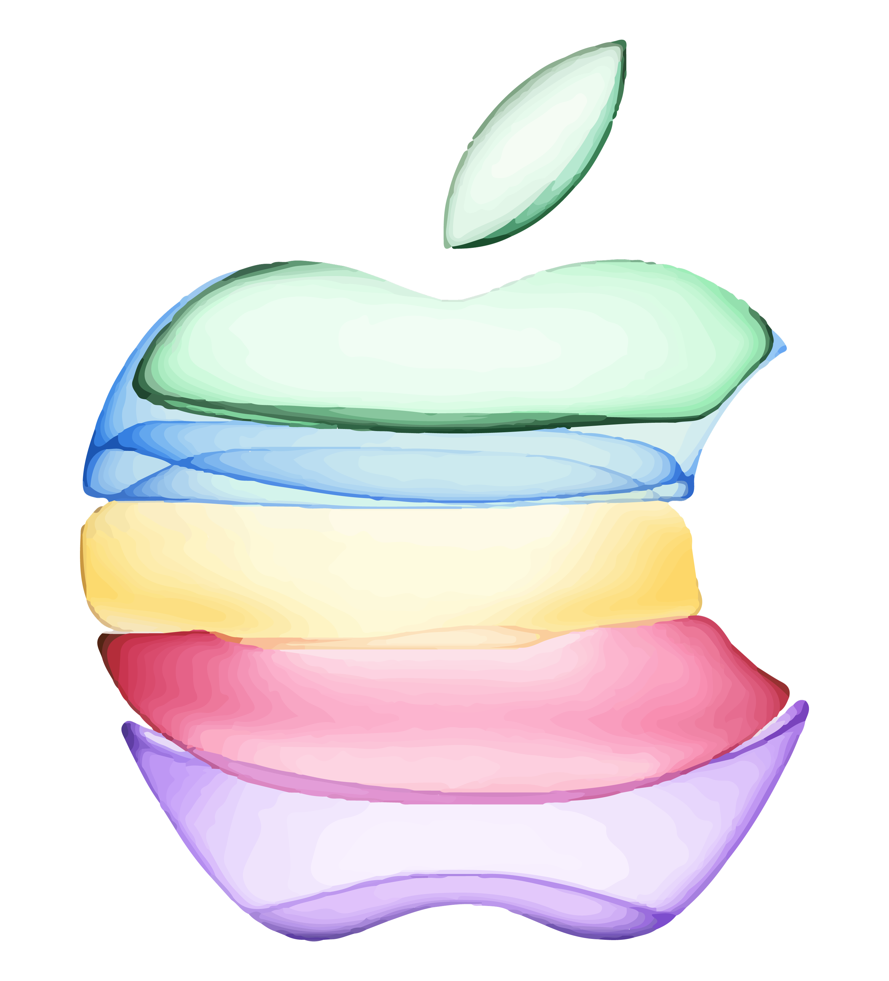
2021
Apple used this logo for their April Spring Event 2021. It is a colorful and modern design featuring a rainbow-colored stylized apple. The apple is made up of three overlapping loops. The loops are in the colors of the rainbow, with the top loop red, the middle loop yellow, and the bottom loop blue. The design is meant to represent the freshness and vibrancy of spring. The logo was designed by the Apple design team and used in Spring Event 2021 marketing materials.
WWDC23
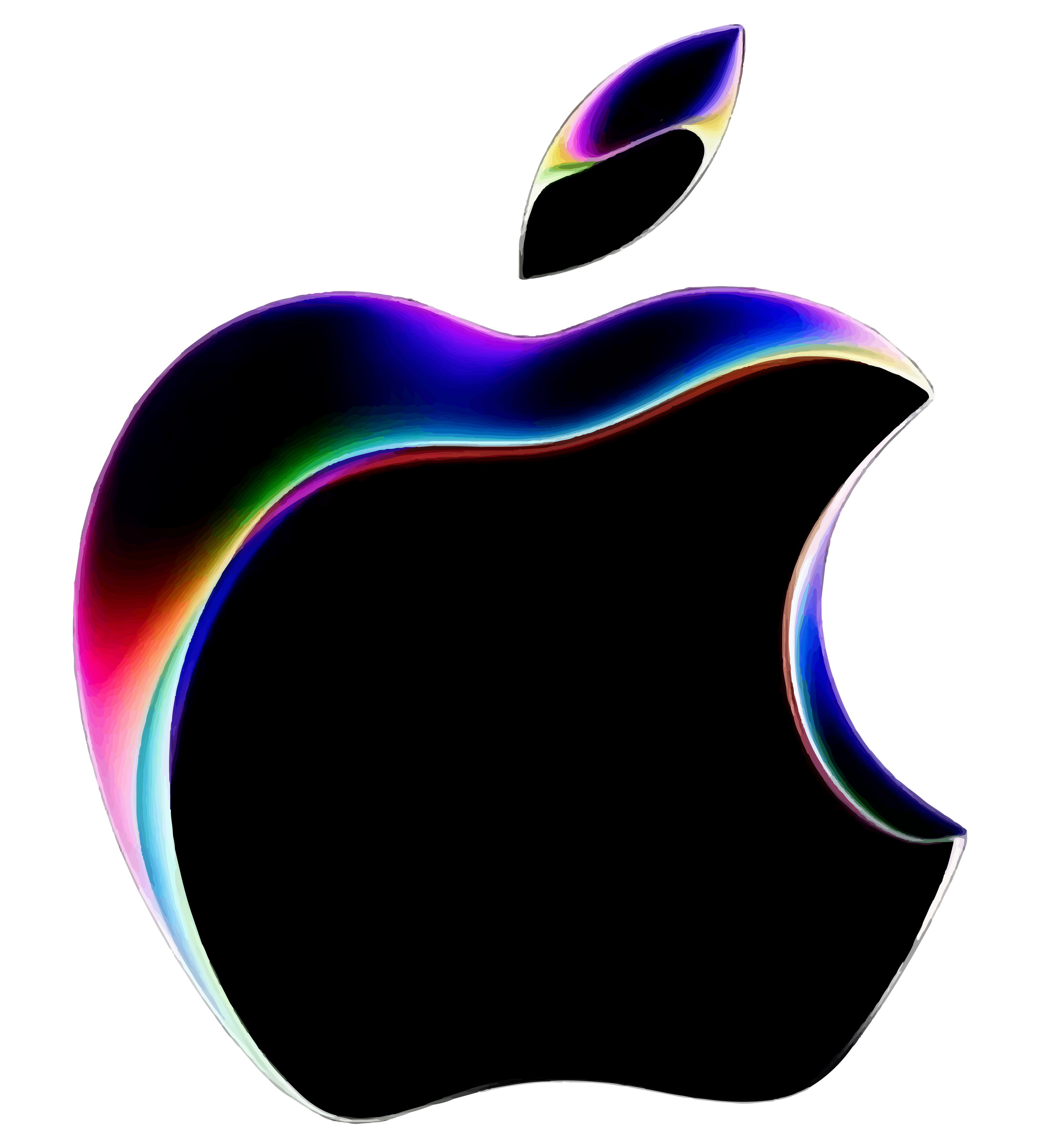
This logo is for the Apple Worldwide Developers Conference (WWDC) 2023, an annual event where Apple showcases its new software and technologies for developers. The Apple logo has a black apple with a shimmering rainbow gradient on the edges to give it a 3D feel. The apple has a bite taken out of it on the right side and a leaf on the top left. The logo is designed to represent the creativity and innovation that the event brings.
2023
The Scary Fast Apple event logo is a Halloween-themed version of the Apple logo. It was used to promote the event on October 30, 2023. The event showcases new Mac products and features, such as Apple Vision Pro, the 15-inch MacBook Air, and the Mac Studio and Mac Pro. The Apple event logo is black, and the border around the Apple has a 3D white effect, giving it an ominous and spooky look.
Apple One Services Logos

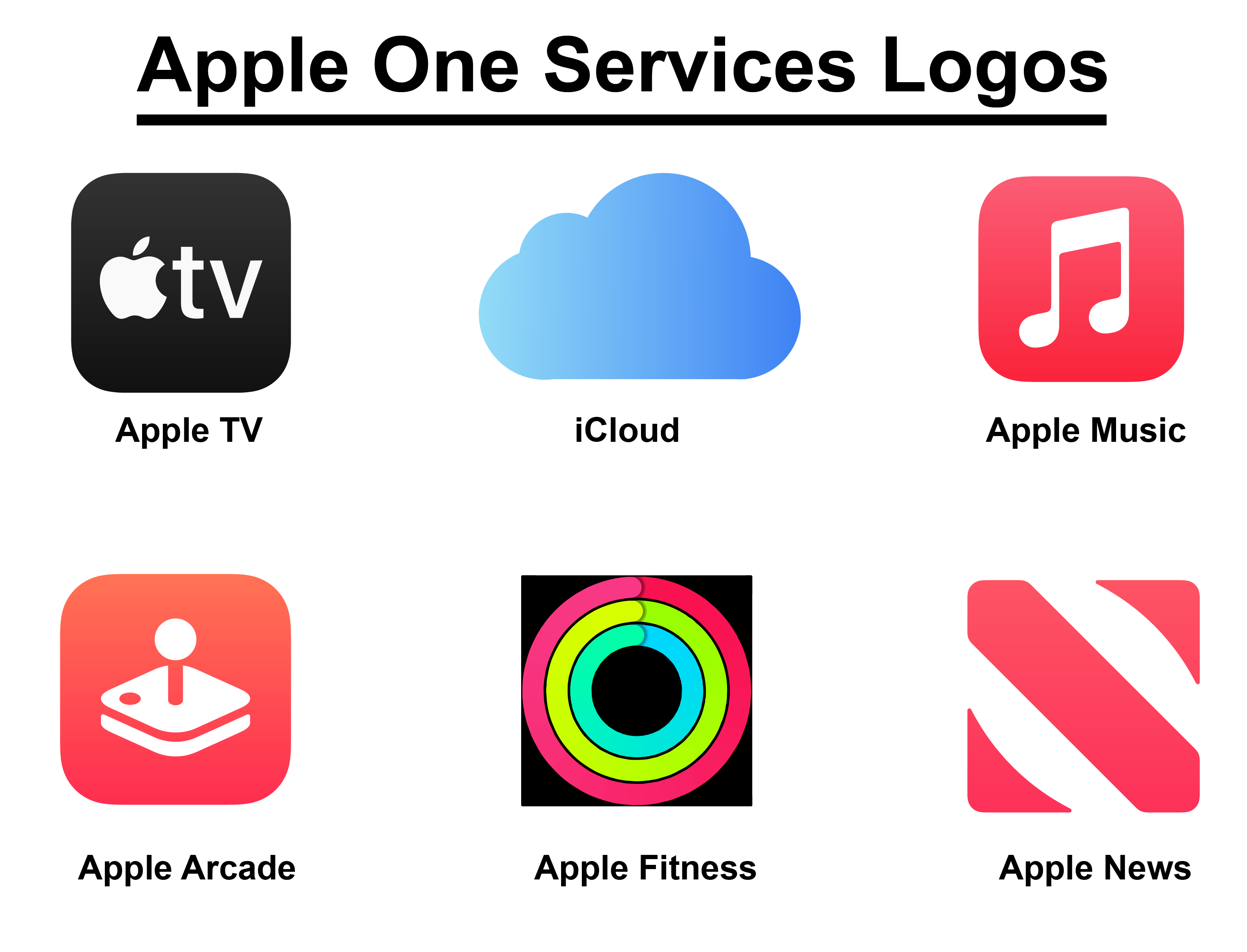
Apple One is a service offered by Apple that bundles various Apple services into a single subscription, providing users with access to multiple services for a single monthly payment. The services included in Apple One vary by the subscription tier, but they can include Apple Music, Apple TV+, Apple Arcade, iCloud+, Apple News+, and Apple Fitness+. The logos used in these services visualize Apple’s different subscription services in one bundle. The logos are designed to reflect the nature and features of each service, as well as the Apple brand identity. Let’s talk about the logos one by one now.
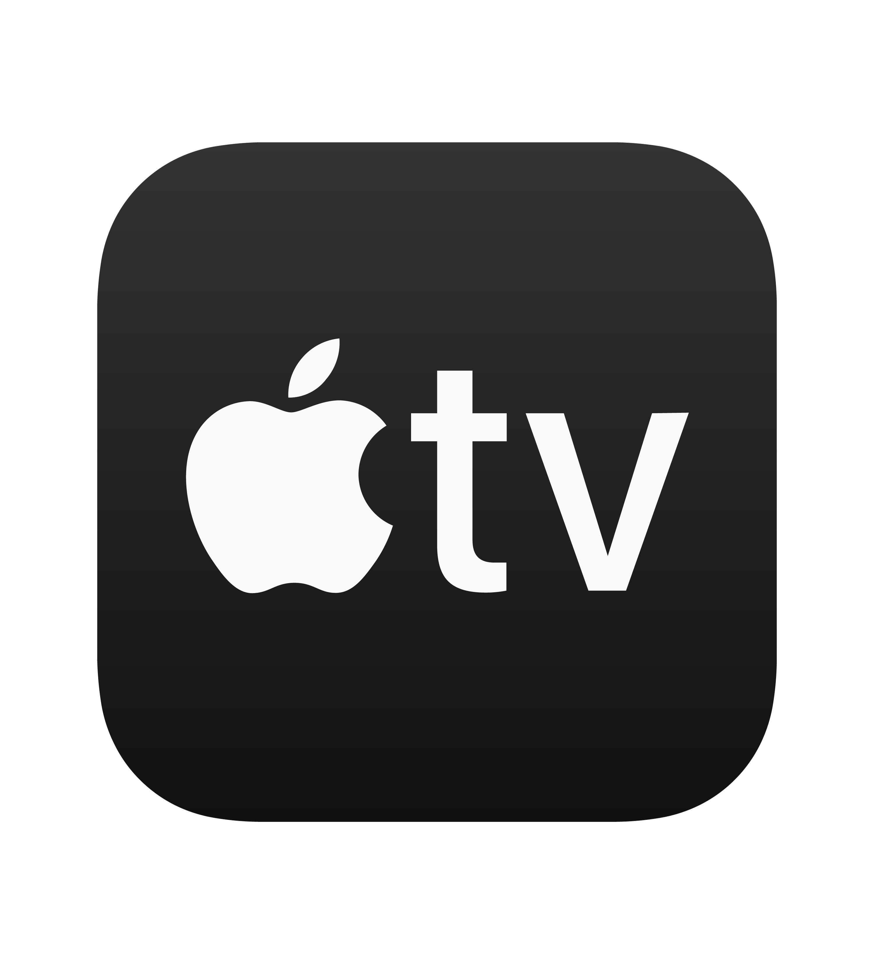
Apple TV
Apple TV+ is a streaming service offered by Apple that provides users access to various TV shows, movies, and original content. The service has gained attention for its curated approach to programming, focusing on high-quality storytelling. The Apple TV icon is a black square with rounded corners. The icon features the white Apple logo on the left side and the letters “tv” on the right inside the black square. It was introduced in 2014, along with the third generation of Apple TV.
I Cloud
Apple iCloud is a cloud storage and computing service offered by Apple. The service allows users to store and access their data across multiple devices, including photos, videos, documents, and music. The logo used in iCloud is a simple cloud with a gradient from light to dark blue color inside and a white or transparent background around it. It represents the cloud storage and cloud computing services that Apple offers to its users. The logo was used in 2011 alongside the launch of the first iCloud service.
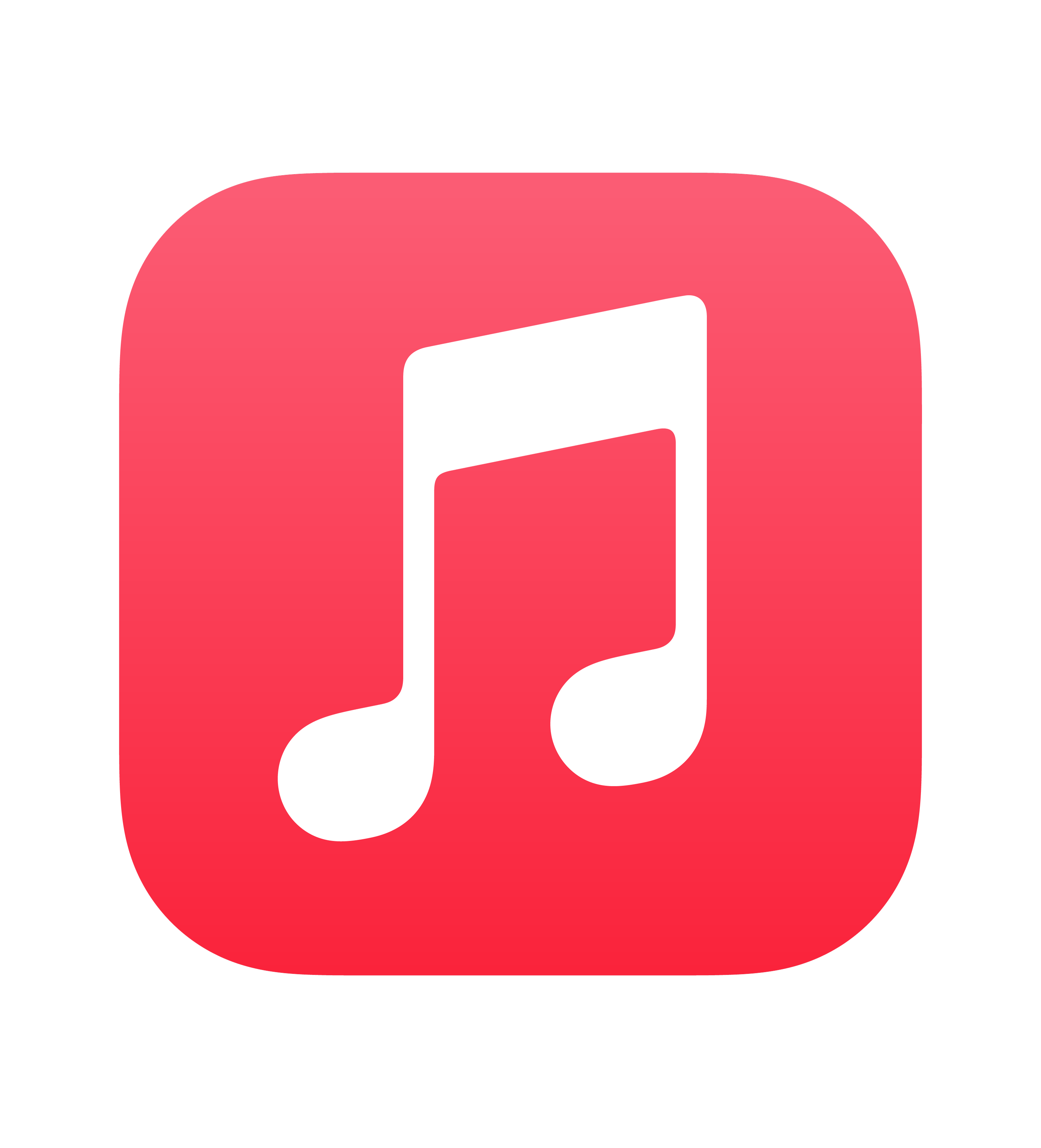
Apple Music
Apple Music is a popular music streaming service offered by Apple, providing users access to 100 million songs, albums, and playlists. It is one of the successors to iTunes. The logo is a red square with a white colored music note in the center. The note is a quarter note with a stem and a flag. The logo was introduced in 2015 and is a part of the Apple ecosystem.
Apple Arcade
This logo is from Apple Arcade, a video game subscription service Apple Inc. offers. Apple launched the service on September 19, 2019. The logo is a red square with a white joystick in the center. The joystick is made up of a circle and two lines. The red color symbolizes passion, energy, and excitement for gaming. The white joystick represents the core service of Apple Arcade, with unlimited access to over 200 ad-free games across different genres and platforms.
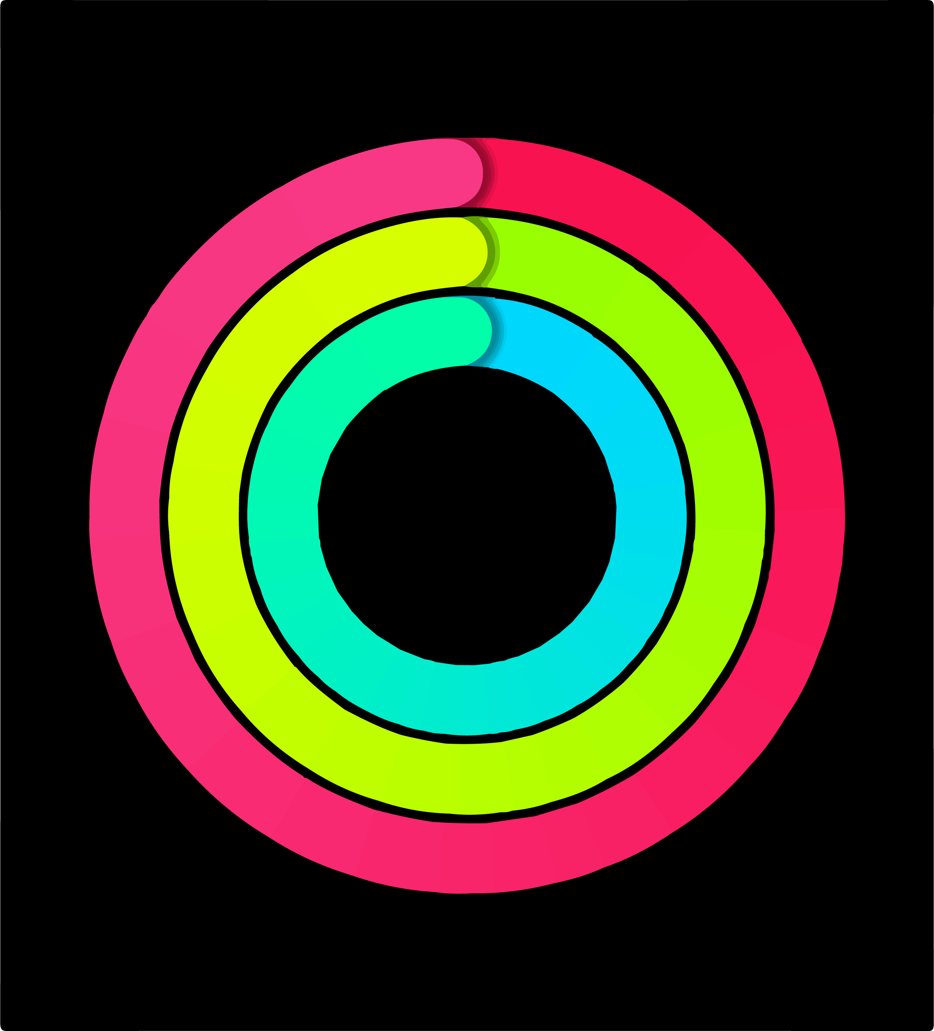
Apple Fitness
Apple Fitness+ is a subscription-based fitness service offered by Apple. It works with Apple Watch or other hardware devices to track your activity, workouts, mindfulness, and dives. The logo is a circle with three concentric rings. The outer ring is pink, the middle ring is green, and the inner ring is blue. The rings are not complete circles but instead have a small gap at the top. They represent the three Activity rings on the Apple Watch: Move, Exercise, and Stand.
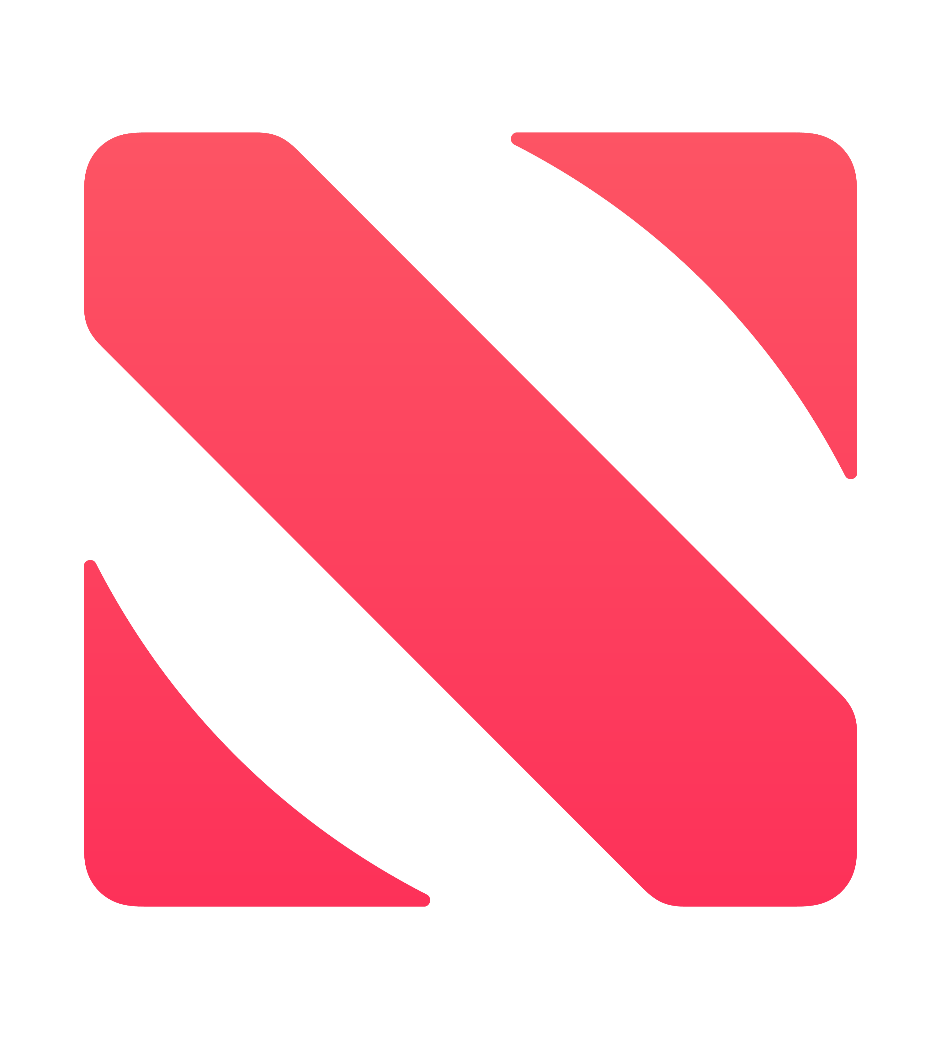
Apple News
Apple News is a news aggregator app offered by Apple. It provides curated and personalized stories from various sources. You can also subscribe to Apple News+, which gives you access to hundreds of magazines and newspapers, audio stories, and local news. The logo is a red letter “N” with a diagonal line through it. The letter “N” is made up of two red triangles. The background is white. The “N” shape represents the core service of Apple News, which is news delivery.
Apple Font
Apple uses different fonts for different purposes and products. For example, Apple uses a custom variant of the ITC Garamond typeface called Apple Garamond for most of its marketing materials and product names. Apple also uses a sans-serif typeface called San Francisco for its operating systems and apps. San Francisco has several variants, such as SF Pro, SF Compact, and SF Mono, optimized for different screen sizes and devices. Apple also uses a serif typeface called New York, which is based on historical style, for some of its products and services. Additionally, Apple uses script extensions for some languages, such as Arabic, Armenian, and Georgian, designed to fit with SF Pro for multilingual typesetting.
Why Apple Logo Works
The Apple logo is widely recognized and has become an iconic symbol of the Apple brand. It works because the logo is simple, elegant, and recognizable. It represents the company’s name, its products, and its values. Although many theories about the bite-on-apple logo exist, the truth is much simpler. The bite symbolizes knowledge, discovery, innovation, and creating a pun on the word “byte.” And with knowledge came brand recognition. Steve Jobs famously said he chose the logo simply because of the name’s recognition and popularity. And thus, even after his death, Apple has become a giant and household name in every corner of the world.
In Summary,
Apple is a globally famous brand all around the world. They have come a long way from their first journey, and it is reflected in their logo. And as their products and services increased, so did their logo and versatility. You can download all these Apple logos for free and use them in your projects.
If you liked this article, then check out our other list of logos like Facebook, Instagram, and LinkedIn fonts now.
Thank you for reading!