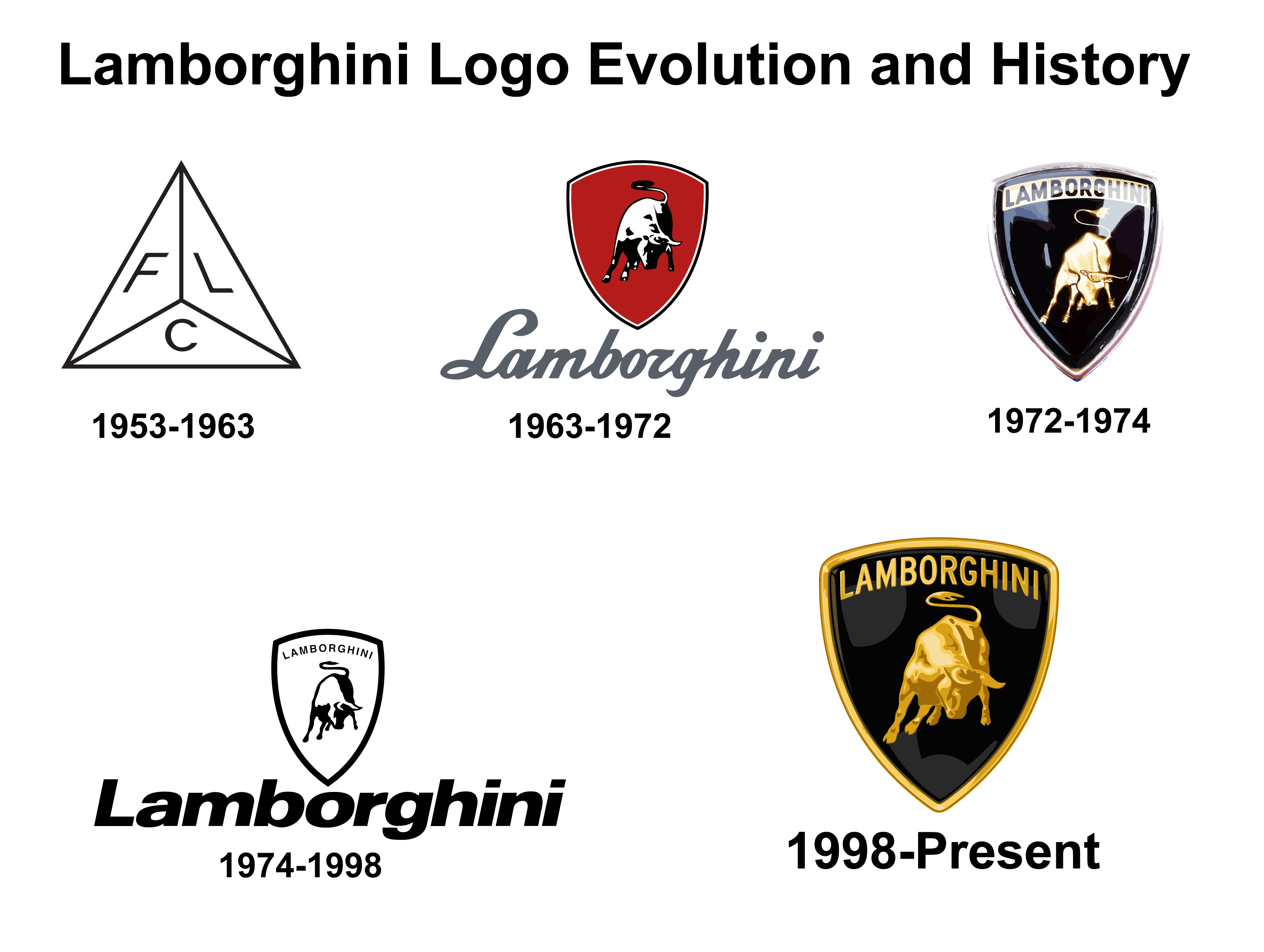
The Lamborghini logo has changed a lot since the company started. It’s a symbol of luxury and speed. The logo has been updated over time to show the brand’s history and the founder’s love for cars. In this article, we’ll look at how the Lamborghini logo has changed over the years and what it represents. You can also download free PNG and Vector images of each logo version.
Lamborghini Logo Evolution and History
1953-1963
Lamborghini’s branding journey started in 1953 with a basic pyramid logo. It had three triangles, each with the letters F, L, and C, which stood for Ferruccio Lamborghini Company. This logo was very different from what we see now.
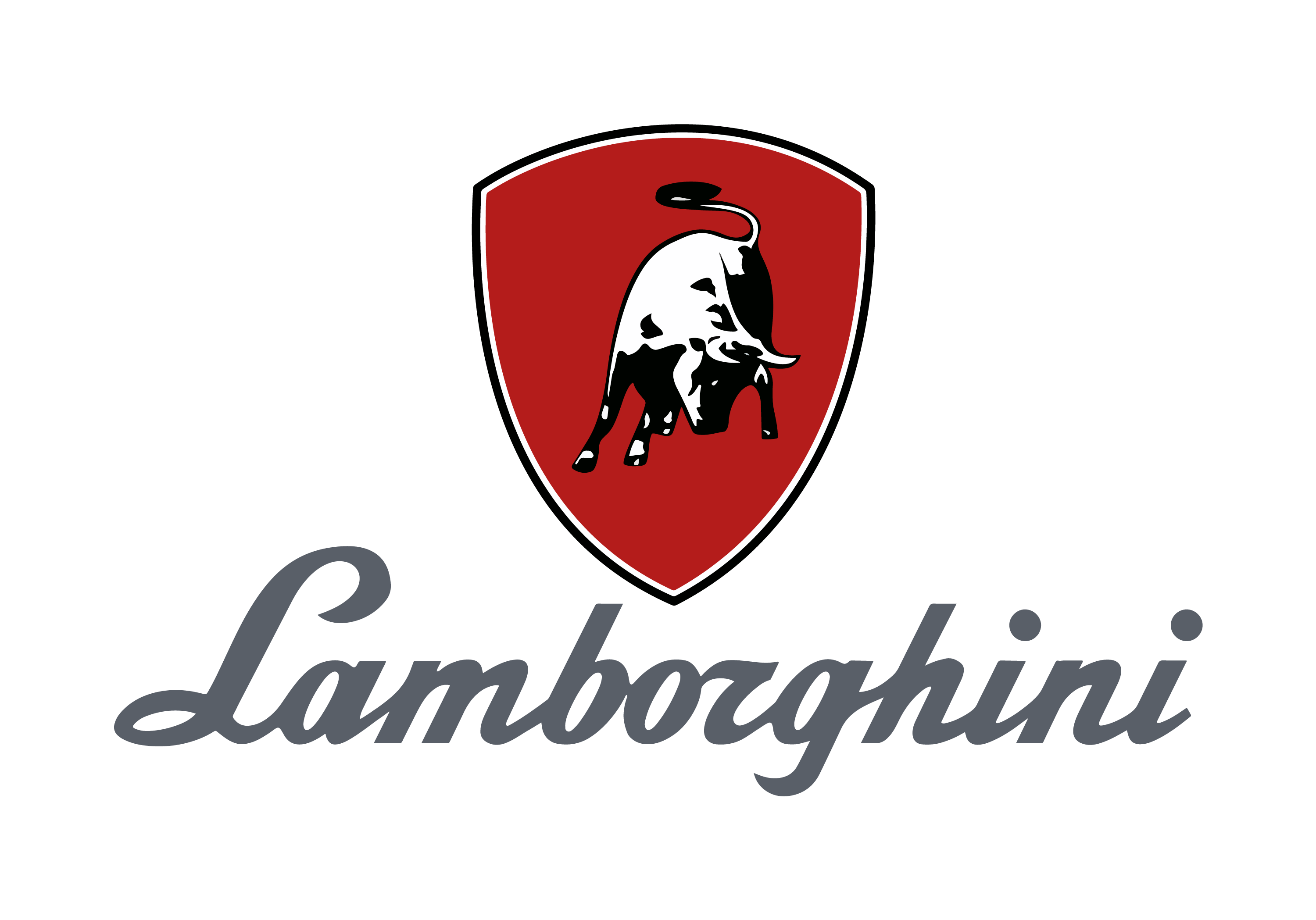
1963-1972
In 1963, Lamborghini introduced the famous bull logo. It was inspired by the zodiac sign of the founder, Ferruccio Lamborghini, which is Taurus. The bull represents strength and determination, which matches the company’s character. The logo showed a running bull on a red shield, with the word “Lamborghini” written in italic, sans-serif letters.
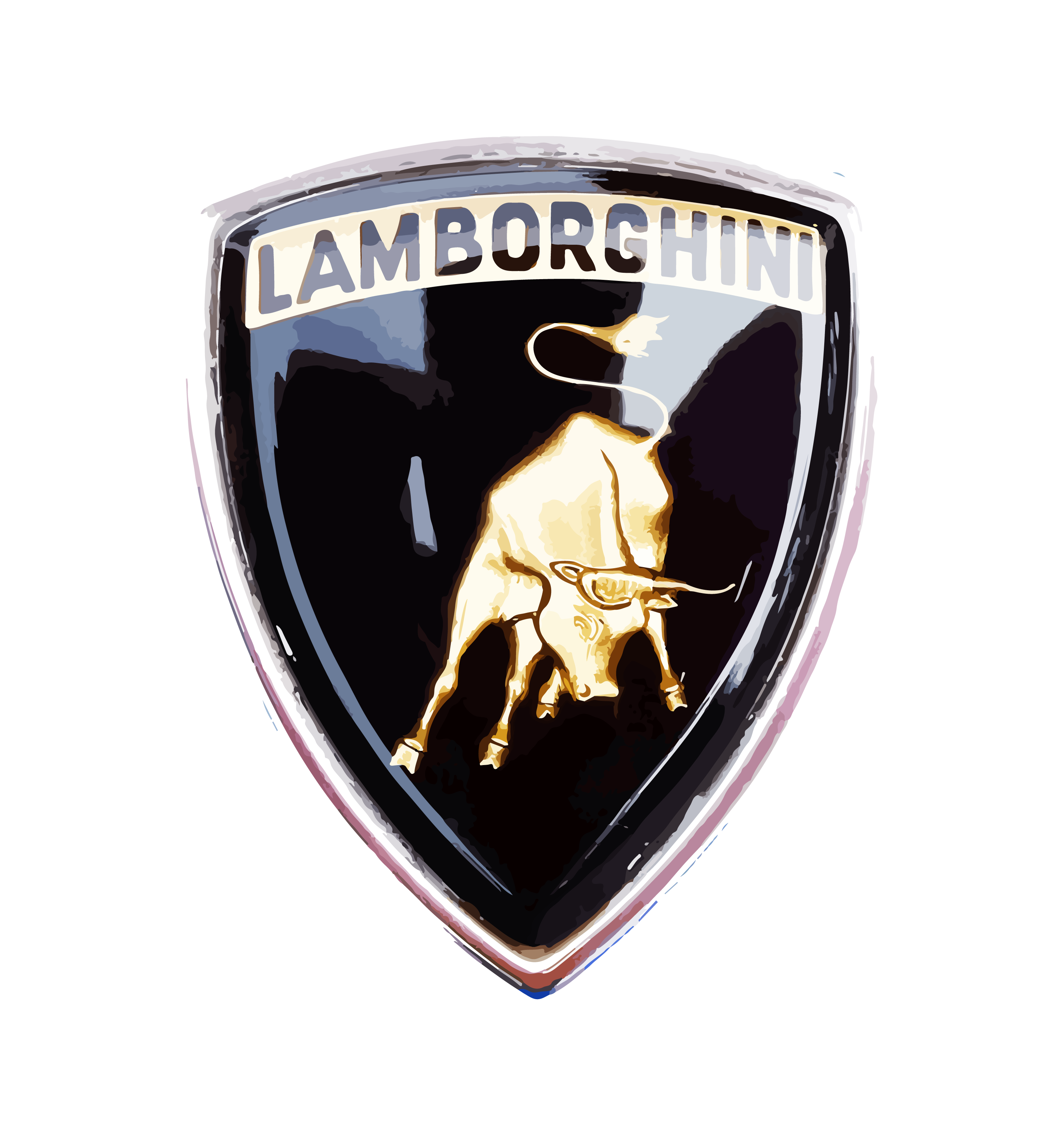
1972-1974
The 1972 redesign introduced a crest-like black medallion with a gold outline, featuring the golden bull and a gold and black banner with the logotype in all capitals. This design laid the groundwork for the current visual identity.
1974-1998
In 1974, a monochrome version of the crest was created, accompanied by a bold sans-serif wordmark under it. This iteration refined the logo’s appearance, emphasizing the brand’s elegance and sophistication.
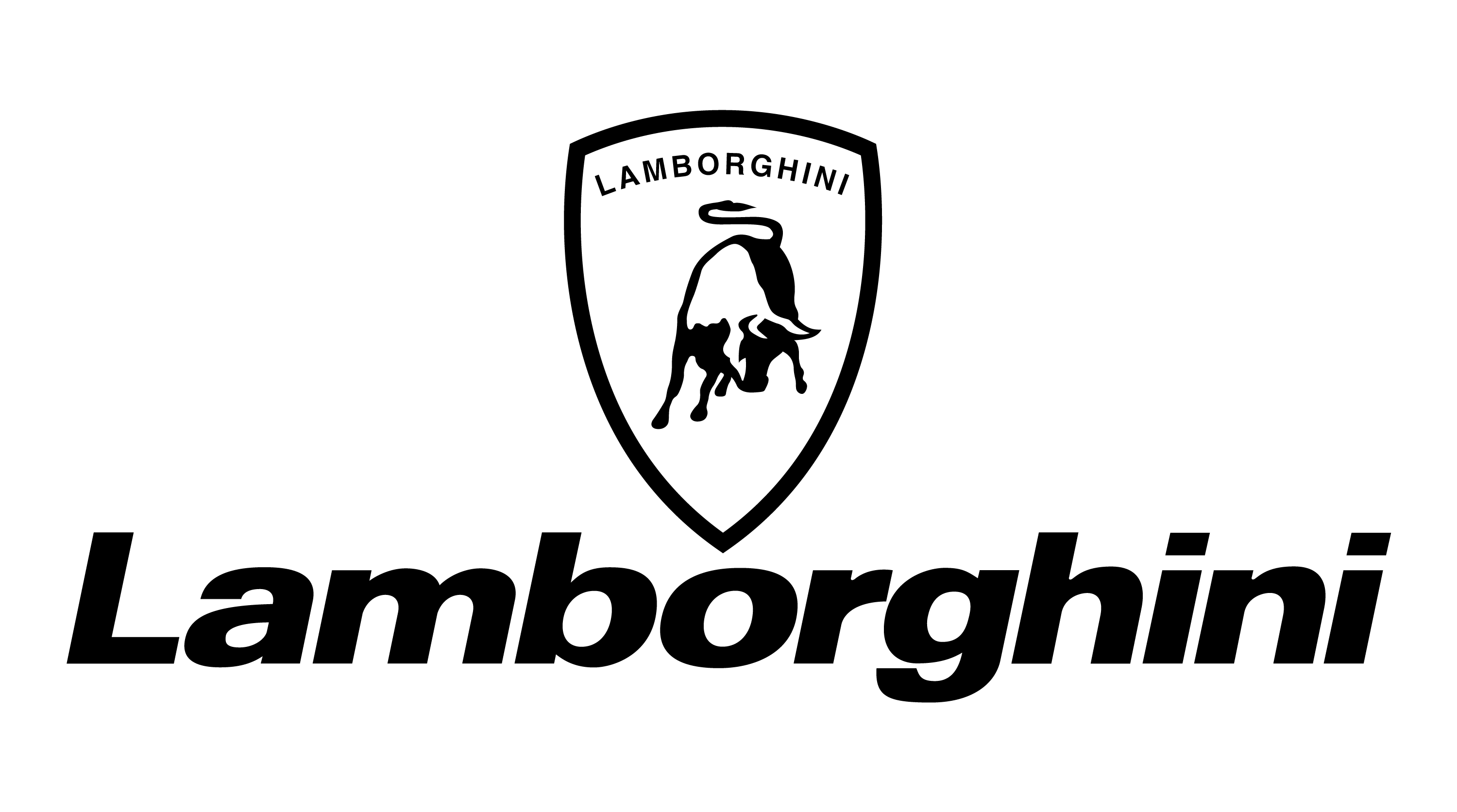
1998-Present
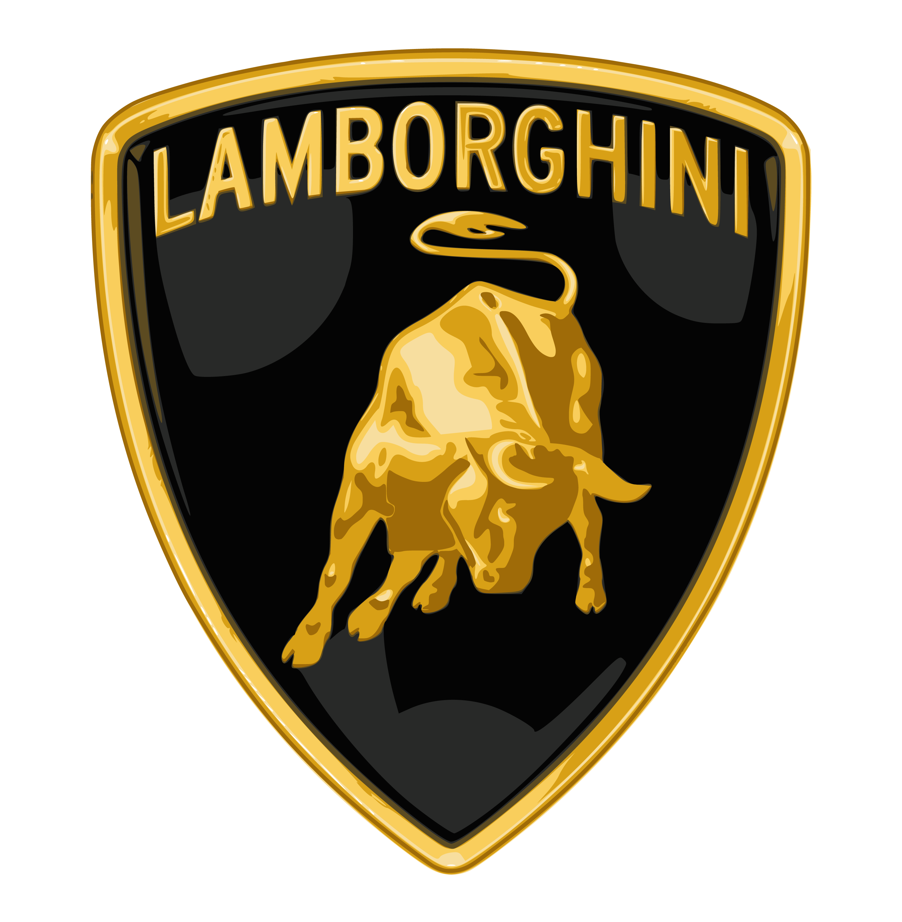
The logo was refined in 1998, with an expanded crest and a more imposing bull. The golden bull now contains more detail, with gradients that convey energy and motion. The brand’s name in all-capital letters adorns the top of the shield in gold, maintaining the logo’s luxurious and powerful essence.
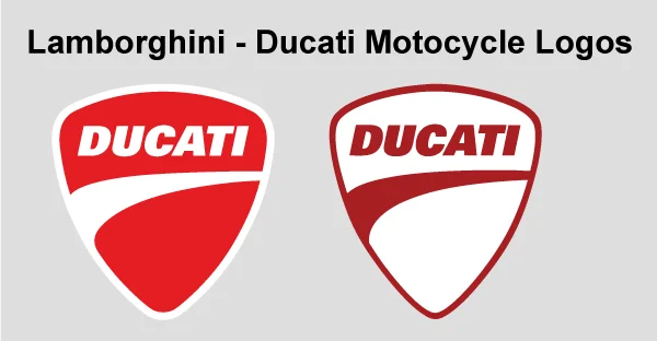
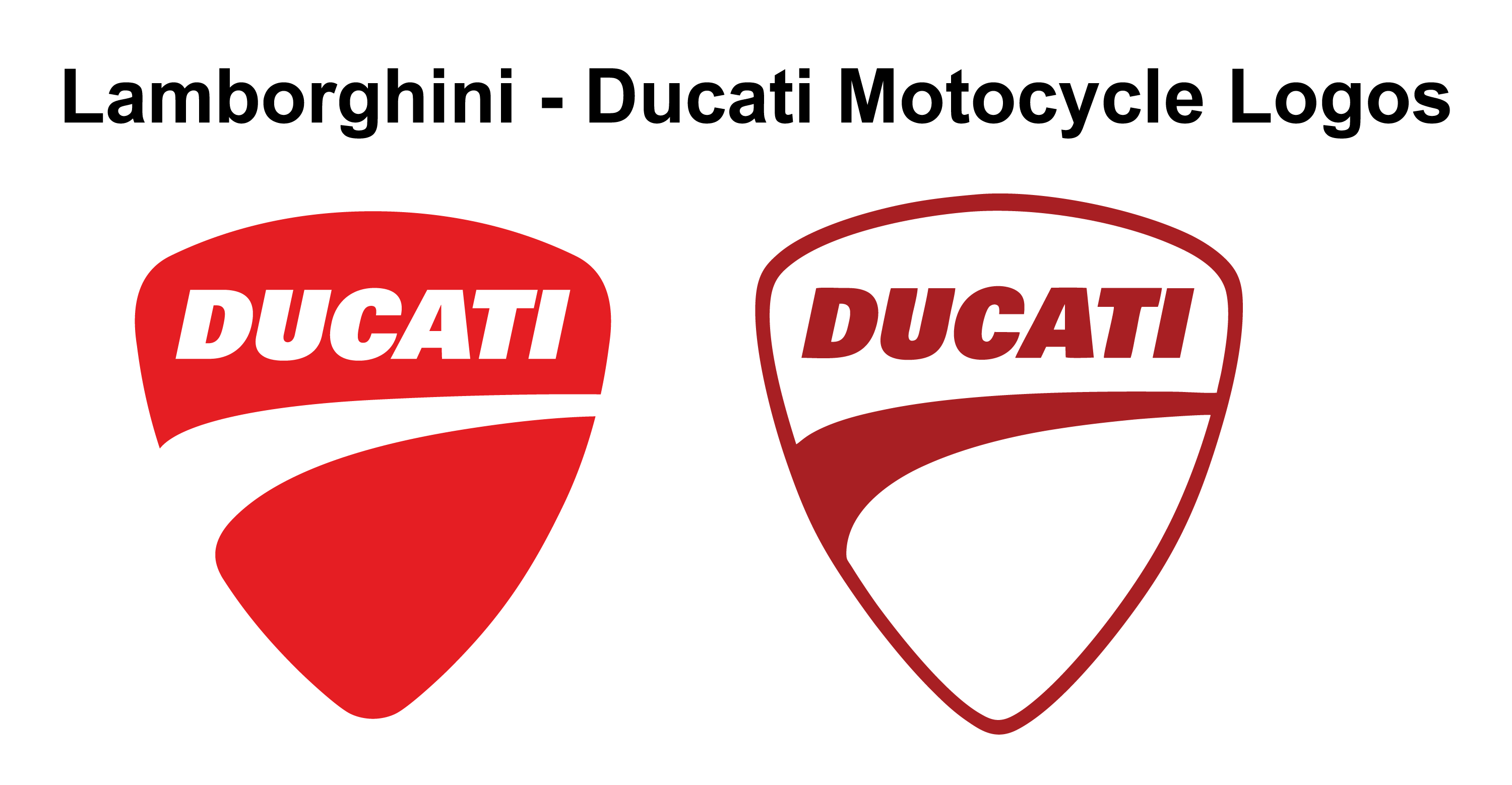
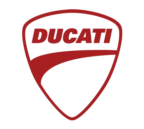
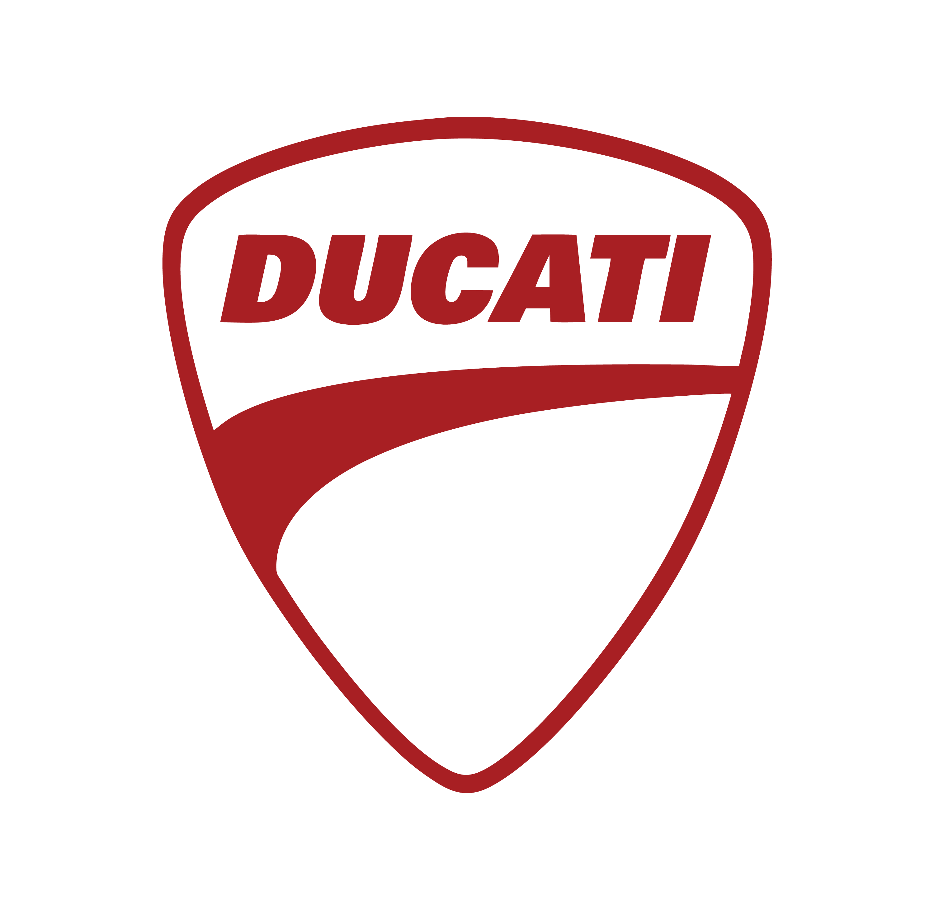
Lamborghini Ducati Motocycle Logo
Ducati is an italian Motocycle company owned by Lamborghini. Below we are showing two Ducati logo iteration.

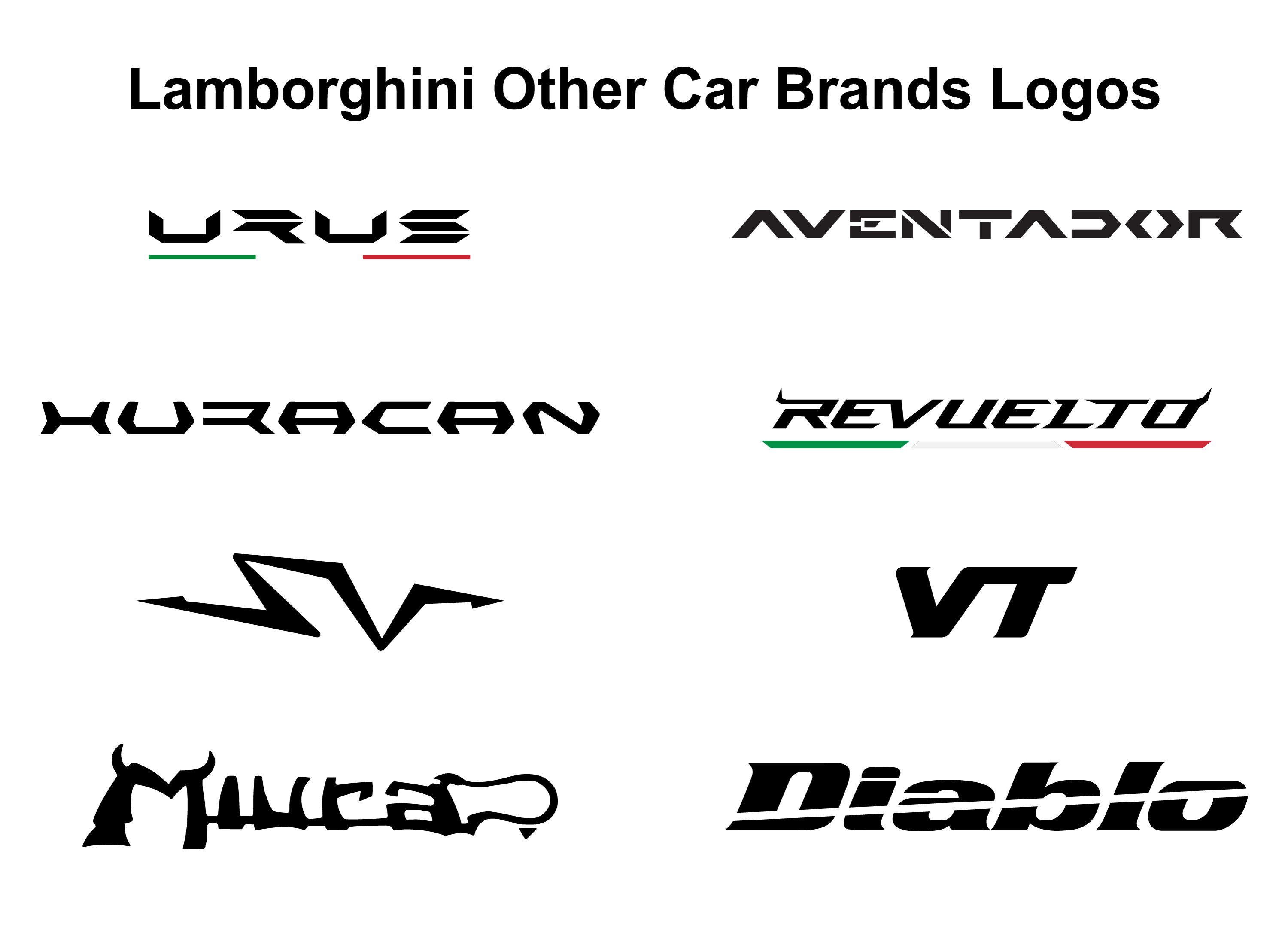
Lamborghini Other Car Brands Logo
Lamborghini has various models, which also become brands. Each model has its own logo adapted with Lamborghini logo.
Lamborghini URUS

Lamborghini Aventador
Lamborghini Huracan

Lamborghini Revueltd
Lamborghini SV
Lamborghini VT

Lamborghini Mwra

Lamborghini Diablo

Similar Logos
The Lamborghini logo shares some design elements with other luxury car brands. Like:
Arash logo
The Arash logo features an eagle, which represents strength and freedom, aligning with the brand’s focus on powerful and dynamic performance. The Lamborghini and old Arash logos share similarities in their use of animal symbolism and sleek, dynamic design elements.
Ferrari logo
The Ferrari logo also shares similarities with the Lamborghini logo. Both logos feature a shield shape, use gold and black colors, and include powerful animals. Lamborghini showcases a bull, while Ferrari showcases a horse.
Porsche logo
Porsche’s logo includes a horse, which represents the horse-breeding heritage of the city of Stuttgart. The Lamborghini and Porsche logos share similarities in their use of powerful animals and the presence of a shield shape in their designs.
Conclusion
The Lamborghini logo is a testament to the brand’s rich history and the vision of its founder. From its humble beginnings in the 1950s to the bold and dynamic emblem it is today, the logo has evolved while staying true to the essence of Lamborghini: strength, power, and luxury. As the company continues to push the boundaries of innovation and redefine automotive excellence, the logo remains a steadfast symbol of a legacy that combines performance with opulence.