Discord, an online messenger launched in 2015, has become a cultural phenomenon, especially among gamers. It’s a platform where users can chat, share files, and hang out virtually. The company, valued at $7 billion as of December 2020, has seen rapid growth and has expanded its reach beyond gaming communities. In this article, we will explore the evolution of the Discord logo, its design choices, and the significance behind them. For those interested in the visual aspects of Discord’s branding, PNGs and vectors for each logo are available for free download.
Introduction to Discord and Its Logo
Discord started with a mission to provide an easy-to-use communication service that fosters relationships and a sense of belonging among users worldwide. Founded by Jason Citron and Stan Vishnevskiy, the platform quickly became a haven for gamers and communities looking for a reliable way to stay connected. The logo, known affectionately as “Clyde,” has been a central part of Discord’s identity, evolving alongside the platform to reflect its growing ambitions and user base.
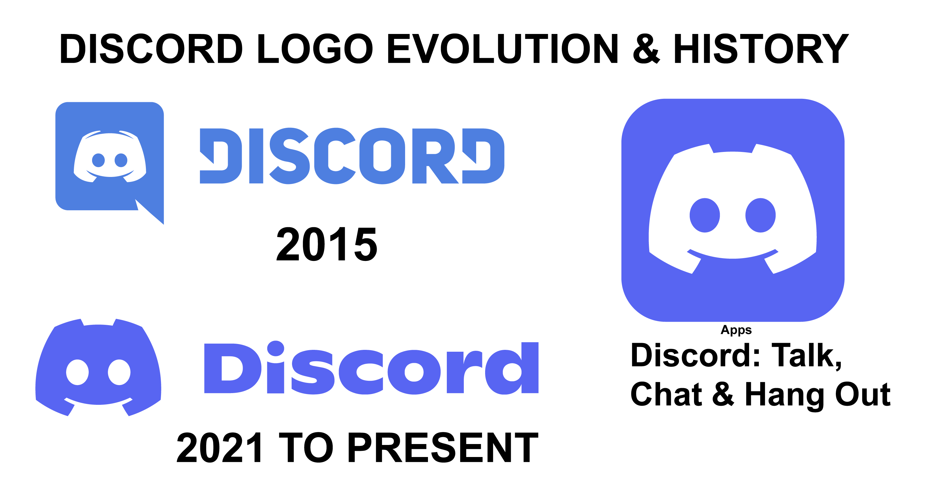
Discord Logo Evolution and History
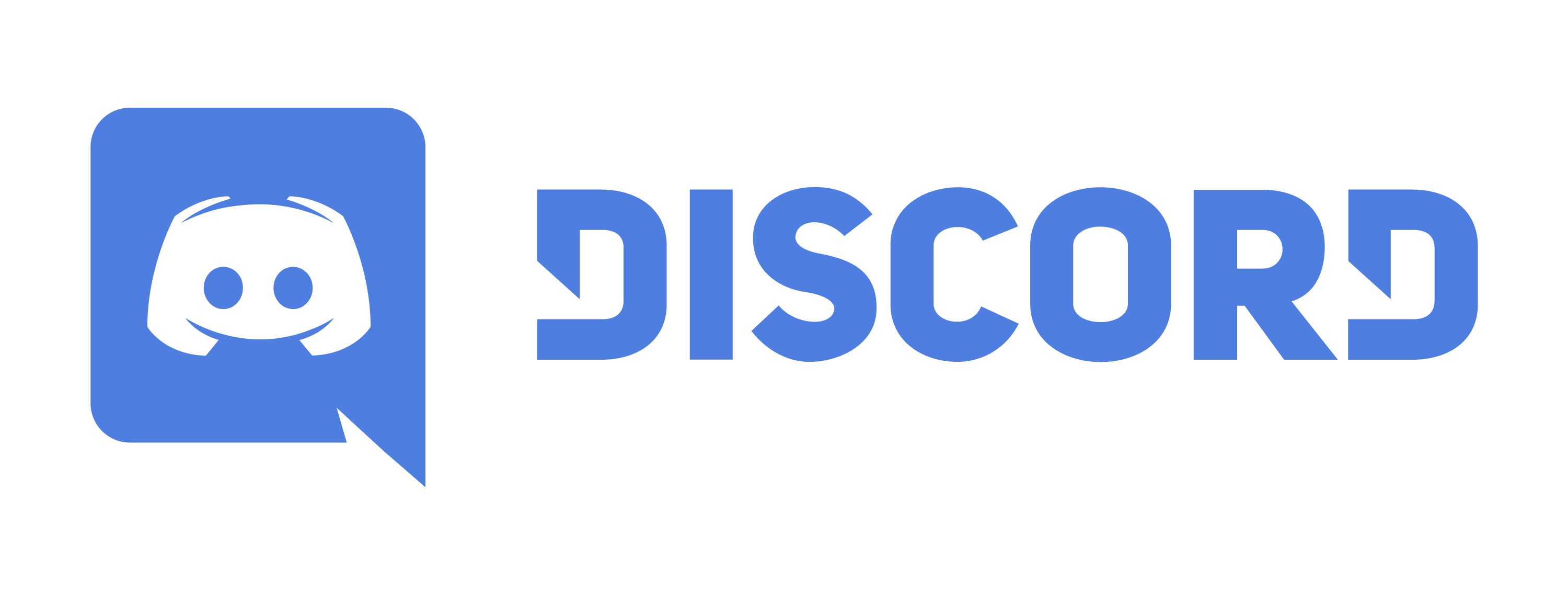
Discord Logo 2015
The original Discord logo introduced in 2015 featured “Clyde,” an icon resembling a crab that also mimics a gaming controller, reflecting the platform’s gaming roots . The emblem was paired with a wordmark in a customized sans-serif typeface, which gave the brand a playful and friendly atmosphere . The color palette primarily consisted of a blue-violet shade known as Vista Blue, symbolizing the sky and ocean, and white, representing clarity and simplicity.
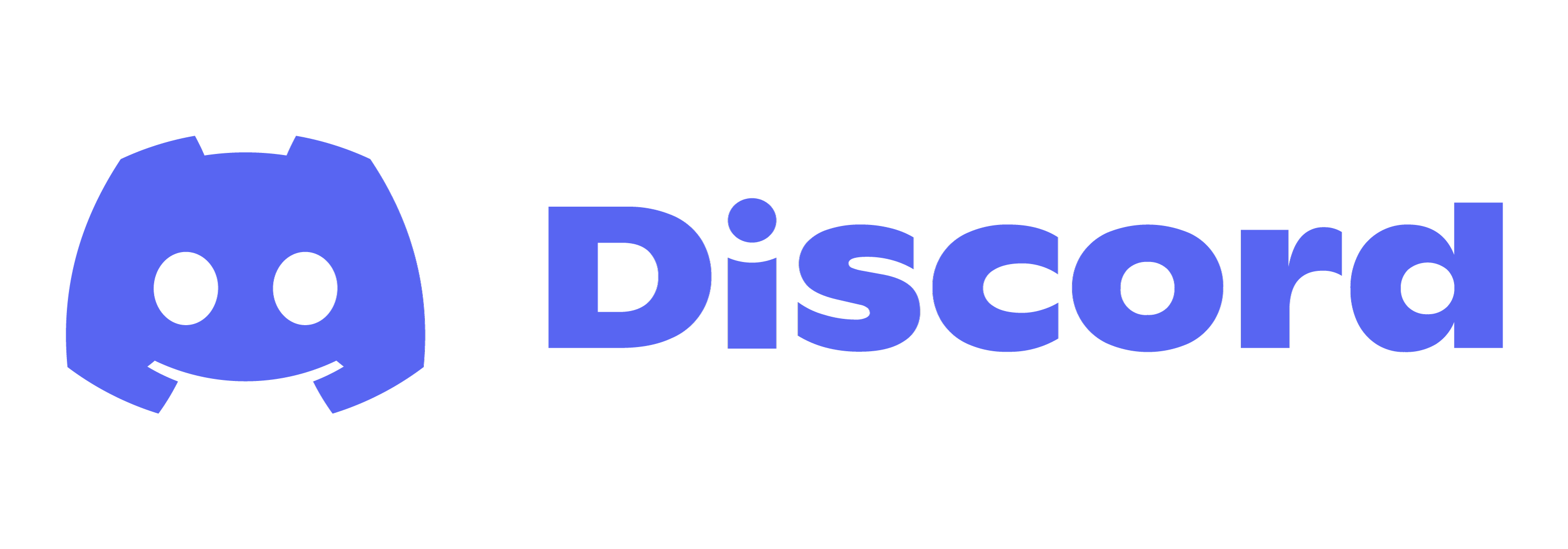
Discord Logo 2021
In 2021, Discord updated its logo to mark its expansion beyond gaming. The redesign, a collaboration with the creative studio Koto, maintained Clyde’s iconic shape but introduced a bolder and stronger look. The wordmark also saw a change, with a new custom font that retained the brand’s unique character. The updated ‘blurple’ color aimed to give the logo a more playful appearance.
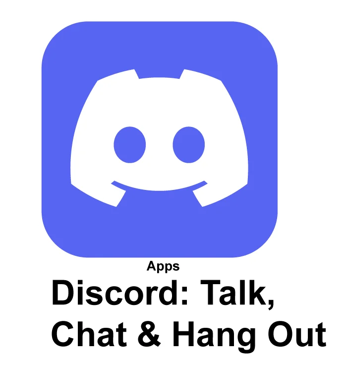
Discord Apps Icon
The Discord app icon is instantly recognizable, featuring the stylized smiling face of Clyde within a dialogue cloud, emphasizing the platform’s focus on communication.
Simliar Logo
When examining logos that are similar to Discord’s, it’s important to consider the key elements that make it distinctive: shape, color, and resemblance percentage. Like:
Reddit logo
The Reddit logo shares some similarities with Discord’s logo. Both logos utilize a simple colored background with white icons, and their designs promote a sense of community and engagement. This similarity showcases how effective visual design can create a welcoming and cohesive user experience across various digital platforms.
Mastodon logo
Similarly, when comparing the Mastodon logo to the Discord logo, you may notice some similarities between them. This could be attributed to their shared design aesthetic and color selection.