Honda’s emblematic ‘H’ has become synonymous with durability, innovation, and trustworthiness in the automotive world. As we explore the evolution of Honda’s logos, from motorcycles to cars and beyond, we invite you to delve into the rich history of a brand that has transcended roads to become a global icon. For enthusiasts and designers alike, we’ve included free download links for PNGs and vectors of each logo, allowing you to appreciate the fine details that mark Honda’s journey through time.
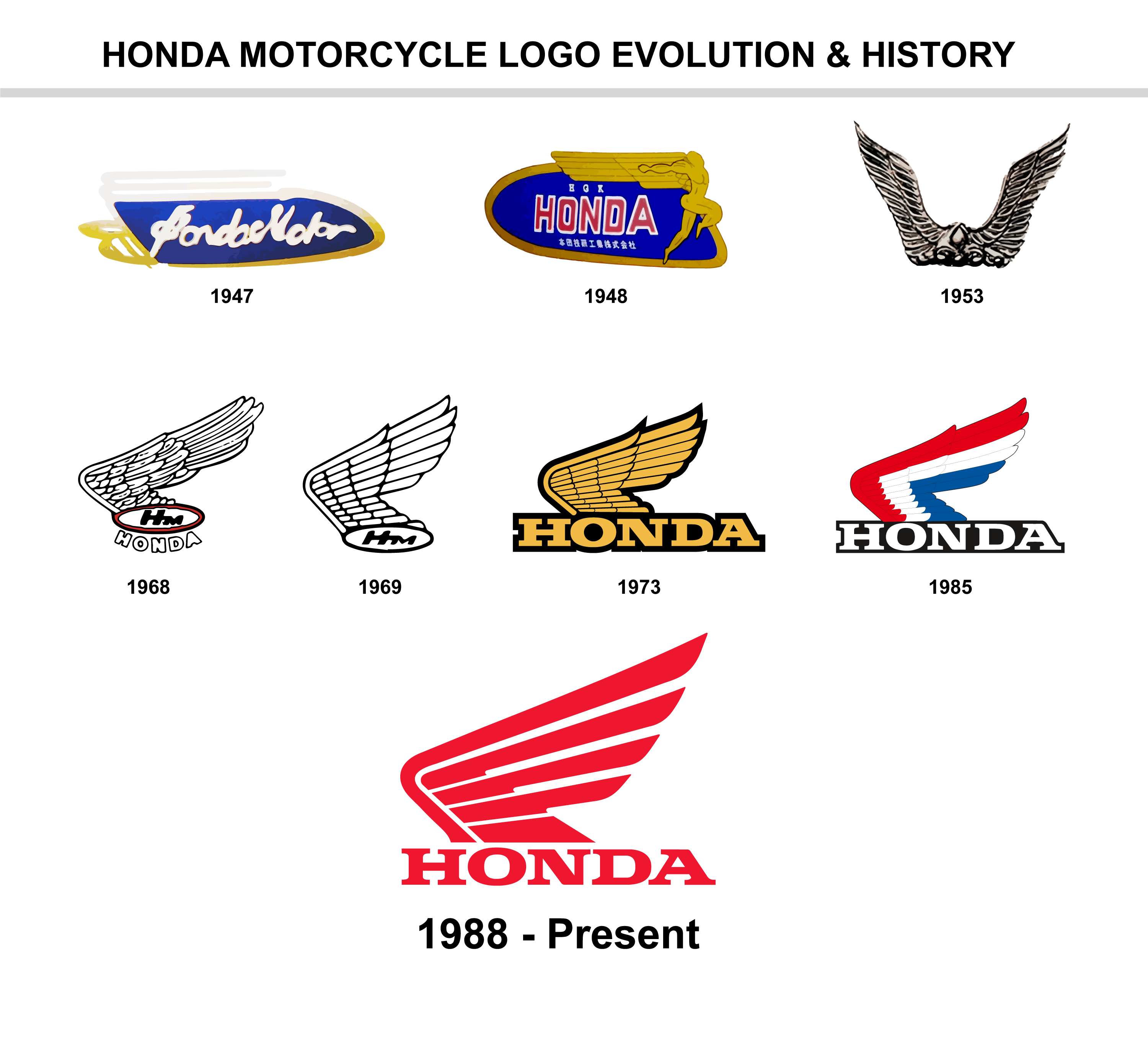
Honda Motorcycle Logo Evolution and History
Honda’s logo is a symbol of the company’s rich history and evolution in the motorcycle industry. Here’s a comprehensive look at the changes and meanings behind the Honda motorcycle logo over the years.
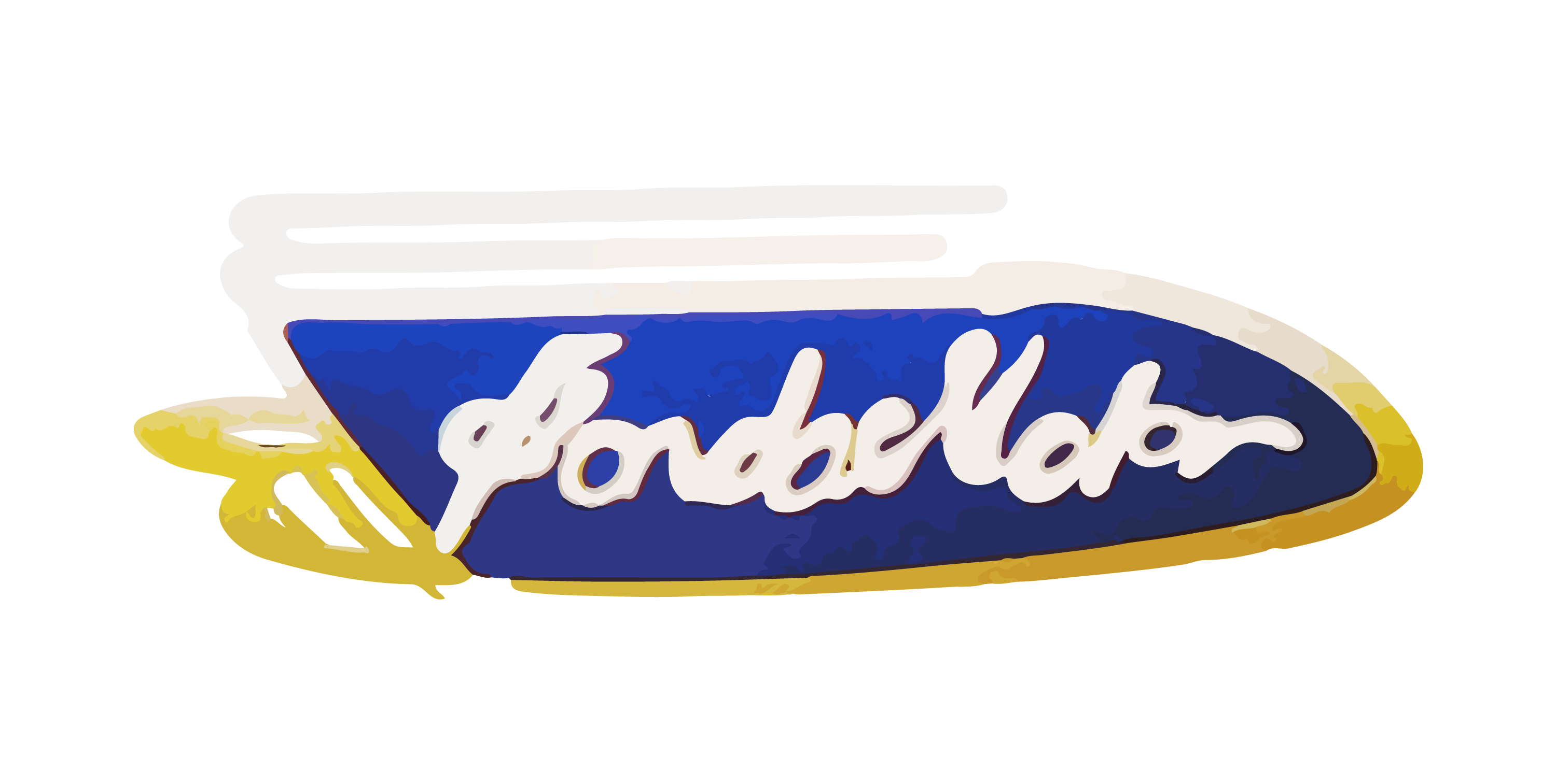
Honda Motorcycle Logo 1947
The Honda logo in 1947 featured a fresh prototype engine sample named “Fireplace”. This marked the very first time Honda’s name was emblazoned on a product, signifying the company’s entry into the motorized world.
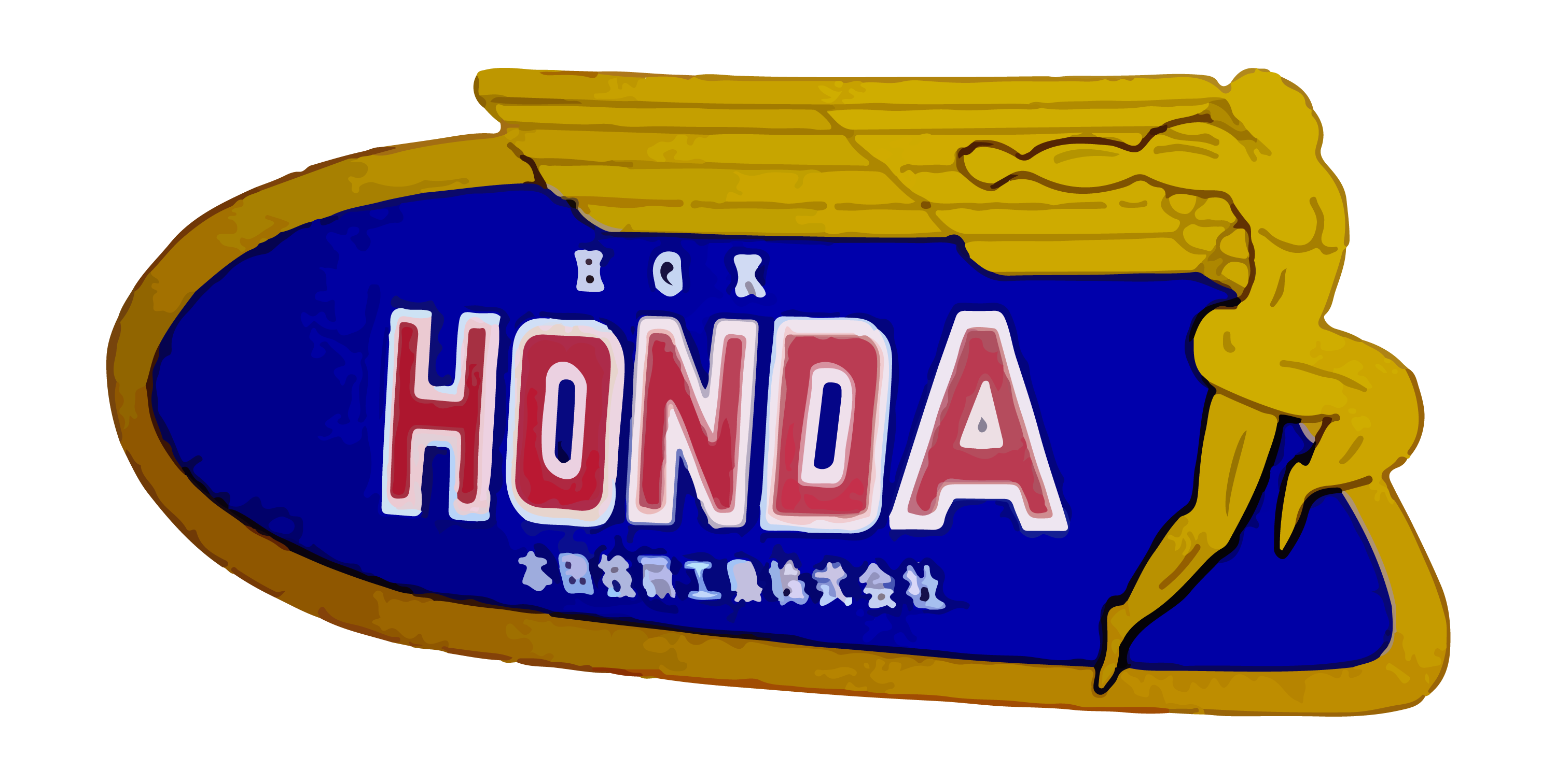
Honda Motorcycle Logo 1948
A year later, in 1948, Honda updated its logo. The new emblem, which was revealed during the presentation of a new motorcycle model, incorporated “wings” that were inspired by the goddess Victoria. This was also the year Honda Motor Co., Ltd. was officially incorporated.
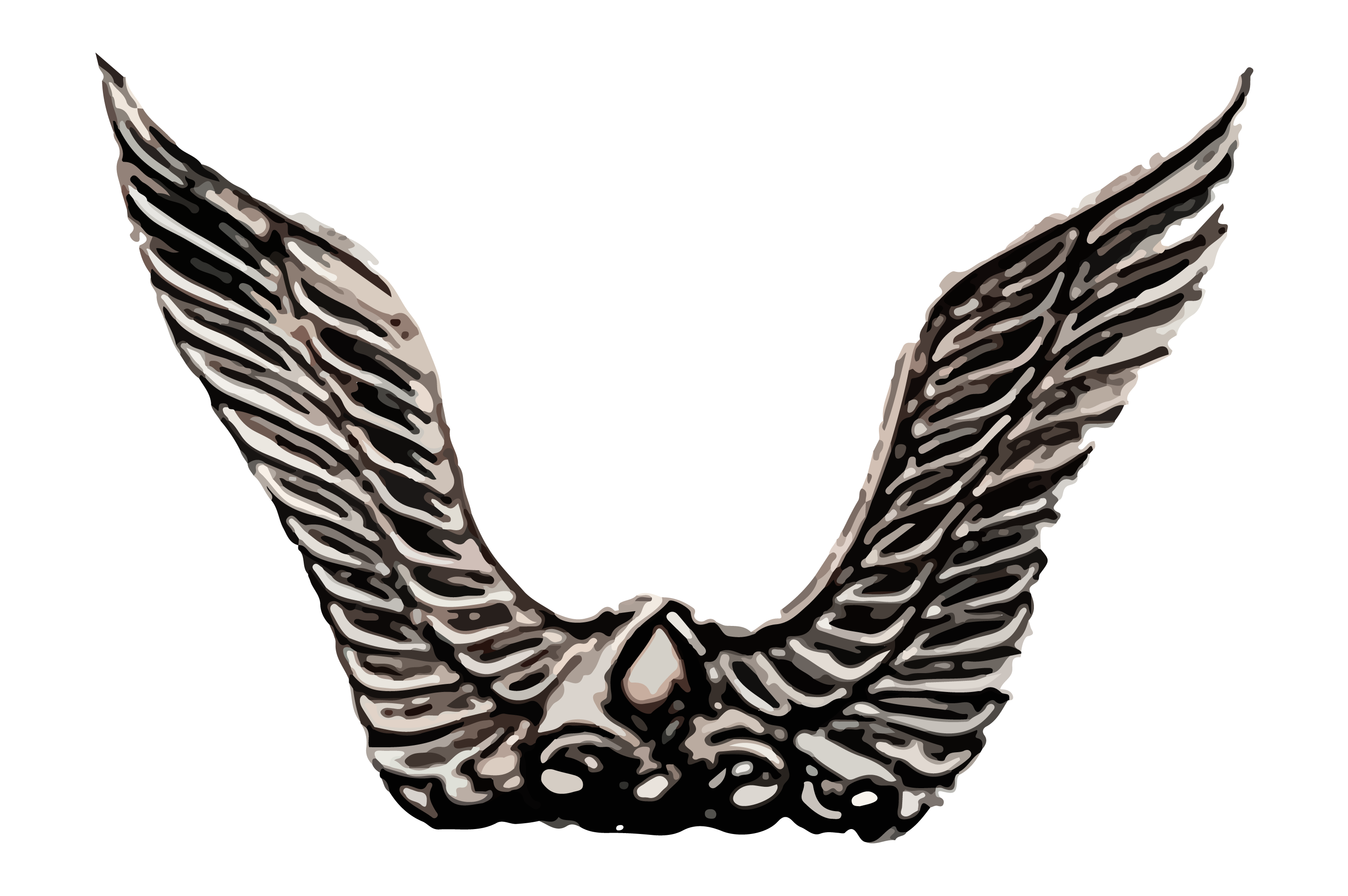
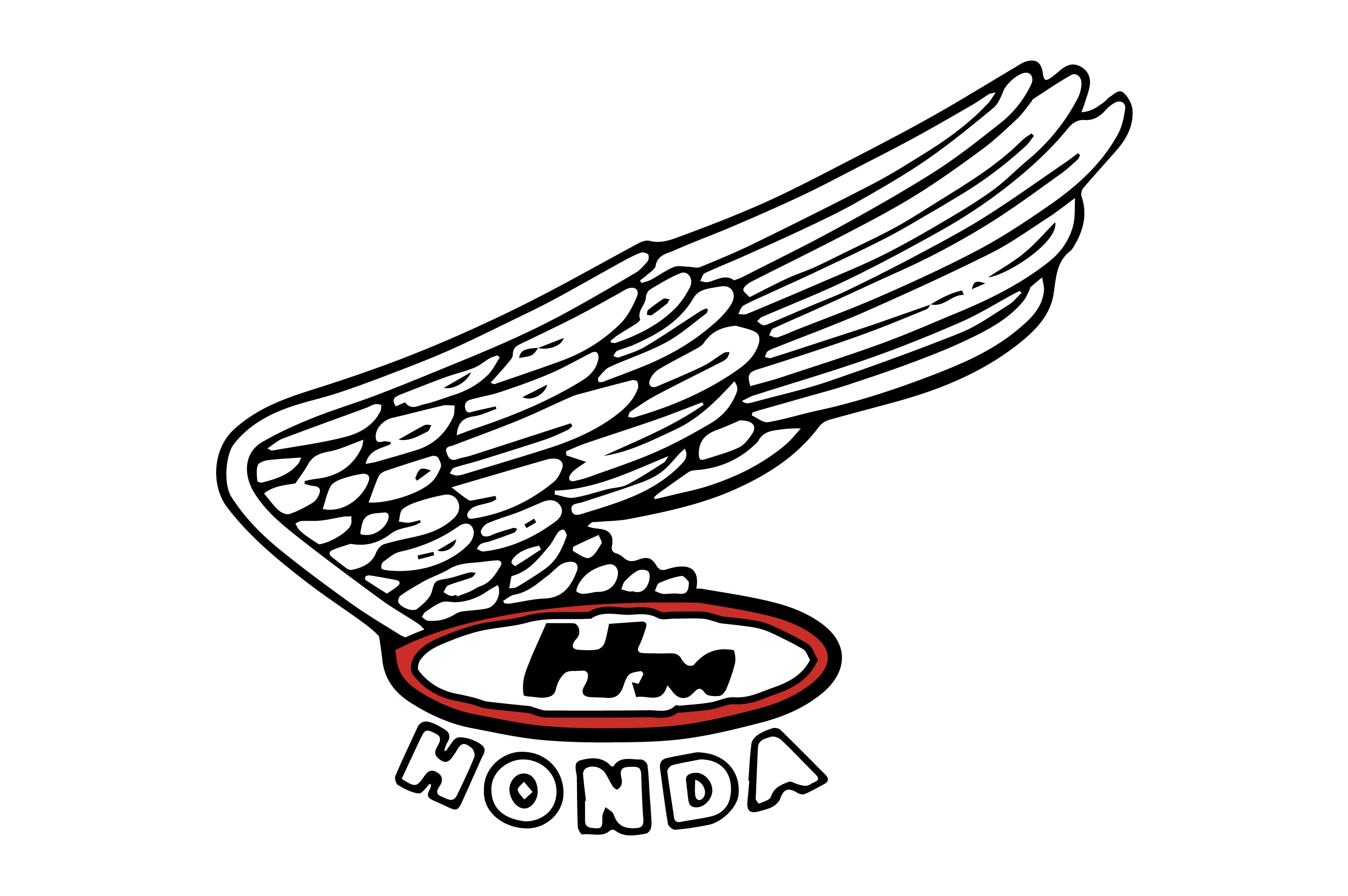
Honda Motorcycle Logo 1953
The badge used by Honda Motor from 1953 to 1968 featured two metallic wings, which were a staple of the brand’s visual identity during this time. In 1968, Honda R & D Co., Ltd. was established to focus on research and development.
Honda Motorcycle Logo 1968
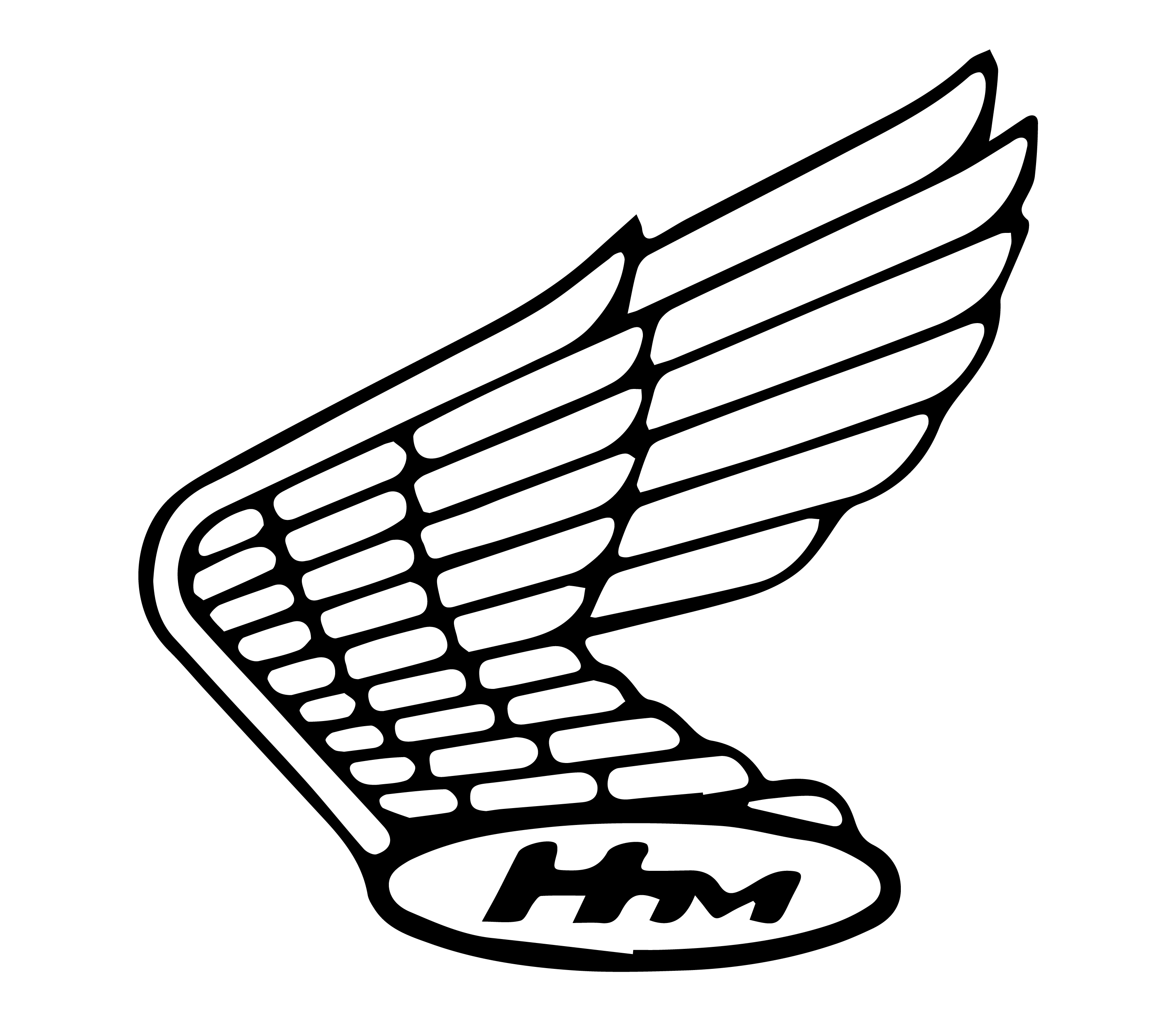
Honda Motorcycle Logo 1969
In 1969, the Honda badge was redesigned to focus solely on the emblem, removing the logotype from the insignia. This was also a victorious year for Honda in racing, as they dominated the Isle of Man TT race.
Honda Motorcycle Logo 1973
By the end of 1973, the “HM” letters were replaced with “Honda,” and the description became yellow with an outline on its contours . This was also a significant year for Honda’s innovation in low-emission technology.
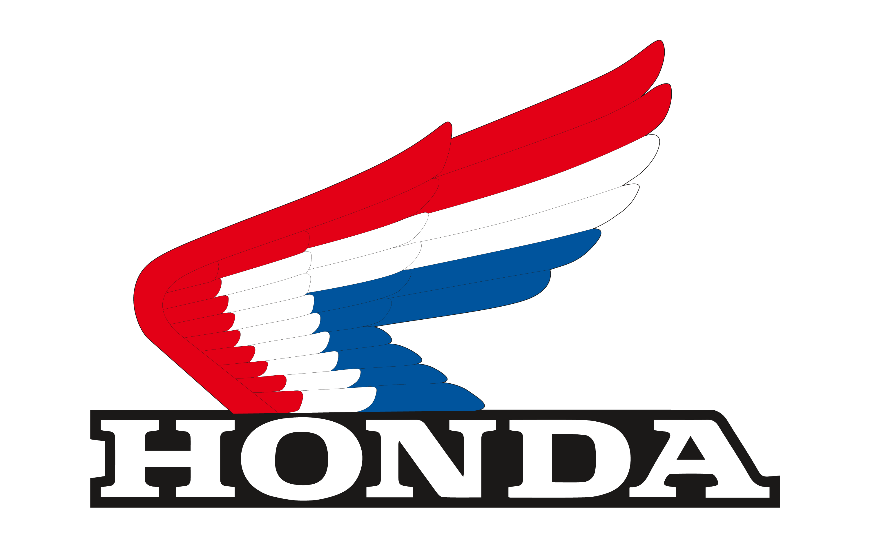
Honda Motorcycle Logo 1985
The contours of all elements in the Honda Motors logo were refined and softened in 1985. The color palette now included white, black, red, and blue for the wing. Honda also developed the world’s first car navigation system during this year.
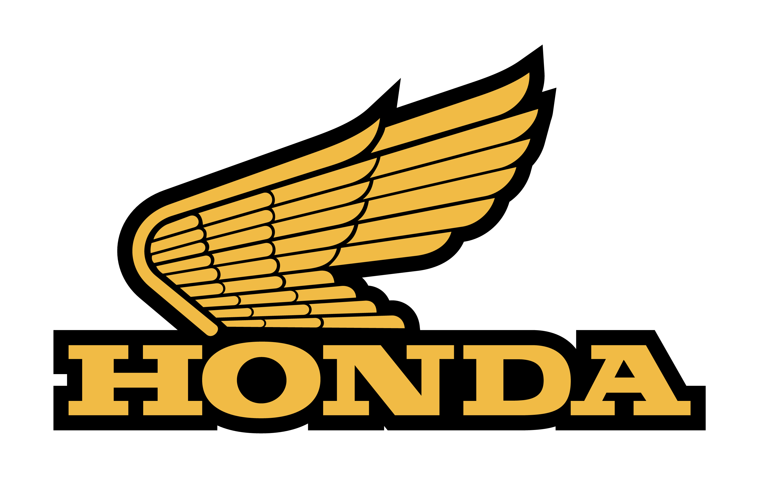
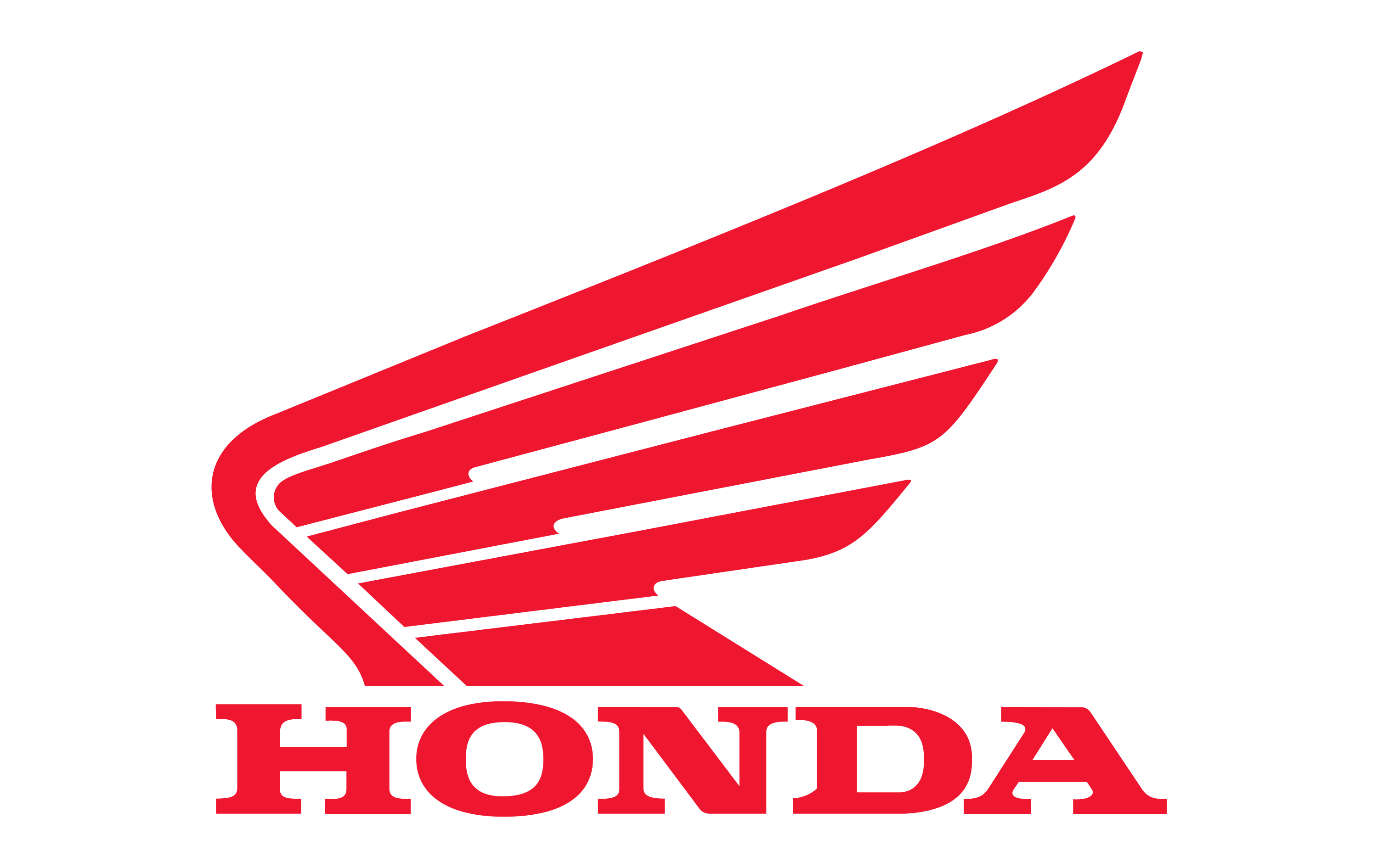
Honda Motorcycle Logo 1988 To Present
In 1988, coinciding with Honda’s 40th anniversary, the emblem was changed to a red color, adopting an abstract and contemporary style . This design has remained the company’s logo to the present day and reflects Honda’s commitment to modernity and innovation.
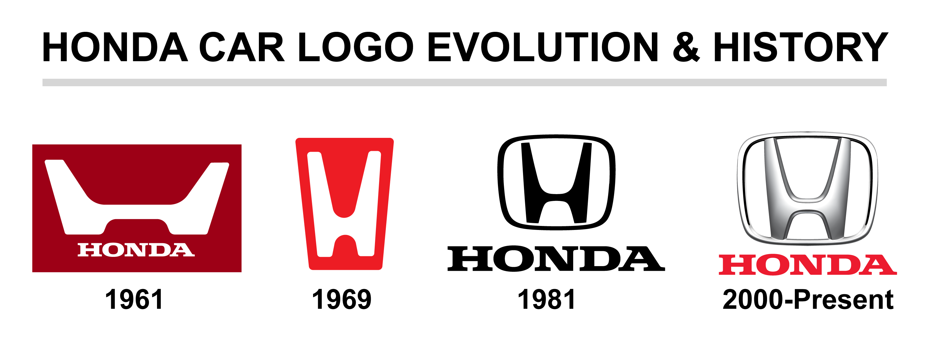
Honda Car Logo Evolution And History
The Honda car logo has undergone several transformations since its inception, reflecting the brand’s growth and innovation. Here’s a detailed look at the evolution of the Honda car logo over the years.
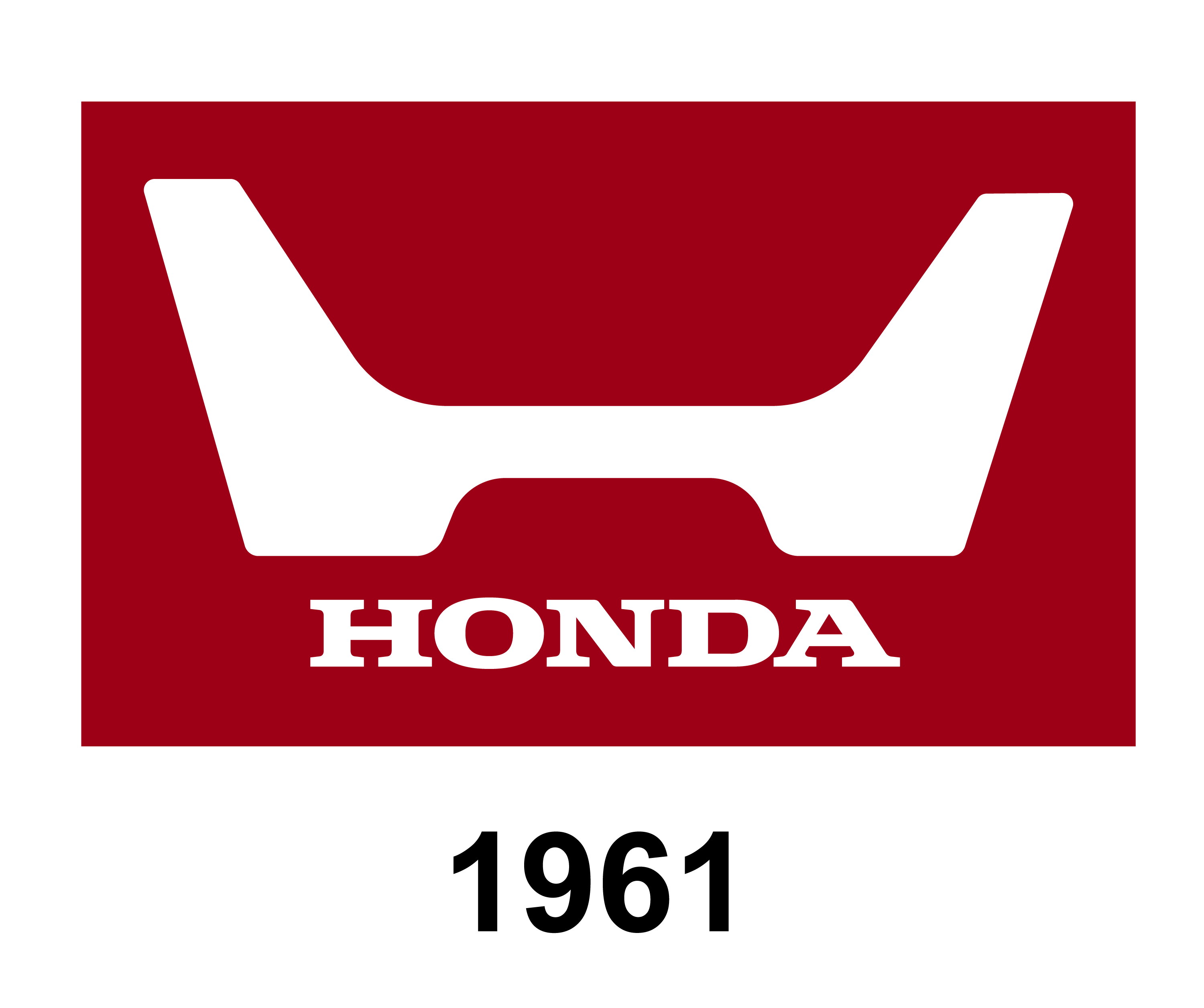
Honda Car Logo 1961
The first Honda car logo in 1961 featured a bold stylized letter “H” enclosed in a trapezoidal frame with rounded angles, set against a burgundy-red background with the letter in light blue. This design coincided with Honda’s first victory at the Isle of Man Tourist Trophy races and the opening of a new R&D facility in Saitama, Japan.
Honda Car Logo 1969
In 1969, the logo was simplified to a monochromatic theme with a black background and a prominent white “H”. This slimmed-down design was used on the Honda 1300 and later on the iconic Honda Civic.
Honda Car Logo 1981
The 1981 logo saw a return to the original trapezoidal shape but with a more balanced and square appearance. The “H” and the framing became more defined, and the company’s full name was added beneath the emblem in massive serif letters . This design forms the basis of the emblems applied to the front of every Honda since .
Honda Car Logo 2000 To Present
The modern emblem, introduced in 2000, embraced a 3D look with a red-silver color scheme, giving a more vibrant and energetic look to the brand’s identity . This skeuomorphic design replicates the actual chrome logos seen on most Honda cars and is used in isolation on the bonnets of cars .
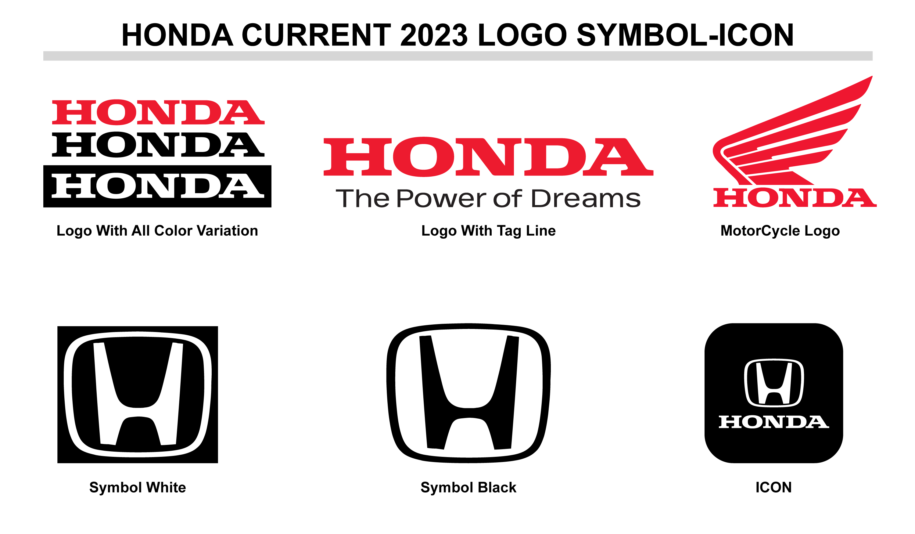
Honda Current Logo Symbol And Icon
The current Honda logo is recognized worldwide and comes in various color variations to suit different applications and branding needs.
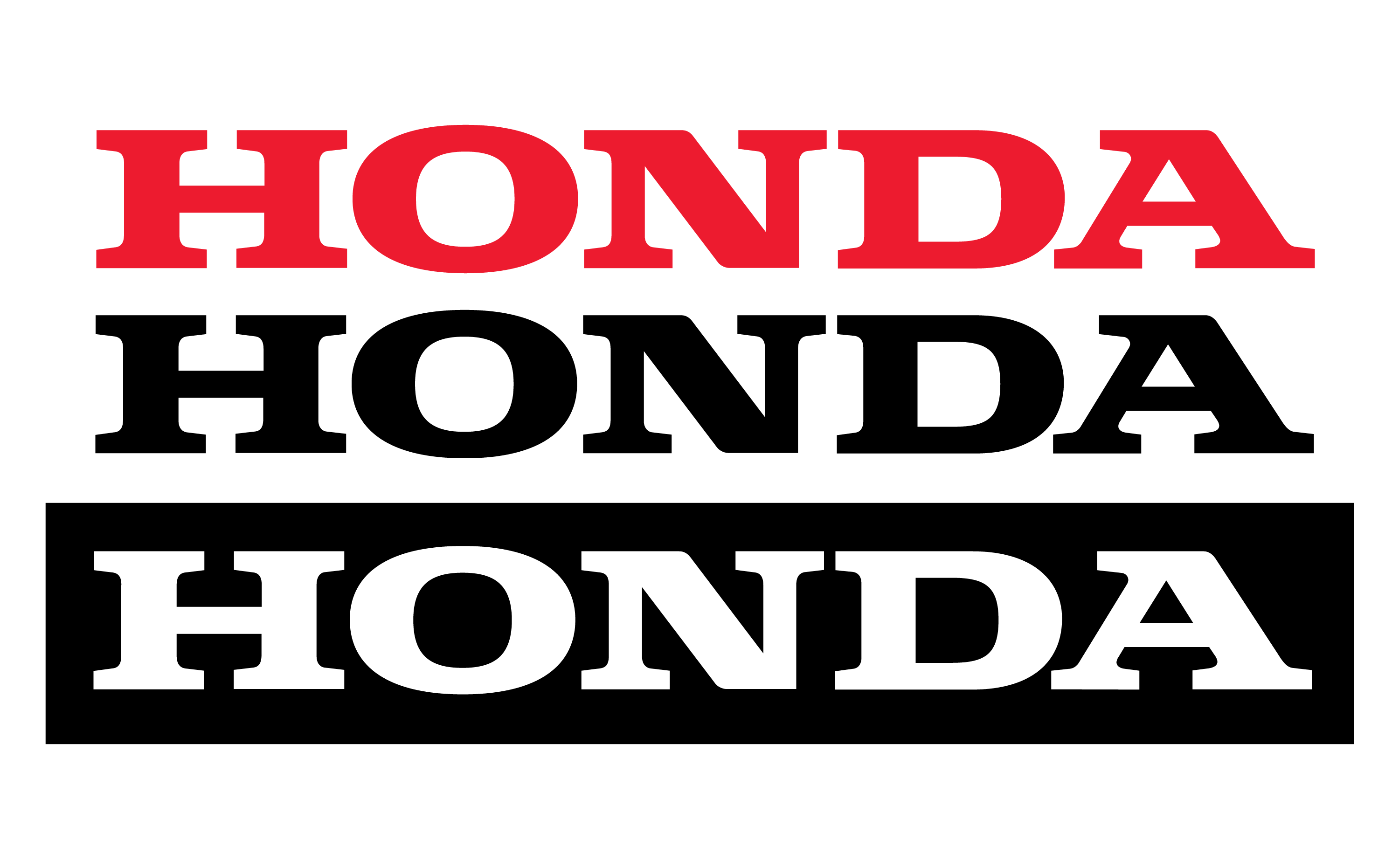
Honda Current Logo With All Color Variation
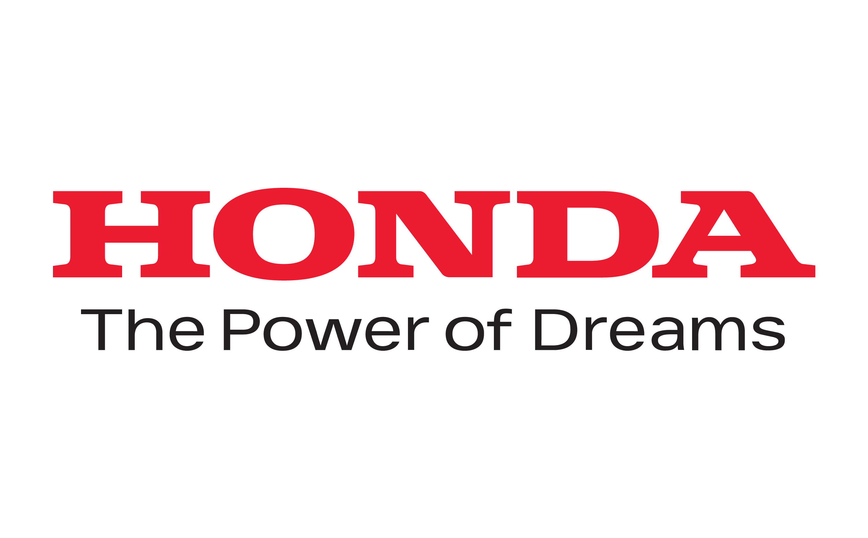
Honda Current Logo With Tag Line
Honda’s current logo sometimes includes a tagline to emphasize the brand’s message or campaign.
Honda Current Motor Cycle Logo
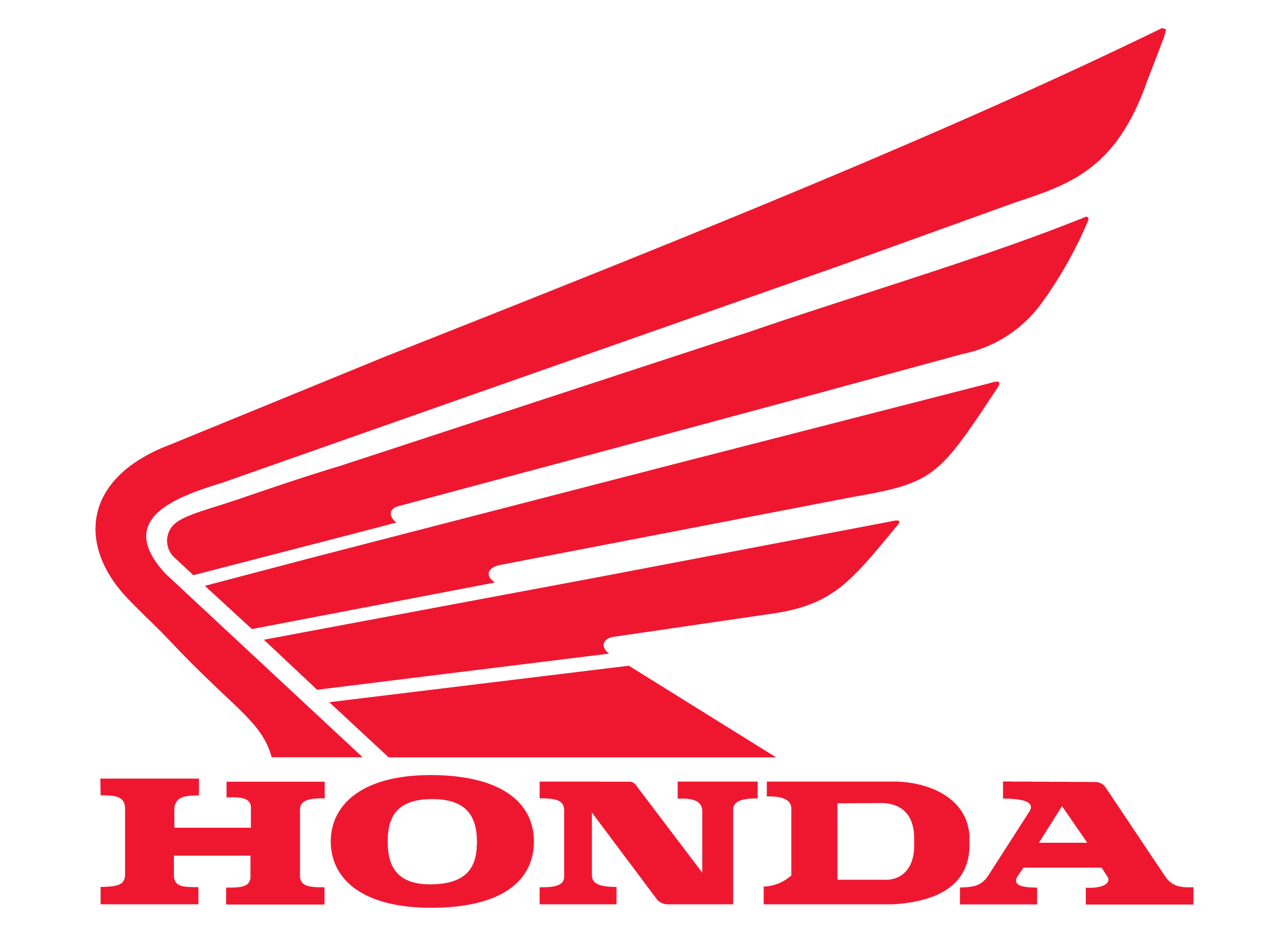
Honda Current Symbol White
Honda Current Symbol Black
Honda Current ICON
The ICON logo is a simplified version of the Honda emblem, used for various branding purposes.
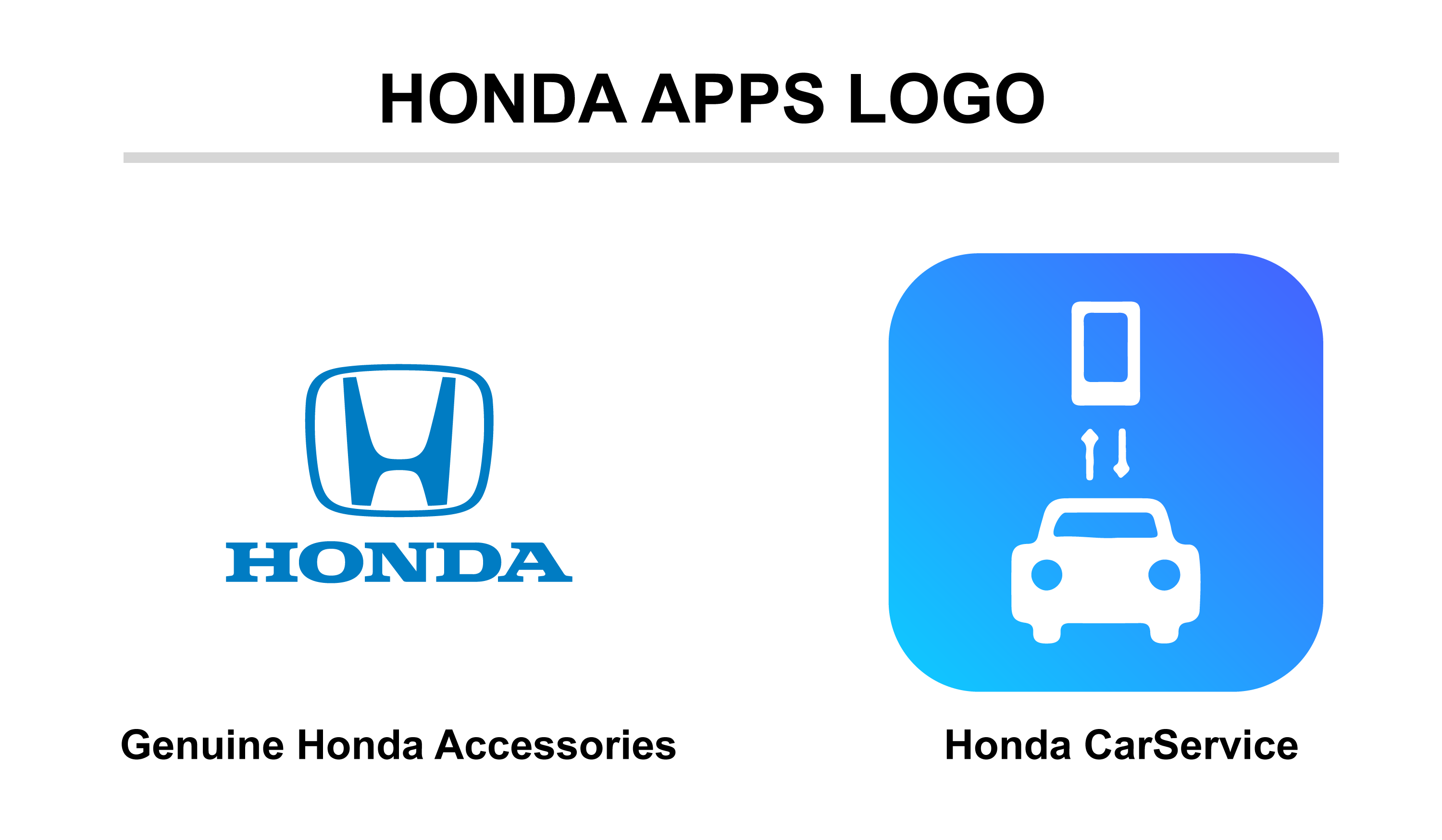
Honda Apps Icon
Honda has also developed logos for its apps, such as the Genuine Honda Accessories app and the Car Service app, which reflect the brand’s commitment to customer service and convenience.
Honda Apps Logo Genuine Honda Accessories
Honda Apps Logo Car Service
Honda Other Brands Logo
Honda’s diverse portfolio includes several sub-brands and partnerships, each with its unique logo:
Honda ACURA Logo
Honda HRC Logo
Hero Honda Motors Logo
Honda Accord Logo
Honda CIVIC Logo
Honda F1 Racing Logo
Similar Logo
Several logos in the automotive industry share similarities with Honda’s emblem, often featuring bold lettering and wing motifs, reflecting themes of speed and excellence.
HYUNDAI logo
From some criteria Hyundai logo look similar to the Honda logo.
Conclusion
Honda’s logos are more than mere symbols; they are the visual storytellers of the brand’s legacy. From the winged emblems of the early motorcycles to the sleek, modern insignias of today’s vehicles, each logo encapsulates a chapter of Honda’s relentless pursuit of innovation. As we’ve explored the evolution of these logos, it’s clear that Honda’s identity is deeply rooted in a commitment to quality and forward-thinking, resonating with customers across the globe.