TikTok is a video-sharing app that allows users to create and share short-form videos on any topic. It’s mainly mobile-based, but you can also watch videos using the web app. The platform evolved from Musical.ly to TikTok, and it has over 1 billion monthly active users. TikTok is known for its viral trends, creative effects, and diverse content, ranging from entertainment to education.
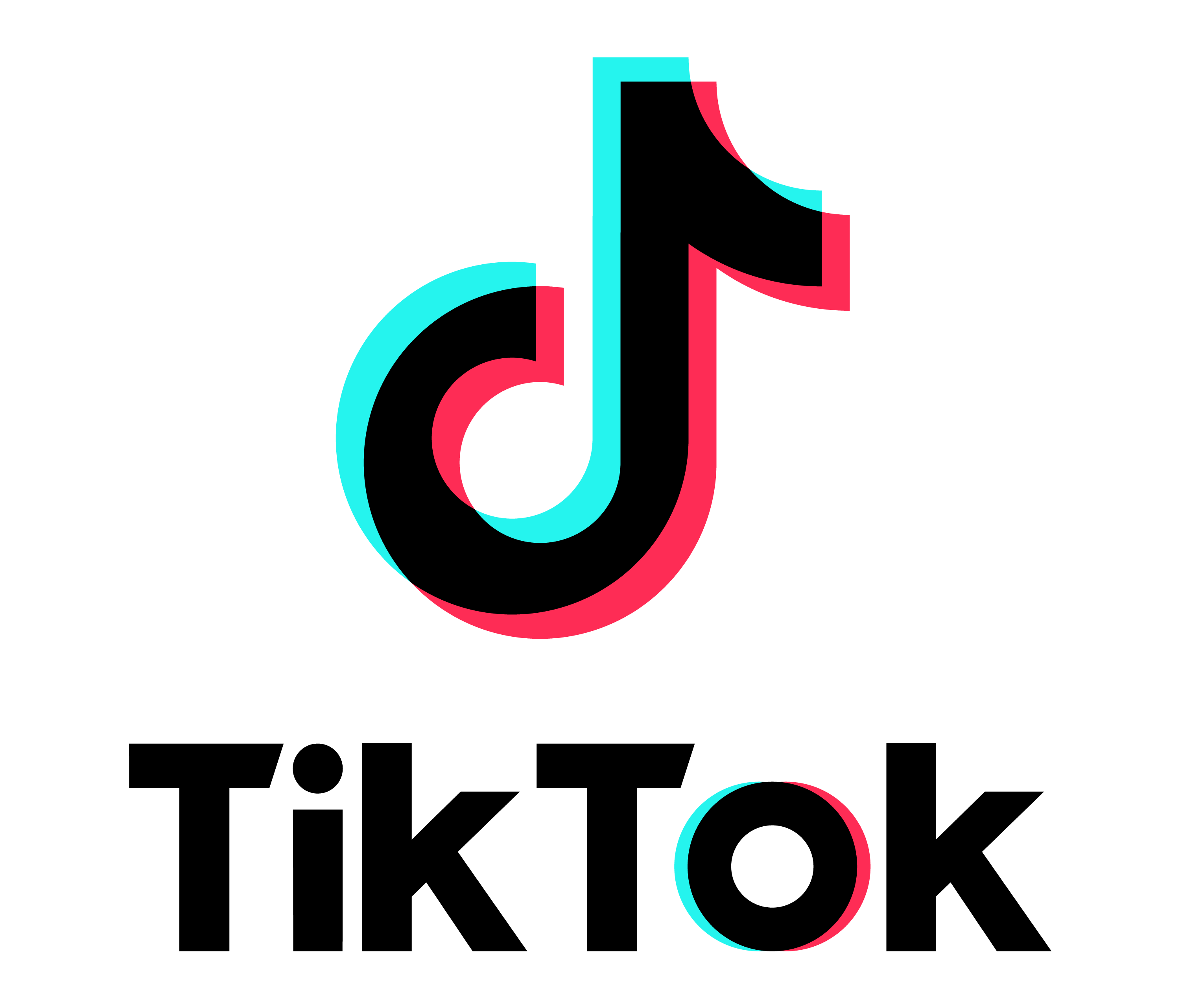
The TikTok logo consists of two parts: the wordmark and the icon. The wordmark is written in a stylized script font. The icon is a combination of the letter “d” and a musical note, forming a shape that resembles an eye. The logo uses a gradient of bright colors, such as pink, blue, and purple, to create a dynamic and vibrant look.
TikTok Logo History
The TikTok logo history traces back to the evolution of the Chinese app A.me into a global phenomenon. The app’s name, derived from the Chinese word “ai mei” meaning “love beautiful” or “love charming,” was represented by a simple wordmark in a rounded sans-serif font with a red dot above the letter “i,” symbolizing a camera lens and love.
In 2018, A.me and Musical.ly were merged into TikTok, with the new logo combining the word “TikTok” in a playful script font and a three-color note inspired by A.me’s dot, symbolizing the app’s vision and creativity. The TikTok logo, reflecting the app’s mission to inspire creativity and bring joy to its diverse and global audience, has remained unchanged since, using a gradient of bright colors to create a dynamic and vibrant look, as well as a 3D effect to make the logo stand out.
2016
2016
2017
2018
TikTok and Musicaly Marge in 2018

TikTok icon Logo
The current official TikTok logo variation is in use
Horizontal Simplified Black Logo
Horizontal Simplified White Logo
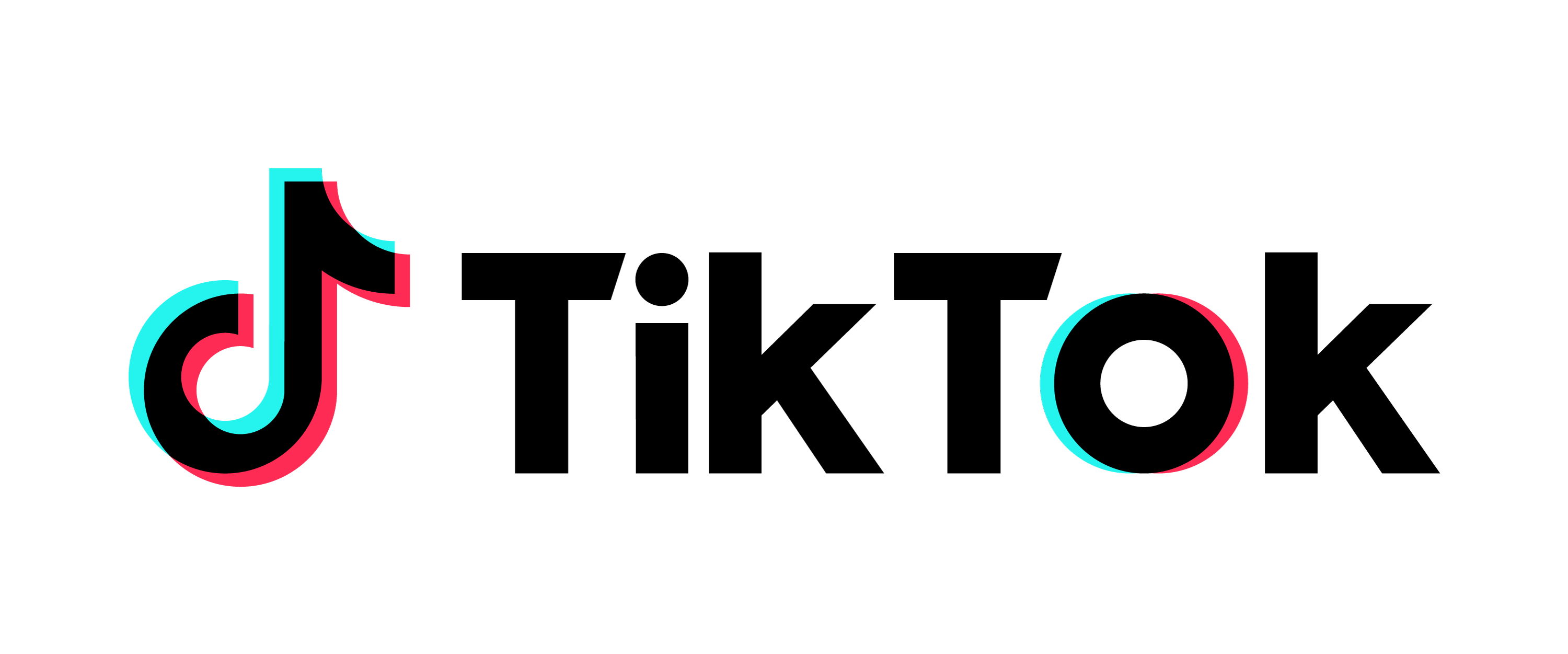
Horizontal Black Logo
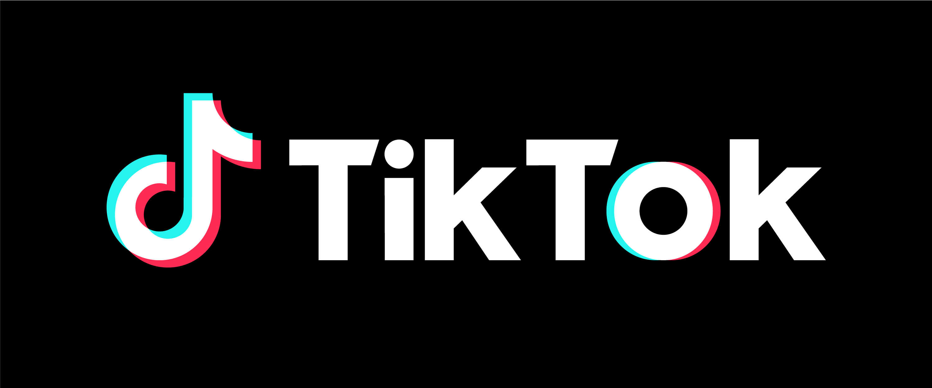
Horizontal White Logo
TikTok for developers
