


There is no doubt that the Nike logo is one of the most famous and valuable logos in the world. It’s the most well-known athletic brand worldwide, with a 31 billion-dollar value in 2023. Their emblem also represents the simple but powerful brand of Nike, a global leader in sportswear and footwear. Nike created an unforgettable identity with a logo that is simple, classic, and catchy. How did this remarkable symbol originate?
Note: You can download all the PNG and Vector files for free. But you need to credit us or mention Similarlogo website in your work and blog posts. Enjoy!
The surprising story starts with a student from a university who’s a graphic designer. Here’s your guide to the history of Nike, its logo, and its evolution.
The Nike Logo Meaing and it’s Design Element
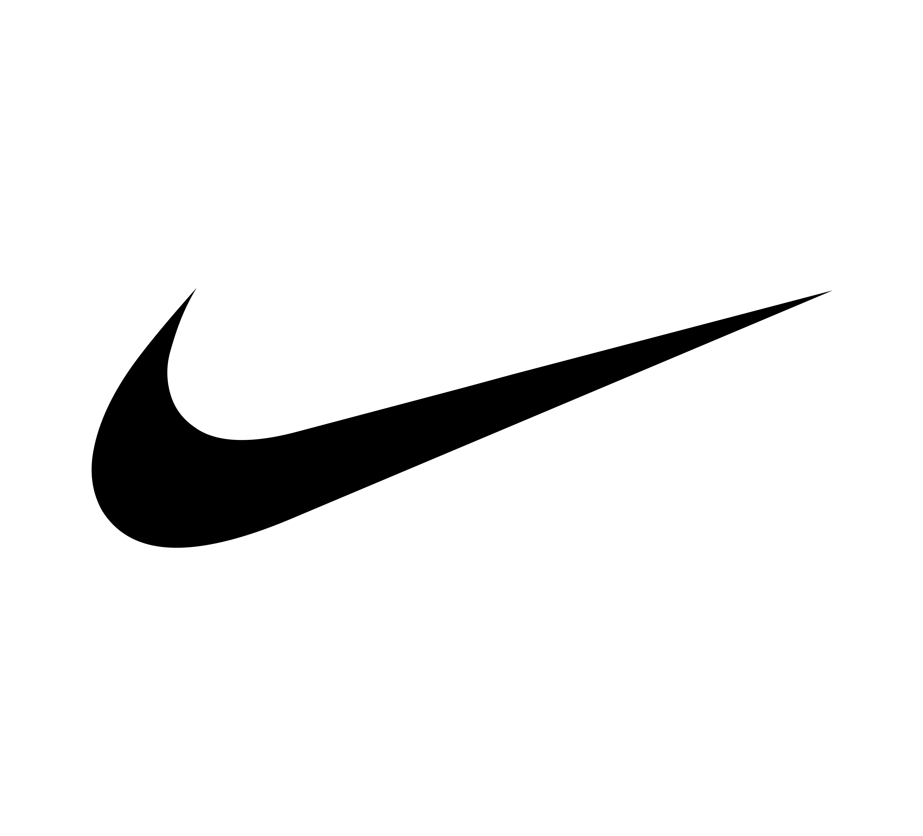
Like many minimalist logo designs, Nike’s swoosh is timeless. It is simple, catchy, and appealing. The logo inspires potential, ambition, and enthusiasm.
The Nike logo design elements include:
Shape: A smooth check mark image that represents the wing of the Greek goddess Nike. Carolyn wanted to copy the wing of Nike, but many people see the swoosh as a simple check nowadays.
Color: The Nike logo comes in different colors around the world. Nike is often associated with red and white. The color red has a long history with Nike, but today, the swoosh can be seen in various colors.
Font: Nike’s logo and font are not always linked. You may sometimes see the word Nike with the graphic image or the slogan “Just do it” on Nike assets. The text uses Futura Bold Font, while the Nike name is always in bold uppercase letters, to highlight the brand. The “K” in Nike is slightly tilted to make it more noticeable.
Additional logos: Nike sometimes makes separate logos for specific product lines. The Nike Skateboarding brand (Nike SB) puts an “SB” under the swoosh. The Nike Air logo uses the word “Air” under the swoosh.
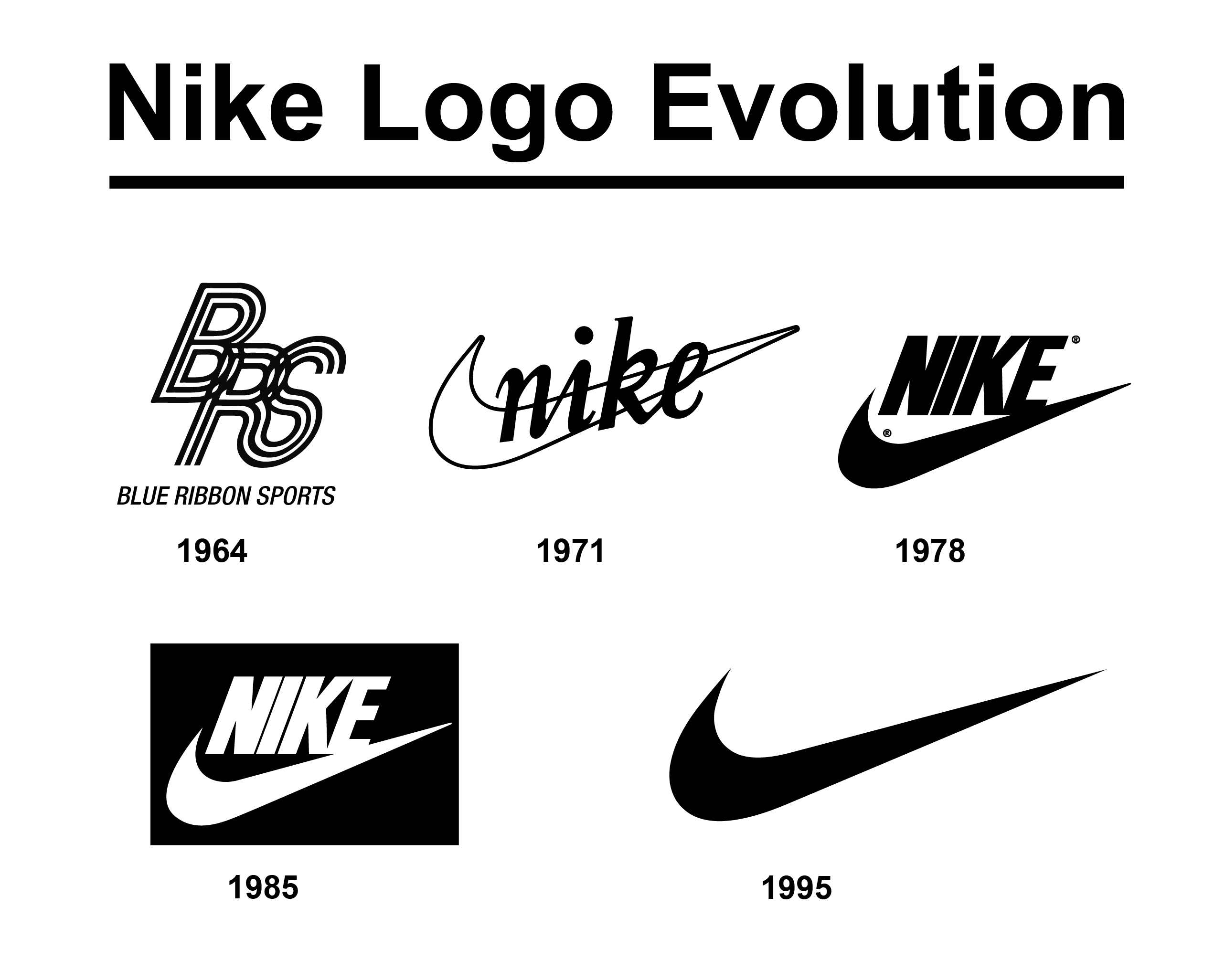
Nike Logo Evolution

Nike’s history started in 1964, when Phil Knight and Bill Bowerman founded Blue Ribbon Sports, a company that imported and sold Japanese running shoes. They later developed their own shoes and changed their name to Nike in 1971, after the Greek goddess of victory. Their logo, the well-known swoosh, was designed by a university student and symbolized the goddess’ wing. The logo was only altered in 1995, when the word Nike was removed to emphasize the graphic. However, the logo has also experienced minor changes over time, such as different colors, sizes, and placements.
1964

The company was founded in 1964 by Phil Knight and Bill Bowerman, who were track athletes and his coach at the University of Oregon. They started as a distributor of Onitsuka Tiger, a Japanese shoe maker, and In 1967, Bowerman created the popular Tiger Cortez, a modified version of the Onitsuka Tiger. The company benefited from the popularity of the Tiger Cortez and later from Bowerman’s inventive “Waffle” sole.
The logo image you see is what Knight and Bowerman used for their Blue Ribbon Sports company. They created this iconic BRS logo in 1964. Later, they changed their name to Nike in 1971, after the Greek goddess of victory and changed to their famous logo.
1971

1978

1985

1995

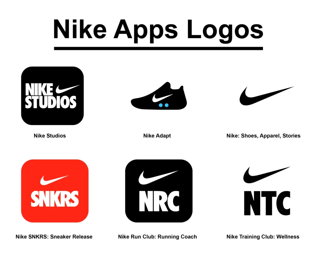
Nike Apps Logos


