


The Grand Theft Auto franchise is a behemoth in the gaming world. The Grand Theft Auto (GTA) logo is also become an iconic symbol. From its simple wordmark to its complex emblem, the GTA logo has evolved with each installment of the popular action-adventure video game series.
In this article, we will explore the history of the GTA logo, highlighting the different iterations and their significance.
Free Download Resources
Before we start, I want to let you know that you can download high-quality images and vector files free of each logo we talk about. These are great for making your own stuff or just to enjoy the details of each design. You’ll find the download links next to each logo’s description.
So, lets start –
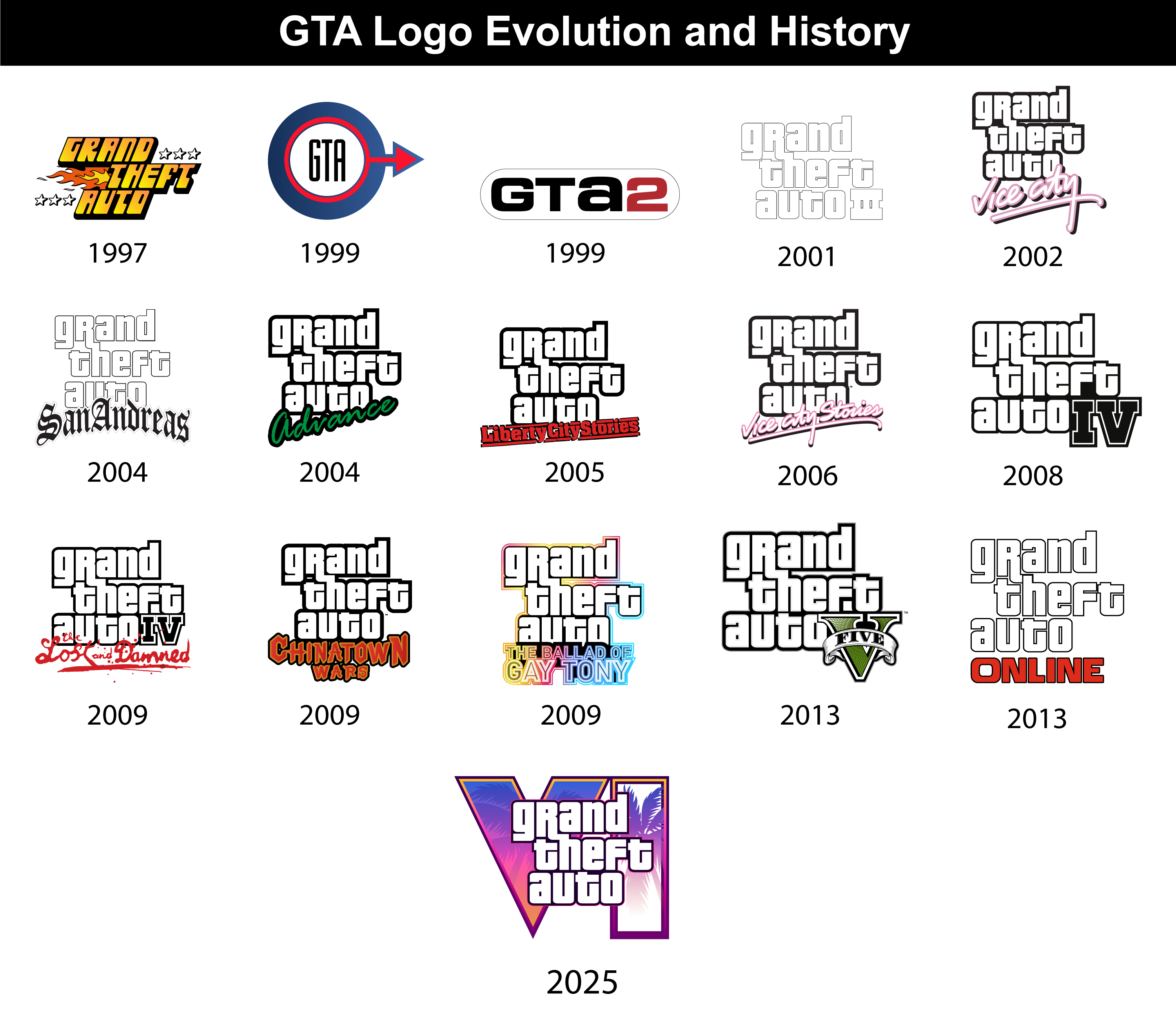
GTA Logo Evolution and History

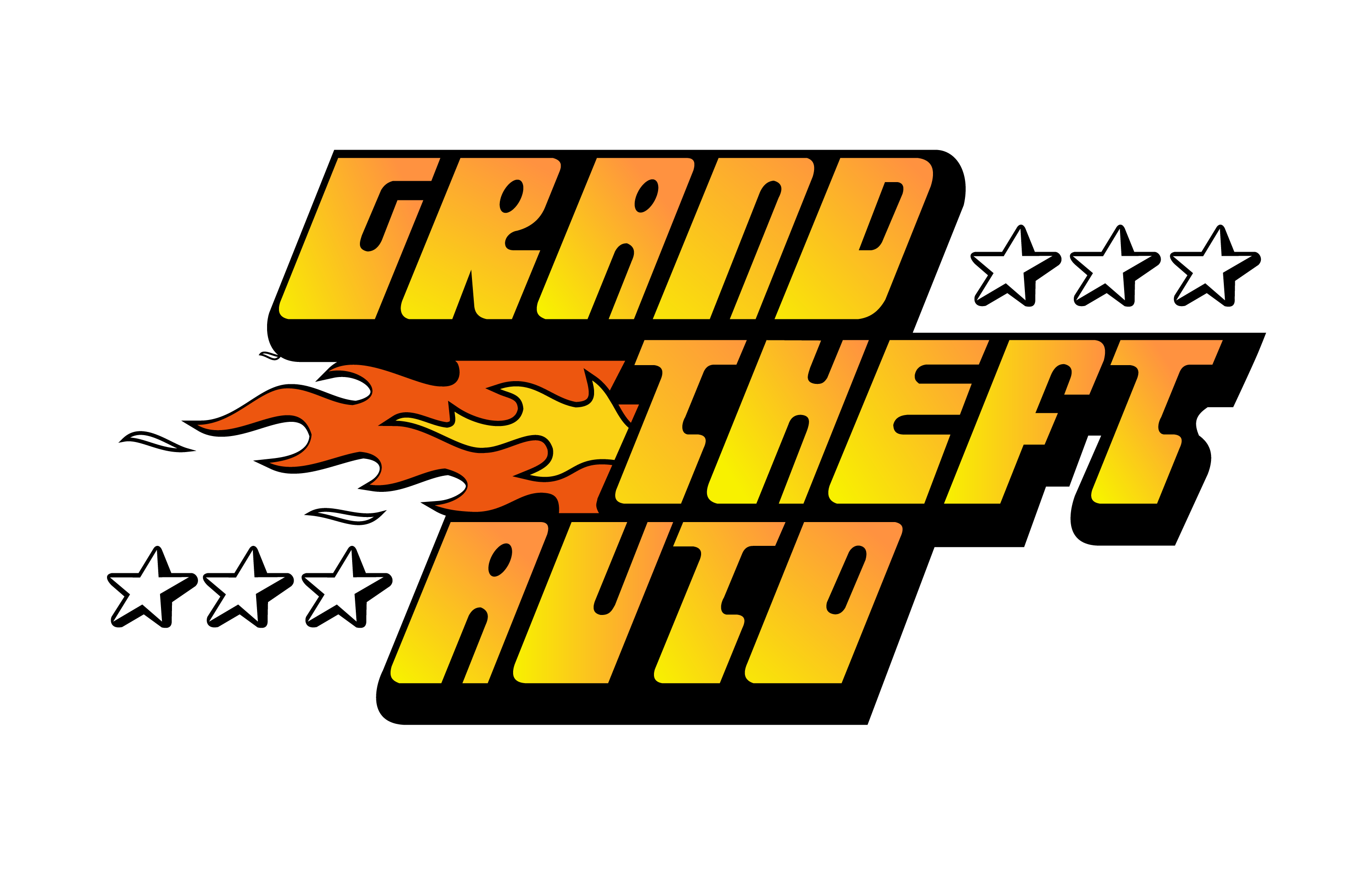
1997
The original GTA logo, introduced in 1997, featured gradient yellow lettering in a bold black outline, surrounded by contoured Six-pointed stars and an orange and yellow flame. This logo was used for only two years.

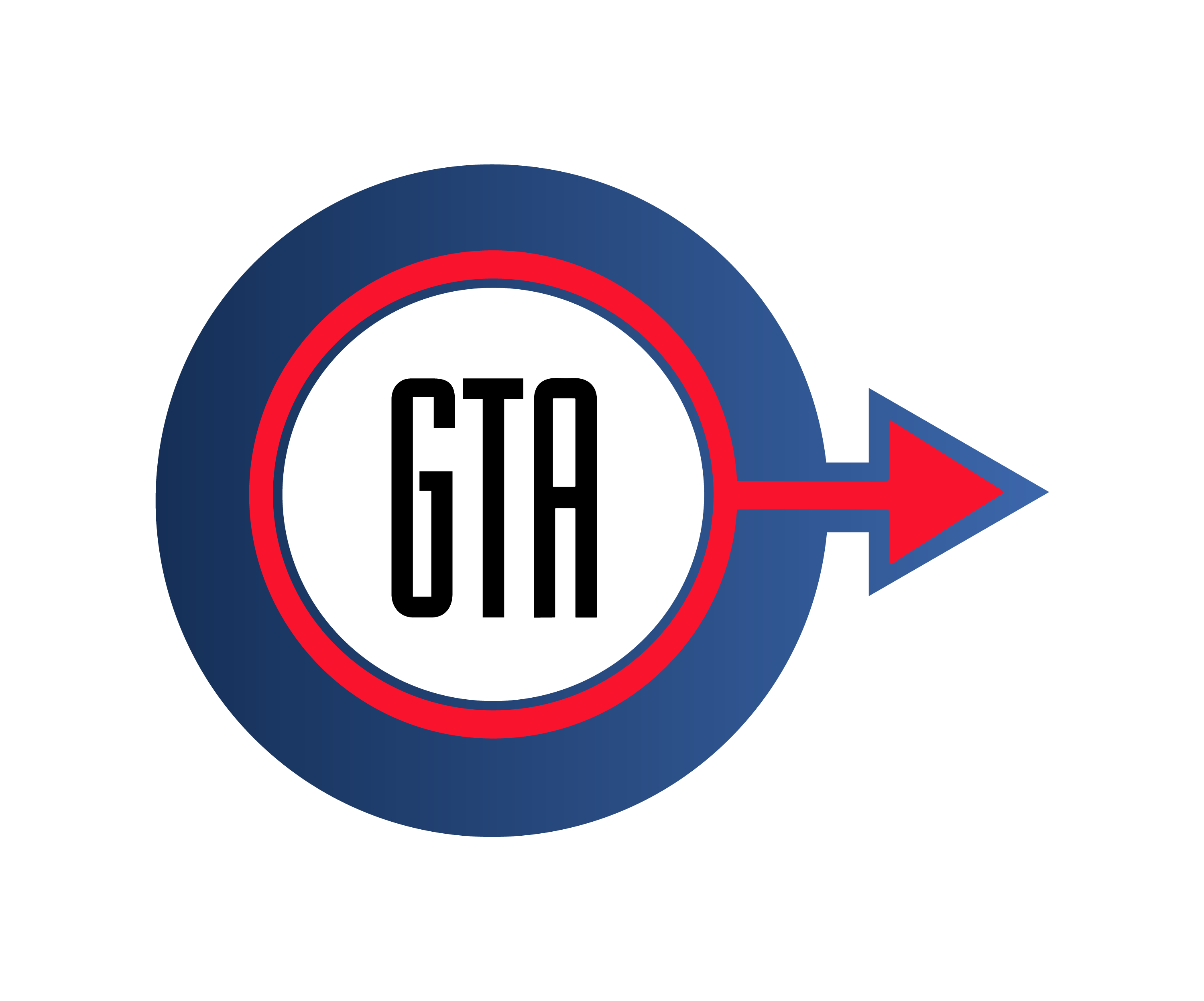
1999

Grand Theft Auto: London 1969 and Grand Theft Auto: London 1961 these were expansion packs for the original GTA game, set in London during the 1960s. The logos for these games reflected the setting and time period, featuring elements such as an Austin Powers-style badge and Union Jack colors.
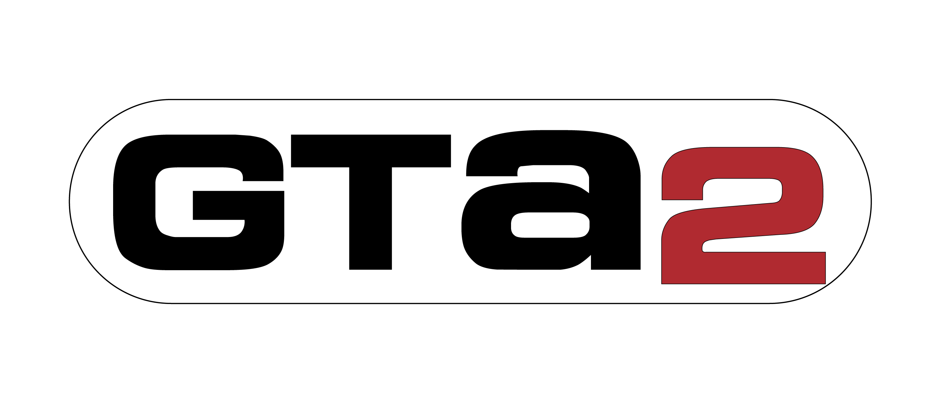
1999
Released on October 22, 1999, the logo for GTA 2 was a departure from the first game. The logo was simpler and more modern, reflecting the game’s evolution in terms of mechanics and visuals. Three thick, black bars formed the “GTA” acronym and with them “2” was set in Red color.

From this point on, the GTA logo would undergo subtle changes with each new game version, reflecting the specific setting and atmosphere of that specific game version. Here’s a quick overview of notable iterations:
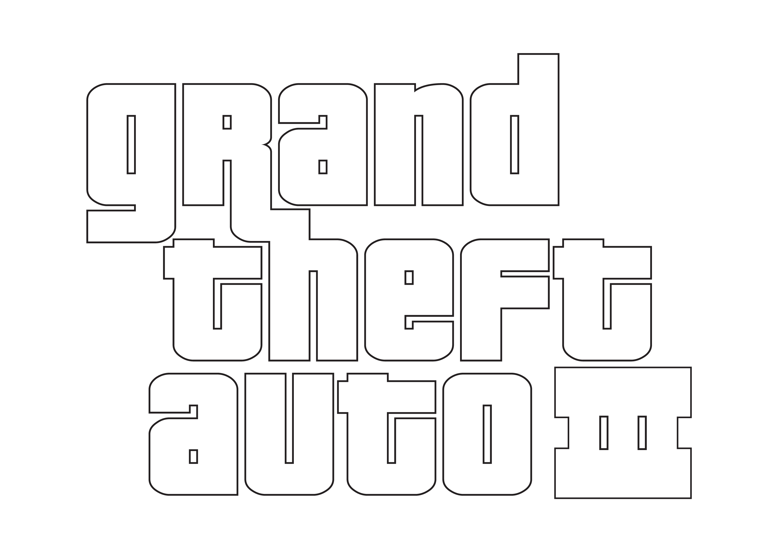
2001 – GTA 3 Logo
The year 2001 marked a turning point for the GTA logo. The now-iconic white, lowercase lettering with a black outline made its debut in Grand Theft Auto 3. This design struck a perfect balance between clean lines and urban style, instantly becoming recognizable and synonymous with the franchise.

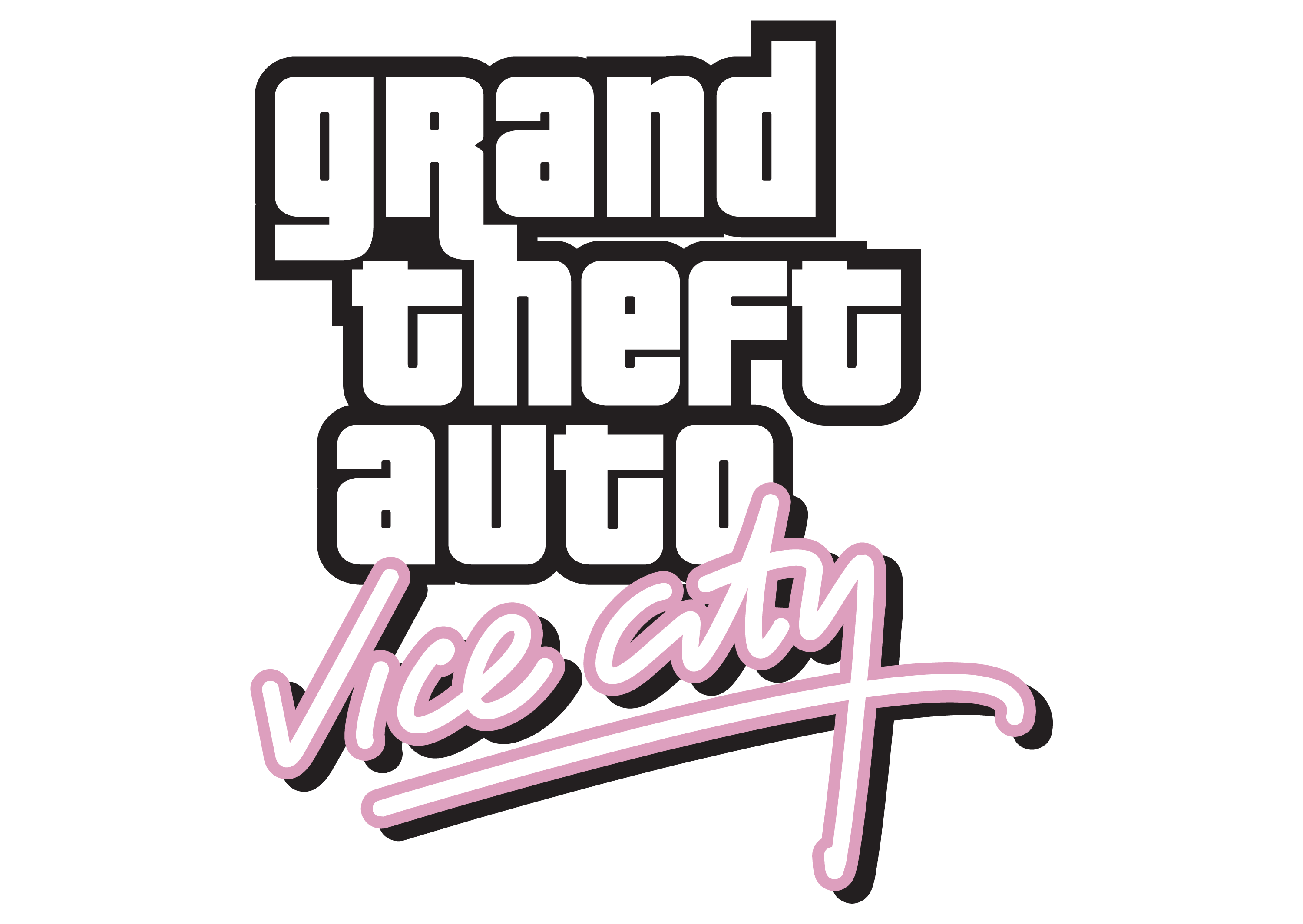
2002 – GTA Vice City Logo
The 2002 Grand Theft Auto Vice City logo features stylized, retro-inspired typography. The words “Grand Theft Auto” are written in a bold, uppercase font, while “Vice City” is written in a script font that evokes the neon and glamour associated with the 1980s Miami, which is the game’s setting.

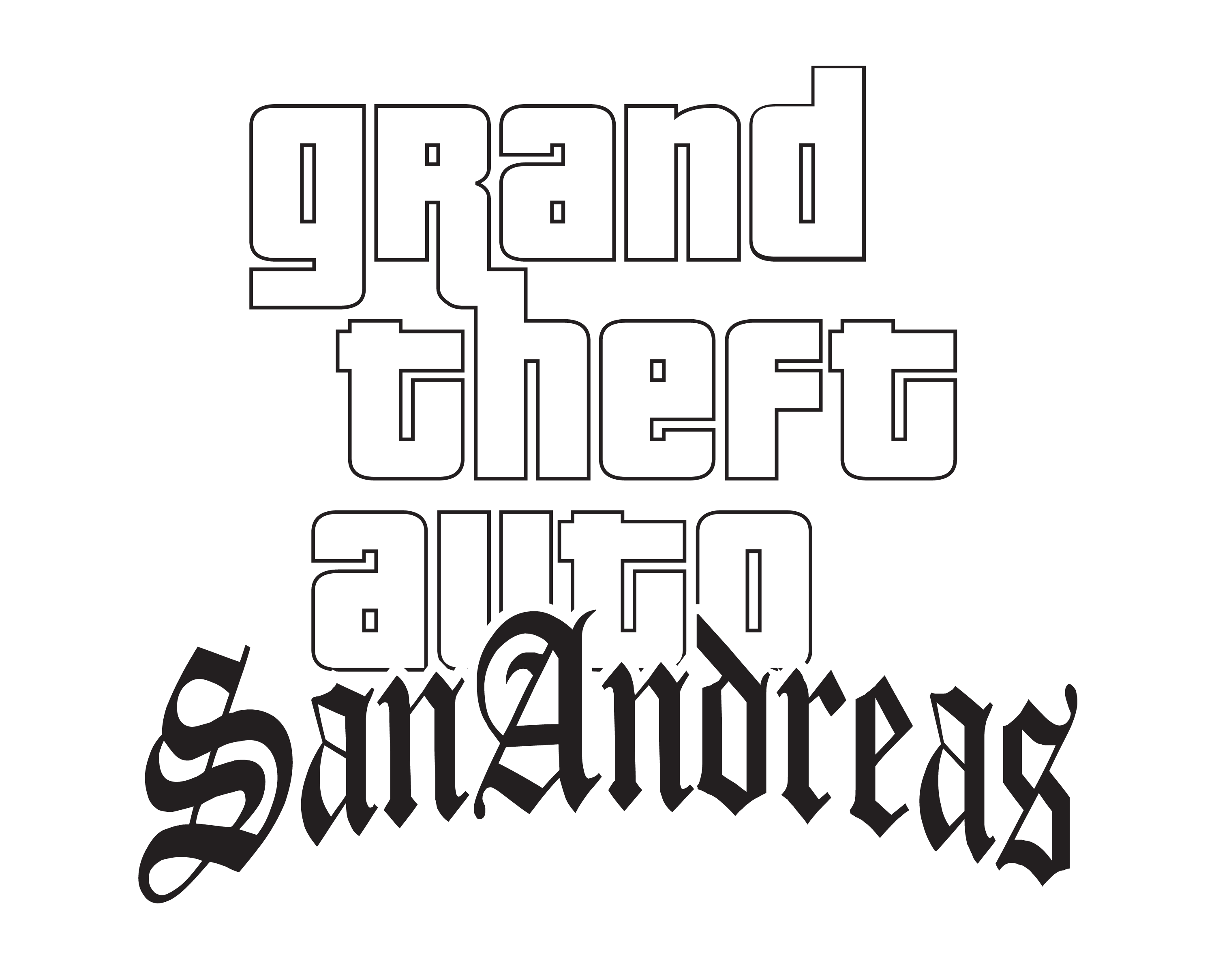
2004 – GTA San Andreas Logo
Grand Theft Auto San Andreas logo continued the trend of adapting the logo to match the game’s setting, this time with a West Coast, early 90s aesthetic. The logo also features the word “San Andreas” written below in a more traditional font, with thin horizontal lines separating each word.

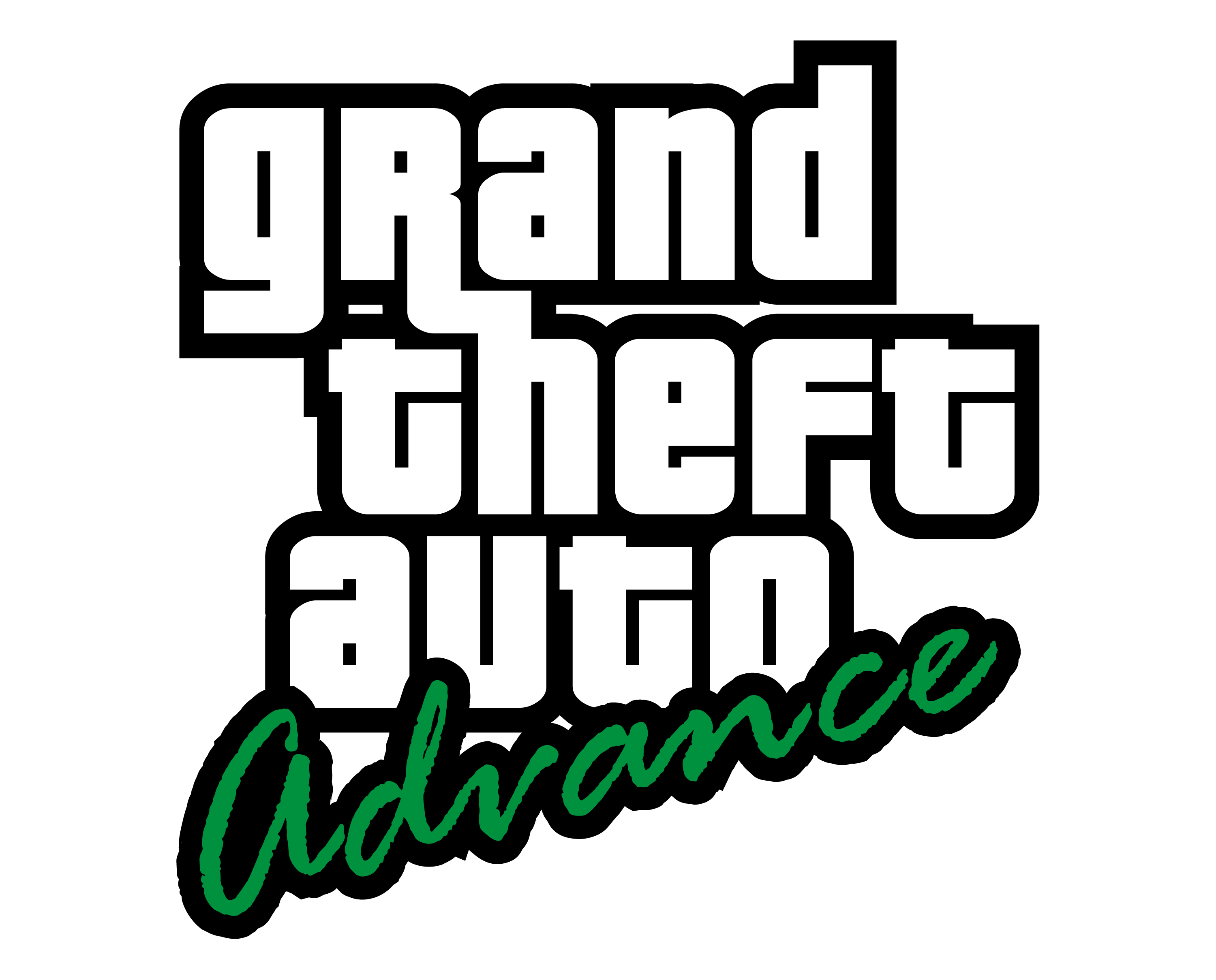
2004 – GTA Advance Logo
The Grand Theft Auto Advance logo features the distinctive typography and style associated with the Grand Theft Auto (GTA) series. The logo typically includes the words “Grand Theft Auto” in large, bold lettering, with “Advance” written underneath in a smaller size.
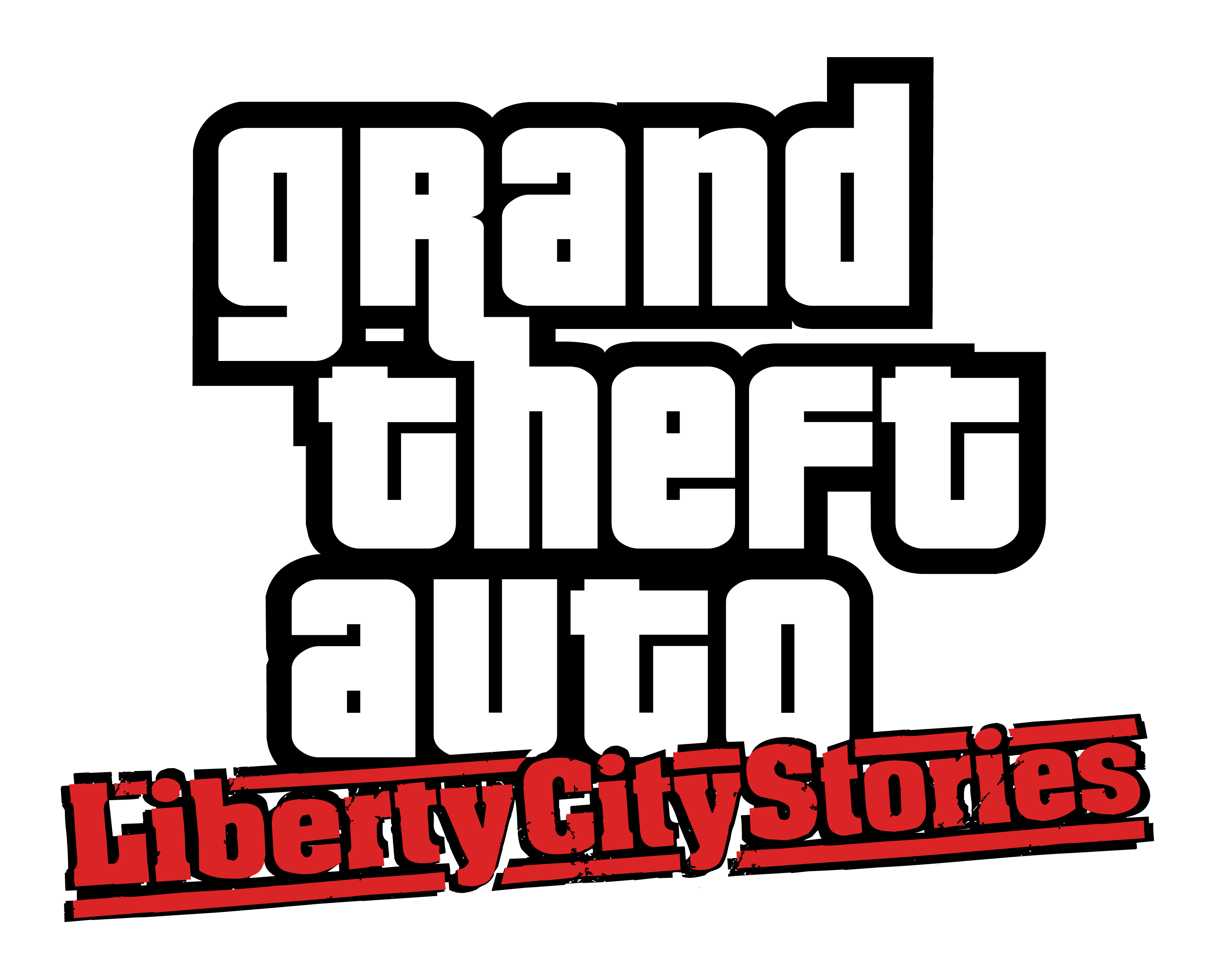
2005 – GTA Liberty City Stories Logo
The logo for Grand Theft Auto: Liberty City Stories features the regular GTA logo while “Liberty City Stories” is written in a smaller, yellow font with a black outline. The entire logo is set against a black background. The font used in the logo is reminiscent of graffiti or street art, which aligns with the game’s urban setting and themes.
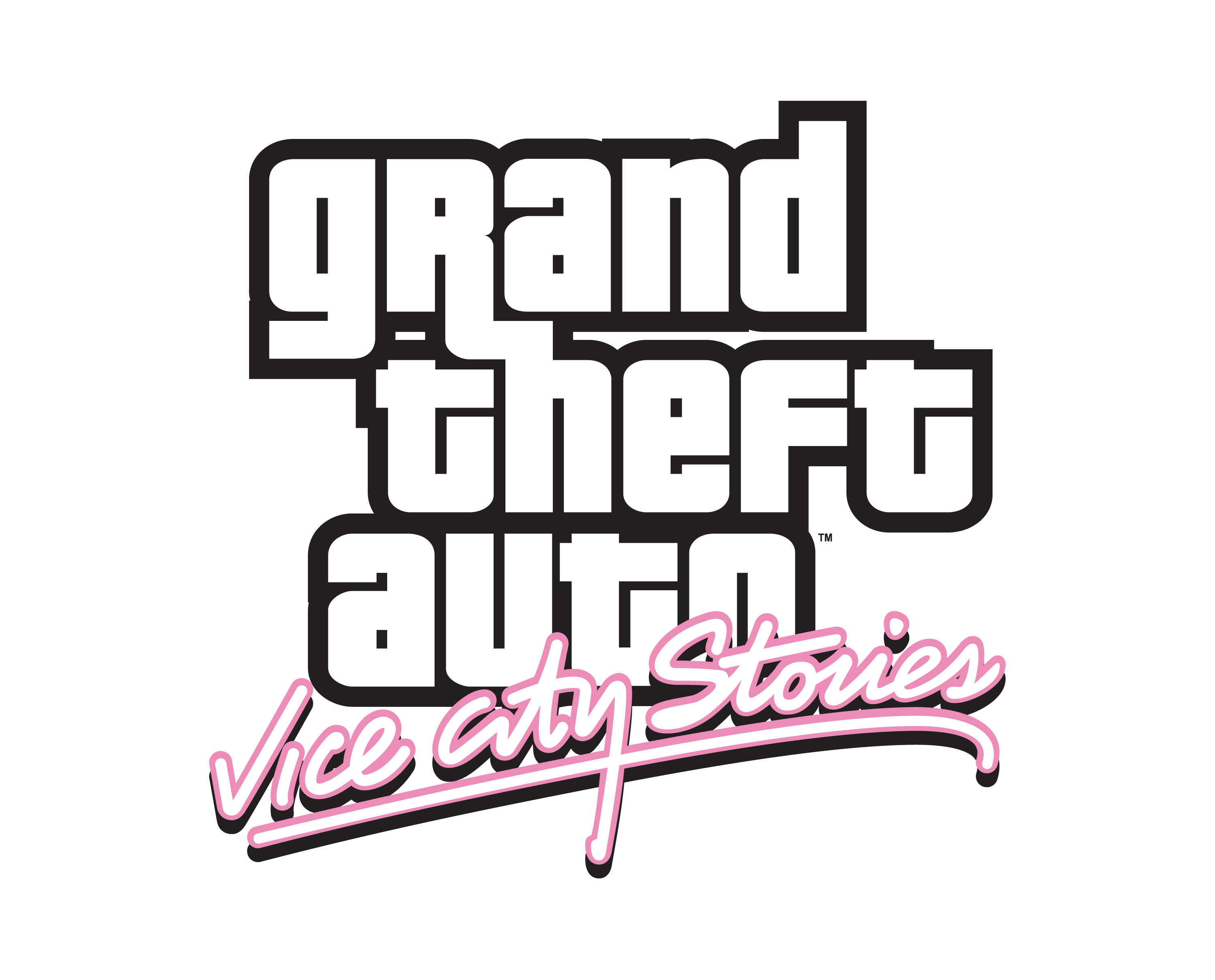
2006 – GTA Vice City Stories Logo
This logo feature the same GTA iconic logo but “Vice City Stories” word prominently displayed below in a larger, more stylized font.

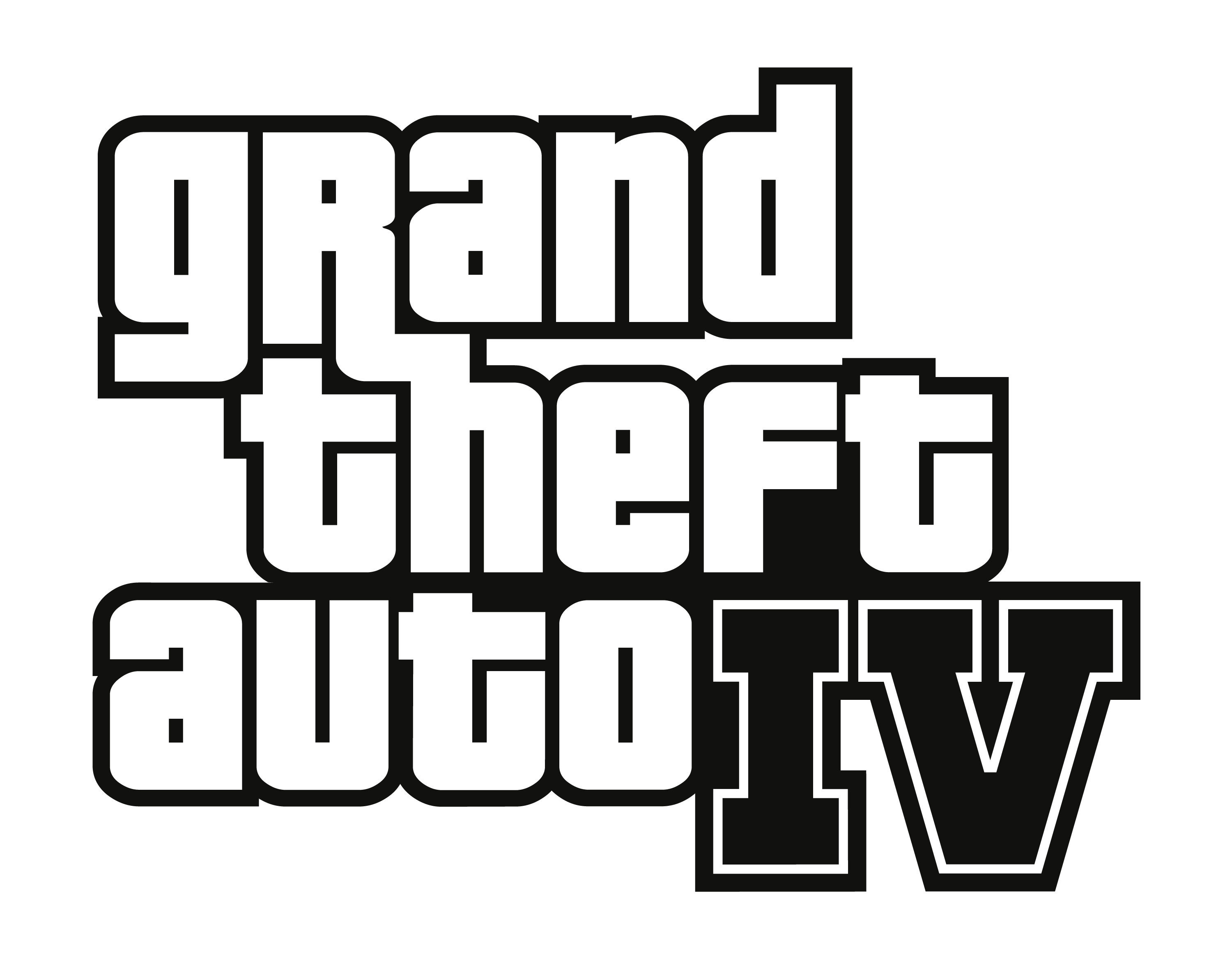
2008 – GTA 4 Logo
The GTA 4 logo returned to the series’ iconic lowercase font, but with a modern, minimalist design. In the logo the “IV” is Roman numerals for 4, indicating that this is the fourth game in the series.

2009 – GTA The Lost and Damned Logo
The logo for “Grand Theft Auto: The Lost and Damned” features stylized text that reflects the gritty and outlaw aesthetic of the game, which focuses on biker gang culture.
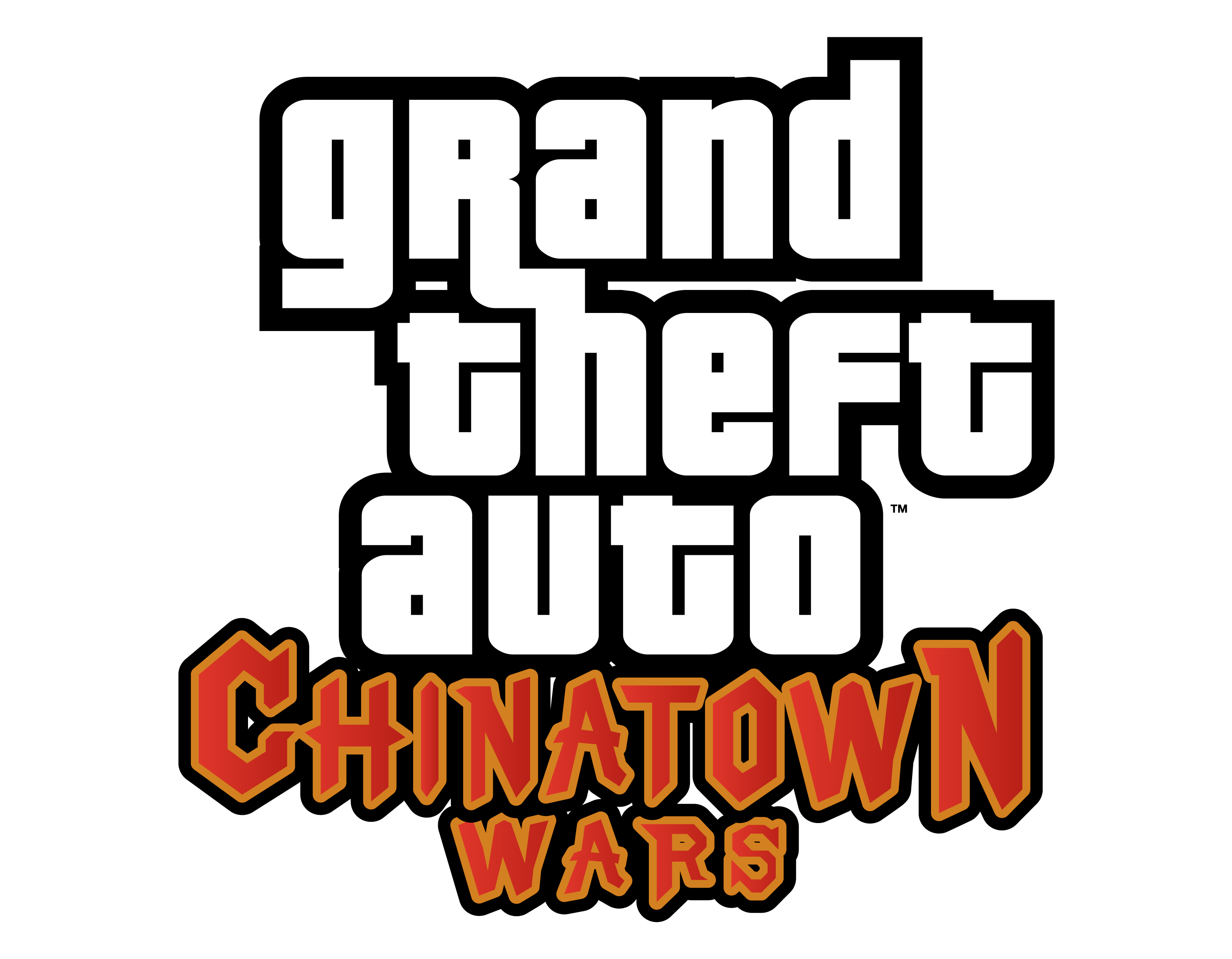
2009 – GTA Chinatown Wars Logo
The logo for the game “Grand Theft Auto: Chinatown Wars” features the title of the game in stylized, bold, and capital letters. The words “Grand Theft Auto” are typically in a larger font size compared to “Chinatown Wars”.

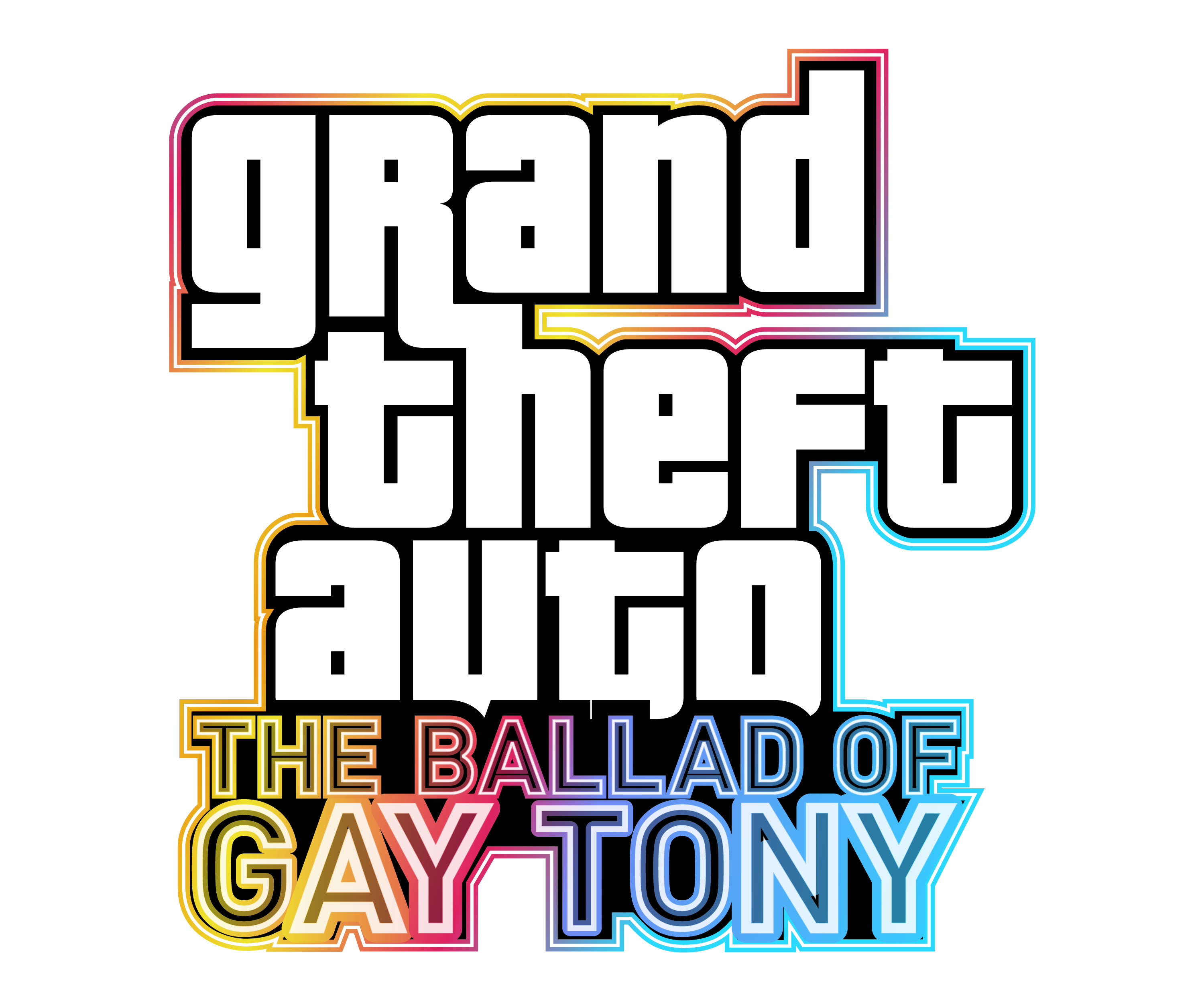
2009 – GTA The Ballad of GAY TONY Logo
The logo has the regular GTA logo and the words “The Ballad of” is in capital but small size but “Gay Tony” word is in big size. The logo look good in a black background.

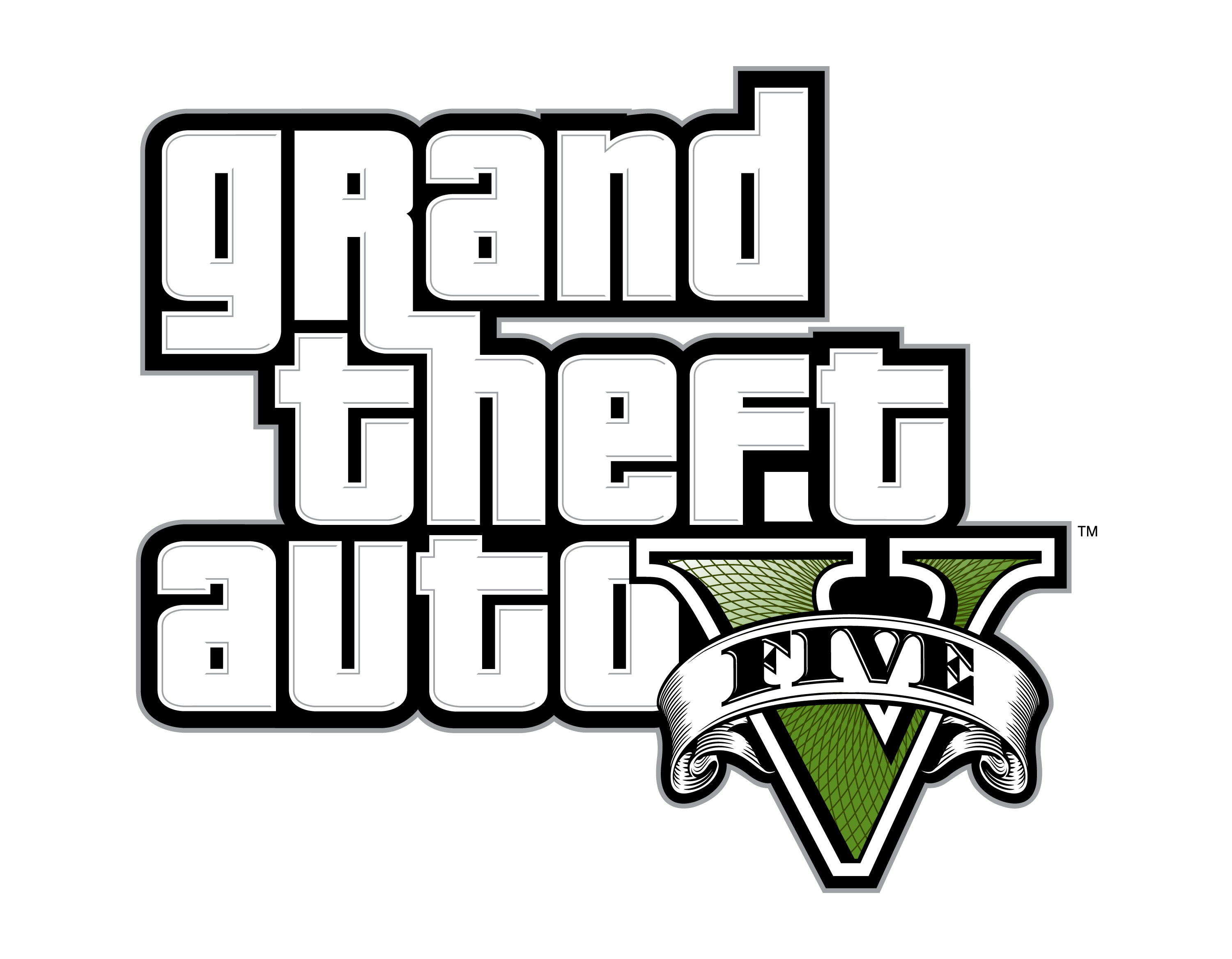
2013 – GTA 5 Logo
The logo for Grand Theft Auto V (GTA V) is instantly recognizable and has become synonymous with the popular action-adventure video game. The logo consists of the game’s title, “Grand Theft Auto”, written in all lowercase letters, except for the “R” which is capitalized.
The game’s emblem is a green Roman numeral “V”, signifying the fifth installment in the series. This “V” is designed in a classic serif font, with traditional elegant lines. Over the “V” is a horizontally arched ribbon, on which the word “Five” is written in a bold serif typeface.

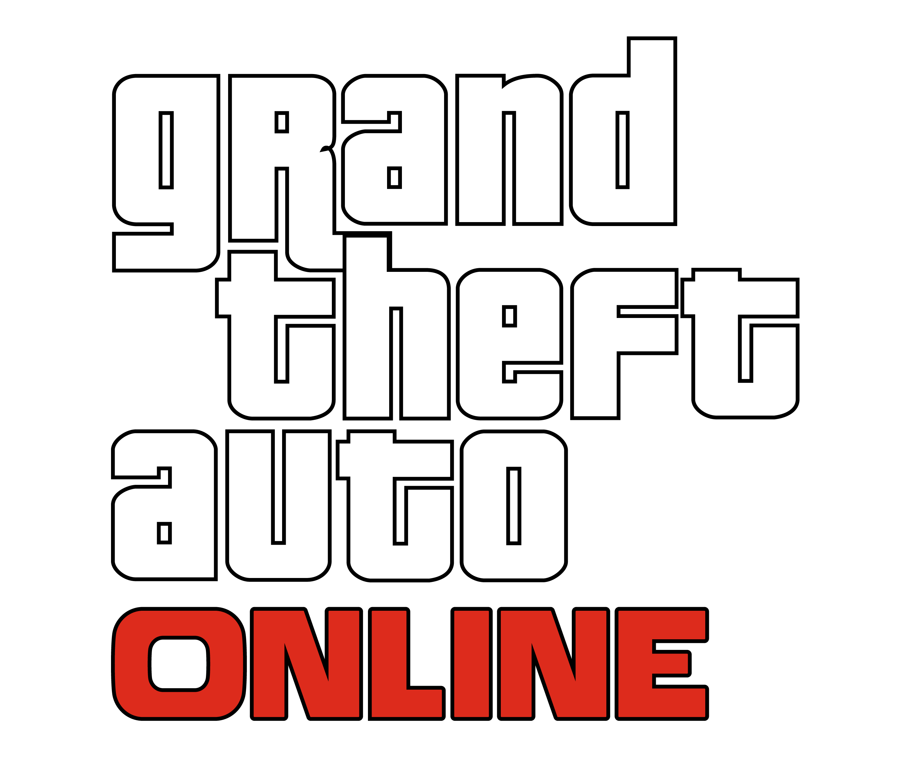
2013 – GTA Online Logo
The GTA Online logo maintained the style of GTA 5’s logo but the word “Online” underneath in a smaller font in red color. It symbolized the game’s focus on multiplayer mayhem and its ever-expanding online world.

Upcoming in 2025 – GTA 6 Logo
The upcoming Grand Theft Auto 6 logo maintains the central lettering and detail but moves the Roman numerals behind it, symbolizing a new era for both Rockstar games and GTA as a franchise.

